
.webp)
Accessible Form Validation: Best Practices


Accessible form validation ensures everyone, including people with disabilities, can use web forms effectively. Here's why it matters and how to do it right:
- Clear Error Messages: Use specific guidance like "Password must include at least 8 characters" instead of vague terms like "Invalid input."
- Labels and Field Identification: Always use
<label>tags and avoid relying on placeholder text alone. - Keyboard Navigation: Ensure users can navigate forms without a mouse, with logical tab order and visible focus indicators.
- Focus Management: Automatically direct focus to the first error after submission to guide users efficiently.
- WCAG Compliance: Follow accessibility standards like adding
aria-invalidandaria-describedbyfor error messages.
Accessible forms improve user experience, reduce abandonment rates, and meet legal requirements. Tools like Reform simplify this process by integrating accessibility features like ARIA attributes, dynamic error feedback, and keyboard-friendly navigation. Testing with screen readers and keyboard-only navigation ensures forms work for everyone.
How to make accessible forms - with lots of examples!
Core Principles of Accessible Form Validation
Creating accessible form validation means designing forms that everyone can use effectively, regardless of their abilities or the assistive technologies they rely on. The Web Content Accessibility Guidelines (WCAG) outline four key principles - Perceivable, Operable, Understandable, and Robust (POUR) - that serve as the backbone for inclusive validation systems.
Clear and Actionable Error Messages
Error messages play a major role in accessible form validation, as they help users understand and fix issues quickly. According to the POUR principles, these messages should be easy to perceive and comprehend. Clear and actionable error messages provide users with specific guidance on how to resolve problems.
"Error messages are crucial elements in UX design, as they play a key role in communicating with users when problematic situations or errors occur. Providing effective error messages helps users understand what went wrong, how they can fix it, and reduces overall frustration, thus improving the experience." - Torresburriel Estudio
Vague phrases like "Invalid input" or overly technical jargon confuse users. Instead, messages should explain the issue and how to fix it. For instance, instead of saying "Password error", a better message would be: "Password must include at least 8 characters, one uppercase letter, and one number."
Specific error messages are especially helpful for users with cognitive challenges, reduced attention, or those using screen readers. Poorly written feedback can lead to frustration and even cause users to abandon the form altogether. Whenever possible, provide examples to clarify expectations. For instance, if a date field requires the format MM/DD/YYYY, include an example like "Enter date as 12/25/2024."
To ensure compatibility with screen readers, error messages should be integrated into the DOM using ARIA attributes such as aria-invalid="true" and aria-describedby. These attributes link error messages directly to their corresponding form fields. Additionally, every form field must have a clear label that works seamlessly with these error messages.
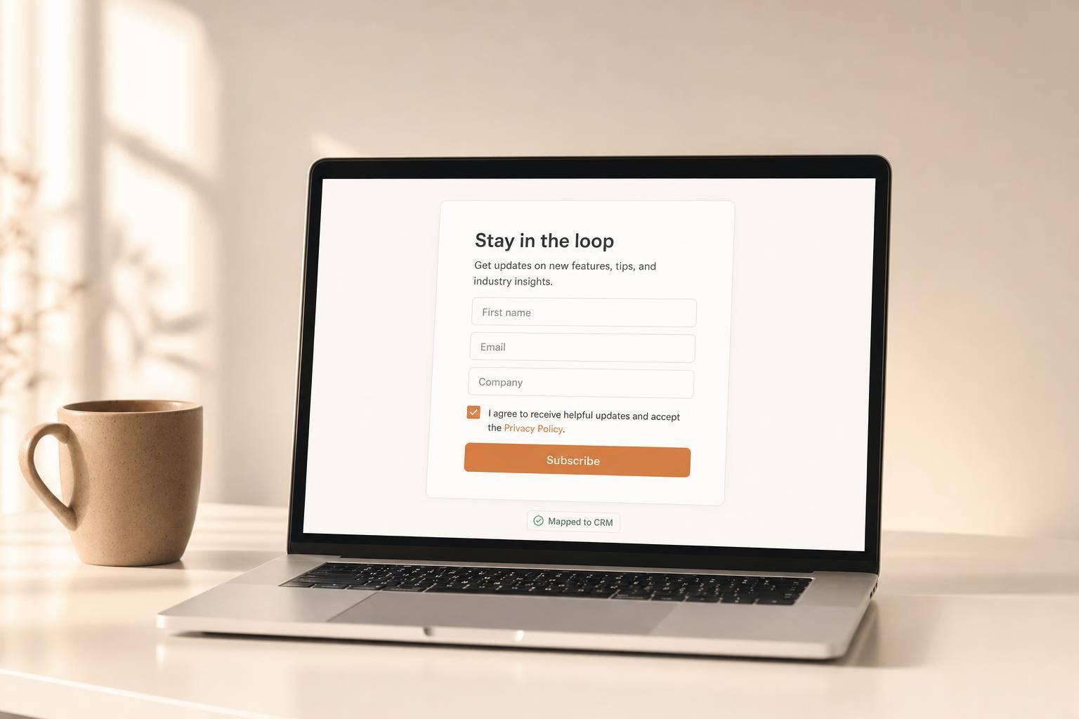
Accessible Labels and Field Identification
Labels are essential for helping users understand what information is needed in a form field. By applying the POUR principles, you ensure that labels are both perceivable and easy to understand. Clear and descriptive labels reduce confusion and guide users to provide accurate information. Assistive technologies rely on these labels to describe form fields accurately.
The <label> element is the most reliable way to associate descriptive text with form controls. Position labels directly above or to the left of input fields for better visibility, particularly for users with low vision who may use screen magnifiers.
Avoid relying on placeholder text as a substitute for labels. Placeholders disappear once users start typing, which can lead to confusion. Instead, use placeholders to provide additional examples while keeping a persistent label visible. This approach benefits users with memory challenges.
For forms with grouped controls, such as checkboxes or radio buttons, use <fieldset> and <legend> elements to provide context. Labels should be specific and informative, like "Email Address" instead of vague terms like "Enter". To indicate required fields, use HTML5 or ARIA attributes to clearly mark mandatory information.
If you're working with custom components that don't support standard HTML labels, use ARIA attributes like aria-label or aria-labelledby to maintain accessibility. By following these guidelines, you ensure your forms are easy to navigate and understand for all users.
Keyboard Navigation and Focus Management
In addition to clear error messages and labels, seamless keyboard navigation is critical for accessibility. Keyboard accessibility is a cornerstone of web accessibility, as it benefits users across a wide range of abilities. Many users rely exclusively on keyboards to interact with forms, so every interactive element must be keyboard-friendly.
All form fields, buttons, links, and custom controls should be navigable using standard keyboard commands. This ensures that users can move through the form without needing a mouse.
Focus management is equally important, especially during validation. When an error occurs, the focus should automatically shift to the first error message, making it immediately clear where the problem lies. Visible focus indicators - such as a highlighted border or underline - help users track their position within the form. These indicators should have sufficient contrast to remain easy to see.
Tab order should follow a logical sequence that mirrors the form's visual layout, typically moving from top to bottom and left to right. For forms with dynamic elements, such as conditional fields or multi-step processes, focus management requires extra care. When new sections appear, users should be notified without losing their place. ARIA live regions can announce these updates while keeping the focus intact, ensuring users remain informed without unnecessary disruptions.
How to Implement Accessible Error Messaging
Creating accessible error messaging requires thoughtful planning of your HTML structure and user interaction design. The goal is to ensure error messages are clear, easy to understand, and compatible with assistive technologies.
Inline Error Messages with ARIA Attributes
ARIA attributes are a powerful way to enhance HTML semantics without affecting the visual design. For instance, adding aria-invalid="true" to an input field signals to screen readers that the field contains an error. When users focus on that field, the screen reader announces it as "invalid".
To further improve accessibility, use aria-describedby to link error messages to their corresponding fields. This attribute references the id of the error message element, ensuring screen readers announce both the field label and the error message when the field is focused.
Here’s an example of how this works:
<div class="control">
  <div>
    <label for="email">Email address: [*]</label>
    <input type="text" name="email" id="email" class="error" aria-invalid="true" aria-describedby="err_1">
  </div>
  <span class="errtext" id="err_1">Error: Incorrect data</span>
</div>
In this snippet, aria-invalid="true" marks the input as invalid, and aria-describedby="err_1" connects the input to the error message with the ID "err_1."
For dynamic error messages, apply aria-live="assertive" to the container so that screen readers announce errors immediately.
Once ARIA attributes are in place, focus management becomes the next critical step in guiding users effectively.
Focus Management for Error Feedback
Proper focus management ensures users can quickly address errors. ARIA properties help guide users, but focus management takes it a step further by directing their attention to the right place at the right time.
One effective method is the "error alert, then focus" approach. This involves announcing the error first and then moving the focus to the problematic field. For forms with multiple errors, consider using an error summary at the top of the form. This summary allows users to see all issues at once and navigate through them systematically, which is especially useful for longer forms with scattered errors.
Use tabindex="-1" for elements requiring programmatic focus but not part of the regular tab sequence. Always maintain a logical focus order that matches the visual layout of the form - typically top to bottom and left to right for forms in the U.S. Additionally, make sure focus indicators are clearly visible and provide enough contrast across different browsers and operating systems.
Combining Inline and Summary Error Feedback
Using both inline error messages and a summary error section ensures clarity for all users. Inline messages provide immediate feedback next to the problematic field, helping users identify and fix errors right away. Meanwhile, a summary at the top of the form offers an overview of all issues, allowing users to plan their corrections more efficiently.
For longer forms, place the error summary above the submit button. This ensures users see all issues before attempting to resubmit. The summary should list each error and include links that take users directly to the corresponding fields. This setup benefits keyboard and screen reader users alike.
In shorter forms, you might focus directly on the first invalid field while providing an invisible error summary for screen readers. Ensure each invalid field has aria-invalid="true" and is linked to its error message using aria-describedby. Use clear visual cues and concise text to differentiate error messages.
Timing also plays a crucial role. While real-time validation can be helpful, avoid overwhelming users with immediate feedback. Allow them to complete their input before displaying errors. A slight delay or validation triggered when the user leaves the field (on blur) strikes a good balance between helpfulness and frustration.
Accessible error messaging benefits everyone - not just users with disabilities. By providing clear, well-placed error messages, you can reduce form abandonment and improve completion rates for all users.
Testing and Auditing for Accessibility
Building on the earlier discussion about accessible error messaging and focus management, thorough testing is essential to ensure your forms work for everyone. A strong accessibility testing process combines automated tools with manual testing using assistive technologies.
Testing with Assistive Technologies
Screen readers, which convert text to audio or Braille, play a crucial role in testing form accessibility. Since different screen readers interpret web content in unique ways, it's important to test with multiple tools. Popular options include NVDA (free and open source) and JAWS (paid). For Mac users, VoiceOver integrates seamlessly with Apple devices but is limited to macOS and iOS.
When using screen readers, check that all form labels, error messages, and field states are announced correctly. The reading order should make sense, and dynamic error messages need to be communicated clearly as they appear. A study by AudioEye highlighted that many issues go unnoticed by automated tools, underscoring the importance of manual testing. Screen reader testing should be part of your routine whenever significant updates are made to your forms.
Keyboard-Only Navigation Testing
Keyboard-only navigation testing ensures users can complete forms without relying on a mouse. Start by using the Tab key to navigate through your form, confirming that the tab order matches the visual flow of the layout.
Focus indicators are critical here - each form field should have a visible outline or highlight when selected so users can easily identify the active element. For forms with errors, verify that keyboard navigation allows easy access to error messages. After submitting a form with errors, the focus should automatically shift to the first error message so screen readers can announce it immediately.
If your form uses JavaScript for dynamic features, ensure the code supports keyboard accessibility. Avoid disabling buttons that block interaction. Instead, allow users to click buttons at any time and display clear error messages with instructions when needed.
Compliance with Accessibility Standards
Adhering to WCAG (Web Content Accessibility Guidelines) is the cornerstone of accessibility testing. Focus on key areas like HTML markup, alternative text, keyboard compatibility, and dynamic content. A well-rounded testing strategy combines automated tools with manual checks.
Prioritize critical aspects during testing. For example, ensure all invalid form fields include aria-invalid="true" so screen readers can identify them as invalid. Use proper ARIA live regions for dynamic content like error messages to announce updates immediately.
Real-user testing with individuals who rely on assistive technologies offers valuable insights into how your forms perform in practical scenarios. This hands-on feedback can reveal barriers that technical testing might overlook, particularly those impacting user experience and workflow.
Accessibility testing shouldn’t be a one-off effort. Incorporate it into your regular maintenance schedule to keep your forms accessible as you introduce new features or make updates. These strategies create a solid foundation for adding advanced accessibility features, which will be discussed in the next section.
sbb-itb-5f36581
Using Reform for Accessible, High-Performing Forms
When creating accessible forms, it’s essential to pair thorough accessibility testing with tools that simplify the process. Reform takes on the challenge of merging accessibility with conversion goals, offering features that cater to both without requiring advanced technical know-how. Its built-in capabilities expand on earlier testing principles, providing a streamlined path from design to delivery.
Accessibility Features in Reform
Reform integrates features that align with WCAG standards, such as automatic support for ARIA attributes, keyboard navigation with clear focus indicators, and the use of semantic HTML. By employing semantic HTML elements for all form controls, Reform ensures compatibility with screen readers and enhances keyboard accessibility.
Error messages on the platform are highly customizable, delivering clear and actionable feedback. Inline error messages, paired with ARIA live regions, allow screen readers to announce updates dynamically. This reduces confusion and provides users with precise instructions for correcting errors.
Integration with Dynamic Form Features
Reform takes accessibility a step further by accommodating dynamic form elements without compromising usability. Its multi-step forms break down complex tasks into smaller, more manageable sections, reducing cognitive load for users.
Conditional routing is handled with accessibility in mind. For instance, when form fields appear or disappear based on user input, Reform ensures proper focus management and announces changes to assistive technologies. Real-time feedback, such as email validation, is also communicated via ARIA live regions, keeping users informed at every step.
Additionally, lead enrichment runs in the background, gathering extra context about submissions without disrupting the form’s accessibility. This allows users to complete forms at their own pace while maintaining a smooth experience.
Optimizing Forms for Accessibility and Conversion
Reform doesn’t just stop at accessible design - it also helps optimize forms for better performance. Using real-time analytics and A/B testing, you can identify and address accessibility barriers. For example, Reform’s analytics can reveal where users abandon forms, helping you understand problem areas and make data-backed improvements. This is especially important given findings from WebAIM, which show that 73% of disabled respondents have encountered inaccessible forms, and 36% have abandoned them due to these challenges.
A/B testing features let you experiment with different elements - such as error message placement, grouping of form fields, or validation timing - to find the best approach for your audience. This evidence-based method not only enhances accessibility but also underscores its value by linking improvements to measurable business outcomes.
Reform’s abandoned submission tracking is another powerful tool. It highlights where users face difficulties, such as repeated drop-offs at specific steps or longer completion times for certain groups. These insights help pinpoint accessibility issues and refine the form experience.
With 1.3 billion people worldwide - 16% of the global population - living with disabilities, according to the World Health Organization, accessible forms aren’t just the right thing to do; they’re also a smart business move. Reform ensures forms are easy to navigate and compliant with accessibility standards, helping you reach a broader audience.
To further support users, Reform includes a save progress feature. This allows individuals to pause and return to partially completed forms without losing their work, accommodating users who may need more time and boosting overall completion rates.
Key Takeaways for Accessible Form Validation
Accessible form validation isn’t just about meeting guidelines - it’s about creating forms that work for everyone. By focusing on accessibility, you not only improve user experience but also expand your reach and boost conversions.
Why Form Accessibility Matters
Making forms accessible ensures that more users, including those with disabilities, can complete them without frustration. This isn’t just good ethics - it’s good business. According to the World Bank, accessibility technology makes website navigation easier for 57% of all computer users. That’s a huge audience you can serve better.
"Accessible forms aren't just about ticking boxes for compliance - they're about creating better experiences for everyone." - 216digital
Accessible forms also increase completion rates, reduce legal risks, and build customer loyalty. By adhering to WCAG guidelines 3.3.1 through 3.3.4, which cover error identification, instructions, suggestions, and prevention, you create forms that are easier and more intuitive for all users.
Steps to Improve Form Accessibility
Start by crafting clear, actionable error messages. Use proper labels, ARIA attributes, and focus management techniques to guide users through the form seamlessly.
Keyboard navigation and focus management are must-haves. Ensure users can navigate and submit forms using only a keyboard, with a logical reading and navigation order. Group related options like checkboxes and radio buttons with fieldsets and legends to make complex forms easier to understand.
Testing is critical. While tools like Lighthouse and WAVE can help, manual testing using keyboard-only navigation and screen readers is essential for spotting real-world usability issues. As accessibility expert Sandrina points out, "Accessibility is about personal experiences, which means it relies a lot on manual testing, similar to how pixel-perfect animations are better tested manually too".
Avoid relying solely on color to indicate errors. Always provide clear, specific error messages that help users resolve issues. And while client-side validation offers instant feedback, back it up with server-side validation to ensure security and reliability.
Using Reform's Tools for Success
Reform simplifies building accessible forms while optimizing for conversions. Its built-in WCAG compliance, ARIA attribute support, and semantic HTML structure take care of the technical details, so you can focus on your form’s content.
Brian Casel, Founder of ZipMessage, shares his experience: "Reform is a simple, fast forms solution. A no-brainer to reach for anytime I need to (quickly!) throw up a form without hacking around with code. I like that it's customizable too. Awesome tool!".
Reform also provides analytics and A/B testing to pinpoint accessibility barriers and track improvements. Features like abandoned submission tracking highlight where users may struggle, while options like saving progress accommodate users who need extra time. Multi-step forms and conditional routing further reduce cognitive load, all while maintaining focus management and screen reader compatibility. By adopting these practices, Reform not only ensures accessibility but also drives better user engagement and higher conversions.
FAQs
How can I make my form's error messages accessible for users with cognitive disabilities or screen readers?
To make your form's error messages more accessible, aim for messages that are clear, concise, and actionable. Use straightforward language to explain the issue and guide users on how to resolve it. For instance, instead of a vague message like "Invalid input", opt for something more specific, such as "Please enter a valid email address."
Leverage ARIA attributes like role="alert" or aria-live to ensure screen readers announce error messages immediately. Make sure error messages are linked to their corresponding form fields using labels or the aria-describedby attribute. This connection helps users understand exactly which field needs attention.
Additionally, shift focus to error messages as they appear. This ensures users don’t overlook critical feedback, improving both accessibility and overall user experience.
What’s the difference between placeholders and labels in form fields for accessibility?
Labels are crucial in form design because they remain visible at all times, providing clear and consistent identification for each field. This is especially important for users who rely on screen readers, as labels help them understand the purpose of every input field without confusion.
Placeholders, however, serve a different role. They offer temporary hints that disappear as soon as someone starts typing. This can create challenges, particularly for users who might forget the expected input or for those with cognitive or visual impairments. To make forms more accessible, always include labels and use placeholders strictly for extra guidance - not as a substitute for labels.
What is focus management, and how does it improve form accessibility?
Focus Management in Forms
Focus management is key to ensuring forms are easy to navigate, especially for users relying on keyboards or assistive technologies. By guiding users through a logical sequence, it makes forms more intuitive and accessible for everyone.
To put focus management into practice, direct focus to relevant elements when a page loads or after specific actions, such as submitting a form. Make sure all interactive elements include visible focus indicators, so users can clearly see where they are. Additionally, maintain a logical focus order to prevent confusion - this is particularly important for dynamic or multi-step forms. These steps help create a smoother and more inclusive experience for all users.
Related posts
Get new content delivered straight to your inbox

The Response
Updates on the Reform platform, insights on optimizing conversion rates, and tips to craft forms that convert.


Drive real results with form optimizations
Tested across hundreds of experiments, our strategies deliver a 215% lift in qualified leads for B2B and SaaS companies.
