
.webp)
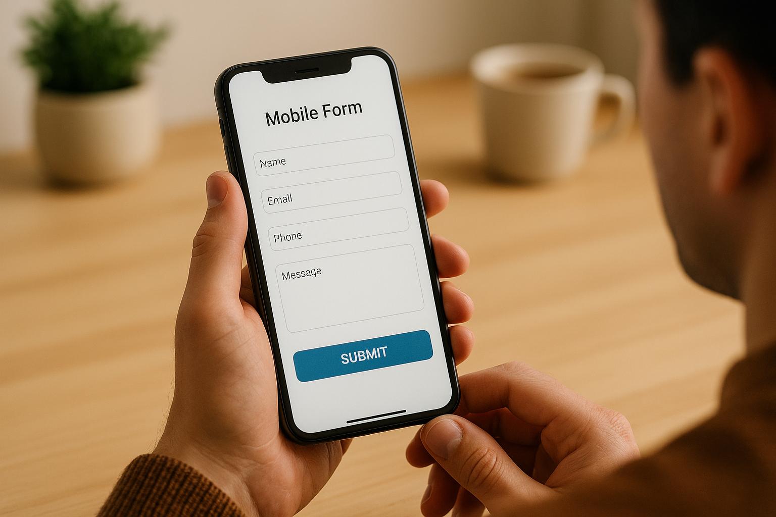
How to Test Mobile Forms for Accessibility


Mobile forms are a critical part of digital experiences, yet many fail to address accessibility challenges. Around 15-20% of the global population lives with disabilities, making accessible forms essential for usability and compliance with laws like ADA, WCAG 2.1, and Section 508. Inaccessible forms can lead to frustration, lost users, legal risks, and missed business opportunities.
Testing mobile forms requires a different approach than desktop forms due to factors like touch controls, screen sizes, and assistive tools like VoiceOver (iOS) and TalkBack (Android). Here's how to ensure accessibility:
- Know the Standards: Follow WCAG 2.1 and Section 508 guidelines, focusing on clear labels, error messages, logical focus order, and responsive design.
- Common Issues: Small touch targets, poor color contrast, and incorrect focus order are frequent problems.
- Testing Steps:
- Identify key workflows (e.g., checkout, login).
- Test across devices and platforms (iPhone, Android, tablets).
- Use assistive technologies like screen readers.
- Combine manual and automated testing tools (e.g., Google Accessibility Scanner, axe, WAVE).
- Long-Term Accessibility: Regularly review forms, integrate accessibility into workflows, and use tools like Reform to simplify compliance.
Accessible forms improve usability for everyone, protect your business legally, and expand your audience. Testing is not optional - it’s essential for creating forms that work for all users.
Mobile Accessibility 102: Mobile Web Techniques - May 2017
Mobile Form Accessibility Standards You Need to Know
Accessibility standards play a crucial role in designing mobile forms that work for everyone. In the United States, the two main standards to know are WCAG 2.1 (Web Content Accessibility Guidelines) and Section 508 of the Rehabilitation Act. WCAG 2.1 is recognized globally as the gold standard for web accessibility, while Section 508 legally requires federal agencies and their contractors to ensure electronic content is accessible. These standards emphasize key elements like clear field labels, accessible error messages, logical focus order, and responsive designs - essential factors to address during accessibility testing.
Why does this matter? The numbers speak for themselves. The CDC reports that 1 in 4 adults in the United States lives with a disability, highlighting the importance of accessible mobile forms to serve a wide user base. Yet, a 2023 WebAIM study revealed that over 98% of home pages had detectable WCAG failures, with issues like missing form labels and unclear error messages among the most common problems. These statistics underscore the critical need to follow accessibility standards when designing mobile forms.
Core Accessibility Principles for Mobile
Accessibility boils down to four guiding principles: perceivability, operability, understandability, and robustness. Here's how these apply specifically to mobile forms:
Perceivability ensures users can access information in ways that suit their abilities. On mobile, this means offering text alternatives for non-text elements and maintaining a minimum 4.5:1 color contrast ratio. Relying solely on visual indicators won't cut it - forms must also accommodate users with screen readers or low vision.
Operability ensures all form elements are functional through different input methods. Mobile forms should support touch gestures, keyboard navigation, and assistive technologies like VoiceOver (iOS) and TalkBack (Android). Buttons and other touch targets need to be at least 44×44 CSS pixels with enough spacing to help users with motor impairments or larger fingers.
Understandability focuses on making instructions and error messages clear and easy to follow. Since mobile screens have limited space, concise and descriptive language becomes even more important.
Robustness guarantees forms work seamlessly across various devices, browsers, and assistive technologies. With mobile tech evolving quickly, your forms must stay compatible with both current and future accessibility tools.
Common Mobile Form Accessibility Problems
Even with clear guidelines, mobile forms often fall short in predictable ways. One of the most common issues is small touch targets. Buttons, checkboxes, and dropdown menus that are too tiny or packed too closely together make it hard for users with motor impairments to interact accurately.
Another frequent problem is poor color contrast, which can make forms unreadable for users with low vision or color blindness. For example, light gray text on a white background or relying solely on color to indicate required fields or errors can leave some users unable to complete the form. This issue is even worse on mobile devices used in bright sunlight or with dimmed screens.
Focus order problems - where the navigation sequence doesn't align with the visual layout - can confuse users who rely on keyboard navigation or screen readers. This misalignment can make it difficult to follow the form logically, leading to frustration and incomplete submissions.
Platforms like Reform simplify the process by integrating accessibility features such as clear labels, responsive designs, and proper error handling by default. These tools help businesses create forms that are accessible to all users without requiring deep expertise in accessibility standards.
"Ensure your forms are easy to navigate for all users, complying with accessibility standards to reach a wider audience." – Reform
How to Prepare for Mobile Accessibility Testing
Getting ready for mobile accessibility testing requires thoughtful planning and a clear focus. Start by setting specific goals, choosing a realistic testing environment, and equipping yourself with the right tools. This groundwork is essential for identifying and improving key workflows.
Begin by reviewing the accessibility standards that apply to your forms. Your preparation should include measurable objectives, such as ensuring compatibility with screen readers, maintaining proper color contrast, and verifying that touch targets are appropriately sized. Document these goals to help guide your testing process and evaluate its success.
Identify Your Most Important Form Workflows
Not all workflows are created equal. Some forms are more critical to your users and your business than others, so it's important to prioritize. Use analytics to determine which forms see the most traffic or play a pivotal role in conversions.
For instance, in an e-commerce app, payment and checkout forms should be at the top of your list since they directly influence revenue. A healthcare app might focus on patient intake forms that are essential for delivering services. Social media platforms often prioritize sign-up and login forms, as they serve as the entry point for users.
Don't overlook workflows that, while not frequently used, are crucial in specific scenarios. A password reset form, for example, might not see heavy traffic but becomes critical when users need it. Tools like Reform's analytics can help identify which forms generate the most interactions, allowing you to focus your accessibility efforts where they matter most.
Select Devices and Platforms for Testing
Choosing the right devices for testing is key. Start with a baseline: an iPhone with Safari, an iPad with Safari, and an Android device with Chrome. From there, use your analytics to decide if additional devices, such as Android tablets, should be included based on how your users interact with your forms.
Make sure to test across a variety of screen sizes and resolutions to catch any responsive design issues. Include both the latest devices and older models to ensure compatibility. A form that works seamlessly on a new iPhone might have issues on an older Android device with a smaller screen.
If your forms are web-based, test on multiple browsers to account for differences in rendering. For responsive sites, check how forms behave at various zoom levels and window sizes to ensure all variations are accessible. If you maintain separate mobile and desktop versions - like m.dot sites - make sure to test those as well.
Keep in mind that iOS and Android handle assistive technologies differently. A form that works well with VoiceOver on iOS might encounter navigation issues with TalkBack on Android. Testing across platforms ensures a consistent experience for all users.
Set Up Assistive Technology for Testing
To replicate real-world usage, enable the native assistive tools that your users rely on daily. These tools are crucial for understanding how users navigate mobile forms and identifying potential accessibility barriers.
| Platform | Essential Assistive Technologies |
|---|---|
| iPhone/iPad | VoiceOver, Keyboard navigation, Switch control, Zoom, Reduce Motion, Invert colors, Grayscale, Reader view |
| Android | TalkBack, Keyboard navigation, Switch control, Magnification, Remove Animations, Color Inversion, Grayscale, Color correction, Increase display size, Increase text size |
Make sure testers are familiar with the gestures and navigation patterns specific to each platform. For example, VoiceOver on iOS operates differently from TalkBack on Android, so hands-on experience with both is vital.
Document standard configurations to ensure consistency during testing. All team members should use the same settings to avoid discrepancies in results. Regularly update your devices and assistive tools to match current user environments.
Consider the needs of users with varying disabilities when setting up your testing environment. For example:
- Visual impairments: Test with screen readers and magnification tools.
- Motor impairments: Include keyboard navigation and switch control testing.
- Cognitive limitations: Evaluate simplified interfaces and motion reduction features.
You can also create user personas to represent these diverse needs, helping to guide your testing strategy.
Finally, complement manual testing with third-party tools like Google Accessibility Scanner and BrowserStack App Accessibility. These tools can help identify common issues, such as color contrast problems and missing labels. However, automated tools should only supplement hands-on testing, as they may miss context-specific issues.
Testing Methods and Tools for Mobile Forms
Testing mobile forms for accessibility requires a mix of manual and automated approaches. Each method has its strengths, and using them together ensures a thorough evaluation of potential barriers. Let’s dive into manual techniques to understand how they simulate real user interactions.
Manual Testing Methods
Manual testing is essential for assessing how users with disabilities interact with mobile forms. By simulating real-world scenarios, it offers insights that automated tools often miss.
Screen reader navigation is a must for manual testing. Use tools like VoiceOver on iOS and TalkBack on Android to navigate every form field, button, and interactive element. Pay close attention to how each element is announced - does it make sense without visual cues? Ensure form field labels are clearly linked to their inputs and are announced correctly when focused on by the user.
Keyboard-only navigation helps identify issues for users who cannot rely on touch gestures. Using an external or built-in keyboard, navigate through the form entirely with keyboard inputs. Check that all interactive elements are accessible, the focus indicator is visible, and the navigation sequence is logical.
Touch target verification ensures that interactive elements are large enough for users with motor impairments. Buttons, links, and other controls should be at least 44×44 CSS pixels. Test tap accuracy with different gestures to confirm usability.
Error message validation involves triggering form validation scenarios, such as submitting incomplete forms or entering incorrect data. This tests whether error messages are clear, actionable, and accessible to screen readers. Messages should explain the issue and how to fix it.
Automated Testing Tools
Automated tools are excellent for quickly identifying technical accessibility issues across multiple forms. They can flag common problems like missing labels or insufficient color contrast, making them a valuable part of your toolkit.
Google Accessibility Scanner is a free tool for Android apps that detects issues like small touch targets, missing content descriptions, and poor color contrast.
axe and WAVE are web-based tools that identify problems such as missing alternative text, incorrect heading structures, and improperly labeled form elements. They easily integrate into development workflows, making them convenient for teams.
BrowserStack App Accessibility offers automated scanning combined with cross-device testing. It’s particularly useful for teams needing to validate forms across various devices and operating systems.
Accessibility Insights from Microsoft combines automated scanning with guided manual testing. It highlights problems like keyboard navigation issues, insufficient ARIA roles, and color contrast errors.
While these tools quickly identify technical issues, they often overlook subtler problems that require human judgment.
Using Manual and Automated Testing Together
The most effective strategy combines both manual and automated testing. Together, they provide a complete picture of accessibility, balancing efficiency with real-world usability insights.
Start with automated scans to catch obvious technical issues like missing labels, poor color contrast, or incorrect element roles. These tools can process entire forms in seconds, giving you a baseline assessment. Use the results to prioritize fixes based on severity.
Then, conduct manual testing to address areas automated tools can’t evaluate well. This includes verifying logical navigation, checking the clarity of error messages, and ensuring dynamic content updates are properly announced to assistive technologies. Manual testing also helps confirm that forms remain accessible when users adjust text size, change device orientation, or enable high-contrast modes.
Some issues, like keyboard focus traps in modal dialogs or custom controls missing ARIA roles, only become apparent during hands-on testing with assistive technologies. These scenarios highlight the importance of manual evaluation.
Document findings from both methods in a unified report, prioritizing issues by their impact on user experience. Automated tools often flag quick fixes, while manual testing may uncover deeper design challenges that require more effort to resolve.
Regular testing cycles should incorporate both approaches. Automated scans can run frequently to catch regressions, while manual testing should occur at key development stages. This balanced approach keeps accessibility at the forefront throughout the development process, ensuring resources are used effectively. Together, these methods lay the groundwork for a detailed, step-by-step accessibility testing plan.
sbb-itb-5f36581
Step-by-Step Mobile Form Accessibility Testing Process
Now that you’ve got a handle on the tools and methods for accessibility testing, it’s time to put them into practice. This step-by-step guide will help you systematically identify and address accessibility issues, ensuring your testing efforts are efficient and effective.
Step 1: Map Out User Journeys and Define the Scope
Begin by pinpointing the essential workflows users need to complete within your forms. Think about the core functionality - like field validation, error recovery, and conditional logic - and map out the journey from start to submission.
Make sure to test how your forms behave across different devices, browsers (e.g., Safari on Apple devices, Chrome on Android), and responsive breakpoints. Don’t forget to factor in variations, like zoom levels, screen sizes, and interactions such as CAPTCHAs, multi-step forms, or file uploads.
If your site is responsive, identify how it adjusts at various breakpoints. For mobile-specific testing, focus on touch interactions and screen reader usability. Start with the most critical issues affecting functionality, then move on to mobile-specific challenges. Once the user journeys and scope are clear, you’re ready to dive into automated scans.
Step 2: Run Automated Accessibility Scans
Automated scans are a great starting point for spotting common issues quickly. They provide an overview of technical problems and help prioritize fixes based on severity.
For Android apps, tools like Google’s Accessibility Scanner can highlight issues such as small touch targets, missing content descriptions, and poor color contrast. For web forms, tools like A11YTools and ColorSlurp can flag missing field labels and improper touch target sizes.
These scans can uncover problems like missing alt text, insufficient color contrast (minimum 4.5:1 ratio), and touch targets smaller than 44×44 CSS pixels. Document these findings to create a roadmap for developers, setting the stage for deeper, manual testing.
Step 3: Conduct Manual Tests
Manual testing with assistive technologies like VoiceOver (iOS) or TalkBack (Android) offers a closer look at how your forms perform for users relying on these tools. Check for logical tab orders, clear field labels, and seamless keyboard navigation.
Pay special attention to how field labels are announced and whether they’re properly linked to their corresponding inputs. Ensure users can navigate the form entirely with a keyboard and that it supports multimodal inputs like speech and on-screen keyboards.
Evaluate error handling by intentionally entering incorrect data - screen readers should announce error messages, providing clear and specific guidance. Also, ensure touch interactions work as expected, with interactive elements having adequate touch target sizes and sufficient inactive space around them.
Step 4: Test Across Devices and Assistive Tools
Accessibility testing isn’t complete until you’ve verified your forms work well on a variety of devices, operating systems, and assistive technologies. Each platform comes with its own set of challenges.
Test on multiple devices to ensure compatibility with features like VoiceOver (iOS) and TalkBack (Android). Cover common setups like iPhones with Safari, iPads with Safari, and Android devices with Chrome. If your analytics show significant tablet usage, include Android tablets in your tests.
Also, check how your forms perform in both mobile and tablet contexts, as well as on responsively sized desktop windows. Testing across these environments ensures your forms are functional for all users, no matter their device or setup.
Step 5: Document and Prioritize Findings
Turn your testing results into actionable insights by organizing your findings into clear categories. This helps your development team understand the severity of each issue and the steps needed to resolve them.
Group issues by type - such as critical functionality problems, mobile-specific challenges, or navigation difficulties. For each issue, note the requirement it violates, its impact, and examples to guide fixes.
Finally, compare your findings against accessibility standards like WCAG 2.1 and Section 508. Sharing a detailed report with your team ensures critical issues that block form completion are addressed immediately, while less urgent improvements can be scheduled for future updates.
How to Keep Your Mobile Forms Accessible Long-Term
Ensuring accessibility isn’t a one-and-done task - it requires ongoing effort and integration into your development process. The organizations that succeed in this area treat accessibility as a core component of their workflow, not something to address after the fact. By embedding accessibility into every phase of development, you can catch issues early and maintain compliance over time. Here’s how to make accessibility a permanent part of your process.
Build Accessibility into Your Development Process
Accessibility should be baked into your design and development workflows from the start. This means making it a priority at every stage, from initial design to final testing.
Start by referencing WCAG 2.1 standards and platform-specific accessibility guidelines during the design phase. Incorporate checks for essential elements like color contrast, proper labeling, and keyboard navigation right from the beginning. This proactive approach reduces the risk of issues cropping up later.
In the development phase, use automated tools like Google Accessibility Scanner to catch common problems quickly. Combine these tools with manual testing using screen readers such as VoiceOver and TalkBack to ensure a comprehensive review. Make it a habit to document findings and share them with your team to promote accountability and knowledge sharing.
Regular training sessions on accessibility best practices can help everyone on your team understand their role in creating accessible designs and code. When accessibility becomes second nature for your team, you’ll identify and fix more issues before they reach the end user.
Use Tools That Support Accessibility by Default
The tools you choose can significantly impact how easily you maintain accessible forms over time. Platforms designed with accessibility in mind can save you time and effort while ensuring compliance.
For example, Reform simplifies the process with its built-in "Accessible Forms" feature. This ensures forms are easy to navigate for all users and meet accessibility standards. Features like accessible design patterns, real-time validation, multi-step forms, and conditional routing make it easier to create forms that work for everyone, including users with disabilities.
Reform’s no-code interface empowers non-technical team members to create and update forms while maintaining accessibility. This eliminates the bottleneck of requiring specialized technical expertise and makes accessibility a team-wide responsibility. Additionally, Reform integrates seamlessly with marketing and CRM tools, preserving accessibility throughout your workflows.
With real-time analytics, Reform also helps you identify barriers by analyzing user interaction metrics like error rates, completion times, and usability across different groups. These insights can guide your accessibility improvements.
Schedule Regular Accessibility Reviews
Even with robust tools and processes, regular reviews are essential to maintaining accessibility over time. Standards change, user needs evolve, and new features can unintentionally introduce barriers.
Aim to review accessibility at least quarterly or whenever significant updates are made to your forms. Use a combination of automated scans and manual testing with assistive technologies to cover all bases. Pay close attention to any new features or design changes that could have introduced regressions.
Involve users with disabilities in your testing process whenever possible. Platforms like UserZoom or Loop11 can facilitate remote testing sessions with users who rely on assistive technologies. This kind of direct feedback often uncovers issues that automated tools and internal testing might overlook.
Track metrics like completion rates for users with assistive devices, error rates across various platforms, and accessibility-related support requests. These data points can help you measure progress and pinpoint areas for improvement.
Document your findings from each review and create a prioritized plan for addressing issues. Share this roadmap with stakeholders across your organization - designers, developers, QA teams, and leadership - to keep accessibility top of mind. By making accessibility reviews a routine part of your workflow, you’ll build more inclusive forms and experiences that serve all users effectively.
Conclusion: Building Mobile Forms That Work for Everyone
Creating mobile forms that everyone can use is about more than just good design - it's about fostering inclusive digital spaces. Accessible forms not only cater to diverse user needs but also present a chance to align ethical responsibility with business growth.
To tackle accessibility challenges effectively, a hybrid testing approach is key. This method uncovers both glaring and nuanced issues, ensuring your forms function smoothly across various devices, assistive technologies, and user preferences. It underscores the importance of a systematic and thorough testing process.
But accessibility doesn’t stop at testing - it’s a long-term commitment. By embedding accessibility into your workflow from the start, you can address potential issues early and maintain compliance effortlessly over time. Tools like Reform make this easier by offering built-in features that ensure your forms are intuitive to navigate and meet accessibility standards from the get-go.
FAQs
What’s the difference between testing mobile forms and desktop forms for accessibility?
Testing mobile forms for accessibility comes with its own set of hurdles compared to desktop forms. The smaller screen size, touch-based interactions, and mobile-specific tools make the process distinct. Since mobile users often rely on gestures like tapping and swiping, forms need to be touch-friendly. That means buttons and input fields should be big enough to tap easily and spaced out to avoid accidental clicks. Plus, mobile forms must work well with screen readers and voice input tools, which are widely used on smartphones and tablets.
Desktop forms, on the other hand, revolve around keyboard navigation and mouse interactions, which call for a different testing approach. While accessibility principles remain consistent across platforms, mobile forms require extra care in areas like responsive design, handling changes in device orientation, and ensuring smooth performance even on slower internet connections. Addressing these elements helps create a more inclusive and user-friendly experience for everyone.
How can businesses keep their mobile forms accessible as technology and standards change?
Creating mobile forms that are easy to use and accessible to everyone is a must for businesses, especially as technology and standards continue to change. To keep up, regularly check your forms against updated accessibility guidelines like the WCAG (Web Content Accessibility Guidelines). This ensures they remain user-friendly and compliant.
Leverage tools and platforms designed with accessibility in mind to simplify the process. Key features to focus on include clear navigation, compatibility with screen readers, and proper color contrast. By staying on top of testing and making updates as needed, you can ensure your forms remain inclusive and functional, no matter how standards evolve.
What are the best practices for incorporating accessibility testing into mobile form development from the start?
Creating mobile forms that everyone can use starts with thoughtful design. Focus on making forms simple to navigate and ensure they align with established accessibility standards. This means using clear, descriptive labels, setting up logical tab orders, and making sure the forms work seamlessly with screen readers.
It's also important to test your forms early and often. Use accessibility tools to catch issues like poor color contrast or missing alternative text. Even better, involve users with disabilities in the testing process. Their feedback can help you fine-tune the experience and address real-world challenges.
By keeping accessibility at the forefront during development, you can build forms that are easy to use and welcoming for everyone.
Related Blog Posts
Get new content delivered straight to your inbox

The Response
Updates on the Reform platform, insights on optimizing conversion rates, and tips to craft forms that convert.


Drive real results with form optimizations
Tested across hundreds of experiments, our strategies deliver a 215% lift in qualified leads for B2B and SaaS companies.
