
.webp)
How Data Visualization Improves Marketing Automation


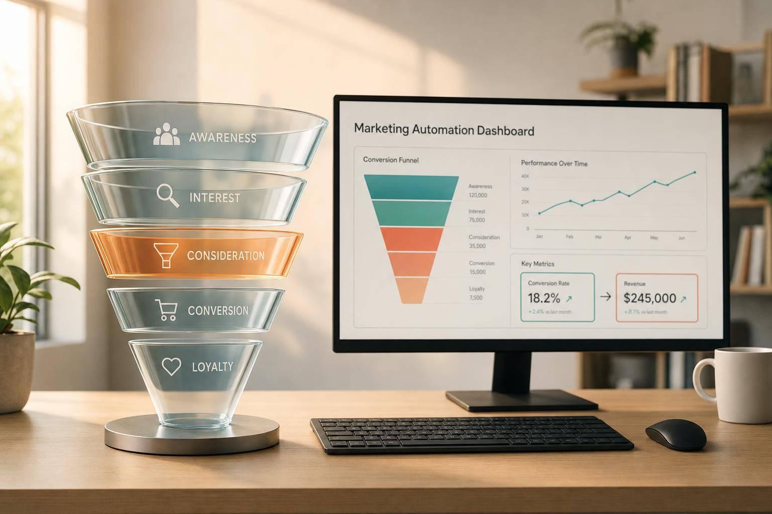
Most marketing automation issues come down to one thing: teams can’t see funnel problems soon enough to fix them. When data sits across CRM, email, web analytics, and ad tools, reporting gets slow, handoffs get messy, and drop-offs hide in spreadsheets. Visual reporting fixes that by showing stage conversion, lead flow, timing, routing results, and revenue in one place.
Here’s the short version:
- Put the full funnel in one view so you can track first touch, MQL, SQL, opportunity, and closed-won revenue together.
- Use the right chart for the job: funnels for drop-offs, line charts for trend shifts, Sankey diagrams for path flow, cohorts for speed by month, and heatmaps for segment activity.
- Track a small set of metrics that show funnel health: conversion by stage, days between stages, sales acceptance rate, routing outcomes, and revenue by source.
- Break results out by channel because blended numbers can hide poor lead quality.
- Mark major changes on charts like a new scoring model or routing rule so teams read the data the right way.
- Keep input data clean by crafting killer lead forms or every report after that gets harder to trust.
- Build dashboards by role and review them on a set schedule: daily for campaign checks, weekly for pipeline health, and monthly for ROI.
A few numbers stand out. Visual data can improve understanding by up to 80%. At the same time, 46% of marketers check performance only once a week, and 25% only once a month. In B2B funnels, about 75% of MQLs may never reach SQL. That’s why clear charts matter: they help you spot where leads stall, where follow-up slows, and where marketing and sales stop agreeing.
If I had to sum up the article in one line, it would be this: data visualization turns marketing automation from a pile of reports into a system you can act on.
Data Visualization Tips For Marketing Reporting (Reduce Noise)
sbb-itb-5f36581
Common Analytics Problems in Marketing Automation
Most marketing automation problems start with poor visibility, not poor strategy. When data is buried in tables, it's much harder to see what's going wrong.
Fragmented journey data across tools
A typical marketing stack pulls data from a bunch of places: website analytics, HubSpot form submissions, email platforms, ad dashboards, and a CRM. Each system is built to track a different outcome. Paid media tools may care most about clicks or cost per lead, while CRMs focus on closed deals. That mismatch often leaves marketing and sales reporting different lead counts.
The result is delayed reporting and messy attribution. Once the data is split across tools, every metric that comes after starts to feel a little shaky.
Poor visibility into funnel drop-offs and timing
Without a clear visual of each stage, teams often can't tell where leads are getting stuck. A high volume of MQLs that never turn into SQLs can look fine in a raw count report. But a stage-by-stage funnel chart makes the drop-off obvious. You can see, at a glance, where leads disappear.
The same issue shows up with timing. If it takes longer than expected to move a lead from MQL to SQL, that delay can quietly become normal. And once that happens, slow follow-up stops looking like a problem.
This also makes stalled deals in the CRM easy to miss. If nobody reviews the pipeline on a set cadence, those deals can sit there for weeks without much notice.
Slow decisions and unclear accountability
When teams spot these gaps late, the cost adds up. 46% of marketers review performance reports only once a week, and another 25% only once a month. So underperformance can keep running for days before anyone steps in. Budget keeps moving, and teams lose time before they can adjust nurture logic or routing rules.
This delay also creates tension between marketing and sales. When lead quality or handoff timing gets disputed, each team may be looking at a different tool with different attribution logic. A shared dashboard gives both sides the same numbers to work from. Without one clear view of spend, pipeline, and revenue, accountability gets blurry.
How Data Visualization Improves Marketing Automation Performance
When visibility falls apart, the next move is simple: put the whole journey in one place. Data visualization helps in three big ways. It gives you a clear view of the journey, shows where deals get stuck, and keeps marketing and sales looking at the same numbers.
See the full customer journey in one view
A funnel chart pulls scattered data into one customer journey view. You can connect first visit, form submission, MQL, SQL, opportunity, and closed-won revenue in a single flow and see how one stage leads to the next. One funnel view makes that progression easy to follow.
Top-of-funnel volume only matters if it turns into revenue. A jump in form submissions doesn't say much if those leads never become SQLs.
Find bottlenecks and fix workflows faster
When every stage is visible, bottlenecks are much easier to spot. Funnel and waterfall charts make stall points stand out, so a steep drop between MQLs and SQLs can point straight to a handoff issue. That gives teams a clear gap to fix instead of leaving them to guess.
Line charts show when performance changes. If MQL-to-SQL conversion drops at a certain point, you have a clear moment to dig in and find out what changed.
Give marketing and sales a shared view
The same dashboard also helps keep handoffs in sync. A shared dashboard gives both teams one set of stage metrics, which helps stop conflicting reports before they turn into arguments.
Track:
- MQL-to-SQL conversion rate
- Stage timing
- Pipeline created
- Closed-won revenue by source
When marketing and sales work from the same pipeline data, the conversation moves from blame to action.
What to Visualize in an Automation Funnel
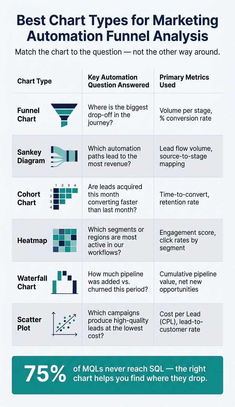
Best Chart Types for Marketing Automation Funnel Analysis
Once you can see the journey, the next job is picking the metrics that show where automation starts to fail.
Key metrics that show automation health
Not every number belongs on a dashboard. For B2B and SaaS teams, the metrics that do the best job of flagging trouble are stage conversion, time to progress, sales acceptance rate, routing outcomes, and revenue by journey path.
Stage conversion rates show where leads slip out of the funnel. A typical B2B funnel loses 75% of MQLs before they reach the SQL stage, so it helps far more to know where that drop happens than to stare at total lead volume. Add velocity metrics, like how many days it takes a lead to move from MQL to SQL, and you can catch workflow slowdowns before they drag on pipeline.
Routing outcomes don’t get much attention, but they’re one of the most useful views you can have. When you chart reason codes for rejected MQLs, such as "not now" or "missing info", you get direct feedback on what needs fixing inside the automation flow.
Break out every funnel by source. Paid search may convert to SQL at half the rate of organic traffic, and that kind of gap disappears fast when you only look at blended numbers. Check channel-level performance before you make any call.
These metrics become much more useful when each one appears in the right chart.
Chart types that work best for journey analysis
The chart you pick shapes the question you can answer. Keep it simple: match the chart to the job at hand, whether that’s conversion, path flow, timing, engagement, pipeline, or ROI.
Sankey diagrams are a smart fit when your automation includes branching paths. They show how leads move through triggers and conditional logic, so you can spot which routes lead to revenue and which ones stall out. Cohort charts answer a different kind of question: are leads from this month moving faster than leads from last month? Heatmaps are handy for engagement because they show which segments or regions are most active.
| Visualization Type | Key Automation Questions Answered | Primary Metrics Used |
|---|---|---|
| Funnel Chart | Where is the biggest drop-off in the journey? | Volume per stage, % conversion rate |
| Sankey Diagram | Which automation paths lead to the most revenue? | Lead flow volume, source-to-stage mapping |
| Cohort Chart | Are leads acquired this month converting faster than last month? | Time-to-convert, retention rate |
| Heatmap | Which segments or regions are most active in our workflows? | Engagement score, click rates by segment |
| Waterfall Chart | How much pipeline was added vs. churned this period? | Cumulative pipeline value, net new opportunities |
| Scatter Plot | Which campaigns produce high-quality leads at the lowest cost? | Cost per Lead (CPL), lead-to-customer rate |
Add notes to charts when something changes. If a new lead scoring model went live on 06/15/2026, mark it right on the chart so nobody mistakes the shift in conversion rates for a long-term pattern.
Why clean form data matters at the start of the journey
Every dashboard depends on clean input data. And that starts with the form layer.
If the data captured when a lead enters your funnel is incomplete, duplicated, or invalid, every chart that follows will reflect that mess. Weak intake data makes downstream reporting harder to trust. 72% of marketing teams struggle with funnel attribution because their data is not clean enough to trust. Tools like Reform help keep entry data clean with validation, enrichment, routing, spam prevention, and real-time analytics. Better visualization only helps if the data underneath it is solid.
Clean entry-point data keeps funnel, cohort, and routing reports accurate instead of skewed by missing or invalid fields.
How to Set Up Visual Reporting for Better Automation Decisions
Once you know what to visualize, the next step is simple: turn those metrics into dashboards people can use to make decisions fast.
Start with clear business questions and clean data
Before you build anything, write down two or three decisions you need the dashboard to support. Think: "Which automation paths drive the most revenue?" or "Where do leads drop after a demo request?" Those questions give the dashboard a job to do. Without that, you get charts that look nice but only tell you what already happened.
If a dashboard cannot change budget, messaging, targeting, or follow-up, it is reporting history, not performance management.
That same logic applies to data quality. It starts at the moment data is collected. High-converting lead forms help keep CRM records in good shape, and that keeps dashboard reporting dependable.
Build role-based dashboards and review them on a set schedule
Once the questions are clear, tie each dashboard to a specific audience and decision rhythm.
Different teams need different views. Marketing ops needs campaign-level detail. Demand gen needs pipeline contribution. Sales leadership needs lead quality and stage health. If everyone looks at the same dashboard, odds are it won't work well for anyone.
Keep each dashboard focused. Use clear labels instead of vague titles. Stick with consistent red, amber, and green thresholds so people can scan the page and know what needs attention.
A simple review cadence helps too:
- Review campaign metrics daily
- Review pipeline health weekly
- Review ROI monthly
Conclusion: Clearer visuals lead to better automation outcomes
Clear dashboards turn visibility into faster action.
FAQs
How do I choose the right chart for each funnel issue?
Pick the chart based on the question you're trying to answer. Use funnel or pipeline charts to check stage-by-stage conversion health, line graphs to track trends over time, and bar charts to compare categories or channels.
For lead capture, tools like Reform can show real-time analytics so you can see where users drop off. That makes it easier to adjust forms and make better marketing decisions.
Which funnel metrics should I track first?
Start with decision-driving KPIs tied to pipeline and revenue, not vanity metrics. Begin with engagement, because it shows how your marketing automation is performing and where you can improve later-stage conversion and ROI.
Then look at conversion rates across each stage to find bottlenecks. That includes traffic source conversion rates, lead scoring distribution, sales acceptance rates, and pipeline contribution.
How often should marketing dashboards be reviewed?
Review dashboards based on how fast your team needs to act, not by sticking to a fixed calendar.
For active campaign monitoring and budget pacing, check dashboards daily or even hourly. Channel performance optimization usually works well with daily updates. Strategic and executive summaries are best reviewed monthly.
If your review cadence is slower than your decision-making pace, it’s easy to miss key optimization windows.
Related Blog Posts
Get new content delivered straight to your inbox

The Response
Updates on the Reform platform, insights on optimizing conversion rates, and tips to craft forms that convert.


Drive real results with form optimizations
Tested across hundreds of experiments, our strategies deliver a 215% lift in qualified leads for B2B and SaaS companies.
