
.webp)
Multi-Step Form Navigation: Best Practices


Multi-step forms simplify long forms by breaking them into smaller, manageable steps, improving user experience and completion rates. Instead of overwhelming users with all fields at once, these forms guide them step-by-step, reducing cognitive load and encouraging engagement. Here's a quick breakdown of what works:
- Clarity and simplicity: Each step should focus on a single purpose with clear labels and instructions.
- Progressive information delivery: Use conditional logic to show only relevant questions and pre-fill fields when possible.
- Mobile optimization: Ensure forms are touch-friendly, with single-column layouts and input types suited for mobile users.
- Navigation controls: Use consistent button placement, clear labels like "Next", and real-time validation to reduce errors.
- Progress indicators: Include progress bars, step counters, or percentage displays to keep users informed and motivated.
- Data saving: Auto-save input between steps so users can return without losing progress.
These principles ensure users can complete forms smoothly, whether on desktop or mobile, while improving data accuracy and reducing drop-offs.
Multi Step Form UX: Best Practices In Multi Step Form Design To 2x Your Leads
Core Principles for Multi-Step Form Navigation Design
Creating successful multi-step forms starts with a focus on user experience. These principles shape how users interact with each step, determining whether they complete the process or abandon it midway.
The best multi-step forms feel natural and easy to use. When navigation is intuitive, users don’t have to second-guess their actions - it aligns seamlessly with their expectations. Everything from button placement to field labels should guide users effortlessly toward completing the form.
Let’s dive into how simplicity, gradual information delivery, and mobile optimization can make navigation more effective.
Keep It Clear and Simple
Each step in the form should have a single, focused purpose. When users arrive at a step, they should immediately understand what’s being asked and why it matters. Avoid cramming unrelated questions into one step, as this can lead to confusion and higher drop-off rates.
Clarity starts with straightforward labels and instructions. For instance, instead of asking, "What’s your preferred contact methodology?" use simpler phrasing like, "How should we contact you?" This kind of plain language removes barriers and helps users progress more smoothly. Button labels should also be clear - options like "Continue" or "Next Step" work better than vague terms like "Proceed" or "Submit Data."
Visual hierarchy plays a big role, too. The most important actions, like the "Next" button, should stand out, while secondary options such as "Back" or "Save for Later" can be styled less prominently. This balance ensures users stay on track without unnecessary distractions.
Once the design is clear and simple, introducing information gradually can keep users engaged.
Show Information Gradually
Progressive disclosure is a powerful way to keep users from feeling overwhelmed. Instead of presenting all fields at once, reveal questions as they become relevant based on the user’s previous answers. This approach makes even lengthy forms feel manageable.
For example, use conditional logic to tailor the form to the user’s responses. If someone selects "Individual" instead of "Business", the form can skip company-related questions entirely. This customization makes the form feel more personal and relevant.
To maintain a smooth flow, reveal new fields immediately after related responses. This creates a conversational rhythm, keeping users engaged. Additionally, pre-filling fields where possible - like automatically populating city and state after a ZIP code is entered - can reduce friction and prevent errors.
With these elements in place, it’s crucial to optimize for mobile users, who often complete forms on the go.
Make Forms Work on Mobile Devices
Mobile optimization isn’t just nice to have - it’s essential. Multi-step forms need to perform seamlessly on smartphones and tablets, with touch-friendly designs and layouts tailored for smaller screens.
The principles of clear design and progressive disclosure should carry over to mobile. Reducing clutter and using mobile-friendly elements ensures the experience remains smooth and accessible.
Navigation should be thumb-friendly, with buttons sized for easy tapping and enough spacing between interactive elements to avoid accidental clicks. A single-column layout works best on mobile, stacking fields vertically to make better use of the screen space and eliminate the need for zooming or scrolling horizontally.
Use input types that match the field requirements. For example, numeric keyboards for phone numbers, email keyboards for email fields, and date pickers for selecting dates. These adjustments reduce typing effort and help users avoid mistakes.
Mobile-specific features can further enhance the experience. Auto-advancing between fields, camera access for uploading documents, or even auto-filling certain fields can make forms faster and easier to complete. Platforms like Reform already incorporate these mobile-friendly features, ensuring forms adjust perfectly to different screen sizes without extra development work.
Navigation Control Best Practices
Navigation controls are like the steering wheel of a form - they guide users through each step, offering clear direction and responsive feedback. When done well, they remove confusion, reduce frustration, and keep users moving forward without abandoning the process.
Design Clear Navigation Buttons
Clear navigation buttons are the backbone of user-friendly forms. They should be easy to spot, consistently positioned, and clearly labeled so users always know how to proceed.
Placement and consistency are critical. Keep "Next" and "Previous" buttons in the same location - typically at the bottom of each step. This consistency helps users build a rhythm, making the form feel natural as they move through it.
Visual design also plays a major role. As product designer Lukáš Andel explains:
"A button must always look like a button. It has to carry a clear call to action in the form of a text surrounded by a sufficiently large frame."
To achieve this, use contrasting colors, appropriate sizing, and unmistakable styling to ensure buttons stand out. For mobile users, this is even more important. Navigation elements should be at least 9 square millimeters wide, making them large enough for easy tapping without accidental misclicks.
Button hierarchy further enhances usability. The primary action, like "Next", should stand out with bold colors and prominent styling, while secondary actions like "Back" or "Save for Later" can use more subtle designs like ghost buttons or text links. This helps users focus on the main task while keeping other options available.
Validate Input and Show Clear Error Messages
Real-time validation is a game-changer for reducing errors and frustration. Instead of waiting until the final submission to flag issues, catch problems as soon as they occur - either when users finish typing or attempt to move to the next step.
Timing matters. Validate fields immediately after users complete them or when they move to the next field. For more complex checks, like verifying if an email is already registered, perform the validation when users attempt to proceed to the next step. This strikes a balance between instant feedback and avoiding interruptions.
Error messages should be specific and actionable. Avoid vague phrases like "Invalid input." Instead, provide clear guidance, such as, "Password must be at least 8 characters and include one number." This removes guesswork and helps users correct mistakes quickly.
Place error messages close to the relevant fields, ideally right below them. Use consistent styling - red text or borders work well - to make errors stand out. For forms with multiple issues, consider adding a summary at the top of the step that lists all errors in one place, making it easier for users to address them.
Progressive validation can make error correction feel less like a chore. For instance, when users type a password, show real-time feedback indicating which requirements they’ve met (length, special characters, etc.). This turns the process into a more engaging, almost game-like experience.
Preserving user input across steps is another crucial element of smooth navigation.
Save User Data Between Steps
Auto-saving user input is essential for a seamless experience. This should happen behind the scenes, saving data as users complete each field or move to the next step. Users shouldn’t have to click "Save Draft" or worry about losing their progress.
Session persistence ensures data remains safe even if the browser closes or the connection drops. By storing data locally in the browser and syncing it with your servers, you create a reliable safety net that allows users to pick up right where they left off.
When users go back to previous steps, pre-fill all previously entered information. This lets them review and update their answers without starting over, reassuring them that their data is being handled properly.
Adding visual indicators for saved data can further enhance the experience. A subtle "Saved" message or checkmark reassures users that their progress is secure. Platforms like Reform handle this seamlessly, saving input at each step and ensuring users can recover their work if needed.
If users return to a partially completed form, recovery messaging can help. A message like "Progress saved from [date]" acknowledges their earlier effort and encourages them to continue where they left off.
"User-friendly navigation is key to the form's usability, encouraging completion by allowing users to move through steps without confusion or frustration." - Webstacks
sbb-itb-5f36581
Progress Indicators and Visual Guides
Progress indicators act as a guide, showing users where they are in a process and how much remains. By breaking the journey into clear steps, they make even lengthy forms feel more approachable and encourage users to complete them.
This transparency helps create a sense of accomplishment, motivating users to stay engaged. Let’s dive into the common types of progress indicators that can improve form navigation.
Different Types of Progress Indicators
Progress bars are horizontal bars that fill as users advance through the form, offering a quick visual cue of how far along they are. These work well for shorter forms with manageable steps, where each small move forward feels rewarding.
Step counters use numbered markers, like "Step 2 of 5" or circular badges, to clearly show the current stage and how many steps remain.
Percentage displays provide precise feedback, such as "60% Complete", which can be especially helpful for longer forms, giving users a clear sense of where they stand.
Breadcrumb navigation combines progress tracking with navigation by listing step names (e.g., "Contact Info > Preferences > Review"). This approach is ideal for more complex forms, as it allows users to backtrack easily while offering context about the form's structure.
Choosing the right progress indicator depends on the form’s complexity. For shorter forms, step counters may work best, while longer forms benefit from progress bars or percentage displays. If steps vary in length, percentage indicators are especially effective at giving users an accurate sense of overall progress.
How to Design and Place Progress Indicators
A good progress indicator doesn’t just show progress - it complements the form’s navigation and keeps users oriented. Once you’ve chosen the right type, its placement and design are key to its effectiveness.
Place the progress indicator at the top of each form step so it’s immediately visible, even on smaller screens. Ensure it remains consistent across all steps to help users track their progress naturally.
The design should be clean and intuitive. Use accent colors for completed steps, neutral tones for upcoming ones, and highlight the current step to guide users visually.
Responsive design is critical for mobile users. On smaller screens, consider compact options like dots instead of full bars or collapsible step names that focus on the current step. This ensures the indicator remains clear without overwhelming limited screen space.
Interactive elements can enhance usability. For instance, allowing users to click on completed steps to revisit earlier sections can be helpful. However, avoid making future steps clickable to prevent confusion or accidental loss of data.
Descriptive labeling provides additional clarity. Instead of generic labels like "Step 1", use specific ones like "Contact Info" or "Shipping" to give users a preview of the information they’ll need to provide.
Reform’s progress indicators are designed to adapt seamlessly to the structure of your form, ensuring they’re always in the right place and optimized for any device. The platform takes care of the technical details, so you can focus on creating a user-friendly experience tailored to your audience.
How to Improve Multi-Step Form Conversion Rates
Boosting conversion rates for multi-step forms requires more than just good design. The best-performing forms combine smart field organization, data-based refinements, and trust-building features to encourage users to complete them. Let’s explore how to simplify steps, leverage analytics, and establish trust to improve conversions.
Keep Steps Short and Focused
The fewer fields, the better. Every extra field adds friction, so only include what’s absolutely necessary. Ask yourself: What information is essential right now, and what can wait until later in the process?
Organize fields logically by grouping related questions within a single step. For example, dedicate one step to contact details, another to preferences, and save the final step for confirmation. This clear structure helps users navigate the form without feeling overwhelmed.
Shorter steps are less intimidating. A step with just three fields feels manageable, while one with eight or more can discourage users before they even begin. Conditional logic can also help streamline the experience by showing users only the fields relevant to their specific situation, making the form feel more personalized and efficient.
Use Analytics and Testing to Improve Forms
Once your form is simplified, use analytics and testing to fine-tune its performance. Tools like drop-off analysis can pinpoint where users abandon the form. For example, Reform’s real-time analytics highlight which steps or fields cause hesitation, how long users spend on each step, and where they drop off entirely.
A/B testing can also provide valuable insights. Experiment with different question phrasing, step orders, or field placements to see what resonates best with users. Even small adjustments - like changing "Phone Number" to "Mobile Number" or moving optional fields to later steps - can make a difference in conversion rates.
Track incomplete submissions to re-engage users who didn’t finish. Sending gentle email reminders that acknowledge their previous progress can help recover leads that might otherwise be lost.
Time-based analytics offer additional insights. If users spend too long on a particular step, it could indicate confusion or a need for clearer instructions. On the other hand, steps completed too quickly might require extra validation to ensure the data is accurate.
Build Trust with Privacy and Security Features
Trust is key to getting users to complete your form. Start by creating a seamless experience that feels secure. Displaying security badges, SSL certificates, and privacy compliance indicators near sensitive fields provides immediate reassurance. Pair these with clear, concise statements like, "Your email will only be used for order updates."
Be transparent about how user data is handled. Let users know when their information is being saved automatically and give them easy options to modify or delete their data if needed. This level of openness is especially helpful for longer forms where users might need to return later.
Build trust progressively by asking for basic details first, such as name and email. Save more sensitive requests, like payment information, for the final steps when users are more committed to completing the form.
Behind-the-scenes spam prevention features, such as email validation and spam filtering, protect both your business and your users without adding unnecessary steps. These measures demonstrate professionalism and a commitment to security.
Finally, consider implementing GDPR and CCPA compliance features, even if your business isn’t legally required to do so. Offering clear consent options and data control features shows respect for user privacy and reinforces trust in your brand.
Key Points for Multi-Step Form Navigation Success
Creating effective multi-step forms is all about finding the right balance between simplicity and usability. The best forms guide users step-by-step without overwhelming them or causing unnecessary frustration.
One crucial element is clear and descriptive navigation. Buttons like "Continue to Payment" or options to easily revisit previous steps help users understand their current position, their next move, and how to backtrack if needed. This clarity ensures a smoother experience.
Another key factor is progress tracking. Use indicators that show users how far they've come and what's left to complete. For instance, a progress bar should advance steadily and predictably. Sudden leaps - like jumping from 20% to 80% in one step - can confuse and discourage users. Gradual progress builds trust and keeps users engaged.
Don’t overlook mobile optimization. Features like touch-friendly buttons, larger clickable areas, and a single-column layout ensure that forms are easy to navigate, no matter the device.
Data preservation is another must-have. Imagine a user gets interrupted mid-form; auto-saving their progress allows them to pick up right where they left off. Tools like Reform offer built-in options for saving drafts and tracking abandoned submissions, making it easier to recover incomplete entries.
Real-time validation is equally important. By providing instant feedback on errors, users can fix issues immediately, reducing the risk of them abandoning the form altogether.
Lastly, continuous testing and analytics are vital for improvement. By analyzing user behavior, you can identify where drop-offs happen and adjust the form’s design to address those pain points. Features like real-time analytics and conditional routing - offered by Reform - help streamline the process by showing only relevant fields to users, simplifying their journey.
With tools like Reform, you can apply these best practices without needing technical expertise. From no-code solutions to features like abandoned submission tracking, these tools ensure your multi-step forms are both user-friendly and effective at capturing leads.
FAQs
What are the common pitfalls to avoid when designing multi-step forms for mobile users?
Designing multi-step forms for mobile devices demands careful attention to detail to create a seamless user experience. Here are some pitfalls to steer clear of:
- Overloading the form: Forms that are too lengthy or overly complex can overwhelm users, causing frustration and higher drop-off rates.
- Unclear navigation: Missing or poorly designed step indicators and inconsistent button placement can leave users confused about where they are in the process.
- Ignoring mobile optimization: Tiny touch targets, hard-to-read fonts, and poorly spaced elements can make interacting with the form frustrating on smaller screens.
To make your forms more user-friendly, focus on simplicity, offer instant error feedback, and ensure every element is designed with mobile screens in mind. These adjustments can help lower abandonment rates and keep users more engaged.
How does real-time validation improve the user experience in multi-step forms?
Real-time validation improves the user experience by offering instant feedback, allowing users to spot and correct mistakes as they fill out a form. This approach saves users from the frustration of finishing an entire form only to discover errors at the end.
By addressing errors in real time and guiding users through the process, this method not only reduces mistakes but also lowers the chances of users abandoning the form. When done right, real-time validation makes the process smoother and more intuitive, giving users the confidence to complete forms with ease.
How can I encourage users to complete longer multi-step forms without dropping off?
To boost completion rates for longer multi-step forms, the key is creating a straightforward and user-friendly journey for users. Break the form into smaller, digestible sections by grouping related fields together. Adding a progress indicator helps users see how far they've come, keeping them motivated to finish.
Keep each step short and simple - aim for no more than 4–5 fields per section. Starting with easier questions can help users ease into the process and minimize mental effort. Make sure the form is fully mobile-optimized, so it’s convenient to fill out on any device.
Visual cues, like checkmarks or highlights, can also guide users and keep them engaged throughout. Together, these strategies help create a smooth experience and reduce the chances of users abandoning the form.
Related posts
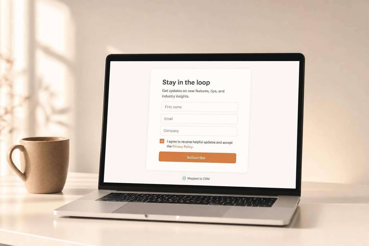
Get new content delivered straight to your inbox

The Response
Updates on the Reform platform, insights on optimizing conversion rates, and tips to craft forms that convert.


Drive real results with form optimizations
Tested across hundreds of experiments, our strategies deliver a 215% lift in qualified leads for B2B and SaaS companies.
