
.webp)
How to A/B Test Form Field Placement


Form field placement significantly influences how users interact with your forms and, ultimately, your conversion rates. A/B testing allows you to compare different layouts and identify what works best for your audience. For example, moving a form above the fold or aligning labels differently can lead to higher completion rates.
Here’s how to approach it:
- Why it matters: Users scan forms in predictable patterns (like the F-pattern). Misplaced fields or labels can slow them down or cause drop-offs.
- Key benefits: A/B testing helps you find the optimal layout, reduce friction, and improve both submission rates and lead quality.
- Steps to test:
- Set clear goals and identify problem areas using analytics.
- Create control and test forms, changing only one variable at a time.
- Split traffic evenly between variants and run the test for at least two weeks.
- Analyze the results and implement the winning version.
Pro tip: Focus on metrics like completion rates, time spent on fields, and drop-offs to pinpoint user friction. Small changes, like reducing one field, can increase conversions by up to 26%. Start testing your forms today to maximize results!
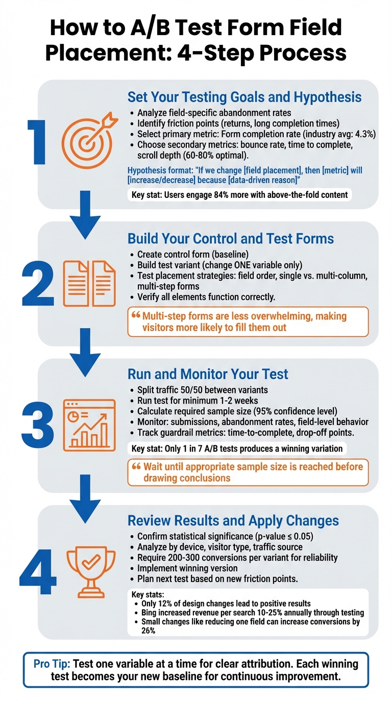
4-Step A/B Testing Process for Form Field Placement Optimization
What is an A/B Test?
Step 1: Set Your Testing Goals and Hypothesis
Before diving into rearranging form fields, it's crucial to understand what you're trying to improve and how you'll measure success. Without clear goals, A/B testing can feel aimless.
Pinpoint Where Your Form Falls Short
Your analytics hold the key to identifying problem areas. Look for field-specific abandonment rates - these can highlight exactly where users are dropping off. For example, if users quit after encountering a specific field, it likely signals friction. On the other hand, high drop-off rates early in the form might just reflect casual visitors who aren't ready to commit.
Pay attention to how often users return to re-enter information in a field. Frequent returns could mean unclear labels or confusing placement. Similarly, if users spend an unusually long time on a simple field in abandoned sessions compared to completed ones, it might suggest layout issues causing hesitation.
Another common issue is the "submit button trap." If users abandon the form at the submit stage, it often points to validation errors in earlier fields rather than a problem with the button itself. On mobile devices, watch for signs of autocorrect interfering with short-character fields or issues with tapping fields on smaller screens.
By identifying these friction points, you'll be better equipped to choose the right metrics to measure and improve upon.
Select Metrics to Measure
Once you've identified where users are struggling, focus on metrics that reflect the impact of those issues. Your primary metric should align with your business goals - most often, this will be your form submission or completion rate. For context, the average conversion rate across industries is about 4.3%, so use your current performance as a benchmark for setting realistic improvement targets.
Secondary metrics can provide a fuller picture. These might include:
- Bounce rate: The percentage of users leaving without interacting.
- Click-through rate on the submit button: A sign of how far users get.
- Time to complete the form: Helps gauge overall usability.
- Scroll depth: Effective pages often see users scroll between 60% and 80% of the way down.
- Submission error rates: High errors could point to validation problems in earlier fields.
"A/B testing metrics are the guiding lights of your A/B test. Choosing the right ones ensures you're testing the KPIs that truly matter and gaining valuable insights."
– Katie Petriella, Content and SEO Specialist, Eppo
Craft a Data-Driven Hypothesis
Your hypothesis should follow this structure:
"If we change [field placement], then [metric] will [increase/decrease] because [data-driven reason]."
For instance:
"If we move the email field above the fold, then our form submission rate will increase by 15% because users engage with above-the-fold content 84% more than below-the-fold content."
Use your analytics to ground your hypothesis in real data. For example, if heatmaps reveal that users rarely scroll past 70% of your page, it might make sense to test placing your form higher. Or, if a phone number field has high return rates, try repositioning its label above the input field to reduce confusion.
To ensure accurate results, test one variable at a time. For example, compare single-column versus multi-column layouts separately from label placement. Similarly, test field order independently from above-the-fold versus below-the-fold positioning. This method isolates changes, making it easier to track what’s driving the results.
Step 2: Build Your Control and Test Forms in Reform

Now that you’ve got your hypothesis, it’s time to create your test forms in Reform. The golden rule here: the only difference between the forms should be the field placement. This way, any changes in performance can be directly linked to that adjustment, not unrelated factors like button design or text changes.
Create Your Control Form
Start by designing your baseline form - the version with your current layout. In Reform's editor, click "Add form block" to insert fields into your form. To rearrange fields, simply hover over a block until you see the six-dot handle, then drag and drop it into the desired position.
If you’re testing a multi-step form, use the "Add Page" button at the bottom of the editor to break your form into smaller, digestible sections.
"Multi-step forms are less overwhelming than single-page forms, making visitors more likely to fill them out." – Reform
Customize your control form by accessing "Form settings" in the top-right corner. Here, you can update the form title and URL slug. If you're using a multi-step layout, consider toggling the "Show progress bar" option. This visual indicator helps users track their progress, which can encourage more completions by setting clear expectations.
Build Your Test Variants
Once your control form is set, make an exact duplicate to create your test variant. This ensures that both versions are identical except for the field placement changes. For example, if your hypothesis suggests moving the email field above the fold could boost submissions, simply drag the email field to the new position while leaving the rest of the form untouched.
You can experiment with various placement strategies depending on your hypothesis. Try reordering fields (e.g., placing the phone number field above or below the email field), switching from a single-column to a multi-column layout, or breaking a long single-page form into multiple steps. If you're testing multi-step variations, the six-dot drag handle makes it easy to move fields between pages.
Before launching, double-check that all interactive elements work as intended on both versions. Any technical glitches could skew your results, making it difficult to determine whether changes in performance are due to field placement or functionality issues.
Turn On A/B Testing in Reform
With your forms ready to go, activate A/B testing in Reform. This feature automatically splits traffic between your control and test variants. Set the split to 50/50 and let the test run for at least two weeks. This duration helps account for fluctuations in user behavior and traffic patterns.
Before starting, use a statistical power calculator to figure out the minimum sample size you’ll need. For instance, if your current form converts at 15% and you’re aiming for a 2% increase (to 17%), you’ll need a specific number of visitors for each variant to achieve statistically significant results. Reform’s real-time analytics will keep you updated, so you’ll know when you’ve gathered enough data to declare a clear winner.
Once everything is set, you’re ready to move on to Step 3: running and monitoring your test.
sbb-itb-5f36581
Step 3: Run and Monitor Your Test
Your forms are live, and traffic is now split between the control and test variants. The next step? Patience. Avoid the temptation to constantly check results - jumping to conclusions too early can lead to misleading insights. A/B tests need enough data to provide reliable outcomes, so give them the time they require.
Set Up Your Test Parameters
First things first: make sure traffic is evenly divided between your variants. This balance is crucial to ensure neither form has an unfair advantage. Plan to run the test for at least 1–2 weeks, allowing enough time to capture variations in user behavior. Before starting, you should have already calculated the required sample size. This calculation accounts for your baseline conversion rate, the minimum detectable effect (MDE) you’re aiming for, and a 95% confidence level.
Monitor Results as They Come In
Use Reform’s real-time analytics to keep an eye on key metrics like submissions, abandonment rates, and behavior at the field level. While conversion rate is the primary focus, don’t ignore guardrail metrics such as time-to-complete or drop-off points. For instance, a higher submission rate won’t mean much if users are consistently abandoning the form at a specific field. That’s a sign of friction that needs fixing.
"To get statistically reliable results, you must wait until the appropriate sample size of a test is reached. Only then you should draw a conclusion and end your A/B test." – Tim Neusesser, NNGroup
Check periodically to ensure both forms are functioning properly and receiving traffic as planned. However, resist the urge to stop the test early, even if one version seems to be outperforming the other. It’s worth noting that only about 1 in 7 A/B tests produces a winning variation, so patience truly pays off. Once your test has run for at least two weeks and you’ve reached the required sample size, it’s time to dive into the results. With enough data on hand, you’ll be ready to move on to Step 4 and put your findings into action.
Step 4: Review Results and Apply Changes
Your testing phase is over, and now it’s time to dig into the data. This is where you figure out which form layout made a difference, separating meaningful patterns from random noise, and turning those findings into actionable steps.
Compare Your Test Results
Start by confirming statistical significance - a p-value of 0.05 or less at a 95% confidence level is a good benchmark. Look at overall conversion rates, but don’t stop there. Break the data down by device, visitor type, and traffic source to spot performance differences tied to specific layouts. For example, one version might perform poorly on desktop but shine on mobile, offering clues about which audience to focus on.
Don’t overlook micro-conversions. Even if the variant didn’t boost total submissions, check if it improved field completion rates or reduced drop-offs at certain points. Also, consider external factors like holidays, seasonal trends, or marketing campaigns that may have influenced the results.
"Any experiment that involves later statistical inference requires a sample size calculation done BEFORE such an experiment starts. A/B testing is no exception." – Khalid Saleh, CEO and co-founder, Invesp
If the difference between your test versions is less than 15–16%, and especially if your site has low traffic, you may want to rerun the test. Aim for at least 200 to 300 conversions per variant to ensure reliable results. Once you’ve confirmed statistical significance, move forward with the variant that meets your goals.
Choose the Winning Version
After identifying the winning layout, double-check its performance across all devices and browsers to ensure there are no technical hiccups. In Reform, you can redirect traffic to the winning version by updating form links or setting it as the default. Also, verify that any workflows - like automated confirmation emails or “Thank You” pages - trigger correctly with the new setup.
"The more radical the change, the less scientific we need to be process-wise. The more specific the change (button color, microcopy, etc.), the more scientific we should be because the change is less likely to have a large and noticeable impact on conversion rate." – Matt Rheault, Senior Software Engineer, HubSpot
It’s worth noting that only about 12% of design changes lead to positive results. Once you’ve identified a winner, implement it quickly, and use it as the new baseline for future testing. This way, you’re building on proven successes rather than starting over each time.
With the winning version in place, you’re ready to take the next steps and refine further.
Plan Your Next Test
Testing is an ongoing process, and each experiment lays the groundwork for the next. After implementing your winning layout, use Reform’s analytics to identify the next friction point. Look at field-level data to see where users are dropping off or encountering issues.
"A/B testing, when done properly, is a continual process that over time yields higher and higher conversion rates." – surfjam, Formidable Forms
Start with the biggest problems. If analytics show a sharp drop-off at a specific field, focus on fixing that before testing smaller elements like button text or color. You can also gather qualitative insights through exit surveys or polls to better understand what’s driving user behavior. These insights can help you form stronger hypotheses for future tests.
When planning your next experiment, stick to testing one variable at a time. For instance, if your last test focused on field placement, the next one could explore form length, button copy, or validation messages. This method ensures you can clearly attribute any changes in conversion rates to the specific adjustment you made. Each test builds on the last, creating a steady cycle of improvement.
Conclusion
A/B testing your form field placement is a continuous process that transforms guesswork into clear, actionable insights. Forms sit at a critical juncture in your customer acquisition funnel, where even minor friction can lead to lost opportunities. By systematically testing and analyzing, you can pinpoint exactly where users encounter obstacles, rather than relying on assumptions.
Businesses that embrace consistent experimentation tend to reap the most rewards. Take Bing, for instance - they’ve managed to boost their revenue per search by 10% to 25% annually through relentless testing. Start by addressing major friction points, and once those are optimized, shift your focus to smaller tweaks like adjusting microcopy or fine-tuning validation timing.
The key is to act on your findings. Test one element at a time, ensure your results are statistically significant, and use each successful outcome as your new benchmark. With tools like Reform's integrated analytics and A/B testing capabilities, you can uncover bottlenecks, experiment effectively, and implement winning changes. Let the data guide your decisions, helping you consistently improve both your conversion rates and the quality of your leads.
FAQs
What’s the best way to decide which form field placement to test first?
To figure out the best starting point for testing where to place form fields, rely on data-driven insights from tools like Reform’s analytics and heatmaps. Begin by enabling real-time tracking to spot fields with low engagement or high drop-off rates. Heatmaps can make this even clearer by visually showing areas with little interaction (e.g., cooler blue zones) or fields that lead users to abandon the form.
Zero in on fields that show both low engagement and high abandonment rates. For instance, if the "Phone Number" field has a high drop-off rate, experiment with its placement. You could try moving it to the top of the form, grouping it with similar fields, or simplifying its layout. After making changes, conduct an A/B test by splitting traffic evenly between the original and updated versions of the form. Track which version performs better in terms of conversions, and use those results to set a new standard for further optimization.
What are the key metrics to focus on when analyzing A/B test results?
When analyzing A/B test results, zero in on the metrics that directly influence how well your form performs. Key areas to prioritize include conversion rates (both total and completed submissions), field engagement rates, drop-off points, and time to completion. These data points will guide you in determining which layout delivers the smoothest user experience and the highest conversion rates.
Take a closer look at where users tend to drop off or pause. These moments can highlight areas where your form's design or placement might need adjustments. By focusing on these metrics, you can make informed, data-backed changes to enhance your form's overall performance.
How long should I run an A/B test to get reliable results?
The length of an A/B test hinges on several factors, including your website's traffic, the specific conversion goals you're targeting, and the level of statistical confidence you need. To get reliable insights, it's crucial to run the test long enough to gather sufficient data and account for fluctuations in user behavior - like differences between weekday and weekend traffic.
A practical guideline is to let the test run for at least two full business cycles (typically two weeks). This timeframe helps capture standard user behavior patterns. That said, the exact duration can vary depending on your audience and the volume of traffic your site receives. Cutting the test short might result in skewed or incomplete findings, so patience is key.
Related Blog Posts
Get new content delivered straight to your inbox

The Response
Updates on the Reform platform, insights on optimizing conversion rates, and tips to craft forms that convert.


Drive real results with form optimizations
Tested across hundreds of experiments, our strategies deliver a 215% lift in qualified leads for B2B and SaaS companies.
