
.webp)
How to A/B Test Multi-Step Forms


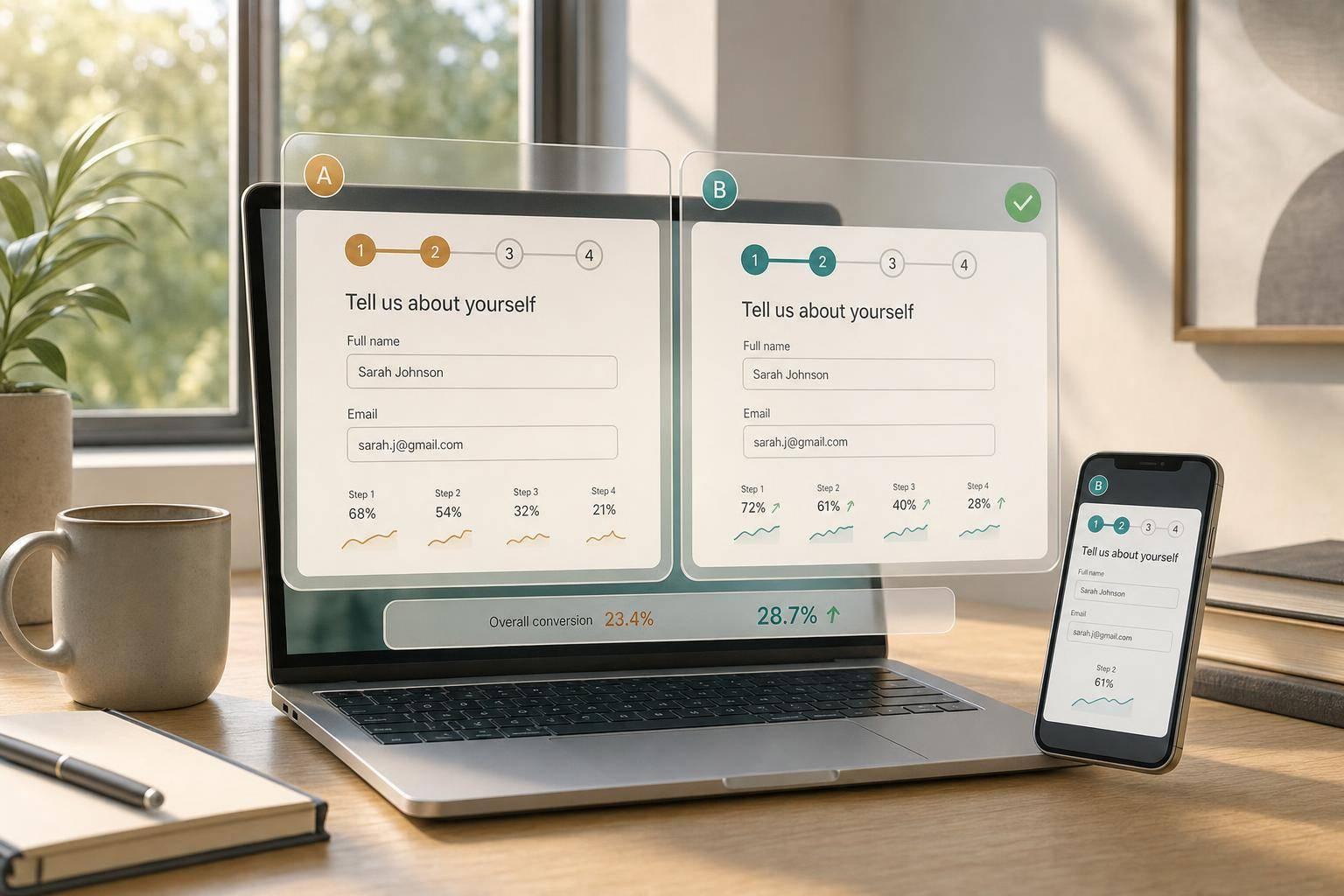
If I want a multi-step form to convert better, I test one change at a time and read results at the step level, not just the final submit rate.
A form can show more submissions and still lose more people earlier in the flow. That’s why I track form starts, step-to-step completion, step abandonment, errors, and final submissions before I change anything. Then I run a 50/50 test for 1–2 weeks, keep users in one version, and judge the result with one main metric plus guardrails like lead quality and time to finish.
Here’s the short version:
- Set a baseline first so I know where users drop off
- Pick one main metric: completion rate or qualified submission rate
- Track six events: impression, start, step advance, validation error, step abandonment, and submission
- Test one variable only: step order, question grouping, progress indicator, or mobile layout
- Segment by device because mobile and desktop often behave differently
- Ship the winner only if the main metric goes up without hurting errors, speed, or lead quality
A few patterns matter most:
- Moving phone, budget, or payment later can cut early exits
- Splitting crowded steps can lower confusion and reduce mistakes
- A “Step 2 of 4” counter or progress bar can calm users when the form feels long
- Mobile form fixes like fewer fields per screen, the right keyboard, and bottom-anchored Next/Back buttons often have the biggest effect
Use this as a simple rule: baseline → one change → step data → mobile check → next test. That’s the full playbook in plain English.
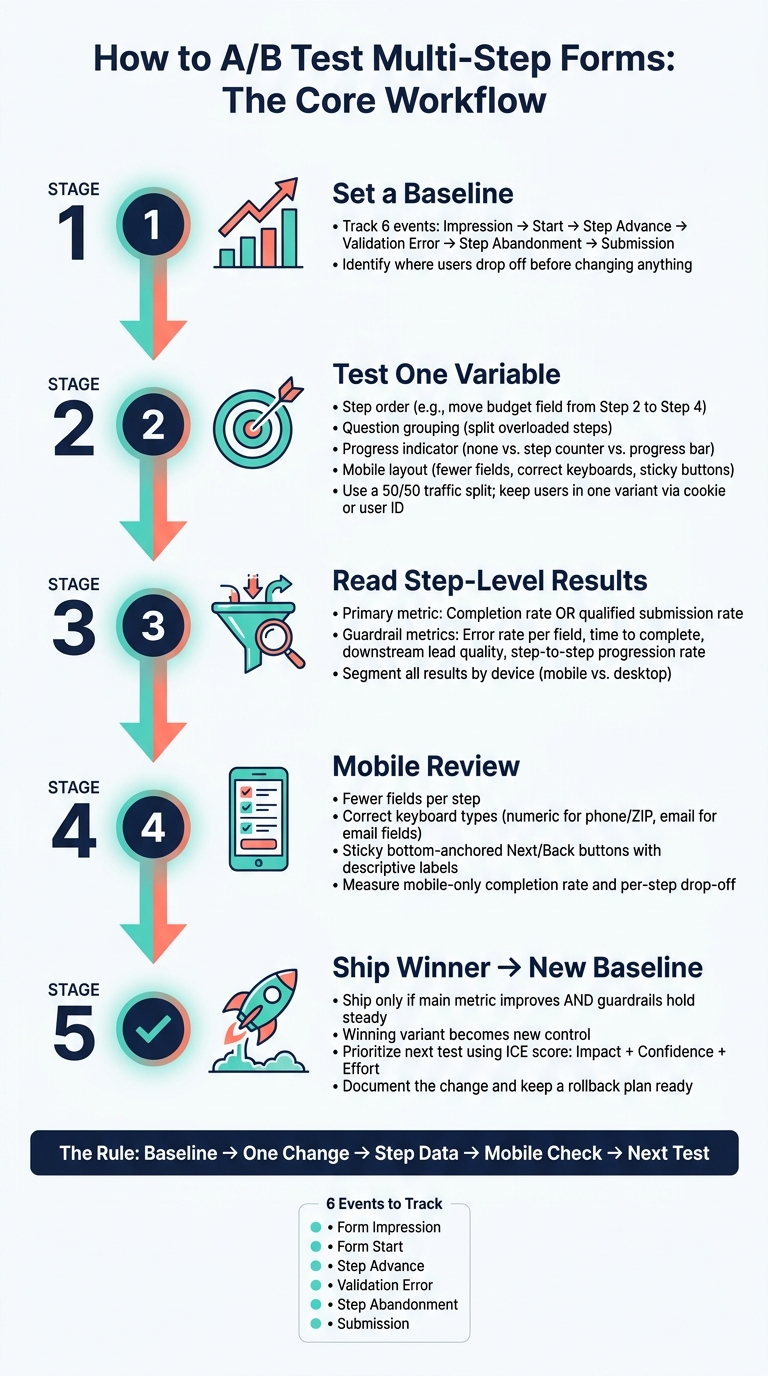
A/B Testing Multi-Step Forms: The Complete Workflow
How to Set Up a Reliable Multi-Step Form Test
Once you’ve set your baseline, freeze the setup before you launch a variant. That means your primary metric, event tracking, and traffic split should stay fixed. If you change those mid-test, it gets hard to tell what actually moved the result. You want to know whether the shift came from step order, field grouping, or navigation - not from messy test setup.
Choose Your Goals, Events, and Primary Metrics
Pick one primary metric before launch: either completion rate or qualified submission rate.
Then track these six events:
| Event | What It Captures |
|---|---|
| Form impression | User sees the form |
| Form start | User interacts with the first field |
| Step advance | User moves from one step to the next |
| Validation error | A field or step triggers an error |
| Step abandonment | User exits before completing the current step |
| Submission | User successfully submits the form |
Secondary metrics like median time to complete, error rate per field, and step-to-step progression percentages are there to help you read the outcome. They tell you why one variant did better or worse. They do not decide the winner.
Split Traffic Correctly and Isolate One Variable
Once your metrics are locked, assign users at random and keep that assignment fixed. Use a randomized 50/50 split, and keep each user tied to one variant across sessions with cookies or a user ID. That prevents cross-variant exposure, which can muddy the data.
Test one variable per run. For example, you might move the budget question from Step 2 to Step 3 while keeping the fields, design, and copy the same. Same form, same wording, same look - just a different position. That kind of setup gives you a clean read on what changed.
Run one form change at a time, then use each finished test as the new baseline for the next one.
Use a Form Platform That Supports Step Analytics
Your form platform should make step-level tracking and abandonment analysis easy. Reform supports multi-step forms with real-time analytics, step-level tracking, and abandoned submission tracking, so you can see exactly where users drop off. That step-level view matters before you test things like step order or mobile layout.
Before the test goes live, complete the form on desktop and mobile, make sure all six events fire, and verify the variant labels.
sbb-itb-5f36581
How to Test Step Order, Question Grouping, and Progress Indicators
Use the baseline step-drop data from the previous section to pick your first test. Start with the step that has the steepest drop-off.
A/B Test Step Order to Reduce Early Abandonment
Step order is one of the highest-leverage things you can test. The way questions are arranged shapes how much work users think the form will take before they fill out even one field.
Put easy, non-sensitive questions first. Move high-friction fields like phone number, budget, and payment later. Then use step-to-step completion data to figure out which fields belong farther down the form.
The right order depends on your goal. If your team cares more about lead quality than raw volume, putting qualification questions earlier can help sales work more efficiently, even if the overall completion rate drops.
| Step-Order Strategy | Expected Impact on Completion | Lead Quality |
|---|---|---|
| Easy Questions First | High (builds momentum) | Neutral |
| Sensitive Fields Later | High (reduces early bounce) | Neutral |
| Qualification Early | Lower (filters users) | High |
For a clean test, keep the total number of questions the same in both variants. Change only the position of one block. For example, move the budget field from Step 2 to Step 4.
Then watch step-level progression from Step 1 to Step 2. That's where early abandonment often shows up most clearly. If the new order is helping, that first transition rate should go up.
If changing the order doesn't fix the drop-off, the issue may be the way each step is put together.
Group Related Questions to Lower Cognitive Load
Each step should do one job. If you can't name a step in two or three words - "Contact Info", "Company Details", "Project Needs" - it's probably doing too much.
Here, change only the grouping of the questions. If one step has the highest exit rate, split its questions by purpose.
When unrelated questions sit in the same step, users have to keep switching mental gears. That slows them down and often leads to more mistakes. In the data, overloaded steps usually stand out in a few clear ways:
- A much longer average time on one step than on the steps before and after it
- High field-level exit rates in the middle of the step, especially on fields that aren't sensitive
- Repeated corrections or validation errors on the same fields
- Lower step-to-step progression on the mixed step than on cleaner, topic-based steps
When those patterns pile up around one step, that's a strong sign you should split it. Use field and step data to spot pauses, corrections, and exits before making the change.
If your steps are grouped well but people still leave early, the next thing to test is how clearly the form shows its length.
Test Progress Bars and Step Counters
Progress indicators change perceived length, not actual length. That's the point of this test: reduce uncertainty about how long the form feels.
Test three versions: no indicator, a step counter, or a progress bar. Use no indicator for short forms, a step counter for modest forms, and a progress bar when momentum matters more than exact duration.
| Progress Indicator Style | Clarity | Perceived Effort | Likely Effect on Completion |
|---|---|---|---|
| No Indicator | Low | High (uncertainty) | Negative for longer forms |
| Step Counter ("Step 2 of 4") | High | Medium | Positive for modest-step forms |
| Visual Progress Bar | High | Low (shows momentum) | Positive when steps are few |
Keep step order, grouping, and field count fixed while you test the indicator. Then track:
- Overall completion rate
- Early exits on Steps 1 and 2
- Average time to complete
If users in the "no indicator" version leave earlier and spend more time on each step, that's a strong sign uncertainty is costing you completions.
How to Find Drop-Off Points and Optimize the Mobile Flow
Map the Biggest Drop-Offs by Step and Field
Start with the weakest step from your earlier tests. That’s usually where the most useful clues show up first.
Build a funnel that tracks each step from the first view to the final submit. The core states should be step viewed → step completed → submit attempt → submit success/fail. Then calculate the transition rate between each step so you can spot where the biggest loss happens.
After you find the worst transition, go one level deeper and look at field-level data. That’s where friction tends to show its hand. A few patterns come up again and again:
- A high validation-error rate on one field usually means the label is unclear or the expected format doesn’t match how people naturally type. This happens a lot with phone numbers and ZIP codes.
- A step that takes much longer than the steps around it and also has a high exit rate often means too many unrelated inputs were packed into one screen.
- Low clicks on the primary button even when there are no errors can mean the label is too vague. A plain
Continuegives people less direction than something likeNext: Project Details.
Track step views, completions, field focus/blur, and validation errors in the same funnel. When all of that sits in one place, the worst transition is much easier to spot.
If the biggest drop-off shows up on mobile, test that step there first.
Run Mobile-Specific A/B Tests on Layout and Navigation
Mobile and desktop don’t behave the same way, so split every result by device before you call a winner. A version that looks flat in the overall data can still be much better on mobile and worse on desktop, or the other way around.
Once you’re looking at mobile-only data, focus first on the tests most likely to move completion:
- Fewer fields per step. When each screen asks for less, the form feels easier right away.
- Correct keyboard types. A numeric keypad for phone and ZIP code fields, plus an email keyboard for email fields, cuts input mistakes and helps people move faster.
- Sticky, bottom-anchored Next/Back buttons with labels like "Next: Shipping Address." If buttons are hidden or too generic, people get lost fast, especially on steps that require scrolling.
Measure success using mobile-only completion rate, per-step drop-off on mobile, error rate per field, and average time to complete. If Variant B with fewer fields per step lifts mobile completion while desktop stays flat, that’s a clear win. You only catch that if you segment the data.
Use No-Code Changes to Iterate Faster on Mobile
Once you know which mobile step is failing, move fast. That’s where many teams get stuck. The issue isn’t spotting the problem. It’s waiting too long to fix it.
Use a no-code builder to reorder steps, split crowded screens, adjust validation rules, and set the right field keyboards without waiting on engineering. Conditional routing can also skip questions users already answered somewhere else, which keeps the flow from feeling bloated.
That gives you a tighter loop: identify the drop-off, build a version aimed at that step, watch mobile metrics in real time, and ship the winner as the new default.
How to Read Results, Ship the Winner, and Plan the Next Test
Decide Which Metrics Matter Most Before Calling a Winner
After you map where people drop off, compare each variant against the step where friction changed the most.
Use completion rate as your main metric. Then look at the guardrails before you ship anything. A variant can drive more submissions and still hurt overall form performance if it increases errors, slows people down, or brings in lower-quality leads.
Before you name a winner, review these metrics next to completion rate:
| Metric | What It Tells You |
|---|---|
| Progression rate by step | Shows whether friction went up or down at a given step |
| Error rate per field | Shows whether the new version confused users or broke validation logic |
| Time to complete | Shows whether the variant added mental effort even if completions went up |
| Downstream lead quality | Shows whether more submissions led to better qualified leads |
A result is only worth shipping if the main metric improves and the guardrails hold steady. Also check that traffic volume, test duration, and device splits stayed stable.
If the winner is clear, move to the next biggest bottleneck.
A Simple Way to Prioritize the Next Experiment
Once the winner goes live, it becomes the new control. The next test should come from your analytics and the biggest friction point left, not guesswork.
A simple way to rank ideas is ICE:
- Impact: How much this change could improve performance
- Confidence: How sure you are that the issue is real and the fix makes sense
- Effort: How much work the change will take
Start with the highest score. Put the next tests behind changes that fix repeat drop-off or repeated validation errors, like trimming down a step that still loses users.
Conclusion: The Core Workflow for Better Multi-Step Form Conversion
Each test should narrow the next question.
The workflow is simple: baseline, one change, step-level data, mobile review, next test. Every winning variant becomes the new baseline and points to the next friction point worth testing.
For B2B and SaaS teams, step analytics, lead enrichment, and CRM integration can improve both submission volume and lead quality. Ship the winner, document the change, and keep a rollback plan ready.
FAQs
How much traffic do I need to A/B test a multi-step form?
There’s no single traffic number that works for every business. The sample size you need depends on two things: your current conversion rate and how much of a lift you expect to see.
For statistically sound results, figure out your sample size before you start the test, use a statistical power calculator, and let the experiment run through a full business cycle - usually 1 to 2 weeks - so you’re not mistaking random noise for a real change.
When should I optimize for lead quality instead of completion rate?
Optimize for lead quality when more form submissions don't lead to better leads. Look at qualified leads by step or path, retention or engagement by audience segment, and revenue per user or downstream conversion signals, not just total completion rate.
If completion is high but lead quality is low, tighten your qualification questions, cut fields that don't help, and segment results by traffic source and device. That helps you spot which paths bring in qualified leads and which ones just pad the numbers.
What should I do if mobile and desktop test results conflict?
Prioritize device-specific optimization instead of forcing one setup across both mobile and desktop. People don't use forms the same way on every screen, so your analytics should break out performance by device.
Start by checking for technical problems like slow load times or layout friction. From there, refine the layout, conditional logic, and progress indicators for each device so the form feels smoother on every screen size.
Related Blog Posts
Get new content delivered straight to your inbox

The Response
Updates on the Reform platform, insights on optimizing conversion rates, and tips to craft forms that convert.



Drive real results with form optimizations
Tested across hundreds of experiments, our strategies deliver a 215% lift in qualified leads for B2B and SaaS companies.
