
.webp)
How Field-Level Insights Improve Conversions


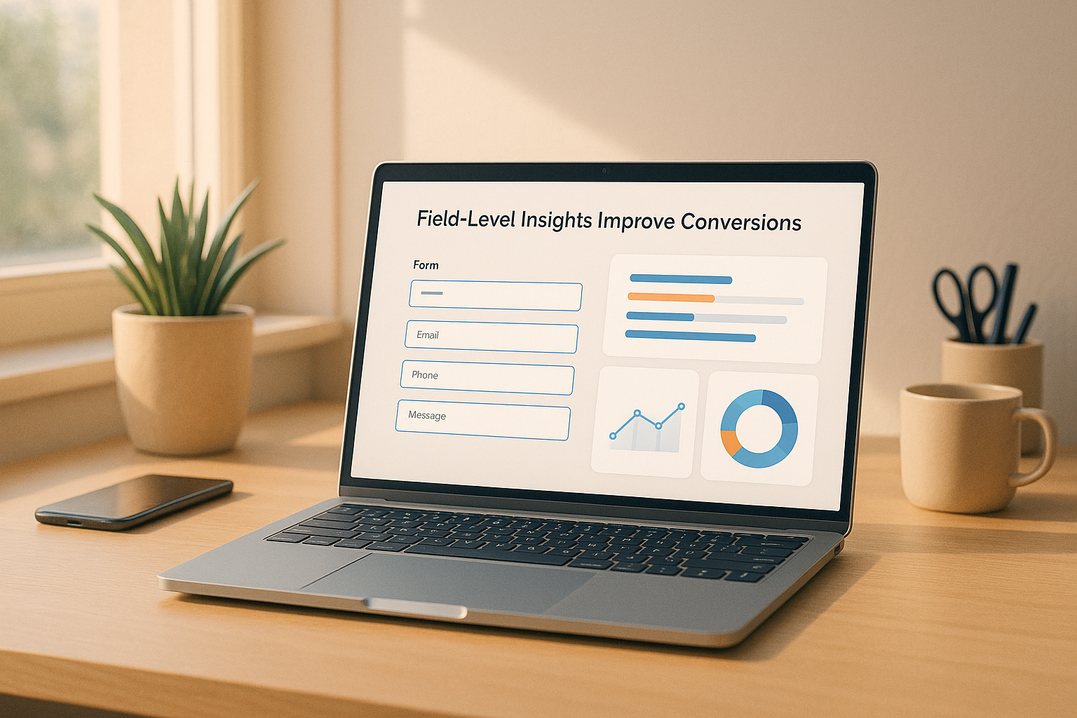
Field-level insights let you see where users have trouble with forms. By checking things like pause time, how often errors come up, and where users stop, you can find issues and fix them. This method makes the user's journey smoother and boosts the number of successful actions.
Key Points:
- What They Watch: Time taken, mistakes, missed fields, and exit spots.
- Why It's Key: Solving these problems can increase successful actions by 10% or more.
- Getting Started: Use tools to check pause time, how long it takes to fill, re-fill numbers, and mistakes. Connect with data tools like Google Sheets or HubSpot for up-to-date insights.
- Usual Fixes: Make forms simpler, give clear steps, and layout forms one step at a time to cut down on user stress.
By often looking at form data and trying out changes, even small adjustments can greatly lift user happiness and how well business goes.
How to Set Up Field-Level Tracking
To set up field-level tracking, pick the right stats, use proper tools, and link with analytics things to find good new points. Let's break down the important stats and tools you need to watch user acts well.
Key Stats to Watch
Watching some stats can show where users face problems when they fill out forms:
- Hesitation time: Checks how long users wait before they start typing in a field. Long waits may mean unclear names or confusing needs.
- Completion time: Looks at how long users take on each field, pointing out parts that may seem too long or hard.
- Refill rate: Shows how often users change their answers after putting them in. High refill rates could hint at unclear tips or check issues.
- Error frequency: Sees how often users go wrong in specific fields, spotting likely mix-ups.
- Validation failures: Finds fields with too strict or unclear format rules.
- Field skips: Shows fields users don't fill out on purpose, often due to not being related or bad design.
- Ignored fields: Watches fields users never click on, which might show bad place or less worth.
- Field-specific drop-offs: Says where users stop the form all at once.
- Time to first play: Checks how fast users start using the form after it shows up.
Checking these stats gives you a better view of where users find it hard and helps make things better.
Tools and Parts for Tracking Field Data
Things like Reform have good tools to make field-level tracking easier. Here are some main tools:
- Real-time analytics: Takes data like pause times, finish rates, and error trends right away, giving you fast insights without more steps.
- Email validation: Stops wrong sends while watching failed checks, helping spot tricky email kinds.
- Incomplete response tracking: Watches half-sends to see where users stop in the process.
- Multi-step forms: Shows user acts across different parts, showing finish rates for each step and spotting hard points.
- Conditional routing: Watches how users move through different form paths based on their replies, showing which logic paths work well and which may need changes.
- File upload tracking: Watches success rates, file size issues, and drop-offs during uploads, giving ideas on possible hard points.
These tools help you spot and fix specific issues, making a smoother user trip.
Linking Field Data with Analytics Things
Reform works well with things like Google Sheets, Zapier, HubSpot, Notion, and ConvertKit, making it simple to sync and look at your data:
- Google Sheets: Gets field-level data for custom reports and looks.
- Zapier: Links Reform to different apps, making things happen based on user acts.
- HubSpot: Moves data to your CRM to make detailed lead looks.
- Notion: Mixes field tips with other business stats in custom boards.
To get the best work, set up auto data flows to keep your info fresh. If you do it by hand, it can get old fast. But, real-time updates mean you use the newest info all the time. Adding these tools helps you smooth out your study and make choices based on data with sureness.
Spotting and Fixing Trouble Spots
When you have collected detailed data from seeing how users move, your next task is to find where they have trouble. This is key to make using it easier. While data from each step provides a start, looking more into how users act shows the exact problems that make them leave. By linking this data to different types of trouble, the main issues become more clear.
Usual Problems in Each Part and Their Reasons
Users face problems mostly from three big sources: interaction trouble (problems with the way the item looks or works), thinking trouble (needs too much thought), and feeling trouble (bad feelings from the user). These troubles can show in different ways in your data.
- Thinking Trouble: When users stop a lot, it might mean they find it hard to get what field names mean. For example, a name like "Company" may make users unsure if they should write their job's name or their own business name. Also, phone number spots without clear format help can make users slow.
- Interaction Trouble: If users often write their answers again, it may hint at very tight or unclear rules. Like, spots that say no to right inputs without clear hints make users fix their text many times, making it slow.
- Feeling Trouble: When users skip or leave spots, it often means they are upset or annoyed. Spots that ask for too much personal info too soon, like detailed money data, are usual issues. If a spot seems not needed or too private, users may skip it on purpose.
- High mistake rates: These can show both interaction and thinking trouble. For instance, unclear rules for passwords or date types lead to many errors. Without clear help, users keep guessing, adding to their annoyance and mistakes.
Using Data to Make Things Better
To improve, mix your numbers with real user thoughts to make clear plans. First, find which trouble spots change the user's journey the most. Focus on making better the spots that cause big problems, mainly those in key parts of the form.
- If users keep typing details often, think about making rules simpler and giving feedback right away. This stops right details from being marked wrong.
- For places often left blank, think about if they are needed. If not too important, move them to later steps or only show them based on what was said before. For needed places, try moving them, making names clearer, or giving quick hints to lessen the load.
- Fix wrong input problems with clear, exact error signs. Swap general tips like "Wrong input" with step-by-step help that tells users how to fix their words. This small move can help more people finish forms.
To know more, use session replays to watch how users act live. These tools can show small things that just data might not catch.
Seeing User Acts Through Session Replays
Field data tells us "what", but session replays show us "why." Seeing how people use your forms can show where they get mixed up or stuck, which isn't clear just from numbers.
For instance, if someone moves their mouse over a field a lot, keeps deleting what they wrote, or hits the back button, it might mean the form is hard to understand or use. In forms with many steps, if people keep hitting "Next" but don't move on, they might not see error signs or needed fields. Also, if they often go back or skip steps, it might mean the form's flow is hard to follow or unclear.
Session replays are great for spotting problems specific to devices. Issues like too-small fields or hard keyboard use on phones might not be clear in desktop data but really affect how phone users feel. This info helps make changes that really fit each device type.
Making Big Changes
When you find parts that don't work well in your forms, it's time to fix them. Start with the big issues - focus on parts that hit many people or make many leave. This makes sure your work has a clear effect.
The changes that matter most often fit into three big areas: making the form simpler, clearer instructions, and splitting long forms into smaller, easy steps. These ideas work well alone but better together. Start by cleaning up your form's look, making instructions easy to get, and cutting long forms into short parts.
Making Form Design Simple and Taking Out Extra Fields
Removing fields you don't need is a simple way to help more people finish forms. Every extra field raises the chance that people will quit the form. If your data shows some fields make people leave or are too slow, ask if they are really needed.
Sort your fields into three groups:
- Must-have: Fields important for your process.
- Nice-to-have: Useful but not must-have.
- Can-get-later: Stuff you can ask for after the first chat.
Put "nice-to-have" fields lower or make them optional. For "can-get-later", think about getting that info in follow-up emails or when they join.
Put related fields together to make the form feel more natural. For instance, keep name, email, and phone number in one part. This smart setup cuts down on confusion and makes the form seem neat.
Watch fields that people often skip or go back to. These fields are key ones to drop, move, or change. If a field is key but hard, think about showing it only when needed based on past answers.
Better Names, Words, and Checks
Once the design is simple, work on clear names and tips.
Specific names cut down on mix-ups. For example, rather than a vague "Name", use "Full Name" or "First and Last Name." Swap "Company" for "Company Name" to be clear.
Give examples and format tips to help users. For a phone number, show the needed format: "Phone Number (555-123-4567)." For dates, show "Start Date (MM/DD/YYYY)." These hints stop mistakes and stress.
Check right away is another big step. Catch errors as users type, not just when they send the form. For example, if someone types a bad email address, say right away: "Please use a proper email like name@company.com." Don't use vague errors like "Invalid email."
Make error messages useful. Rather than just saying, "Password must meet requirements", tell them what's needed: "Password needs at least 8 characters, with one number and one special mark." Clear, useful tips stop users from guessing and getting upset.
Also, think on how you sound. Saying "required field" can seem hard. Try using "We need this to send you updates" instead. This way, users get why you ask them, and they're more likely to fill it out.
Use Step-by-Step Forms and If-Then Choices
When forms are long, step-by-step layouts help a lot. Cut a big form into smaller parts to make it seem less of a task. Don't hit users with 15 fields at once. Break them into 3-5 clear steps, each about one key point.
With step-by-step forms, start easy. Ask easy stuff like contact info first to keep things moving. Save the big or private stuff, like how much they make or business details, for later, when users feel more relaxed.
Showing progress is key too. A simple "Step 2 of 4" or a progress bar tells users how much more they need to do, easing worry and helping more finish.
If-then choices are also smart. They change the form based on what the user says. If someone picks "Individual" not "Business", skip the work questions. This feels more right for each user and cuts fields that might mix them up or bug them.
If-then choices help make long pick lists shorter too. Ask if they work in B2B or B2C first, then show only the choices that fit. This makes things flow and still digs deep.
Lastly, for step-by-step forms, saving their spot is a must. Users might need to stop to find info or get cut off. Let them start where they left off to make sure you don't miss out. This is extra good for tough forms like for loans or detailed polls.
sbb-itb-5f36581
Keep Testing and Making It Better
Working with the tools and ways we talked about before, making your form work better is a job that never ends. What users like keeps changing - what was good six months back may not work now.
To make sure more people keep filling out your form, you should keep an eye on what works, try new things, and check the results. This helps you keep your forms good and up-to-date.
Make Reviewing a Regular Thing
For many companies, checking every month works best. These regular checks help you spot problems early. Don't wait for small troubles to turn into big ones.
Start by looking at how things have changed from month to month. Search for trends, like fewer forms filled out during holidays or busy times. See if the changes you made before are still helping - sometimes an idea works at first but doesn't hold up as time goes on.
Keep the way you check things easy. Set up a simple track sheet and get reports sent to you automatically. You can be alerted, like if there's a 5% drop in forms filled.
Also, write down every change you make. In six months, you'll be glad you wrote down why you moved a part of the form or changed a warning message. This record is key to learn from what works and what doesn't.
Having a steady check routine helps you set up sharp tests.
Do Tight A/B Tests
When you test, change just one thing at a time. If you change many parts, it's hard to tell which one made things better. Begin with the part of your form that has the most issues and test one fix at a time.
Some of the simplest - and big deal - tests can be just changing the labels on fields. You might test "Full Name" against "First and Last Name" or "Company" versus "Company Name." Small changes in words can bring big surprises.
Another smart move is to test the order of your fields. Move fields that cause issues to different spots in the form. A field that’s tricky at the start might do better in the middle. Fields that are not needed often work better at the end instead of all over the place.
You could also try different times for showing errors. Test showing mistakes as people type instead of waiting until they click "submit." Some like getting feedback right away, while it might bother others. Testing will show what suits your users best.
Let these tests run for at least two weeks, making sure each version is seen at least 1,000 times. This makes sure the data you get is solid to see the effect of your changes.
Check Improvements and What You Gain
After testing, it's time to look at the numbers. Compare before and after to really see the effect of your changes. Don't just look at how many finish the form - go deeper. Check how long people stay on each part, how often mistakes happen, and where people stop.
Also, you need to work out how much money your changes make. Say your form gets 1,000 fills a month and each one is worth $50, a 10% rise in fill rates could mean $5,000 more money. This makes it easy to see why the work on making it better is worth it.
Look at how the user feels too. Are users finishing forms quicker? Are they making fewer errors? Even if the same number of forms get filled, making the process smoother builds trust and may lead to more sales later.
Be sure to look at the same times of the year to see real changes. For example, if you deal in B2B, look at this December’s data and last December’s - not January’s - to better see your progress.
Set up your reports to run by themselves to save time. Most tools for looking at data can send you monthly updates on key points, making it easier to see trends and stay on top of things.
Keep in mind, little wins add up. A 2% rise in how many forms are filled might look small, but can mean a lot more leads over a year. Aim for small, steady wins instead of waiting for a big jump.
With tools like Reform’s live data look, you can watch data as it happens, set alerts for big changes, and see how your changes do without needing to switch between different systems. This makes the process smoother, helps you find problems fast, and tracks changes better.
Conclusion: Better Forms, Better Results
If you want to get more form-completions, using field-level insights is a big help. This data shows you clear parts of your forms that are confusing or too hard. It tells you where people stop, mess up, or waste time. This points you to exact spots to work on.
For example, if a field slows users down a whole lot, it might need easier words or a cleaner look. If errors pop up a lot in one part, it might mean there's a bug or unclear steps there. Even small fixes, like changing the words or splitting a long form into short parts, can really impact how people use your forms - and how many successfully complete them.
Keep checking this data often. Regular checks help you see patterns, try new things, and keep making things better. Tools like Reform help you do this well by mixing instant data, tracking, and easy testing in one place. With all you need right there, you can fast see issues, fix them, and track results - all without extra stress.
Start using insights from each field now, and watch small tweaks turn into big wins for your forms.
FAQs
How can I find out which parts of my form make people leave?
To know what parts of your form make people stop, use form check tools. These tools see stuff like when users click a part (focus), move out (blur), or leave the form all at once. The data can show which parts many people leave at, pointing to places in the form that may be hard or take too long to fill out.
By looking at the last part people touch before they go, you can spot the trouble spots and make fixes to make the form easier to use - and, in the end, get more people to finish it.
How can knowing field details help make more people finish forms?
Knowing Field Details To Help More People Finish Forms
Getting insights from each field can change the game in making form completion rates go up. By seeing how people use your form - like where they stop, leave, or make mistakes - you can spot exactly where they get stuck or quit. This info lets you fix specific hard spots that might be making them upset.
One good way is to make the form simpler. Drop fields that are not needed, break the form into smaller parts with multi-step forms, or add conditional logic so people only see parts that matter to them. These changes can make the form seem less scary and easier to deal with.
Another smart move is to watch how long people stay on each part and look for common errors. For instance, if one part always slows people down or causes errors, it might need clearer directions or a new setup. By fixing these problems, you make a smoother, easier path that makes people want to finish the form. The end result? More people sign up, and everyone is happier.
How can watching user actions help make forms better and get more people to fill them out?
Watching user actions, or session replays, lets you see exactly how people use your forms. You can watch these video-like clips and find out where people stop, struggle, or leave the form. This helps you see where the forms may be too hard or unclear, and lets you fix these parts.
By looking at real actions from users, session replays show trends and specific trouble spots that you might not see otherwise. Fixing these problems makes the form simpler to fill out and helps more people to complete it, which can make more people take key actions. This move can make your numbers go up.
Related posts
Get new content delivered straight to your inbox

The Response
Updates on the Reform platform, insights on optimizing conversion rates, and tips to craft forms that convert.


Drive real results with form optimizations
Tested across hundreds of experiments, our strategies deliver a 215% lift in qualified leads for B2B and SaaS companies.
