
.webp)
How to Design Responsive Email Forms


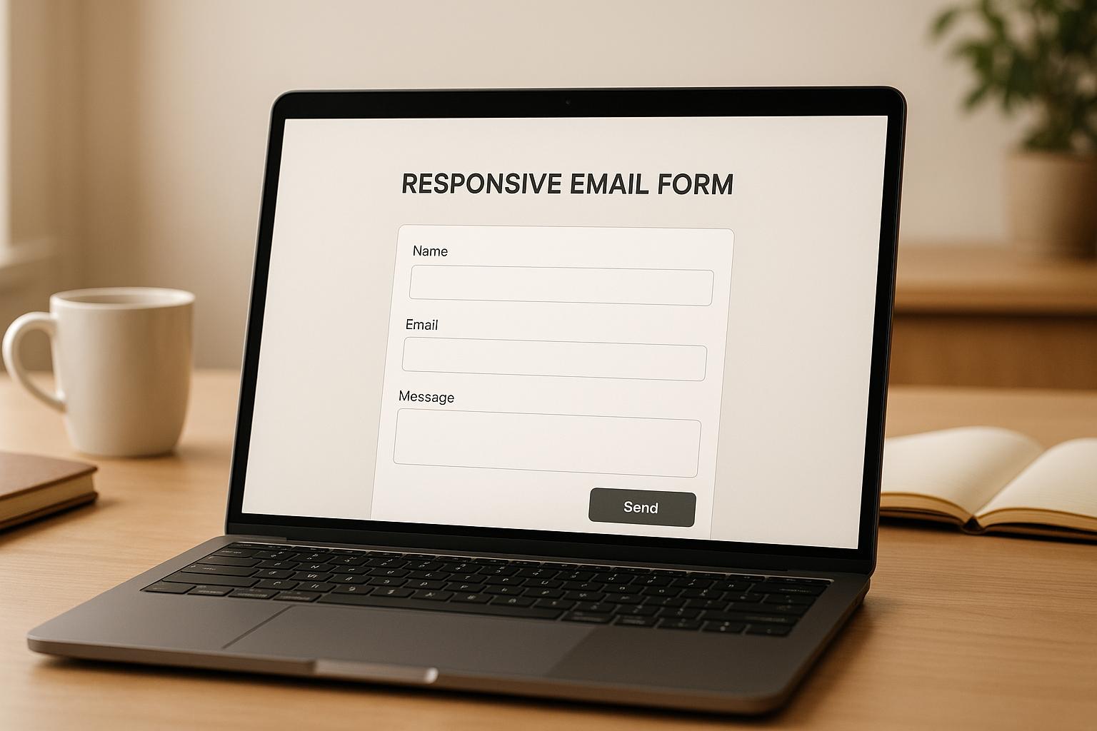
When designing email forms, the goal is simple: make them work well on any device - smartphones, tablets, or desktops. Why? Because most people check emails on mobile devices, and if your form is hard to use, they’ll skip it. Here’s what you need to know:
- Use a single-column layout: It’s easier to read and interact with on smaller screens.
- Make buttons and fields touch-friendly: At least 44x44 pixels for easy tapping.
- Start with mobile-first design: Build for small screens first, then scale up for larger devices.
- Leverage media queries: Adjust styles for different screen sizes (e.g., phones, tablets, desktops).
- Use tools like Reform: Platforms like this simplify form creation with features like multi-step forms, real-time validation, and analytics.
- Test across devices: Check your form on different devices and orientations to ensure it works smoothly.
Working Responsive Contact Form in HTML/CSS | Sends responses to your email
Core Rules for Email Forms That Work on Any Device
Designing email forms that function smoothly on any device requires thoughtful planning to ensure both usability and visual consistency, no matter the screen size.
Flexible Layouts That Adapt to Any Screen
Your form layout should adapt dynamically to different screen sizes. Instead of fixed pixel widths, use percentage-based widths (like setting fields to 100%) and stick to a single-column layout. This ensures that form elements stack neatly and remain fully visible on any device. Multi-column layouts can cause issues on smaller screens, like forcing users to scroll sideways or cutting off fields - frustrating experiences no one wants.
When designing for touchscreens, make sure your form fields and buttons have generous touch targets. Aim for a size of 44–48 pixels, which provides enough space for easy taps without requiring pinpoint accuracy.
For text, scalable fonts are a must. Use relative units like em or rem instead of fixed pixels. This way, your labels and instructions adjust automatically to various screen resolutions, keeping text legible on everything from tiny phone screens to large monitors.
Media Queries for Responsive Refinement
Flexible layouts are just the starting point. Media queries in your CSS allow you to fine-tune styles based on specific device characteristics. For example, you can define breakpoints for different screen widths: ≤480px for phones, 481–768px for tablets, and ≥769px for desktops. This lets you customize the appearance and functionality of your form for each category of device, ensuring a polished experience across the board.
Start with Mobile, Then Scale Up
A mobile-first design approach is key to creating forms that prioritize essential elements. By starting with mobile, you focus on clarity, speed, and simplicity - exactly what mobile users need. From there, you can progressively enhance the form for larger screens, adding extra features or design elements without overloading the base version.
This method also ensures faster load times and guarantees that the core functionality works seamlessly for everyone, regardless of their device. Progressive enhancement becomes much easier when your foundation is built for mobile users first.
Platforms like Reform make this process even simpler by automatically optimizing forms for all devices, so you don’t have to worry about compatibility issues.
Tools and Methods for Building Device-Friendly Email Forms
Creating device-friendly email forms has become simpler with modern tools and techniques. These solutions save you from building forms manually, making the process faster and more efficient.
Building Forms with No-Code Platforms Like Reform
No-code platforms, like Reform, make it easy to design responsive forms without needing to write a single line of code. Reform's multi-step forms are particularly effective for mobile users, breaking tasks into smaller, more manageable chunks. This reduces the mental effort required on smaller screens, encouraging users to complete the form.
Features like conditional routing allow forms to adapt based on user responses, offering a personalized experience across devices. To minimize errors, Reform includes real-time email validation, which is especially helpful on mobile devices where typos are more common. Spam prevention tools also ensure high-quality submissions without frustrating users.
Reform also provides real-time analytics, enabling you to monitor how your forms perform on different devices. You can identify where users drop off and make adjustments to improve completion rates. Plus, with A/B testing, you can compare different form designs to see which works best for mobile and desktop audiences.
Once your form design is in place, the next step is optimizing your code for compatibility across various email clients.
Using CSS and Inline Styles for Email Compatibility
Inline CSS is essential for email forms because many email clients strip out external styles. To ensure compatibility, embed media queries in the email's head while providing fallback inline styles for basic functionality. For instance, set form fields to width: 100% inline to ensure they fit smaller screens, and use media queries to fine-tune padding and margins for different devices.
For consistent rendering across email clients, table-based layouts are your best bet. Use tables to structure the form, then enhance responsiveness with CSS. This approach ensures your forms look good and function well, no matter the device or email client.
Testing Tools to Check Form Display Across Devices
After coding your form, thorough testing is crucial to ensure it works seamlessly on all devices. Start with tools like Chrome's mobile simulation for quick checks, then use services like Litmus to identify quirks specific to various email clients. Testing on real devices is also essential to evaluate tap responsiveness and scrolling behavior.
Switch between portrait and landscape orientations during testing to catch layout issues that might not appear in a desktop view. Keep older devices on hand, as they can highlight performance issues that newer models might handle better. Accessibility testing tools like WAVE or axe DevTools are also critical to verify that your forms are usable with screen readers and other assistive technologies.
To stay organized, create a testing checklist that covers all key aspects: form functionality, visual design, and performance across target devices. Test for successful form submissions, proper display of error messages, and smooth rendering of confirmation pages. This ensures your forms are ready to perform well and convert effectively on any device.
sbb-itb-5f36581
Step-by-Step Process for Creating Device-Friendly Email Forms
Designing email forms that work seamlessly across devices is essential for maximizing user engagement. Here's a step-by-step guide to help you create forms that perform well on mobile phones, tablets, and desktops.
Creating a Mobile-Friendly Form Layout
Start with a single-column layout, which ensures your form displays clearly on smaller screens, including devices as narrow as 320 pixels wide. This approach simplifies stacking and makes your form easier to read and interact with.
Set the form container to a maximum width of 600 pixels for email compatibility, while allowing it to scale down proportionally. Use 100% width for input fields to ensure responsiveness across all screen sizes.
When designing buttons, make them at least 44 pixels tall and 88 pixels wide for easy tapping. If your form includes multiple buttons, leave at least 8 pixels of space between them to prevent accidental clicks.
Place labels directly above input fields, using a minimum font size of 16 pixels. This ensures readability and avoids automatic zooming on iOS devices when users tap on form fields.
To make the process less overwhelming for mobile users, consider using multi-step forms. Platforms like Reform offer this feature, which breaks the form into smaller, manageable steps, improving completion rates.
Once your layout is ready, define breakpoints to fine-tune the design for different devices.
Setting Up Media Queries for Different Screen Sizes
Media queries are essential for adjusting your form's design based on the user's device. Focus on three main breakpoints: mobile (up to 480px), tablet (481px to 768px), and desktop (769px and above).
Here’s an example of how you can structure your media queries:
/* Mobile styles (default) */
.form-container {
  padding: 16px;
  font-size: 16px;
}

/* Tablet styles */
@media screen and (min-width: 481px) {
  .form-container {
    padding: 24px;
    font-size: 18px;
  }
}

/* Desktop styles */
@media screen and (min-width: 769px) {
  .form-container {
    padding: 32px;
    max-width: 500px;
    margin: 0 auto;
  }
}
Instead of shrinking desktop designs to fit smaller screens, use progressive enhancement. Start with mobile-friendly styles as your foundation, then add improvements for larger screens. This approach ensures your form remains functional even if media queries aren't supported.
For email clients, embed these media queries within the <style> section of your email's head. However, always include inline fallback styles since some email clients strip out <style> tags. Inline styles act as a safety net, ensuring your form remains functional.
Test your breakpoints by resizing your browser window gradually. Look for any issues, such as cramped spacing, unreadable text, or buttons that are difficult to tap. Adjust your design based on where these problems occur, rather than strictly adhering to standard device sizes.
Once your media queries are configured, it’s time to focus on accessibility.
Making Forms Accessible and Easy to Use
Accessibility is just as important as layout and design. Use clear, descriptive labels with proper HTML tags, such as <label for='...'>, to ensure compatibility with screen readers. Instead of generic labels like "Email", use more descriptive ones like "Your email address" to provide context.
Place error messages directly below the affected fields, using specific and clear language (e.g., "Enter a valid email address like name@company.com"). Use red text with a high contrast ratio (at least 4.5:1) and consider adding icons to make the errors more noticeable.
For users relying on keyboards or assistive devices, ensure logical navigation by setting proper tabindex values if the natural flow doesn't align with the visual layout. For touch interactions, make the entire area around checkboxes and radio buttons clickable by expanding the label's tappable area. This makes it easier for users to select options on small screens.
Keep font sizes no smaller than 16 pixels for body text and form fields, with 18-20 pixels being ideal for better readability, especially for older users.
Implement features like smart defaults and auto-completion to speed up form completion. Use input types such as email, tel, and url to trigger the appropriate mobile keyboards, making the process smoother for users.
Reform simplifies many of these accessibility requirements by offering built-in features like proper labeling, keyboard navigation, and screen reader compatibility. It also includes real-time validation, providing users with immediate feedback without requiring them to submit the entire form.
Improving and Testing Your Email Forms
Once your responsive email form is live, the real challenge begins. Tracking its performance and making informed tweaks can help you boost conversions and create a smoother experience for users.
Using Analytics to Track Form Performance
Analytics can give you a real-time view of how users interact with your forms. Reform’s built-in dashboard tracks key metrics like completion rates, drop-off points, and submission times across various devices. These insights help you identify trouble spots that may frustrate users.
For instance, if completion rates vary significantly by device type, it could indicate your responsive design needs adjustments. A high drop-off rate on a specific field might mean it’s too confusing or time-consuming and needs redesigning.
Abandoned submissions are another metric to watch. This feature captures partial responses from users who start filling out the form but don’t finish. Following up or analyzing this data can reveal what’s stopping them from completing the process.
Also, compare average completion times across devices. If mobile users take longer than desktop users, consider simplifying the form or splitting it into smaller steps. High validation error rates on certain fields might point to the need for clearer instructions or formatting hints.
Use these analytics to fine-tune your forms and make them more effective.
Adding Advanced Form Features
To make your forms more user-friendly, consider incorporating advanced features:
- Multi-step forms: Breaking long forms into smaller sections with progress indicators can make them less overwhelming, especially on mobile.
- Conditional routing: Customize the form based on user input. For example, if someone selects "Enterprise" as their company size, additional relevant fields can appear while unnecessary ones stay hidden.
- Lead enrichment: Automatically fill in extra details about users, like company information, based on their email address. This reduces the number of fields they need to complete.
- Smart validation: Provide real-time feedback as users type to catch errors early and reduce frustration.
- Save drafts: Allow users to save their progress and return later - perfect for longer forms or when additional information is needed.
These features can streamline the process and improve the overall experience.
Testing Different Form Versions to Improve Results
Use your analytics data to guide A/B testing and refine your forms over time. Reform’s A/B testing tool can split traffic between different versions of your form and track their performance, helping you identify what works best.
Start by testing the form’s length. Reducing unnecessary fields can make a big difference in conversion rates. Even small changes, like removing a couple of nonessential questions, can lead to noticeable improvements.
Experiment with other elements too, like the order of fields, button text, colors, and layout. For example, replacing a generic "Submit" button with something more engaging like "Get My Free Quote" or "Start My Trial" can encourage more users to complete the form.
You can also test different layouts. Compare single-column vs. multi-column designs for desktop users, adjust field spacing, and try changing label positions. What works for one audience might not resonate with another.
For multi-step forms, test how progress is displayed. Some users might prefer a clear "Step 2 of 4" label, while others respond better to a percentage-based progress bar.
Run each test for at least two weeks to collect meaningful data. Document your findings and build on the changes that improve results. Even small boosts in completion rates or lead quality can make a big difference over time.
Summary: Main Points for Creating Device-Friendly Email Forms
Designing responsive email forms requires a mobile-first approach, adaptable layouts, and continuous refinement. These elements form the foundation of effective strategies for creating user-friendly forms.
A few essential practices include using flexible, single-column layouts, applying media queries for device-specific styling, and prioritizing mobile-first design to enhance readability and usability on smaller screens.
Platforms like Reform simplify the process with features such as built-in responsive design, multi-step forms, conditional routing, lead enrichment, and real-time analytics - making form creation more efficient and impactful.
To ensure your forms display correctly across various email clients, leverage CSS media queries and inline styles. Testing tools are invaluable for spotting and fixing display issues, ultimately reducing user frustration.
For ongoing improvements, use analytics and A/B testing to pinpoint where users drop off and adjust accordingly. Combine an accessible design with intuitive navigation and smart validation to guide users seamlessly. Regularly refining your forms based on user behavior helps ensure they remain effective and engaging on any device.
FAQs
Why is a mobile-first approach important for designing responsive email forms?
A mobile-first approach is key when designing responsive email forms because it prioritizes the devices most people rely on every day. Starting with mobile design means focusing on simplicity, speed, and ease of use - all essential for smaller screens and touch navigation.
This method enhances the user experience by ensuring fast load times and smooth interactions, making it hassle-free for users to fill out forms while on the move. Plus, by designing for mobile first, you can easily adapt and scale your forms to look and perform well across larger screens, ensuring a consistent experience for everyone.
How can I make sure my email forms are accessible to everyone, including users with disabilities?
To make your email forms accessible, prioritize clear labels and simple navigation. Ensure every field has a visible, descriptive label, provide straightforward instructions, and design forms that can be fully navigated using just a keyboard. Don't rely solely on visual cues - maintain high text-to-background contrast and include alternative text for any images.
Whenever possible, use native HTML elements. These are generally more compatible with assistive technologies, making your forms easier to use for individuals relying on screen readers or other assistive tools. This approach ensures your forms are inclusive and functional for a broader audience.
What mistakes should I avoid when creating responsive email forms for different devices?
When creating responsive email forms, it's important to steer clear of these frequent missteps:
- Skipping responsive templates: Forms that don’t adjust to various screen sizes can frustrate mobile users and hurt engagement.
- Cluttering forms with too many images or text: This not only slows down loading times but also makes the design harder to adapt across devices.
- Overlooking mobile usability: Without testing on smaller screens, you might end up with buttons that are too tiny or fields that are difficult to use.
- Forgetting inline CSS styling: Properly applied inline styles are key to ensuring your forms display consistently across different email clients.
To deliver a smooth user experience, keep your design clean, test it thoroughly on multiple devices, and prioritize mobile-friendly approaches.
Related Blog Posts
Get new content delivered straight to your inbox

The Response
Updates on the Reform platform, insights on optimizing conversion rates, and tips to craft forms that convert.


Drive real results with form optimizations
Tested across hundreds of experiments, our strategies deliver a 215% lift in qualified leads for B2B and SaaS companies.
