
.webp)
How To Prioritize Accessibility Issues


Struggling with inaccessible forms? Here's how to fix them.
Making forms accessible is about more than compliance - it's about creating a better experience for everyone, including users with disabilities. By addressing common barriers like missing labels, poor keyboard navigation, and low color contrast, you can improve usability and boost your business outcomes.
Key Steps to Prioritize Accessibility Issues:
- Identify Common Barriers - Missing labels, broken keyboard navigation, and screen reader incompatibility are critical issues.
- Follow WCAG Standards - Start with Level A (basic accessibility) and move to Level AA (enhanced usability).
- Use Data to Guide Fixes - Focus on high-traffic forms and analyze where users drop off or struggle.
- Plan a Fix Schedule - Tackle critical issues first, then work on usability improvements and enhancements.
- Test and Update Regularly - Use automated tools and user feedback to ensure ongoing accessibility.
Quick Overview of Accessibility Priorities:
| Priority | Examples | Fix Timeline |
|---|---|---|
| Critical Issues | Missing labels, keyboard traps | 1–2 weeks |
| High Priority | Error messages, focus indicators | 2–4 weeks |
| Medium Priority | Mobile responsiveness, field order | 4–8 weeks |
| Enhancements | Visual design, advanced features | 8–12 weeks |
Tip: Regular testing and user feedback are essential for maintaining accessibility over time.
Want to make your forms accessible and user-friendly? Start by fixing the most critical barriers first, and build from there.
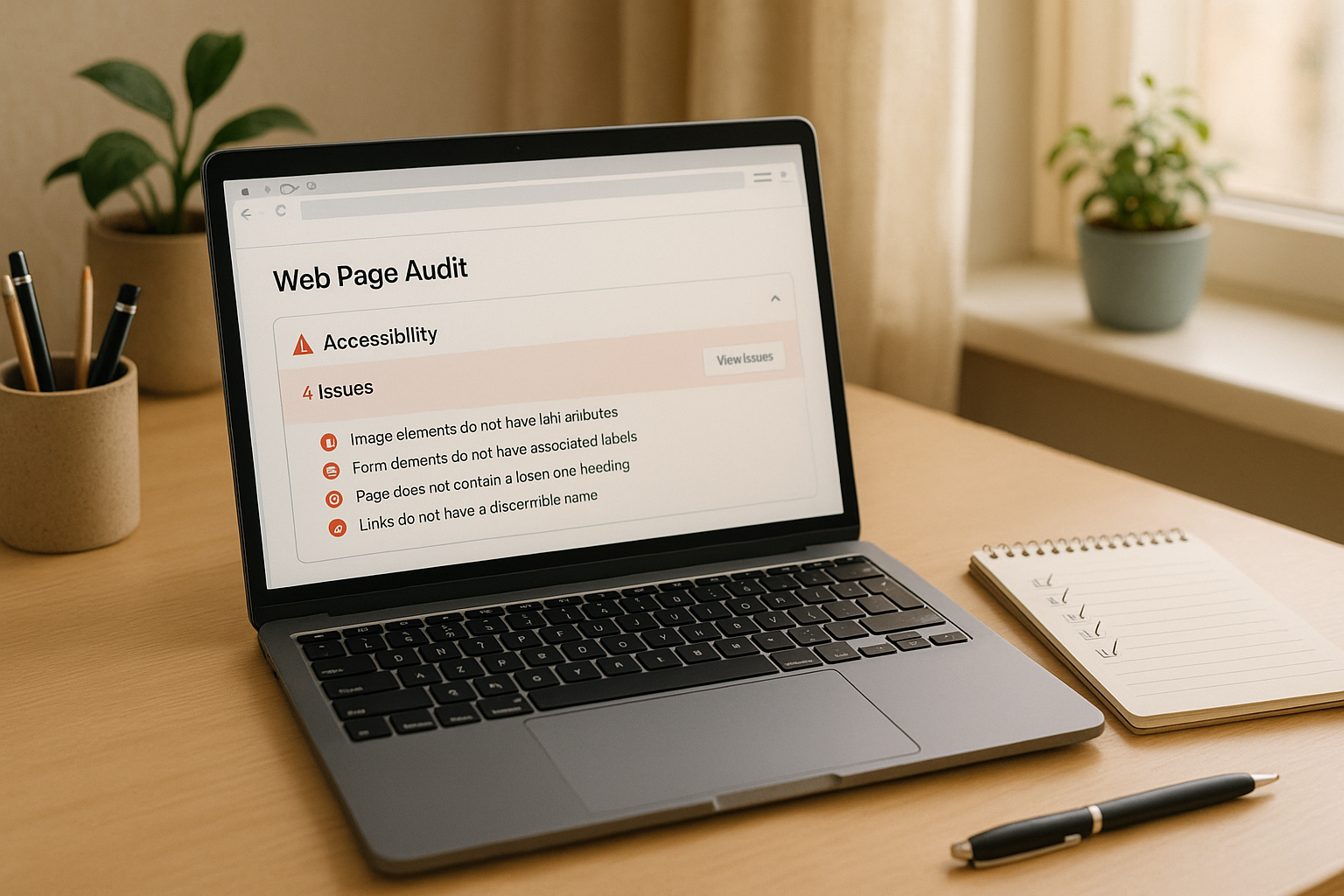
Step 1: Find Common Form Accessibility Problems
Major vs. Minor Accessibility Issues
When tackling form accessibility, it's useful to separate major barriers from minor ones. Major issues are the kind that stop users in their tracks. These include things like missing form labels, keyboard navigation that doesn’t work, or screen readers that can’t interpret the form. If these issues exist, users might not be able to complete the form at all.
On the other hand, minor issues are more about creating frustration rather than complete roadblocks. For example, inconsistent visual styling, a tab order that feels awkward, or color contrast that doesn’t quite meet guidelines. While these don’t prevent form submission, they can still make the experience less smooth and should be addressed when possible.
| Issue Type | Impact Level | Examples | Priority |
|---|---|---|---|
| Major | Blocks completion | Missing labels, keyboard traps, timing limits | Fix immediately |
| Minor | Creates user friction | Inconsistent styles, poor tab order | Address in future updates |
Common Form Accessibility Barriers
By knowing the typical challenges users face with forms, you can better prioritize fixes. Here are some of the most frequent barriers:
-
Keyboard Navigation Problems
Some users rely entirely on their keyboard to navigate, so issues like missing focus indicators, dropdown menus that can’t be accessed, or broken tab navigation can make forms unusable. -
Screen Reader Compatibility
Forms must work seamlessly with screen readers. This means including ARIA attributes where needed and using a proper heading structure so screen readers can interpret the form logically. -
Visual Accessibility
Poor color contrast, text that’s too small, and unclear error messages can make forms difficult to use for people with visual impairments. For instance, WCAG 2.1 recommends a minimum contrast ratio of 4.5:1 for regular text and 3:1 for larger text.
Forms should also avoid strict time limits whenever possible. If timing restrictions are necessary, provide clear options to extend or disable them. This is especially important for users with motor or cognitive challenges who may need extra time to complete their submissions.
Finally, tools like no-code form builders (e.g., Reform) often incorporate accessibility best practices, making it easier to address these challenges right from the start.
Step 2: Match Fixes to WCAG Standards
Meet WCAG A and AA Requirements
In the United States, WCAG standards lay the groundwork for digital accessibility compliance. These guidelines are built around four key principles: Perceivable, Operable, Understandable, and Robust. To meet compliance, you’ll need to address both Level A and Level AA requirements.
Level A sets the basic accessibility foundation with essentials like:
- Clear and descriptive field labels
- Functional keyboard navigation
- Proper use of ARIA attributes
- Clear and actionable error messages
Level AA takes accessibility further by adding features such as:
- Minimum color contrast ratios of 4.5:1 for standard text
- Error prevention for critical form submissions
- Multiple ways to locate and complete forms
- Consistent navigation and identification patterns
Here's how the levels compare:
| WCAG Level | Requirements | Business Impact |
|---|---|---|
| Level A | Basic accessibility features | Meets the legal minimum and avoids major barriers |
| Level AA | Advanced accessibility features | Widely recognized standard; improves usability and access |
| Combined | Comprehensive compliance framework | Ensures legal protection and a better experience for all users |
Link Form Issues to WCAG Rules
To address accessibility issues effectively, connect each problem to a specific WCAG criterion. This approach ensures no detail is missed and provides a clear roadmap for fixes. Below are examples of common form issues and their corresponding WCAG criteria:
| Form Issue | WCAG Criterion | Priority Level |
|---|---|---|
| Missing input labels | 1.3.1 Info and Relationships | Critical |
| Problems with keyboard navigation | 2.1.1 Keyboard | High |
| Missing or unclear error messages | 3.3.1 Error Identification | Medium |
| Incompatibility with screen readers | 4.1.2 Name, Role, Value | Critical |
For each issue, document its WCAG criterion, conformance level, user impact, and the technical steps required to resolve it. This process not only simplifies remediation but also helps maintain focus on the user's experience.
Advanced form-building tools can make this process easier by offering built-in compliance features like automatic labels and ARIA attributes, reducing the need for manual adjustments.
Ultimately, WCAG compliance is about more than just meeting standards - it’s about ensuring forms are functional and inclusive for everyone. By mapping issues directly to WCAG rules, you create a clear path for prioritizing fixes, setting the stage for data-driven improvements in the next step.
Karl Groves "Prioritizing Remediation of Accessibility Issues" (ID24 2014)
Step 3: Use Data to Pick Priority Fixes
Once you've mapped issues to WCAG standards, the next step is to let user data guide you in deciding which fixes to tackle first.
Check Form Usage Patterns
Data is your best ally when it comes to prioritizing accessibility improvements. By analyzing how users interact with your site, you can pinpoint where accessibility barriers are having the biggest impact on user experience and conversion rates. Focus on high-traffic form elements where changes will benefit the most people. Key metrics to track include:
- Form completion rates - Look for points where users abandon the form - this could reveal obstacles preventing them from finishing.
- Time spent per field - If users are spending too long on specific fields, it may signal an accessibility issue.
- Error frequency - Repeated errors in a field might indicate unclear instructions or poorly labeled inputs.
- Device usage patterns - Review how different devices and assistive technologies are interacting with your forms.
For example, high drop-off rates on mobile might point to problems like touch targets that are too small. Combine these insights with automated testing to create a solid baseline for your fixes.
Run Automated Tests
Automated testing tools are a fast and efficient way to identify and categorize accessibility issues. They help you establish a baseline and track improvements over time.
"Get instant feedback on how users interact with your forms, allowing for rapid iteration and improvement." - Reform
When reviewing results from automated tests, prioritize fixes based on:
-
Severity:
- Critical - Issues that completely block users from completing a task.
- High - Problems that significantly hinder usability.
- Medium - Minor inconveniences that still affect the experience.
- Low - Cosmetic issues that don't impact functionality.
- Number of affected users: Focus on issues that impact the largest portion of your audience.
- Usage frequency: Prioritize fixes for elements that are used most often.
- Business impact: Address issues that directly affect conversions or revenue.
This data-driven approach ensures you're tackling the most impactful problems first, leading to meaningful improvements in accessibility.
Step 4: Build a Fix Schedule
Keeping a well-organized schedule for your fixes ensures steady progress and prevents delays.
Create a Step-by-Step Plan for Fixes
Prioritize your fixes based on their severity and the impact they have on accessibility and usability:
-
Phase 1: Critical Fixes (1–2 weeks)
Address the most pressing issues that block users from accessing or navigating your platform:- Keyboard navigation barriers
- Missing form labels
- Color contrast issues
- Indicators for required fields
-
Phase 2: High-Priority Issues (2–4 weeks)
Focus on improving usability by tackling these high-priority problems:- Improving clarity of error messages
- Adding visible focus indicators
- Properly grouping form fields
- Providing feedback for input validation
-
Phase 3: Medium-Priority Improvements (4–8 weeks)
Work on refining the user experience with these adjustments:- Enhancing help text for better guidance
- Optimizing the sequence of fields
- Ensuring mobile responsiveness
- Improving compatibility with screen readers
-
Phase 4: Enhancement Tasks (8–12 weeks)
Once the major issues are resolved, shift your attention to fine-tuning and adding extra features:- Refining visual design elements
- Boosting performance
- Adding support for additional languages
- Implementing advanced validation features
Assign Deadlines for Fixes
After organizing your fixes into phases, set specific deadlines to keep the process on track. Use the table below as a guide:
| Timeline | Priority Level | Focus Areas |
|---|---|---|
| Week 1–2 | Critical | Resolving blocking issues |
| Week 3–4 | High | Fixing usability barriers |
| Week 5–8 | Medium | Enhancing user experience |
| Week 9–12 | Low | Optimizing and refining |
When setting deadlines, consider factors like your team’s capacity, the complexity of each fix, time for testing and quality assurance, and incorporating user feedback. A realistic timeline ensures steady progress without overwhelming your team.
sbb-itb-5f36581
Step 5: Track and Update Accessibility
Keeping forms accessible is an ongoing process. Regular testing and a structured tracking system are essential to catch and address potential issues as forms evolve.
Schedule Regular Tests
Consistent testing helps identify problems early. Tools like Reform's real-time analytics provide valuable insights into how users interact with forms. To stay on top of accessibility, set up a testing schedule like this:
| Testing Frequency | Focus Areas | Tools/Methods |
|---|---|---|
| Weekly | User interaction patterns, completion rates | Real-time analytics |
| Monthly | Form abandonment analysis, A/B test results | Automated testing tools |
| Quarterly | Comprehensive accessibility audit | Manual testing + user feedback |
Key areas to monitor include:
- Completion patterns: Understand how different user groups navigate forms.
- Abandonment points: Pinpoint where users tend to exit forms.
- Input validation: Ensure error messages are clear and helpful.
- Navigation flow: Verify that forms are fully functional with keyboard controls.
While automated tools provide valuable data, direct user feedback adds depth and context to these insights.
Get User Input
Analytics can only tell part of the story. User feedback fills in the gaps, helping you uncover issues that might not be obvious from data alone. Reform makes it easier to track abandoned submissions, offering clues about potential accessibility barriers.
"I'm a happy customer. One of the best parts of being a customer is that they constantly send emails with new additions to the software. And each addition is based on real customer requests." - Andrew Warner, Founder, Mixergy
To make the most of user feedback:
- Enable progress saving - Let users pause and return to forms without losing their work.
- Monitor partial submissions - Identify where users struggle or stop.
- Implement A/B testing - Compare different layouts to find the most accessible option.
- Create feedback channels - Provide clear ways for users to report issues.
Keep a record of all feedback and test results. This documentation will be invaluable for future updates and ensuring compliance with accessibility standards.
"Ensure your forms are easy to navigate for all users, complying with accessibility standards to reach a wider audience." - Reform
Conclusion: Main Points for Accessibility Planning
Ensuring accessibility is not a one-time task - it's an ongoing effort that requires thoughtful planning and regular updates. From identifying barriers to implementing fixes, having a clear and actionable strategy is key. Here's a streamlined roadmap to keep your forms accessible and user-friendly:
- Audit barriers - Regularly review your forms to identify both major and minor accessibility challenges.
- Align fixes with WCAG - Address issues by adhering to the latest Web Content Accessibility Guidelines (WCAG).
- Use data to prioritize - Leverage analytics and user feedback to focus on the most impactful changes first.
- Set clear timelines - Plan your updates based on urgency and the potential impact on users.
- Monitor regularly - Schedule consistent testing to stay ahead of new challenges and maintain accessibility.
This roadmap provides a straightforward framework to help your accessibility efforts keep pace with your users' needs.
"I'm a happy customer. One of the best parts of being a customer is that they constantly send emails with new additions to the software. And each addition is based on real customer requests."
FAQs
What are the main differences between WCAG Level A and Level AA requirements, and how do they affect form accessibility?
WCAG Accessibility Levels Explained
The Web Content Accessibility Guidelines (WCAG) outline different levels of accessibility to make digital content usable for everyone, including individuals with disabilities.
Level A represents the most basic requirements. These address critical barriers to accessibility, such as providing alternative text for images and ensuring forms can be navigated using just a keyboard. These are the minimum standards needed for basic functionality.
Level AA goes a step further by focusing on improving usability and inclusivity. It includes requirements like maintaining sufficient color contrast, providing clear focus indicators, and offering error suggestions in forms. Achieving Level AA compliance creates a better experience for a broader range of users and is often the benchmark for legal compliance in the U.S.
By first addressing Level A requirements and then tackling Level AA, you can design forms that are both compliant and user-friendly, ensuring accessibility for a diverse audience.
How can I use user data to decide which accessibility issues to address first on my forms?
Prioritizing Accessibility Issues
Tackling accessibility challenges begins with digging into user data to uncover the most pressing barriers your audience faces. Start by examining analytics to identify high-traffic areas, like forms or sections, that show low completion rates - these are often hotspots for user frustration.
Another goldmine of insight? User feedback. Comments and complaints can shine a light on specific obstacles people encounter, giving you a clear idea of where to focus your efforts.
When prioritizing fixes, target issues that impact essential functionality first - like navigation glitches or broken form submissions. These types of problems can make or break usability. It’s also smart to address issues that affect a wide range of users, such as missing form labels or poor color contrast, as these can create barriers for many people.
By blending user data with accessibility guidelines, you can build an experience that’s easier to use and more welcoming for everyone.
What are the best practices for keeping forms accessible, and how often should accessibility testing be done?
To keep your forms consistently accessible, stick to these practical steps:
- Review forms regularly - Check them against the latest WCAG (Web Content Accessibility Guidelines) to confirm they align with current standards.
- Leverage accessibility tools - Use software to spot and resolve issues like missing labels, low contrast, or navigation glitches.
- Engage with your users - Collect input from individuals with disabilities to better understand any challenges they face.
Make sure to run accessibility tests at least every quarter or whenever you roll out major updates to your forms. This proactive approach helps ensure compliance and creates a more inclusive experience for everyone.
Related posts
Get new content delivered straight to your inbox

The Response
Updates on the Reform platform, insights on optimizing conversion rates, and tips to craft forms that convert.


Drive real results with form optimizations
Tested across hundreds of experiments, our strategies deliver a 215% lift in qualified leads for B2B and SaaS companies.
