
.webp)
How to Make Forms Mobile-Friendly for Better Leads


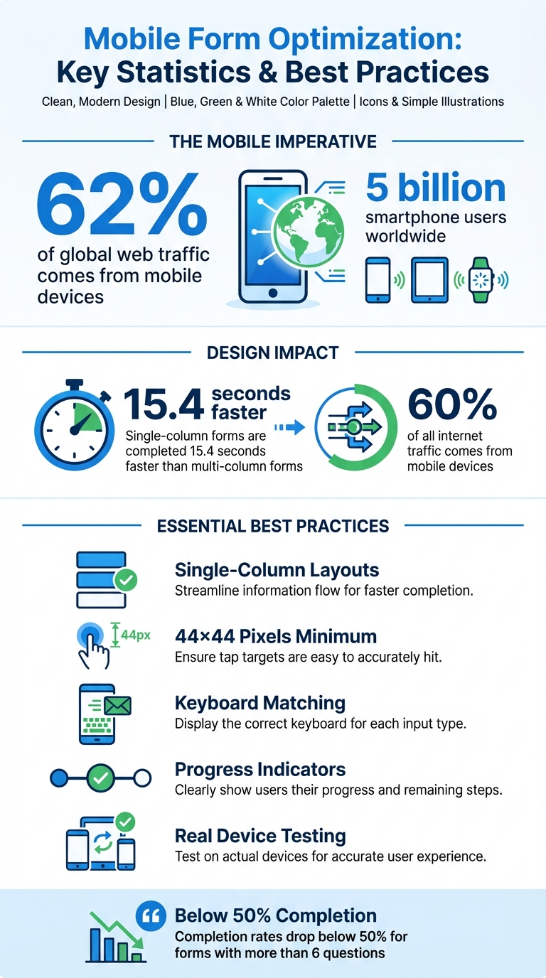
Mobile forms can make or break your lead generation. With mobile devices accounting for over 62% of global web traffic and nearly 5 billion smartphone users worldwide, ensuring your forms work smoothly on small screens is no longer optional. Poorly designed forms lead to user frustration and higher abandonment rates, but mobile-optimized forms can significantly boost conversions.
Here’s what works:
- Use single-column layouts: These eliminate cramped designs and align with natural scrolling behavior.
- Match input fields to keyboard types: Simplify typing by triggering the right keyboard (e.g., numeric for phone numbers).
- Size buttons for easy tapping: Ensure buttons are at least 44×44 pixels and spaced properly to avoid accidental clicks.
- Add progress indicators: Break long forms into steps to keep users engaged.
- Test on real devices: Simulators miss small but critical issues, like misplaced buttons or text readability.
Mobile Form Optimization Statistics and Best Practices
Optimizing Forms for Mobile Devices
Design Forms with Responsive Layouts
Creating a seamless form experience on mobile devices is crucial for capturing quality leads. Responsive layouts ensure your forms adapt to any screen size - whether it's an iPhone, Android, or desktop - removing the frustration of pinch-and-zoom navigation. By reorganizing content, navigation, and input fields to fit the device's dimensions, users enjoy a smoother, more intuitive experience.
These layouts rely on flexible grids and CSS media queries to adjust images, rearrange text, and stack elements vertically, all while maintaining fast load times. With mobile devices accounting for 60% of all internet traffic, optimizing for smaller screens is no longer a luxury - it's a necessity.
Use Single-Column Layouts
While multi-column forms might look tidy on desktops, they can be a nightmare on smartphones. Fields placed side-by-side often lead to cramped layouts, requiring horizontal scrolling and reducing usability. A single-column layout solves this by stacking fields vertically, aligning perfectly with the natural scrolling behavior of mobile users.
In fact, single-column forms are completed 15.4 seconds faster on average, thanks to their intuitive top-to-bottom flow.
"Building your form in the single column format will mean that it is automatically responsive and will render in the mobile environment as it should".
Test on Different Devices
While browser emulators are useful, they don’t catch everything. Testing on actual devices can uncover issues that desktop previews might miss - like buttons placed too close to screen edges, text that becomes hard to read, or forms that glitch during orientation changes. With mobile usage so high, real-world testing is non-negotiable.
Start with Chrome Dev Tools' device toolbar for initial checks, then move to physical iOS and Android devices. Ensure buttons are at least 44×44 pixels for easy tapping, confirm error messages display instantly when fields are filled incorrectly, and verify that numerical fields trigger the correct keyboard type. These small adjustments can significantly impact your form's performance and conversion rates.
Refining these responsive elements sets the stage for improving touch interactions and overall usability.
Make Input Fields Easy to Use on Touchscreens
Typing on a smartphone keyboard can feel like a chore. Each extra keystroke increases the chance of frustration, or worse, abandonment. That’s why designing input fields to work smoothly on mobile devices is crucial.
Start by using the right input types to trigger keyboards that match the task. For example, if users need to input a phone number, set the field to type="tel". This ensures the numeric keypad pops up automatically. Similarly, for email addresses, type="email" brings up a keyboard with the "@" symbol and period prominently displayed, making the process quicker and easier.
Match Input Fields to Keyboard Types
Assigning the correct input type not only makes typing easier but also reduces errors.
"When you're tapping on a small keyboard, it's easy to make a mistake." - Zuko Blog
HTML5 input types, like type="email", go a step further by enabling browser validation. For instance, browsers will check for an "@" symbol in email fields before submission, catching mistakes early. Additionally, enabling auto-fill for common fields or using GPS to pre-fill location details can save users time and effort.
Reduce Typing with Selection Options
Whenever possible, replace text entry fields with simple selection tools. Options like radio buttons, checkboxes, and dropdown menus allow users to select answers without opening the keyboard. For fewer than five choices, radio buttons are ideal because they display all options at once. Visual elements, such as image-based selections for products, can also keep users engaged. Range sliders are another great tool for numerical values or ratings, eliminating the need to type numbers altogether. Every field swapped for a selection option removes a potential obstacle to completing the form.
Enable Auto-Focus on the First Field
Auto-focusing on the first input field saves users an extra tap and gets them started immediately. For single-choice questions, such as Yes/No answers, consider adding auto-advance functionality. Once a user selects their answer, the form automatically moves to the next question. This keeps the process flowing smoothly and helps maintain user momentum. These small adjustments, combined with responsive layouts, create a mobile experience that feels effortless.
Improve Labels, Buttons, and Navigation
Once input fields are optimized for touchscreens, the next step is refining labels, buttons, and navigation to make the mobile experience as seamless as possible. On smaller screens, every design choice matters to keep users engaged and prevent drop-offs.
Place Labels Above Input Fields
Positioning labels above input fields is a game-changer for mobile usability. Why? Because smartphone keyboards take up the bottom third of the screen, and top-aligned labels remain visible, ensuring users always have context as they type.
This layout also improves readability, allowing users to move smoothly through the form in a single vertical motion without needing to shift focus between left-aligned labels and right-side inputs. Unlike inline placeholders that disappear as soon as typing begins, top-aligned labels stay put, providing a constant reference and reducing mental effort.
Additionally, this approach creates clear boundaries between fields, making it easier to tap the right input area without accidentally selecting the wrong one. If space is tight, consider using the "float label pattern", where the label starts inside the field and moves above it in a smaller size when the user begins typing.
Size Buttons for Easy Tapping
A button is only as useful as it is tappable. Stick to the recommended minimum size of 44×44 pixels for tap targets to ensure users can easily interact with buttons.
Make sure your call-to-action stands out with high-contrast colors that are visible in any lighting condition. Use a font size of at least 16px for button text, so users don’t have to zoom in, and add plenty of white space and padding between buttons and other elements to avoid accidental taps. Including icons, like a phone or arrow, can also help clarify the button's purpose at a glance.
Add Progress Indicators for Multi-Step Forms
Filling out a long form on a small screen can feel daunting, but progress indicators can transform the experience. By breaking the form into smaller, digestible steps and showing users exactly where they are - like "Step 2 of 4" - you provide clarity and motivation to keep going.
"Visible progress indicators in forms give users a sense of accomplishment and encourage them to complete the process." - LeadSync
Progress bars are especially effective for forms with more than six questions, where completion rates tend to drop below 50%. By guiding users step by step, progress indicators reduce the feeling of overwhelm and keep them on track to finish the form.
sbb-itb-5f36581
Handle Errors and Support Accessibility
Even the most well-designed mobile forms can fall short if errors or accessibility barriers prevent users from completing them. Clear error handling and strong accessibility features are essential to ensure that everyone - regardless of ability or device - can navigate and fill out your form without unnecessary frustration. Let’s focus on creating precise error messages, meeting accessibility guidelines, and thoroughly testing your forms to improve the mobile experience.
Write Specific Error Messages
Vague error messages can leave users confused and frustrated. Instead, provide clear and specific instructions. For example, instead of saying "Invalid date", say something like, "Enter the date in MM-DD-YYYY format, e.g., 01-15-2026."
Real-time validation is another key tool. It allows users to correct mistakes as they go, rather than waiting until after submission to find out something’s wrong. Combine visual indicators, like red borders, with descriptive text to make errors clear. This is especially important for users with color blindness, ensuring they can understand the issue without relying solely on color. For screen reader accessibility, use aria-describedby attributes to link error messages directly to the relevant fields, so the issue is announced clearly.
"The field where the error occurred must be clearly identified, and the error itself must be described to the user in text." - web.dev
Meet Accessibility Standards
Accessibility isn’t optional - it’s a core part of creating effective mobile forms. High contrast between text and background, readable fonts, and support for zooming are all essential. With mobile devices accounting for 62.54% of global website traffic, your forms need to accommodate users with visual, motor, or cognitive disabilities. Avoid relying solely on color to convey information. Pair visual cues with text or icons for clarity.
Interactive elements like buttons and fields should meet a minimum size of 44×44 pixels to make them easy to tap, especially for users navigating with their thumbs. Labels should always be visible - not hidden as placeholders - and positioned above fields so they remain accessible during interaction. Additionally, ensure that forms are fully operable using only a keyboard, with a logical tab order for smooth navigation.
"Accessibility and usability go hand in hand - by creating forms with these tenets in mind, you not only make them more inclusive, but also enhance your users' experience." - Accessibud
Test in Mobile Preview Mode
Testing is where all your efforts come together. Always test your forms on actual mobile devices to catch issues that desktop previews might miss. Tools like Chrome DevTools let you simulate different screen sizes, helping you ensure that text remains crisp even when users zoom in. Pay attention to button and field placement - elements positioned too close to the screen edges can make tapping difficult.
Use automated tools like Lighthouse or WAVE to identify problems such as missing labels, poor color contrast, or broken ARIA connections. For a hands-on approach, test your form using only a keyboard or screen reader. This helps confirm that the focus order is logical and all fields are accessible. Also, make sure each input field triggers the correct mobile keyboard - for example, a numeric keypad for phone numbers.
"If a user has to pinch and zoom to use your form, you've failed." - Bart Fish, Freelance Designer
Build Mobile-Friendly Forms with Reform

Creating forms that work smoothly on mobile devices can be tricky, especially without coding skills. That’s where Reform, a no-code form builder, comes in. Reform makes it easy for businesses to design mobile-responsive forms that look great and function seamlessly. By focusing on mobile optimization, Reform simplifies the process of crafting forms that not only collect information but also enhance lead generation. With features like responsive templates, conditional logic, and real-time analytics, the platform ensures that your forms are effective and user-friendly on any screen size. Whether you're gathering contact details, qualifying leads, or conducting surveys, Reform ensures your forms adapt effortlessly to mobile devices.
Use Multi-Step Forms and Conditional Logic
Filling out long, single-page forms on a mobile device can feel overwhelming and often leads to users abandoning the process. Reform addresses this issue with multi-step forms, which break down lengthy forms into smaller, easier-to-handle sections. This approach reduces cognitive load and keeps users engaged. Once someone answers the first question, they’re more likely to continue filling out the rest of the form.
To make things even more efficient, Reform includes conditional logic. This feature tailors the form experience by showing only the questions that are relevant based on previous answers. For example, if a user selects "I'm interested in pricing", the form automatically displays pricing-related questions while skipping unrelated sections. This personalized flow keeps the form concise and improves the overall user experience, helping to reduce abandonment rates.
Start with Mobile-Responsive Templates
Reform offers pre-built templates that are already optimized for mobile devices, so you don’t have to worry about designing from scratch. These templates automatically adjust to fit various screen sizes, ensuring a consistent and polished look whether your audience is using a smartphone, tablet, or desktop. Plus, they’re designed with mobile best practices in mind, eliminating the guesswork involved in responsive design.
You can easily customize these templates with your brand’s colors, fonts, and logos, all while keeping the mobile-friendly structure intact. This saves you hours of testing and tweaking, allowing you to focus on crafting the right questions instead of dealing with technical details like CSS and breakpoints. Once your form is live, you can rely on real-time analytics to monitor and improve its performance.
Track Performance with Real-Time Analytics
Understanding how users interact with your forms is key to improving them, and Reform’s real-time analytics make this process straightforward. These insights show exactly where users drop off, which fields might be confusing, and how mobile performance stacks up against desktop.
For example, if you notice that users frequently abandon the form at a specific question, you can revise or simplify it to make it less intimidating. Breaking it into smaller steps might also help. By making data-driven adjustments based on real user behavior rather than assumptions, you can continually refine your mobile forms and create a smoother experience for your audience. This approach ensures your forms are as effective as possible, no matter where they’re being accessed.
Conclusion
Optimizing forms for mobile devices removes hurdles for users on the go, ensuring a seamless experience. The strategies outlined here - like using responsive single-column layouts, touch-friendly buttons (at least 44×44 pixels), appropriate keyboard settings, and clear error messages - combine to create a user-friendly path to conversion.
When you design forms with responsive layouts and touch-friendly elements, you’re not just improving usability - you’re showing respect for your audience’s time. This builds trust and directly impacts the quality of your leads. As someone once said, "The best forms attempt to limit the amount of friction for users - just as the best doors are most often the ones you don't notice". Great forms should feel invisible, allowing users to focus on providing their information without distraction.
Here’s something to consider: single-column forms are completed 15.4 seconds faster than multi-column ones. That’s not just about speed - it’s about creating an edge over the competition. Sam Shank, CEO of Hotel Tonight, captured this idea perfectly when he said:
"Booking a hotel happens in 3 taps and a swipe. This is a competitive advantage".
Mobile-optimized forms also open up opportunities for smarter data collection. By enabling zero-party data collection - where users willingly share their preferences - you gain insights that are far more precise and actionable than relying on inferred data alone. This self-reported information can significantly enhance your marketing efforts and improve lead quality.
To take these strategies even further, keep testing and refining. Use analytics to identify where users drop off, simplify form fields, and aim for load times of under two seconds. By prioritizing mobile users and embracing these best practices, you’ll create forms that not only attract more leads but also deliver prospects who are ready to become loyal customers.
FAQs
How can I make my forms mobile-friendly to improve lead generation?
To ensure your forms work smoothly on mobile devices and help boost lead generation, it's all about creating a user-friendly experience on smaller screens. Start by using a single-column layout that adjusts effortlessly to different screen sizes. This makes your fields and content easy to read and interact with. Tools like responsive design techniques or no-code form builders can handle these adjustments automatically.
Keep things straightforward by using fewer fields. If your form needs more information, break it into multi-step flows with clear progress indicators to keep users engaged. Make sure buttons and touchable elements are large enough to tap comfortably, with enough space around them to avoid accidental clicks. Using native input types such as email, tel, or date can also simplify the process by pulling up the right keyboard for mobile users.
Don’t forget to speed up your form's loading time. Compress images and reduce unnecessary code to keep things running quickly. And always test your forms on actual devices to confirm they look good and work seamlessly across a variety of smartphones and tablets.
Why are single-column layouts better for mobile forms?
Single-column layouts work perfectly for mobile forms because they match the natural vertical scrolling motion of smartphone users. This design ensures a straightforward, step-by-step flow, making it easier for users to navigate without confusion or mistakes.
On top of that, single-column forms keep things visually simple by avoiding the messiness of side-by-side fields. This clean design feels less intimidating, encouraging users to complete the form. Plus, they’re naturally responsive, fitting snugly on narrow screens without the hassle of horizontal scrolling. This not only improves usability but also speeds up load times. With a smoother experience, users are more likely to fill out the form quickly and accurately, boosting conversion rates and helping you capture higher-quality leads from mobile visitors.
Why should input fields use the right keyboard type on mobile?
Using the right keyboard for each input field - such as a numeric keypad for phone numbers or an email-specific keyboard for email addresses - can make filling out forms on mobile devices much smoother. This simple adjustment not only speeds up the process but also reduces typing mistakes. By making forms easier to complete, you enhance the user experience and may even boost conversion rates by cutting down on user frustration.
Related Blog Posts
Get new content delivered straight to your inbox

The Response
Updates on the Reform platform, insights on optimizing conversion rates, and tips to craft forms that convert.


Drive real results with form optimizations
Tested across hundreds of experiments, our strategies deliver a 215% lift in qualified leads for B2B and SaaS companies.
