
.webp)
How to Use Plain Language in Forms


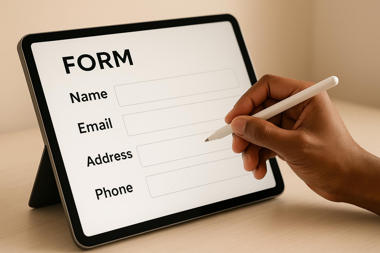
Filling out forms shouldn’t feel like solving a puzzle. Using plain language makes forms easier to understand, improves completion rates, and ensures accessibility for everyone - including non-native English speakers and individuals with cognitive disabilities.
Here’s how you can simplify your forms:
- Use clear, simple labels: Replace technical terms like "residential domicile" with "home address."
- Group related fields together: Keep similar fields (e.g., contact details) in one section.
- Simplify design: Remove unnecessary fields and use clear instructions directly in labels.
- Provide real-time feedback: Help users fix errors as they go with clear messages like "Enter your phone number in this format: (555) 123-4567."
- Ensure accessibility: Use features like ARIA labels, proper contrast, and logical keyboard navigation.
Plain language not only helps users complete forms faster but also reduces errors and improves accessibility. Start by reviewing your forms for complex language, rewriting unclear parts, and testing them with real users. The result? Forms that are easier to use and more effective at achieving your goals.
Creating and designing forms: Free NALA Plain English Webinar
Basic Rules for Plain Language in Forms
Designing forms with plain language is about more than just using simple words - it’s about creating an intuitive experience where every element works together. These principles will help you craft forms that users can complete with ease and confidence.
Write Clear and Simple Labels
Labels are the backbone of any form. They guide users on what to provide, and unclear labels can lead to hesitation, mistakes, or even abandonment.
Use words your audience already understands. Avoid jargon, technical terms, or abbreviations. For instance, replace "Telephonic Contact Information" with "Phone Number" or "Residential Domicile" with "Home Address."
"One of the most important principles of writing clear and concise labels is to use plain language that your users can easily understand." - LinkedIn
Be specific about what you’re asking for. A generic term like "Address" can confuse users - clarify it with "Shipping Address" or "Home Address" to reduce errors. Stick to simple nouns or noun phrases like "Name" instead of full sentences such as "What is your name?"
Avoid relying on placeholder text as labels. Placeholder text disappears once users start typing, making it harder to refer back for guidance. It can also pose challenges for screen readers, reducing accessibility.
Consistency is key. Place labels either above or to the left of input fields and stick with that placement throughout the form. This consistency helps users develop a natural rhythm while filling out the form.
Once your labels are clear, focus on grouping related fields logically.
Group Related Fields Together
Clustering similar fields together makes forms easier to navigate. When fields are scattered, users have to switch between different types of information, which slows them down and increases frustration.
Organize fields by topic or theme. For example:
- Group contact details (name, email, phone number) together.
- Keep address fields in one section.
- Separate payment information from personal details.
Take inspiration from Coinbase, which organizes forms logically: legal first and last names are grouped together, followed by birth date fields (month, day, year), and then address components (street, city, state, ZIP code). This structure helps users recall and input related information more efficiently.
Use clear section headings like "Contact Information", "Shipping Details," or "Payment Method" to set expectations for what users need to provide. Enhance these groupings visually by using white space, close spacing, or subtle design elements like light background colors or thin borders.
With fields organized, the next step is to simplify the overall design.
Simplify Form Design
A clean, straightforward design helps users focus on completing the form quickly and accurately. Simplification doesn’t mean stripping the form bare - it’s about removing anything unnecessary.
Evaluate every field. Ask yourself: Do you really need both a phone number and an email address? Can some information be collected later? Cutting non-essential fields reduces the chance of users abandoning the form.
Clearly mark required fields using a simple asterisk (*) or the word "Required". Avoid confusing symbols or color codes, and explain the marking system at the top of the form.
Only ask for what’s absolutely necessary. For instance, if you’re requesting a ZIP code, you might not need to ask for the city and state separately - these can often be auto-filled. If a user selects "United States" as their country, provide a dropdown for states instead of a long, scrolling list.
Make the form self-explanatory. Instead of lengthy instructions, include guidance directly in the labels. For example, use "Phone Number (555-123-4567)" to show the expected format.
For longer forms, consider breaking them into smaller steps or pages. A single form with 20 fields can feel overwhelming, but dividing it into four sections with five fields each makes the process more manageable. Users will feel a sense of progress as they complete each step.
Step-by-Step Guide to Using Plain Language in Forms
Follow these steps to turn your complex forms into user-friendly tools that anyone can complete with ease.
Review Existing Forms for Complex Language
Start by auditing your current forms. Look at them on different devices to get a fresh perspective, and identify areas where the language might confuse users.
- Spot jargon and technical terms: Replace words like "remuneration" with "salary", "domicile" with "address", or "telephonic contact" with "phone number." Avoid abbreviations that might leave users scratching their heads.
- Check instructions and help text: If a field requires a lengthy explanation, it’s a sign that the label or question needs to be simplified.
- Identify inconsistent terminology: Are you switching between "email" and "email address" or "phone" and "telephone"? These small inconsistencies can slow users down.
- Simplify formal language: Instead of "Please provide your full legal name as it appears on official documentation", try "Full Name" with a short note about matching ID if necessary.
- Clarify error messages: Replace vague messages like "Invalid input detected in field" with actionable guidance, such as "Enter your phone number in this format: (555) 123-4567."
Pay special attention to fields that users frequently skip or fill in incorrectly. Analytics showing high abandonment rates are a clear sign that those sections need clearer language.
Rewrite Labels, Instructions, and Error Messages
Once you’ve identified problem areas, focus on simplifying the language.
- Keep field labels simple and clear: Swap "Residential Address" for "Home Address", "Preferred Nomenclature" for "Name", and "Employment Status" for "Job Status." Stick to brief, everyday language.
- Use active voice for instructions: Instead of "The information provided herein will be utilized for processing purposes", say "We’ll use this information to process your request." Shorter sentences are easier to follow.
- Make error messages helpful: Replace generic errors like "Invalid format" with specific instructions, such as "Enter your date of birth as MM/DD/YYYY."
- Provide examples for formatting: Show users what you’re looking for. For dates, use "MM/DD/YYYY" or an example like "12/25/2024." For phone numbers, include the U.S. format: "(555) 123-4567."
- Write conversational help text: Use a friendly tone, like "We need your ZIP code to calculate shipping costs", rather than formal phrasing like "Postal code required for shipping calculation purposes."
- Tailor language for U.S. users: Use familiar terms like "ZIP code" instead of "postal code", "apartment" instead of "flat", and "cell phone" instead of "mobile telephone."
Keep sentences concise - if one runs over 20 words, find a way to break it up or simplify it.
Test Forms with Real Users
To confirm your changes work for everyone, test your forms with actual users. Their feedback is essential for creating forms that are easy to use.
- Start with informal testing: Ask colleagues, friends, or family members to complete the form while sharing their thoughts aloud. Pay attention to moments of hesitation or confusion.
- Include users with disabilities: Feedback from those using screen readers or with cognitive challenges can highlight areas where your language might still be unclear.
- Test across devices: What works on a desktop might not translate well to a mobile phone. Check that your simplified language is effective on all screen sizes.
Leverage tools like Reform’s analytics to track how users interact with your forms. Identify where users pause, abandon the form, or struggle with specific fields. A/B testing can also help you compare versions of your forms to see which changes lead to higher completion rates.
- Monitor metrics: Look for improvements in completion times, reduced abandonment rates, and fewer support requests about confusing forms.
- Gather qualitative feedback: Use surveys or short interviews to ask users about their experience. Questions like "Was anything unclear?" or "Did you understand what we were asking in each field?" provide valuable insights.
Reform also ensures your forms meet accessibility standards, making them usable for a diverse audience. Use the feedback you collect to refine your forms further, addressing issues you might not have noticed during the initial review. Testing with real users is the key to creating forms that truly work for everyone.
sbb-itb-5f36581
Meeting Accessibility and Compliance Requirements
Using plain language in forms not only improves the user experience but also ensures compliance with ADA and Section 508 standards. These guidelines help make forms clear, understandable, and compliant.
Use U.S. Formatting Standards
Standardized formatting ensures users can easily understand what’s expected, reducing confusion for people from diverse backgrounds.
Dates should follow the U.S. format: MM/DD/YYYY. Including examples like "12/25/1990" as placeholder text can clarify expectations.
Currency fields should use the dollar sign ($) and include commas for thousands. For instance, "$1,250.00" is a clear example. When asking for salary ranges, formats like "$50,000 - $75,000" make the input straightforward.
Phone numbers should follow the standard U.S. format, such as (555) 123-4567. Auto-formatting can help users enter numbers correctly, even if they type variations like "555.123.4567" or "5551234567", which can be automatically converted to the standard format.
Address fields should use terms familiar to U.S. users. For example, use "ZIP code" instead of "postal code", "apartment" instead of "flat", and "state" instead of "province." These small adjustments make forms feel intuitive for American users.
Add Real-Time Validation and Error Feedback
Real-time validation prevents errors as users fill out forms, reducing frustration and abandonment.
Password fields can benefit from live feedback. Display requirements like "8 characters, one uppercase letter, one number" clearly, and use green checkmarks to show progress as users meet each criterion.
Email validation should occur immediately after users finish typing. Instead of technical error codes, provide helpful messages like "Please enter a valid email address, e.g., name@example.com." Some forms even catch typos like "gmail.con" and suggest corrections, such as "Did you mean gmail.com?"
Required fields should be clearly marked with a red asterisk (*) and explained at the top of the form (e.g., "Fields marked with * are required"). If users skip required fields, provide specific messages like "Please enter your first name" instead of generic warnings.
Format-specific fields like Social Security numbers or credit card numbers should use masked input to guide users. For example, as users type "123456789", the field can display "123-45-6789." If there’s an error, show a clear message like "Enter your SSN as 123-45-6789."
Real-time feedback makes the form-filling process smoother and prevents common mistakes.
Add Accessibility Features
Beyond formatting and validation, accessibility features ensure forms are usable for everyone, including those with disabilities.
ARIA labels help screen readers provide context. For example, a date field might include an ARIA label that says "Birth date, format month day year", ensuring users understand the required input.
Keyboard navigation should follow a logical order. Users should be able to tab through fields in sequence, access dropdown menus with arrow keys, and submit the form by pressing Enter. For longer forms, include "skip links" at the top to let users jump to specific sections.
Focus indicators make navigation easier by showing users where they are in the form. Use a visible border or highlight (at least 2 pixels thick) with sufficient contrast against the background.
Alt text for icons ensures screen reader users can understand visual elements. For example, assign alt text like "Open date picker" to calendar icons. For decorative icons, use empty alt text (alt="") so screen readers ignore them.
Color contrast must meet WCAG AA standards. Text should have a contrast ratio of at least 4.5:1 for normal text and 3:1 for large text. Error messages in red should be paired with icons or bold text to ensure issues are clear without relying solely on color.
Reform’s built-in accessibility tools handle many of these features automatically, making it easier to create forms that are clear, compliant, and user-friendly for everyone.
How Reform Simplifies Plain Language Implementation
Creating plain language forms is a breeze with Reform. The platform seamlessly integrates plain language principles into the form-building process, making forms clearer and more accessible for everyone.
Easy Customization Without Code
Reform’s visual editor allows you to tweak every bit of text in your forms - no coding required. Whether it’s labels, placeholders, or error messages, you can adjust everything to align with plain language best practices.
The drag-and-drop interface makes testing different phrasing simple. For instance, if you want to change "Please provide your contact information" to "Your phone number", you can do it instantly and see the results in real-time. This quick feedback ensures you catch overly complex or unclear language before publishing your form.
You can also create custom thank-you pages to reinforce plain language. Instead of a generic "Thank you", you can craft messages like, "Thanks! We’ll call you within 24 hours to schedule your consultation", giving users clear next steps.
For organizations with strict branding or specific plain language needs, Reform’s headless forms feature is a game-changer. It lets you manage form logic in Reform while fully controlling how the text appears on your site.
On top of text customization, Reform enhances user experience with features like multi-step forms and conditional logic.
Simplifying Forms with Multi-Step and Conditional Logic
A clear structure is just as important as clear language. Long, overwhelming forms can discourage users, even if the text is straightforward. Reform’s multi-step forms break down complex forms into manageable sections, making the process feel less daunting.
Conditional logic takes this a step further by showing only the fields that are relevant to each user. For example, if someone selects "Individual" instead of "Business", only the necessary fields for individuals will appear. This approach eliminates unnecessary information and keeps instructions concise and user-focused.
To guide users through the process, Reform includes progress indicators with simple, descriptive labels. Instead of vague terms like "Step 3 of 7", you can use labels like "Contact Information" or "Project Details", so users know exactly what to expect.
Reform also reduces stress with its save drafts feature. Knowing they can return later to complete the form encourages users to take their time and carefully read through instructions, especially in more detailed sections.
Accessibility and User-Friendly Compliance
Reform ensures accessibility by incorporating ARIA labels that provide essential context for screen readers. The platform also supports keyboard navigation with a logical tab order and includes proper focus indicators that meet WCAG contrast standards.
The email validation system helps users by offering clear, plain-language error messages. With real-time validation, users get immediate feedback across all fields, making it easier to fix mistakes as they go.
When it comes to spam prevention, Reform keeps things simple. Instead of relying on frustrating CAPTCHAs, the platform filters out bot submissions in the background, maintaining a smooth and user-friendly experience.
For file uploads, Reform uses clear progress indicators and specific error messages. If a user tries to upload a file that’s too large, they’ll see a message like, "Please choose a file smaller than 10MB", instead of a confusing error code.
Finally, Reform’s analytics and tracking tools help pinpoint where users might struggle. By identifying fields with high abandonment rates, you can test different wording to make your forms even more user-friendly and easy to complete.
Conclusion: The Benefits of Plain Language in Forms
Simplifying the language in your forms isn’t just about clarity - it’s a smart business move that can directly influence your bottom line. When forms are easier to understand, users need less effort to complete them, which leads to better outcomes.
Here’s the proof: while the average form conversion rate is around 3%, businesses that adopt plain language principles often see major improvements. For instance, removing just one unnecessary field can boost conversions by 50%. Even more astonishing, tweaking a single word in a call-to-action button has increased qualified leads from homepages by a staggering 221%.
Why does this work? Plain language eliminates obstacles between users and their goals. Clear labels and instructions reduce confusion, while straightforward error messages encourage users to fix issues rather than give up. The result? A smoother experience that keeps users engaged.
Accessibility is another huge win. Writing in plain language doesn’t just meet compliance standards - it creates forms that are easier for everyone to use. From individuals with cognitive disabilities to busy commuters filling out forms on their phones, clear communication ensures your forms work for a wider audience. This inclusivity naturally broadens your reach and enhances user engagement.
To see the difference, track your form performance before and after making these changes. Use A/B testing to measure the impact of clearer labels, simplified instructions, and better error messages.
Platforms like Reform make it easy to apply these principles. With its no-code tools, you can instantly test different wording, use multi-step forms, and add conditional logic to present information in the most user-friendly way possible.
Take a moment to review your forms, make those plain language adjustments, and watch the results. Your users - and your conversion rates - will be better off for it.
FAQs
How does using plain language make forms more accessible for people with disabilities?
Using simple, clear language makes forms much easier for people to understand and use - especially those with cognitive, intellectual, or reading challenges. When the wording is straightforward, users are less likely to feel confused and more likely to complete forms on their own with confidence.
This practice promotes inclusivity by ensuring that forms are accessible to everyone, regardless of their abilities. Focusing on clarity and simplicity doesn't just help some users - it improves the experience for everyone.
What mistakes should I avoid when creating forms with plain language?
When creating forms with plain language, steer clear of unclear labels or technical jargon that might leave users scratching their heads. Stick to asking only for the information you truly need - long, drawn-out forms can often scare people away before they even start. And don’t forget: design for mobile. Forms should work just as smoothly on a phone as they do on a desktop.
Other mistakes to watch out for? A cluttered visual layout can make forms feel overwhelming, while missing or vague labels can lead to errors and frustration. Keep things simple, clear, and accessible to ensure users have a seamless experience from start to finish.
How does plain language in forms improve user engagement and conversions?
Using clear and simple language in forms makes them easier for people to understand and complete. When forms are straightforward, users are less likely to feel confused or overwhelmed, which encourages them to finish the process without giving up.
This approach also makes forms more accessible, allowing a broader range of people to engage with them. The result? Fewer mistakes, lower drop-off rates, and a smoother experience overall - all of which can directly boost conversion rates.
Related Blog Posts
Get new content delivered straight to your inbox

The Response
Updates on the Reform platform, insights on optimizing conversion rates, and tips to craft forms that convert.


Drive real results with form optimizations
Tested across hundreds of experiments, our strategies deliver a 215% lift in qualified leads for B2B and SaaS companies.
