
.webp)
Top Metrics to Visualize in Marketing Automation


Marketing automation generates vast data daily - email opens, click-throughs, conversions, and more. But raw numbers alone don’t guide decisions. Visual dashboards simplify this chaos, offering clarity and actionable insights. Companies using automation tools report an average return of $5.44 for every $1 spent within three years. Yet, 54% of marketers struggle to agree on the right metrics to track. This guide highlights the key metrics to visualize for better campaign performance and ROI:
- Conversion Rate: Tracks actions like purchases or form submissions. Funnel charts help identify drop-off points.
- Lead Volume & Pipeline: Evaluates lead quality and progression through the sales funnel.
- Open & Click-Through Rates: Measures email engagement and identifies content improvements.
- Revenue by Channel: Shows which marketing channels drive the most income.
- Engagement Metrics: Assesses audience interaction with content to refine strategies.
- ROI & ROAS: Links campaigns to profitability and ad spend efficiency.
- Lead Source Attribution: Identifies which channels bring the most valuable leads.
- Customer Journey Metrics: Tracks user behavior through automation workflows.
- Abandoned Submission Rate: Highlights form drop-offs to improve completion rates.
Visualizing these metrics ensures your team focuses on what drives growth, minimizes wasted effort, and connects marketing actions to tangible outcomes.
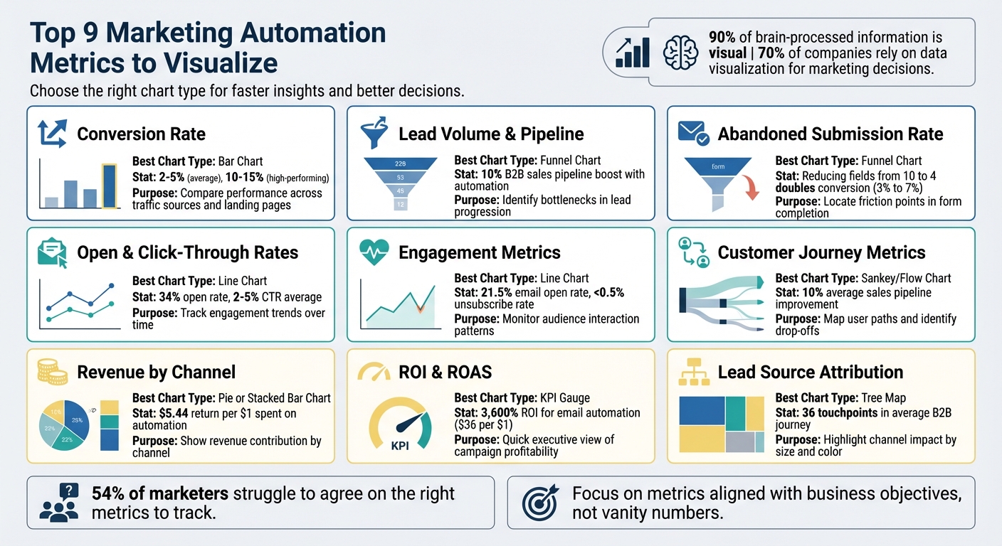
9 Essential Marketing Automation Metrics and Best Visualization Methods
Google Looker Studio tutorial (2025): automate your marketing dashboards

1. Conversion Rate
The conversion rate measures the percentage of people who take a desired action - whether that's filling out a form, subscribing to a newsletter, or making a purchase - compared to the total number of visitors who had the opportunity to do so. The formula? (Conversions / Total Visitors) x 100. While most industries see "good" conversion rates between 2% and 5%, some high-performing landing pages, especially in sectors like SaaS and finance, can achieve rates as high as 10% to 15%.
Relevance to Campaign Performance
Conversion rate is a standout metric because it ties automated workflows to tangible business results. Unlike vanity metrics, it focuses on actions that truly matter. As Insightly aptly states:
"Engagement is an important first step, but conversion is the true goal of any campaign."
This metric helps assess whether your automated workflows are effectively targeting the right audience and guiding them through the sales funnel. With the average landing page conversion rate hovering around 4.3%, comparing your results to this benchmark can reveal whether your messaging is hitting the mark.
Actionable Insights
Visualizing conversion rates through tools like funnel charts can pinpoint where potential customers drop off in your automated sequences. Tracking micro-conversions - like "add to cart" clicks or partial form completions - can help identify and fix bottlenecks before they impact your bottom line. For instance, if your email open rate is 34% but click-throughs are stuck at 3%, it might be time to refine your call-to-action. Even small adjustments, such as reducing the number of form fields from 10 to 4, can dramatically increase completion rates.
Impact on ROI
Higher conversion rates have a direct, positive impact on your ROI. By converting more visitors into customers, you lower your Customer Acquisition Cost (CAC) without needing to boost traffic. As Mailchimp explains:
"A higher conversion rate means spending less on your marketing efforts while earning more customers."
Given that marketing automation already delivers an average return of $5.44 for every $1 spent, improving your conversion rate amplifies those gains. Tools like Reform can be especially helpful here, offering real-time analytics and A/B testing to optimize form completion rates and test configurations that drive better results.
2. Lead Volume and Pipeline
When it comes to measuring campaign success, it's not just about conversion rates. Lead volume and pipeline metrics offer a broader perspective, helping you evaluate not only the number of leads but also how effectively they’re converting. It’s more than just counting contacts - it’s about assessing whether your automated campaigns are pulling in the right audience and preparing them to engage with your sales team. These metrics work hand-in-hand with conversion data to give you a clearer picture of how prospects are moving through your pipeline.
Relevance to Campaign Performance
A rise in Marketing Qualified Leads (MQLs) is a strong indicator that your campaigns are hitting the mark with your target audience. In fact, 80% of marketers have reported an increase in leads, with B2B automation boosting sales pipelines by around 10%. As BDO Digital explains:
"If the lead scoring framework in your MA system is doing what it's supposed to be doing, then the leads you send over to sales will be good ones."
This highlights the importance of a well-tuned lead scoring system to ensure sales teams receive high-quality prospects.
Actionability of Insights
Funnel charts can be especially useful in identifying bottlenecks in your pipeline. For example, if you’re seeing a high volume of MQLs but a low number of Sales Qualified Leads (SQLs), it’s a sign that your lead scoring system may need adjustment, or that marketing and sales teams need better alignment. Additionally, tracking the length of your sales cycle can help pinpoint delays in your pipeline. As Keen points out:
"Tracking how automation touchpoints influence pipeline activity - like demos booked or deals created - gives you visibility into its role in early- and mid-funnel momentum."
This kind of tracking ensures you’re not just generating leads but also keeping them engaged throughout their journey.
Impact on ROI Optimization
Pipeline insights play a critical role in improving your Return on Investment (ROI). By streamlining lead flow, you can reduce Customer Acquisition Costs (CAC) and speed up the progression of leads through your pipeline. Measuring metrics like "Pipeline Influenced by Automation" allows you to showcase the financial impact of your campaigns beyond surface-level engagement.
Marketing automation, on average, delivers a return of $5.44 for every $1 spent. Optimizing your pipeline amplifies these returns. Tools like Reform can further enhance your efforts by capturing high-quality leads through optimized forms with real-time analytics. This ensures that the leads entering your pipeline are well-qualified, tying insights from conversion and pipeline data directly to actionable outcomes.
3. Open and Click-Through Rates
Open rates tell you how well your subject lines and send timing are working, while click-through rates (CTR) measure how engaged your audience is with the content inside your email. Think of open rates as the initial handshake, and CTR as the moment your recipient decides to take action.
Relevance to Campaign Performance
These metrics are key indicators of how your email campaigns are performing. On average, open rates across industries hover around 34%, while CTR typically lands between 2% and 5%. If your open rate is high but your CTR is low, your subject line is doing its job, but the content or call-to-action (CTA) might need work. On the other hand, low open rates could point to issues with your subject lines, timing, or even how well your audience is segmented. As Team Braze puts it:
"Open rate: A basic signal of subject line strength and timing"
However, changes like Apple’s Mail Privacy Protection have made open rates less reliable. This shift has led marketers to focus more on CTR and conversion rates to better gauge engagement. These insights help refine both subject lines and the content that follows.
Actionability of Insights
If your open rates are below average, try experimenting with shorter subject lines - under 40 characters tends to work best for mobile devices. A/B testing your subject lines can also lead to a 10% improvement in open rates.
For low CTR, focus on testing your CTAs and content. Clear, action-oriented CTAs like "Download Now" or "Book Your Spot" often perform better than vague language. Adding visuals can also make a big difference, potentially increasing CTR by up to 300%. Additionally, tweaking the placement, color, and wording of your CTAs through A/B testing can significantly improve your conversion rates.
Impact on ROI Optimization
Metrics like open and click-through rates directly affect your email marketing ROI. With an average ROI of 36:1, email campaigns can be highly profitable - but only if your audience finds your content engaging. High engagement rates also signal to email providers that your messages are relevant, which helps maintain your sender reputation and ensures better delivery rates.
If your unsubscribe rate exceeds 1%, it may be a sign of issues with targeting or email frequency. For businesses that rely on lead capture forms, tools like Reform can improve lead quality by integrating real-time analytics and enrichment features into your email sequences. This ensures that every automated email touchpoint is as impactful as possible. Next, we’ll explore how these metrics compare to other visualization techniques.
4. Revenue by Channel
"Revenue by channel" focuses on the income generated by different marketing channels - like email, paid ads, organic search, social media, or referrals. Unlike metrics such as clicks or impressions, this approach zeroes in on actual business outcomes. It’s a practical way to determine which campaigns are worth scaling.
Relevance to Campaign Performance
Tracking revenue by channel helps answer a key question: which campaigns are driving real results? As marketing expert Jen Ribble explains:
"The ultimate measure of campaign performance is the amount of revenue generated."
Data backs this up. Companies using marketing automation report an average return of $5.44 for every $1 spent within three years. In 2024, aligning cross-channel data led to a 15% increase in marketing investments and a 4% boost in ROI. Notably, 89% of top marketers now rely on metrics like gross revenue to evaluate success instead of focusing solely on activity-based metrics. Breaking down revenue by channel provides clarity on where to allocate budgets for the best results - and where to cut back on underperforming strategies.
Actionability of Insights
When a channel generates strong revenue, it’s a clear signal to shift more resources in that direction. As the IMPACT Team emphasizes:
"Marketing-attributed revenue is the most direct way to demonstrate your impact on business growth."
To fully understand each channel’s contribution, integrating your CRM with marketing automation tools is crucial. This allows you to trace revenue from closed deals back to the originating channel. Multi-touch attribution further uncovers how different touchpoints - like a social media ad followed by an email - work together to drive conversions. For businesses collecting leads through forms, tools like Reform offer real-time analytics and lead enrichment, ensuring every channel's role is accurately tracked. These insights don’t just complement other metrics like conversion rates and lead volume - they connect marketing efforts directly to revenue.
Impact on ROI Optimization
Calculating ROI for each channel using the formula (Revenue - Cost) / Cost provides a clear picture of which campaigns are profitable and which aren’t. For example, if a single nurture sequence is delivering exceptional results, that’s a strategy worth scaling. With 40% of marketers under pressure to show revenue growth, having detailed channel insights is essential for proving the value of marketing efforts and making smarter budget decisions.
5. Engagement Metrics
Engagement metrics, while not directly tied to revenue, play a crucial role in shaping strategies and identifying potential issues before they escalate. They provide valuable insights into how your audience interacts with your content, offering early warning signs that can help fine-tune your approach.
Relevance to Campaign Performance
Engagement is the backbone of any successful marketing campaign. Without it, metrics like conversion rates and ROI remain stagnant. As Keen aptly states:
"Engagement metrics are key to measuring marketing automation success because, without engagement, no downstream metrics like conversion or ROI can improve."
For example, if your email open rate falls below the industry benchmark of 21.5% or if your unsubscribe rate climbs above 0.5%, it’s a clear signal that your message isn’t resonating. Similarly, a bounce rate exceeding 60% suggests a disconnect between your ad’s promise and the landing page experience, while an average website visit time of just 53 seconds highlights the need to immediately capture and hold your audience’s attention. Just like conversion metrics, engagement data serves as a foundation for diagnosing and addressing issues early in the campaign lifecycle.
Actionability of Insights
Engagement metrics aren’t just numbers - they’re actionable insights. Low email open rates, for instance, call for A/B testing of subject lines and send times. If your click-through rate (CTR) dips below the 2–5% range, consider using more compelling calls to action, such as “Reserve your seat now”. When unsubscribe rates exceed 1%, it’s time to audit your email list and refine your segmentation strategy. These adjustments can prevent engagement issues from snowballing into larger conversion problems. For businesses capturing leads through forms, tools like Reform provide real-time analytics to track user engagement and identify drop-off points, enabling quick optimizations to boost conversions.
Ease of Visualization
Real-time visualization of engagement metrics is essential for making timely adjustments. Tools like Google Data Studio and Tableau aggregate multi-channel data into cohesive dashboards, allowing you to monitor trends as they happen. In today’s fast-paced environment, outdated data is practically useless - your insights need to keep up with your audience. Trend lines can reveal fluctuations in open rates over time, while heatmaps highlight where users are scrolling and clicking on your landing pages. These visualizations make it easier to spot issues and pivot your strategy when performance dips.
Impact on ROI Optimization
While engagement metrics don’t directly measure revenue, they lay the groundwork for conversions. By analyzing which content drives the most clicks and keeps users engaged, you can allocate your budget more effectively toward high-performing strategies. For instance, automated email campaigns boast 84% higher open rates and 31% higher click-through rates compared to non-automated ones. Leveraging engagement data to refine your approach can help you achieve the impressive $5.44 return on every $1 spent that marketing automation typically delivers.
sbb-itb-5f36581
6. ROI and ROAS
Relevance to Campaign Performance
ROI (Return on Investment) and ROAS (Return on Ad Spend) are essential for understanding if your marketing automation efforts are actually paying off. ROI takes a broader view, measuring the overall profitability of your automation platform, factoring in costs like software, implementation, and team salaries. ROAS, on the other hand, focuses specifically on the revenue generated by individual advertising campaigns. For example, email marketing automation typically delivers an average return of $36 for every $1 spent, equating to an impressive 3,600% ROI. These numbers provide clear evidence to justify investing in marketing technology. The next step? Use these metrics to fine-tune your campaigns for even better results.
Actionability of Insights
Visualizing ROI and ROAS isn’t just about crunching numbers - it’s about identifying which campaigns deserve more resources and which need a strategic overhaul. Tools like revenue-based heatmaps can link user actions to sales, highlighting high-performing elements like buttons and links. A great example comes from Obvi, a health supplement company, which discovered in 2025 that its main call-to-action button was buried below the average mobile fold. By simply repositioning the CTA higher and moving the disclaimer, Obvi saw a 4.69% boost in conversion rates, adding $2.5 million in revenue in just one month. For businesses using lead forms, platforms like Reform offer real-time analytics to show which form fields drive valuable conversions. These insights enable quick optimizations that directly enhance your bottom line.
Ease of Visualization
ROI is a straightforward metric, making it perfect for executive dashboards and investor updates. However, calculating it accurately requires considering indirect costs like agency fees, creative production, and time spent managing teams - not just direct media expenses. Multi-touch attribution models help distribute credit across the entire customer journey, offering a more balanced view of what drives revenue. Real-time dashboards make it easier to act fast when issues arise, such as unexpected drops in conversion rates or spikes in acquisition costs. For instance, the Cooking Guild, a kitchenware brand, used revenue-focused optimization to analyze its collections pages. They discovered their most expensive products weren’t the most profitable when featured prominently. By reorganizing their product display strategy, they achieved a 48% increase in revenue per session and a 40x ROI within 30 days.
Impact on ROI Optimization
Tracking ROI consistently allows you to identify when workflows need a refresh. As MarTech Do explains:
"The real value of marketing automation isn't just speed; it's the creation of smarter, scalable processes. Optimized operations free your team for high-impact work that delivers compounding returns." – MarTech Do
AI-powered tools can enhance ROI by 10–20% while cutting human error by around 20%. By combining ROI with other metrics like lead source attribution and customer journey analytics, you can pinpoint which touchpoints are worth further investment and which are draining resources without delivering results. This approach ensures every dollar is working as hard as it can for your business.
7. Lead Source Attribution
Relevance to Campaign Performance
Lead source attribution is all about identifying which channels - like social media, email campaigns, paid ads, organic search, or even offline events - are driving leads and sales. On average, B2B customers interact with 36 touchpoints before making a decision. Without proper attribution, you're left guessing. For instance, you might think organic search is driving conversions, while the real credit belongs to a prior paid brand-awareness campaign. Understanding the entire customer journey ensures you don’t mistakenly cut effective campaigns or pour resources into underperforming ones. It’s this clear view of the journey that lays the foundation for actionable insights.
Actionability of Insights
Attribution insights aren’t just for show - they guide smarter decisions. Different attribution models, like linear, time decay, or multi-touch, assign credit to various customer interactions in unique ways. Multi-touch attribution takes it a step further by analyzing specific campaigns and messaging sequences rather than just broad channels. Interestingly, 75% of marketers rely on multi-channel attribution. Tools like UTM parameters and tracking pixels create a detailed map of customer interactions across digital platforms. For businesses using lead forms, platforms such as Reform offer real-time analytics, showing which form fields and sources lead to the most valuable conversions. This allows for quick, data-driven adjustments to improve performance.
Ease of Visualization
Modern dashboards simplify attribution by consolidating data from multiple platforms into a single, easy-to-read view. Funnel-based visualizations are particularly helpful, as they trace the journey from ad impressions all the way to qualified leads in your CRM. By integrating data from tools like Google Ads, Facebook, and email marketing platforms into one system, you can avoid missing key interactions. Real-time dashboards also allow you to spot opportunities or fix broken workflows immediately. However, one ongoing challenge is getting a complete breakdown of costs.
Impact on ROI Optimization
Accurate attribution is a game-changer for connecting marketing efforts to revenue. Companies using marketing automation report an average return of $5.44 for every $1 spent within the first three years, often seeing payback in under six months. Attribution tracking links every marketing activity to revenue, helping you focus budgets on the most efficient channels. For offline events, tracking the "halo effect" by accounting for costs and conversions over an extended period is essential. Extending lookback windows to at least 90 days - rather than the typical 30 days - is particularly important for strategies like SEO or content marketing. By tying marketing efforts directly to closed deals, you not only optimize budgets but also prove marketing’s value to executives and stakeholders.
8. Customer Journey Metrics
Relevance to Campaign Performance
Customer journey metrics help pinpoint exactly where users drop off in automated workflows, making it easier to identify weak points in the process. For example, tracking the journey completion rate - the percentage of users who finish an entire automated sequence - can reveal whether your automation strategy is working as intended. Diving deeper, analyzing step-by-step performance metrics like opens, clicks, and exits for each message lets you zero in on specific touchpoints that need improvement. This is especially important when you consider that 54% of marketers say agreeing on the right metrics to track is one of their biggest challenges in marketing automation. This granular level of insight complements earlier metrics by highlighting precise moments where optimization can make the biggest difference.
Actionability of Insights
These metrics aren’t just for observation - they’re meant to drive immediate action. If a funnel visualization shows a significant drop-off at a specific step, you can test changes like tweaking the subject line, adjusting the call-to-action (CTA), or shifting the timing of your messages. Time-to-conversion data can shed light on delays in user behavior, helping you fine-tune your nurture sequences. Similarly, monitoring the progression from marketing-qualified leads (MQLs) to sales-qualified leads (SQLs) can uncover whether leads are stalling due to quality issues or a disconnect between sales and marketing teams. For businesses that rely on forms as entry points, tools like Reform offer analytics to show which form fields or submission sources drive the highest completion rates, enabling quick and precise improvements.
Ease of Visualization
Modern dashboards make it simple to visualize journey metrics using tools like funnel charts and Sankey diagrams, which clearly highlight where users drop off at each stage. These visualizations allow marketers to create custom dashboards without needing to write any code. Real-time tracking adds another layer of responsiveness, letting you immediately address sudden spikes in mid-journey exits. Additionally, interactive "Liveboards" offer the ability to drill down into specific workflow steps as soon as performance starts to dip, giving you the flexibility to act quickly.
Impact on ROI Optimization
Journey metrics don’t just provide insights - they directly connect user behavior to ROI improvements. For instance, visualizing which content - whether it’s blogs, videos, or downloadable resources - leads engage with before making a purchase can help justify your investment in high-performing assets while phasing out those that underperform. These insights have helped B2B marketers boost their sales pipeline rates by an average of 10%. By tracking the length of your sales cycle alongside journey metrics, you can also identify where leads are getting stuck and make adjustments to shorten the path to purchase. This approach shifts the focus from simply tracking activities to driving measurable outcomes that contribute to real business growth.
9. Abandoned Submission Rate
Relevance to Campaign Performance
The abandoned submission rate measures the percentage of users who begin filling out a form but don’t complete it. It’s a key indicator of why high traffic or solid click-through rates might not translate into actual leads. Unlike bounce rate, which tracks users leaving after viewing just one page, this metric zeroes in on those who engage with your form but stop short of submitting it. By identifying where users drop off, you can focus on refining your form to improve conversions.
Actionability of Insights
Tracking abandonment rates helps you pinpoint problem areas within your form. For instance, if users frequently abandon the form at a specific field, you can test changes like removing, rephrasing, or making that field optional. A high abandonment rate might also suggest a disconnect between the form and the expectations set by your call-to-action. Real-time dashboards are especially useful for spotting sudden spikes in abandonment, which could indicate technical issues like slow loading times or broken submission buttons. Additionally, analyzing abandonment rates by traffic source - such as comparing email-driven visitors to paid ad traffic - can highlight which channels are attracting less engaged users [5, 15, 25, 43].
Ease of Visualization
Funnel charts are a great way to map out the form completion process, showing the steps from "Form Viewed" to "Form Started" to "Form Submitted". Many modern tools now offer journey-level tracking, eliminating the need for manual data exports. For example, platforms like Reform provide real-time analytics and abandoned submission tracking, making it easier to identify and address drop-off points. By visualizing these trends, businesses can enhance the user experience and maximize their return on investment.
Impact on ROI Optimization
Lowering the abandoned submission rate can significantly improve ROI by converting more leads from your existing traffic without increasing ad spend [6, 19]. For example, reducing the number of form fields from 10 to just 4 can more than double conversion rates, boosting them from around 3% to nearly 7%. This not only reduces the cost of acquiring new customers but also improves your return on ad spend (ROAS), making your campaigns more efficient and effective.
Metric Visualization Comparison
Choosing the right chart type can make problem detection and decision-making much faster. Studies suggest that 90% of the information our brain processes is visual, and 70% of companies see data visualization as essential for marketing decisions.
Different metrics call for specific visualizations. For instance, bar charts work well for comparing conversion rates across traffic sources or landing pages. Funnel charts are perfect for illustrating lead volume and pipeline data, as they clearly show where prospects drop off at stages like Contacts → Prospects → Customers. When it comes to tracking engagement trends over time, line charts are your go-to, as they highlight spikes or dips that might follow changes in your automation workflows.
| Metric | Best Chart Type | Purpose |
|---|---|---|
| Conversion Rate | Bar Chart | Compares performance across traffic sources, landing pages, or audience segments. |
| Lead Volume & Pipeline | Funnel Chart | Highlights lead movement through stages and identifies bottlenecks. |
| Open & Click-Through Rates | Line Chart | Tracks engagement trends over time, revealing spikes or dips after workflow changes. |
| Revenue by Channel | Pie or Stacked Bar Chart | Shows how much revenue each channel (Email, SMS, Ads) contributes. |
| ROI and ROAS | KPI Gauge or Plain Text | Provides a quick, high-level view of campaign performance for executives. |
| Lead Source Attribution | Tree Map | Uses color and size to highlight the impact of different channels. |
| Customer Journey Metrics | Flow or Sankey Chart | Maps user paths through workflows to identify drop-offs or strong-performing routes. |
| Abandoned Submission Rate | Funnel Chart | Breaks down stages like Form Viewed → Form Started → Form Submitted to locate friction points. |
This guide connects metrics to their ideal chart types, helping you pick the best visualization for your goals. For example, tree maps are great for analyzing categorical splits like lead sources, line charts excel at showing growth trends, and funnel charts simplify process metrics like conversions. Tools like Reform make this even easier by offering real-time analytics with built-in visualization features, saving you from the hassle of manual data wrangling.
Conclusion
Turning your marketing automation metrics into visualizations transforms complex data into clear, actionable insights. It connects everyday tasks to broader goals, such as boosting revenue and building customer loyalty. With 90% of information processed by the brain being visual and 70% of businesses relying on data visualization for marketing decisions, the importance of visual tools becomes undeniable. These insights help tie daily efforts to overarching outcomes.
Effective visualizations bring all your data - CRM, email, and analytics - into a single, cohesive dashboard. This not only reduces reporting time and errors but also ensures your team has a reliable source of truth. Even better, real-time visualizations allow for quicker, more informed decisions.
"KPIs create accountability. They connect activity (what you're doing) to performance (what it's achieving)." - Natalia Misiukiewicz, Content Writer, Text®
This highlights how visualizing data isn’t just about understanding performance - it’s about driving accountability and enabling strategic pivots when needed.
To get the most out of your efforts, focus on metrics that align with your business objectives rather than being distracted by vanity numbers. For operational efficiency, visualize metrics like Customer Acquisition Cost (CAC). For growth, track Customer Lifetime Value (CLTV). Businesses that invest in marketing automation often see meaningful returns over time. Tools like Reform make this process easier, offering real-time analytics and lead tracking features. These tools ensure your visualizations are accurate, helping you make faster, smarter decisions that elevate campaign performance.
FAQs
How does visualizing conversion rates help improve marketing ROI?
Understanding conversion rates visually offers a straightforward way to gauge how effectively your campaigns, channels, and funnel stages are transforming prospects into paying customers. It helps pinpoint the exact moments where potential customers disengage, giving you the chance to fine-tune those weak spots and allocate your budget to strategies that yield the strongest outcomes.
By leaning on this kind of data-focused strategy, you can ensure your resources are directed toward what truly works, boosting your marketing ROI and improving overall campaign performance.
What are the key metrics to measure the success of an email campaign?
The effectiveness of an email campaign boils down to three critical areas: delivery, engagement, and conversion.
- Delivery metrics include the delivery rate and bounce rate. These help determine whether your emails are making it to recipients' inboxes. A high bounce rate could signal problems with your email list, like outdated or invalid addresses.
- Engagement metrics focus on how your audience responds to your content. The open rate reflects how compelling your subject lines are, while the click-through rate (CTR) reveals which calls-to-action are driving user interaction.
- Conversion metrics measure the direct impact of your campaign on business goals. Metrics like conversion rate show how many clicks lead to actions such as purchases or sign-ups. Revenue per email connects your campaign's performance to actual financial outcomes, while unsubscribe rates can indicate whether your content aligns with audience expectations.
By keeping an eye on all these metrics, you’ll uncover patterns and opportunities to fine-tune your campaigns for better results.
Why is understanding lead source attribution important for improving marketing strategies?
Lead source attribution plays a crucial role in understanding which channels bring in the most valuable leads. By pinpointing where your leads originate, you can make smarter decisions about how to allocate your marketing budget. This means investing more in channels that deliver results and cutting back on those that don’t perform as well.
This knowledge doesn’t just make your campaigns more efficient - it ensures your efforts are focused where they’ll have the greatest impact. It’s an essential part of fine-tuning your strategy and getting the best possible return on your investment (ROI).
Related Blog Posts
Get new content delivered straight to your inbox

The Response
Updates on the Reform platform, insights on optimizing conversion rates, and tips to craft forms that convert.


Drive real results with form optimizations
Tested across hundreds of experiments, our strategies deliver a 215% lift in qualified leads for B2B and SaaS companies.
