
.webp)
Multi-Step Form Drop-Off Rates: How to Reduce Them


67% of users abandon forms before completing them. That’s a huge loss, but it doesn’t have to be. Multi-step forms - when designed well - can increase conversions by up to 300%. The key is reducing friction, improving clarity, and guiding users through the process step-by-step. Here’s how you can make it happen:
- Simplify your forms: Reduce unnecessary fields and start with easy questions.
- Use progress indicators: Show users how far along they are to keep them motivated.
- Add conditional logic: Only ask relevant questions based on user inputs.
- Leverage analytics: Identify where users drop off and fix those problem areas.
- Test and refine: Use A/B testing to find what works best for your audience.
For example, companies like Venture Harbour have seen conversion rates jump by 743% using multi-step forms. With the right strategies, you can turn drop-offs into completed submissions and improve your bottom line.
Multi Step Form UX: Best Practices In Multi Step Form Design To 2x Your Leads
Finding Drop-Off Points in Multi-Step Forms
To fix drop-off issues in your forms, you first need to figure out exactly where users are getting stuck. Modern analytics tools can help you identify these problem areas.
Using Analytics to Find Drop-Off Trends
Analytics tools provide a window into user behavior, offering data that highlights where users abandon your form. Start by tracking step completion rates. For example, if 100 users begin your form but only 60 make it past step two, you've pinpointed a critical area that needs improvement.
Button click analysis is another helpful tool. If users frequently toggle between "next" and "previous" buttons, it likely signals confusion and a need for clearer instructions.
Funnel analysis is great for visualizing the entire user journey. It shows exit points, errors, and even how long users spend on each step. For instance, if users linger on one field for 20 seconds while others take just 3.5 seconds, that field might need simplification.
Metrics like hesitation time and refill rates also shed light on user struggles. If users repeatedly delete and re-enter information in a field, it could mean the instructions or requirements aren't clear enough.
Heatmaps and session recordings provide visual insights into where users pause or get confused. These tools can highlight specific areas that need attention.
A great example comes from Qualicorp, which used VWO Form Analysis and Testing in 2025 to improve its lead generation forms. They removed duplicate fields, clarified labels, and marked mandatory fields, resulting in a 24.68% increase in form sign-ups and a 16.93% boost in page visits.
By diving into these analytics insights, you can uncover the "why" behind user drop-offs and start addressing the root causes.
Common Reasons for Form Abandonment
Once you've identified where users are abandoning the form, the next step is to understand why. Patterns in user behavior often reveal common obstacles that can be addressed systematically.
One major issue is form complexity. Around 27% of users abandon forms because they are too long or complicated. Forms with too many fields or a cluttered layout can be overwhelming - especially on mobile devices, where navigation is more challenging.
Trust concerns also play a role. Users may hesitate to share personal information if they're unsure why it's being requested. For example, requiring users to register can lead to up to 24% of checkout abandonments.
Unclear instructions and vague field labels are another common problem. When users aren’t sure what’s expected, they often spend too much time trying to figure it out - or simply give up.
Technical issues like broken forms, slow load times, or compatibility problems can derail the user experience instantly. These issues often go unnoticed unless the form is thoroughly tested across different platforms.
Some fields, like those asking for sensitive information (e.g., income details), can feel intrusive and create psychological barriers. Similarly, external disruptions, such as unexpected pop-ups or links to third-party sites, can break the user's flow and lead to abandonment.
To address these challenges effectively, segmented analysis is crucial. Different audience groups and traffic sources may face unique issues. By examining your data through these lenses, you can create targeted solutions for each user segment.
Proven Strategies to Reduce Drop-Off Rates
Boosting completion rates often comes down to smart, user-focused strategies. Let’s dive into actionable ways to reduce drop-offs, starting with simplifying forms.
Simplifying Forms and Reducing User Friction
Reducing drop-offs starts with making forms as user-friendly as possible. The less friction users encounter, the more likely they are to complete the process.
Start with the right number of fields. Research indicates that forms with 2-5 fields typically perform better than single-field forms. A good starting point is 5-6 fields, and you can test adding more as needed. For example, Norwegian ecommerce company BliVakker tested three versions of their form: a control with 17 fields, a "Skjema-Light" version with three fewer fields, and a "Skjema-Uberlight" version with even fewer. The "Skjema-Light" version increased conversions by nearly 11%.
Focus on the essentials. Stick to the information you absolutely need. One HVAC client saw a 41% increase in completed bookings - and an extra $9,300 in monthly revenue - just by reducing form fields to name, phone number, and time slots.
Design fields for clarity. Replace placeholder text with clear, visible labels outside the fields. Add helpful hints where needed and mark required fields clearly. For optional fields, explicitly label them as "optional" to avoid any confusion.
Provide real-time feedback. Inline validation helps users catch and fix mistakes as they go, reducing frustration and preventing failed submissions.
Structure questions strategically. Begin with simple, low-effort questions to ease users into the process. Save more complex or sensitive queries for later, once users are more invested.
Darryl Stevens highlights the importance of presentation:
"Friction isn't just about how many fields you have; it's about how they're presented. When you create an experience that adapts in real time and removes irrelevant steps, users move faster and with less resistance. And in digital environments where attention is fragile, that small difference can be the deciding factor between drop-off and conversion."
Using Progress Indicators to Guide Users
Simplifying forms is only part of the equation. Visual guidance, like progress indicators, plays a big role in keeping users engaged.
Clearly show progress. Progress bars or step indicators give users a sense of how far along they are in the process. This visual feedback provides a feeling of accomplishment, motivating users to keep going.
Ease uncertainty and anxiety. Progress indicators reassure users by showing how much more is required. This eliminates the fear of endless questions and helps users mentally prepare for what's ahead.
Design for all devices. Whether users are on a desktop, tablet, or smartphone, ensure your progress bar looks clean and functions well. It should be easy to understand, no matter the screen size.
Allow users to go back. Let users navigate to previous steps to review or edit their information. This flexibility reduces anxiety about making mistakes and gives users more control.
The benefits of progress indicators are hard to ignore. HubSpot found that multi-step forms achieve 86% higher conversion rates than single-step forms. In some cases, multi-step forms have driven 300% more conversions compared to traditional forms. Additionally, marketers using multi-step forms report a 17% increase in satisfaction with their lead generation efforts.
Taige Zhang underscores their value:
"If I had to pick out the most effective tool for onboarding a user, it would be the progress bar."
Dr. Hugo Liu explains the psychological boost:
"It turns out that when you finish a complex task, your brain releases massive quantities of endorphins."
Adding Conditional Logic for Personalization
Once you’ve streamlined the basics and guided users effectively, adding personalization through conditional logic can take your forms to the next level.
Ask only relevant questions. Conditional logic tailors the form to each user by showing fields based on their previous answers. This ensures every question feels relevant, reducing the risk of abandonment.
Make forms feel shorter. By only displaying applicable questions, the form appears less daunting. This is especially important since 81% of users have abandoned a form mid-way, and the average form abandonment rate hovers around 68%.
Optimize for mobile users. Mobile users have limited screen space and shorter attention spans. Conditional logic, combined with fewer fields, creates a smoother experience that’s easier to complete on smaller devices.
Prevent errors with smart formatting. Use input masks for fields like phone numbers or passwords to minimize errors. Combined with conditional logic, these features make the form more intuitive.
Test across all devices. Ensure your conditional logic works seamlessly on mobile, tablet, and desktop devices. The experience should remain smooth regardless of how users interact with your form.
Ravi Klaassens captures the essence of this approach:
"Sometimes reducing friction isn't about cutting steps; it's about respecting the user's rhythm. Meet them where they are, then move with them, not ahead of them."
Vaibhav Kishnani adds:
"Ask only what you need when you need it, and guide the user through the process instead of overwhelming them upfront."
sbb-itb-5f36581
Ongoing Optimization Through A/B Testing and Analytics
Reducing drop-off rates isn’t a one-and-done task - it’s an ongoing effort. By digging into performance data and running controlled experiments, you can uncover ways to consistently improve conversion rates. This process relies heavily on A/B testing and detailed tracking to deliver results.
A/B Testing for Form Variations
A/B testing is all about making informed decisions by comparing two versions of your form to see which one drives better results. The key? Test one variable at a time. Whether it’s button text, field labels, or the layout, isolating changes helps you identify what truly makes an impact.
Focus on elements that influence first impressions, like call-to-action text, button colors, or headline wording. To get accurate results, run tests over a complete business cycle - typically one to two weeks - to capture consistent user behavior. And don’t forget to use statistical power calculators to ensure your results aren’t just random noise.
When done right, A/B testing can deliver game-changing results. Take Clear Within, for instance. In February 2025, this skin health supplement brand revamped its product page by improving the hero section, showcasing key ingredients with icons, and refining the CTA placement. The result? An 80% jump in add-to-cart rates. Similarly, Swiss Gear saw a 52% boost in conversions - with seasonal spikes hitting 137% - by decluttering their pages, enhancing visual hierarchy, and making their CTA button more prominent.
The takeaway? Document your findings and apply successful changes across your forms. Companies that consistently refine their best-performing versions can see up to 25% higher long-term revenue growth.
Tracking Step Completions and Final Submissions
To optimize effectively, you need to track more than just final form submissions. Breaking it down to monitor individual step completions can reveal exactly where users are running into trouble.
Pay attention to metrics like field interactions, abandonment rates, time spent on each field, and error frequency. Device-specific tracking is also crucial - look at completion rates, time spent, and abandonment patterns on mobile versus desktop to address any platform-specific issues.
Beyond basic metrics, dive deeper into user experience data. For example, track the average time spent per field and error rates by field type. If certain fields have high abandonment rates, consider simplifying labels, adding helper text, marking non-essential fields as optional, or reordering the form so critical fields appear first.
The payoff for thorough tracking is massive. Companies that implement detailed form analytics and optimization strategies typically see conversion rates improve by 275% within six months.
Use this data to create segmented follow-up campaigns. For instance, send reminder emails to users who partially completed forms or target ads toward those who abandoned at specific steps. You can also use insights from high-abandonment areas to design focused A/B tests that address bottlenecks, driving even better results over time.
How Reform Can Help Optimize Multi-Step Forms
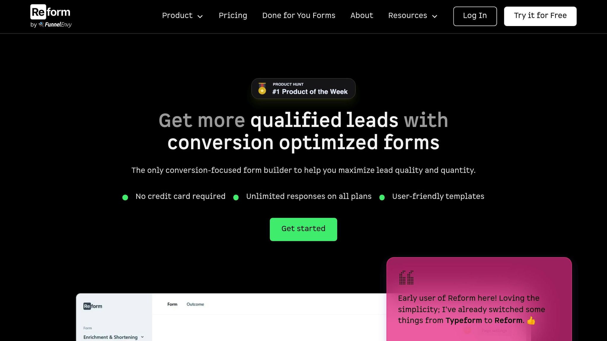
Reform's no-code, conversion-focused platform is designed to help you fine-tune multi-step forms, cutting down on drop-offs without requiring any technical skills. With features that simplify the user journey and enhance lead capture, Reform seamlessly integrates with other tools to provide a complete solution.
Features That Keep Users Engaged
One standout feature of Reform is its conditional logic, which tailors the form experience to each user. Instead of overwhelming everyone with a long list of questions, the form adapts based on previous answers. Users only see what’s relevant to them, making the process feel more personalized and efficient. This approach has been shown to boost completion rates by 20%.
Setting up these dynamic forms is straightforward. You can easily configure them to ask only the most essential questions, hiding or showing fields based on user input.
Another helpful tool is the progress indicator. Reform includes a progress bar that shows users exactly where they are in the form. This transparency helps manage expectations and reduces the stress of completing longer forms, especially when users are in the middle of detailed qualification steps.
Reform also provides real-time analytics to pinpoint where users drop off. You can track completion rates for each step and see how much time users spend on specific sections. This data makes it easy to identify problem areas, whether it's a confusing question, a technical hiccup, or just a step that feels too demanding.
Additionally, the platform includes abandoned submission tracking, which captures partially completed forms. This feature is invaluable for understanding user behavior and creating re-engagement opportunities.
By breaking down complex forms into manageable steps, Reform can increase conversion rates by as much as 300% compared to traditional single-page forms. This approach makes the entire process less intimidating and more likely to result in completed submissions.
Seamless Integrations for Better Lead Management
Reform doesn’t stop at optimizing the user experience - it also ensures that every lead you capture is actionable. The platform integrates effortlessly with major CRM tools like HubSpot Marketing Hub, HubSpot Sales Hub, Salesforce, Pipedrive, and Close. These integrations include custom mapping and duplicate handling, so your lead data stays clean and organized.
For marketing automation, Reform connects with tools like Marketo Engage, Mailchimp, ActiveCampaign, Kit, and Klaviyo. This allows you to set up immediate follow-up sequences based on form responses. On the productivity side, integrations with Google Sheets, Slack, and Google Analytics 360 make it easy to track performance and share results.
Reform also supports Zapier integration, giving you access to thousands of additional apps. For more custom needs, the platform offers webhooks and APIs, allowing you to connect with internal tools or specialized software.
These integrations create a seamless lead management process. If a user abandons a form midway, the partial data can trigger re-engagement campaigns. When a form is fully completed, all the qualification details are instantly sent to your sales team. This smooth data flow ensures that your optimized forms don’t just capture leads - they actively contribute to better lead management and higher conversion rates.
Conclusion: Converting Drop-Offs Into Leads
Turning user engagement into actionable leads requires a thoughtful and well-rounded strategy. The numbers tell a compelling story: over 67% of visitors abandon forms when they run into issues. But there's good news - smartly designed multi-step forms can significantly improve outcomes, with some studies reporting conversion rates of 13.9% compared to just 4.5% for single-page forms. Effective A/B testing can even push these rates up by as much as 400%.
The key is to combine data-driven insights with user-friendly design. Funnel analysis can pinpoint exactly where users drop off, allowing you to make precise adjustments rather than relying on guesswork. Simplicity is crucial - streamline forms by removing unnecessary fields, optimizing layouts for mobile users, and incorporating inline validation. Features like progress indicators and well-placed incentives can further guide users through the process.
As Karan Bhakui puts it:
"Multi-step popups are not just about gathering information; they are about creating a seamless and engaging user journey."
Don't underestimate the cost of abandoned forms - only 20% of visitors return after leaving a form incomplete, making every drop-off a missed opportunity. Tools like Reform's abandoned submission tracking can help by capturing partial data, enabling you to re-engage users effectively.
A winning strategy relies on a mix of qualitative and quantitative research. It's not just about knowing what users do, but understanding why they do it. A/B testing can help refine form versions, adjust field order, and reduce cognitive load. Ensuring robust data security with encryption is also essential for building trust.
The results speak for themselves: Venture Harbour increased their conversion rates by an astonishing 743% over five years, and similar strategies have delivered boosts of 200–300% for other businesses.
FAQs
How can I pinpoint which step in my multi-step form is causing users to drop off?
To figure out where users are dropping off in your multi-step form, use analytics tools that monitor completion rates for each step. Pay close attention to the step with the highest drop-off rate - that’s usually where users are running into trouble.
After pinpointing the problem area, take a closer look at that step. Are the instructions unclear? Are there too many fields to fill out? Is the design confusing? Fixing these issues can make the process smoother and keep users from abandoning the form.
What psychological factors cause users to abandon multi-step forms, and how can I overcome them?
Users often give up on multi-step forms because they feel overwhelmed - especially when the form looks long or overly complicated. This can trigger frustration or even anxiety. Another frequent problem is a lack of clarity, where users aren't sure what information is being requested or how far they are in the process.
To tackle these issues, split the form into clearly defined, smaller steps and include a progress indicator so users can see how much they have left to complete. Keep questions simple to ease mental effort, and offer brief, straightforward instructions for each step. These adjustments can make the experience feel less intimidating and encourage users to finish the form, which can lead to higher conversion rates.
How can using conditional logic in forms improve user experience and boost completion rates?
Conditional logic enhances the user experience by tailoring forms to display only the questions relevant to each individual, based on their prior responses. This approach makes the form feel more customized, eliminates unnecessary steps, and helps users avoid feeling overloaded with irrelevant questions.
By simplifying the process and cutting down on effort, conditional logic can boost form completion rates. It also speeds up interactions and lowers drop-off rates, making the overall experience smoother and more user-friendly.
Related posts
Get new content delivered straight to your inbox

The Response
Updates on the Reform platform, insights on optimizing conversion rates, and tips to craft forms that convert.


Drive real results with form optimizations
Tested across hundreds of experiments, our strategies deliver a 215% lift in qualified leads for B2B and SaaS companies.
