
.webp)
Top Tools for Testing Form Color Contrast


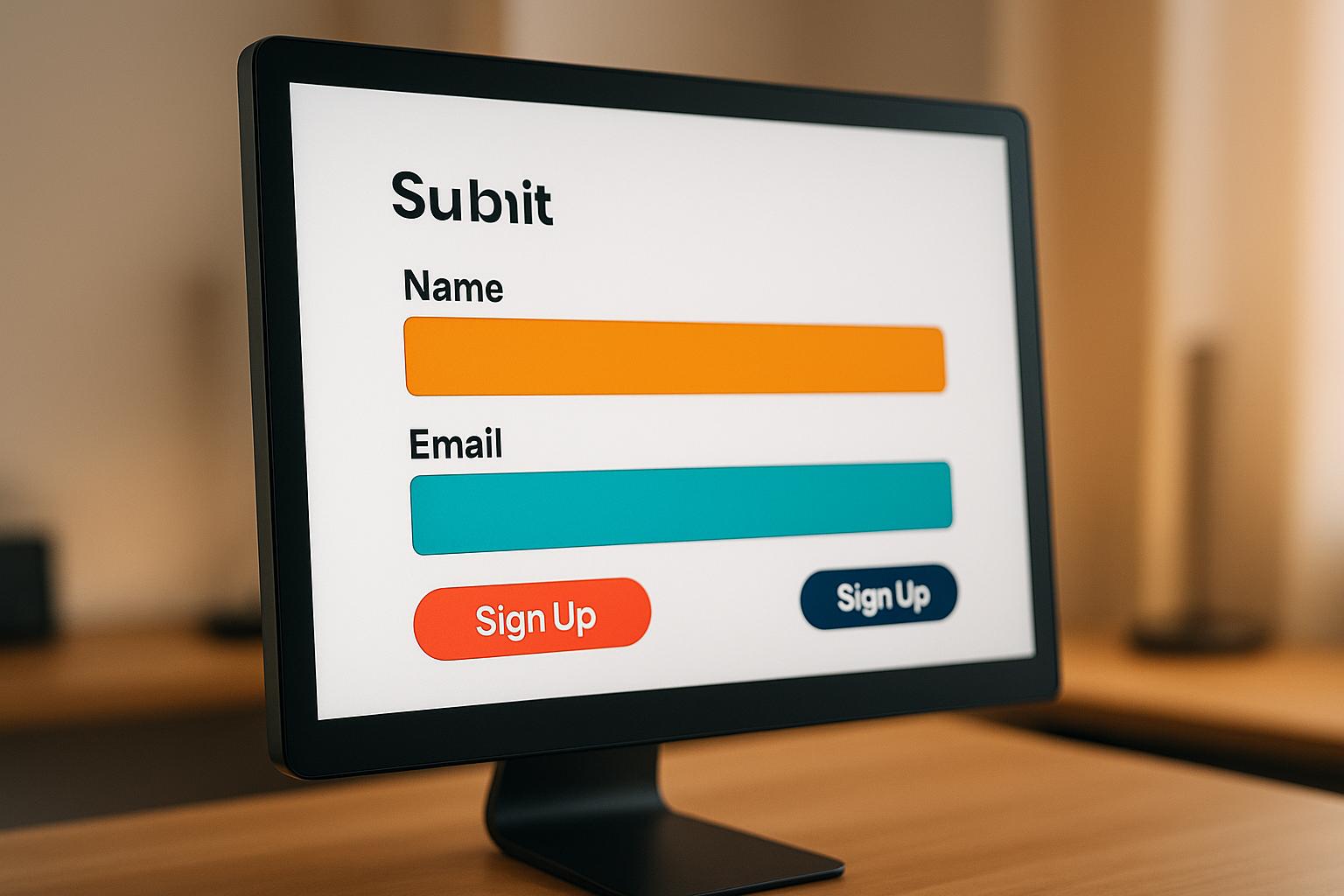
Testing form color contrast ensures readability and accessibility for all users, including those with visual impairments or color blindness. Around 2.2 billion people globally face vision challenges, and poor contrast can lead to usability issues, legal risks, and lost conversions. The Web Content Accessibility Guidelines (WCAG) set standards for contrast ratios: 4.5:1 for normal text and 3:1 for large text at Level AA, with stricter requirements for Level AAA.
Here’s a quick guide to the best tools for testing form color contrast:
- Siteimprove Color Contrast Checker: Web-based with HEX/RGB inputs, live previews, and enterprise-level reporting.
- WebAIM Contrast Checker: Free, browser-based, supports HEX/RGB, and includes real-time sliders for adjustments.
- Colour Contrast Analyser (TPGi): Desktop app for Windows/Mac, tests gradients, and includes color blindness simulation.
- Accessible Web Color Contrast Checker: Browser extension for live page testing, with compliance suggestions.
- Deque Color Contrast Analyzer: Desktop tool with batch testing and developer-friendly features.
- Coolors Contrast Checker: Web-based, focused on quick HEX input and palette generation.
- AudioEye Color Contrast Checker: Web-based, part of a larger accessibility platform, with ADA compliance checks.
- WAVE Tool by WebAIM: Browser extension offering full-page accessibility audits and visual feedback.
Quick Comparison:
| Tool | WCAG Levels | Input Methods | Platform | Key Features |
|---|---|---|---|---|
| Siteimprove | AA, AAA | HEX, RGB, Picker | Web-based | Reporting, live previews |
| WebAIM Contrast Checker | AA, AAA | HEX, RGB, Sliders | Web-based, Ext. | Real-time adjustments, simple UI |
| Colour Contrast Analyser | AA, AAA | HEX, RGB, HSV, HSL | Desktop App | Gradient testing, color blindness sim |
| Accessible Web Checker | AA, AAA | HEX, RGB, Picker | Web-based, Ext. | Live page testing, suggestions |
| Deque Analyzer | AA, AAA | HEX, RGB, Picker | Desktop App | Batch testing, dev tools integration |
| Coolors | AA, AAA | HEX | Web-based | Palette generation, quick checks |
| AudioEye Checker | AA, AAA | HEX, RGB, Picker | Web-based | ADA compliance, suggestions |
| WAVE Tool | AA, AAA | HEX, RGB, Picker | Browser Ext. | Full-page audits, visual feedback |
Each tool caters to different needs, from quick checks to enterprise-level compliance. Prioritize tools that align with your workflow to ensure your forms are accessible, readable, and compliant.
How to test for Color Contrast | TPGI & WebAIM | WCAG
Color Contrast Standards for Forms
The Web Content Accessibility Guidelines (WCAG) 2.1 and 2.2 set global standards for digital accessibility, including specific color contrast requirements. These guidelines are especially important for ensuring that content remains readable for users with visual impairments.
Contrast ratios, expressed as numbers (e.g., 4.5:1 or 7:1), measure the difference in brightness between text and its background. For example, black text on a white background achieves a perfect 21:1 ratio, while light gray text on white might only reach about 1.6:1 - making it much harder to read.
WCAG Compliance Levels for Forms
Compliance with WCAG standards is categorized into two main levels for forms:
- Level AA: This is the minimum standard required under the Americans with Disabilities Act (ADA). It calls for a contrast ratio of at least 4.5:1 for regular text (smaller than 18pt or 14pt bold) and 3:1 for larger text (18pt or 14pt bold and above).
- Level AAA: A stricter standard designed to further improve accessibility. It requires a 7:1 contrast ratio for normal text and 4.5:1 for larger text. While not legally mandatory in most cases, many organizations aim for AAA compliance to support a wider range of users.
| WCAG Level | Normal Text (under 18pt/14pt bold) | Large Text (18pt+ or 14pt+ bold) |
|---|---|---|
| AA | 4.5:1 | 3:1 |
| AAA | 7:1 | 4.5:1 |
These standards should be applied consistently to all elements in your forms.
Form-Specific Applications
Every text element in a form - labels, input fields, placeholders, button text, error messages, and help text - must meet these contrast requirements to ensure clarity and accessibility.
- Input Field Labels: Standard-sized labels must meet the 4.5:1 contrast ratio, while larger fonts (18pt or more) can follow the 3:1 requirement.
- Placeholder Text: Often overlooked, placeholder text must also meet contrast standards. Users with low vision may depend on it to understand what information is required.
- Button Text: Contrast is critical here. For example, white text on a medium blue button (#FFFFFF on #0074D9) achieves an excellent contrast ratio of 8.59:1, meeting both AA and AAA standards. In contrast, yellow text on a white button (#FFFF00 on #FFFFFF) only achieves a ratio of 1.07:1, making it illegible for many users.
Common Compliance Challenges
Certain elements, like error messages, can present unique challenges. Light red text, commonly used for errors, often lacks sufficient contrast. To address this, use darker shades of red and consider adding supplemental icons to reinforce the message visually.
Focus indicators and hover states also require attention. They must maintain enough contrast to help users who rely on keyboards or assistive technologies easily identify interactive elements.
Exceptions and Special Cases
Some text elements are exempt from these contrast requirements, such as logos, brand names, and purely decorative text. However, all essential form content and interactive controls must adhere to WCAG standards.
It’s also worth noting that external factors like screen brightness, glare, or device settings can impact how users perceive contrast. For this reason, exceeding the minimum contrast ratios is often a good idea to ensure readability in various environments.
Modern tools, such as Reform, simplify compliance by integrating these guidelines directly into their design systems. This allows businesses to create accessible forms without needing deep technical expertise. By aligning every form element with these standards, you not only meet legal requirements but also make your forms more user-friendly for everyone.
1. Siteimprove Color Contrast Checker
Siteimprove is a widely-used accessibility platform that supports over 6,000 organizations globally, including universities, government agencies, and Fortune 500 companies. Among its many tools, the color contrast checker stands out as part of its accessibility suite, designed to simplify compliance auditing and management.
This tool helps designers catch contrast issues early, preventing potential compliance problems. For example, it evaluates the contrast ratio of a blue background (#0057B8) with white text (#FFFFFF) against WCAG AA and AAA standards.
WCAG Compliance Levels Supported
The tool supports both WCAG 2.1 Level AA and AAA standards, clearly showing whether a design passes or fails for each level.
This dual-level support is especially helpful for organizations like government agencies and educational institutions that often need to meet stricter AAA standards. At the same time, it accommodates businesses aiming for the minimum AA compliance required under the Americans with Disabilities Act.
Input Methods
Siteimprove offers several ways to test color combinations, including HEX and RGB code inputs. One of its standout features is the eyedropper tool, which allows users to pick colors directly from their screen. This makes it easier to test real-world designs without needing to identify color codes manually.
The eyedropper is particularly useful for designers working with existing brand colors or evaluating live forms. It allows them to sample any visible color combination and get instant feedback on whether it meets accessibility requirements.
Platform Compatibility
As a web-based tool, the contrast checker works across Windows and macOS on any modern browser. There's no need for installation, making it a convenient option for quick checks and seamless integration into design workflows.
This browser-based setup allows teams to access the tool from anywhere and share results effortlessly. It's especially beneficial for distributed design teams or agencies juggling multiple clients. This flexibility complements additional features that enhance accessibility testing.
Additional Features
The tool includes live previews of text and background color combinations, so users can immediately see how their choices will look. This real-time feedback helps ensure readability while maintaining visual appeal.
According to Siteimprove's 2022 Customer Satisfaction Report, 87% of users reported better accessibility compliance after using the platform's tools. The contrast checker also integrates with Siteimprove's broader suite of accessibility reporting and analytics tools, allowing teams to track progress and generate detailed compliance reports over time.
2. WebAIM Contrast Checker
WebAIM Contrast Checker is a free, straightforward tool designed to make testing form color contrast quick and easy. Created by the University of Utah's Center for Persons with Disabilities, it’s a popular choice among designers who need a reliable way to verify contrast without dealing with complicated software.
What sets this tool apart is its speed and simplicity. Unlike platforms that require subscriptions or installations, this browser-based tool provides instant results. For designers working on forms and juggling multiple color combinations, it’s a practical solution that fits seamlessly into the design process.
WCAG Compliance Levels Supported
WebAIM Contrast Checker evaluates color combinations against WCAG 2.1 Level AA and AAA standards, offering clear pass/fail results for each level. Since Level AA compliance is the baseline requirement for ADA accessibility, this tool is critical for reducing legal risks. Its effectiveness is evident - institutions like the University of Washington have integrated WebAIM’s tools to meet Level AA standards across their digital platforms.
Input Methods
The tool supports various input methods to accommodate users with different technical preferences. You can enter colors using HEX codes, RGB values, or a built-in color picker widget. One standout feature is its eyedropper tool, which allows you to sample colors directly from your screen. This is especially helpful for testing colors in existing forms or ensuring brand colors meet accessibility standards without needing to dig up exact codes.
Platform Compatibility
WebAIM Contrast Checker is compatible with Windows, macOS, and Linux, working seamlessly in any modern browser. This flexibility means you can access it from virtually any device with internet access.
Additionally, the tool is integrated into the WAVE Browser Extension for Chrome and Firefox, letting you check contrast directly within your browser. This dual functionality provides flexibility, allowing designers to choose the setup that best fits their workflow.
Additional Features
The tool includes an adjustable slider that lets you fine-tune colors by lightening or darkening them until they meet WCAG standards. This feature eliminates the trial-and-error process, helping designers quickly find compliant color combinations.
Real-time pass/fail updates provide instant feedback as you adjust colors, streamlining the testing process. For organizations using the Canvas learning management system, WebAIM’s contrast checking is built into Canvas’s accessibility reporting tools, making it easier to ensure accessibility across entire courses.
With its user-friendly design and practical features, WebAIM Contrast Checker is a valuable addition to any designer’s toolkit, complementing other accessibility testing tools.
3. Colour Contrast Analyser (TPGi)
The Colour Contrast Analyser by TPGi is a desktop application designed to tackle contrast challenges, particularly with gradient backgrounds and images. These issues often trip up form designers working with intricate visual elements. Unlike browser-based tools, this standalone app tests contrast across any program on your computer, making it a versatile choice for designers using various software or needing to ensure accessibility across multiple platforms.
WCAG Compliance Levels Supported
This tool offers straightforward pass/fail ratings for WCAG Level AA and AAA standards, automatically factoring in text size. It classifies text as large if it’s 18pt or larger, or 14pt or larger when bold. This level of detail is especially helpful for form design, where elements like labels, input fields, and buttons often vary in size and weight.
Input Methods
The Colour Contrast Analyser supports several color input formats, including HEX, RGB, HSV, and HSL values, giving designers the freedom to use their preferred color system. You can enter or paste color values directly, making it easy to align with existing brand guidelines or design systems.
Its built-in eyedropper tool is a standout feature, allowing you to sample colors from any on-screen content - whether it’s a design file, a PDF, or another application. This capability goes beyond the limits of browser-based tools and is ideal for testing colors in real-world scenarios.
Platform Compatibility
The tool is available as a free download for both Windows and Mac. Since it works offline, you can perform reliable contrast checks without needing an internet connection. While browser tools are convenient for certain tasks, this desktop application excels in more specialized scenarios, ensuring thorough contrast testing for accessible forms.
However, one limitation is that it’s not available as a web-based tool or browser extension. Installation is required, which might be a drawback for teams that prefer cloud-based solutions or need immediate access across multiple devices.
Additional Features
The Colour Contrast Analyser includes adjustable color sliders that allow you to fine-tune colors until they meet compliance standards. This feature eliminates guesswork and simplifies the process of refining colors without starting over.
For form accessibility, one of its most practical features is the ability to test multiple color pairs quickly. While it doesn’t offer traditional batch testing, its workflow enables designers to efficiently evaluate various form elements - like input fields, error messages, and buttons - ensuring that every part of the design meets accessibility standards.
Additionally, the software displays color values in multiple formats simultaneously (RGB, HSV, HSL, and HEX), making it easy to transfer your choices back into design tools or development specs. This multi-format display streamlines the process of integrating accessible colors into your projects.
4. Accessible Web Color Contrast Checker
The Accessible Web Color Contrast Checker is a handy tool integrated into the Accessible Web Helper browser extension, making it easy to test color contrasts directly on live web pages and forms. It operates in real-time, blending seamlessly into your development workflow while adhering to strict accessibility standards.
WCAG Compliance Levels Supported
This tool supports WCAG 2.1 Level AA and AAA standards, providing clear pass/fail indicators for compliance. It automatically adjusts for text size classifications, ensuring precise results. This feature is especially useful when dealing with form elements, which often combine various text sizes across labels, input fields, and helper text.
Input Methods
The tool accepts both HEX and RGB color codes, allowing you to test specific brand colors or design palettes against different backgrounds. This straightforward input method simplifies the process of systematically evaluating your form's color scheme.
Platform Compatibility
The Accessible Web Color Contrast Checker works seamlessly on modern browsers across Windows, macOS, and Linux - no installation needed. With the Accessible Web Helper browser extension, users can scan live web pages for WCAG compliance issues and check contrast ratios directly on the page.
What sets this tool apart is its real-time integration. Instead of testing colors in isolation, you can evaluate them within the actual web environments you're developing, making it a natural fit for live projects.
Additional Features
This tool offers visual previews of text and background color combinations, so you can see how your choices will appear to users. If a color pair fails to meet accessibility standards, it suggests alternative color pairs that achieve the required contrast ratio, removing the guesswork from finding compliant options.
For instance, testing white (#FFFFFF) against light gray (#B0B0B0) might prompt a suggestion like #333333, with a live preview showing the improved contrast.
Beyond basic contrast checks, the Accessible Web Helper also provides full website scanning capabilities. The premium Accessible Web RAMP service goes a step further, enabling teams to analyze and fix entire websites. This feature is especially beneficial for organizations managing multiple forms or large web properties, ensuring consistent accessibility across all projects.
5. Deque Color Contrast Analyzer

The Deque Color Contrast Analyzer is a desktop tool designed to make accessibility testing easy and effective. Unlike web-based tools, this analyzer works directly on your device, fitting smoothly into your design workflow. It ensures your designs meet WCAG Level AA and AAA standards, helping you stay compliant without disrupting your process.
WCAG Compliance Levels Supported
This tool evaluates color combinations against WCAG Level AA and AAA standards. For Level AA, it checks for a contrast ratio of 4.5:1 for normal text and 3:1 for large text. For Level AAA, it requires a contrast ratio of 7:1 for normal text and 4.5:1 for large text.
For example, if you're testing a registration form's input field labels, the tool provides instant feedback, letting you know if your colors meet the standards. This kind of immediate insight simplifies decision-making during the design process.
Input Methods
The analyzer supports HEX and RGB color inputs and includes an eyedropper tool for sampling colors directly from your screen. Whether you're working with predefined brand colors or testing live elements in your design software, this tool adapts to your needs.
Platform Compatibility
Available for both Windows and macOS, the Deque Color Contrast Analyzer ensures accessibility testing is possible across different operating systems. This flexibility makes it a valuable resource for teams working on diverse platforms.
Additional Features
The tool offers live previews, showing exactly how your text and background colors will look together, and batch testing, which allows you to evaluate multiple color combinations at once. These features save time and make your accessibility reviews more efficient.
sbb-itb-5f36581
6. Coolors Contrast Checker
Coolors Contrast Checker is a handy web-based tool that combines color palette generation with accessibility checks. It lets you quickly determine if your color combinations meet accessibility standards, all without needing to install software or create an account. Its simplicity makes it a great addition to the tools we've discussed so far.
WCAG Compliance Levels Supported
This tool assesses color pairings based on WCAG 2.1 Level AA and AAA standards. It provides clear pass/fail results for each level and includes descriptive feedback like "Very good" or "Fail", making it easy to understand how your colors measure up against accessibility guidelines.
Input Methods
You can input colors using HEX codes for both text and background, making it perfect for ensuring established brand colors comply with accessibility standards. However, it lacks RGB input and an eyedropper tool, which might be a limitation for some users. Even so, it's an efficient way to validate color choices that are both visually appealing and accessible.
Platform Compatibility
Since it’s web-based, Coolors works smoothly on both Windows and macOS without any installation. Its design is platform-independent, making it a reliable option for designers working across different systems.
Additional Features
Coolors offers a live preview feature, letting you see exactly how your text will look against your chosen background color. While it’s excellent for quick checks of individual color pairs, it doesn’t support batch testing or integrate directly with design tools. This makes it particularly useful for spot-checking the accessibility of specific form elements during the design process.
7. AudioEye Color Contrast Checker
The AudioEye Color Contrast Checker is a free, web-based tool designed to help form designers ensure their color choices align with accessibility standards. It's part of a larger accessibility platform, making it especially useful for organizations focused on maintaining compliance over time.
WCAG Compliance Levels Supported
This tool provides instant feedback on whether your color combinations meet WCAG AA (4.5:1 for normal text, 3:1 for large text) and WCAG AAA (7:1 for normal text, 4.5:1 for large text) standards. The results are displayed clearly, so you can immediately see if your form elements meet the required accessibility guidelines.
Input Methods
The checker supports both HEX and RGB color codes, offering flexibility for specifying colors. It also features an eyedropper tool that allows you to pick colors directly from your screen. This is particularly handy for testing colors in live form elements, ensuring that both planned designs and existing forms meet accessibility standards.
Platform Compatibility
As a web-based tool, the AudioEye Color Contrast Checker works seamlessly across Windows, macOS, and Linux operating systems. You can access it through any modern browser without needing to install additional software. While it doesn't offer a standalone desktop app or browser extension, its web-based nature ensures compatibility across various devices and platforms, making it a practical choice for diverse design teams.
Additional Features
The tool offers real-time previews of color contrast results, so you can instantly see how adjustments impact accessibility. If a color combination fails to meet the required standards, the checker provides clear suggestions for improving contrast ratios. Although it doesn't support batch testing of multiple color pairs at once, its integration with the broader AudioEye platform allows organizations to monitor and manage accessibility across multiple websites, including forms. These features make it easier to improve contrast ratios and ensure compliance with accessibility standards.
8. WAVE Tool by WebAIM
The WAVE Tool by WebAIM is a handy accessibility evaluation tool that goes beyond just checking color contrast. It scans entire web pages, making it especially useful for testing forms in their actual context. By highlighting accessibility issues directly in the browser, it helps designers quickly identify and fix potential problems. Let’s break down its key features.
WCAG Compliance Levels Supported
WAVE checks color contrast against WCAG 2.1 Level AA standards. It ensures text meets the recommended contrast ratios: 4.5:1 for normal text and 3:1 for large text.
Input Methods
The tool offers several ways to input colors, including HEX and RGB values. Its built-in eyedropper tool allows you to pick colors directly from any on-screen element. This feature is particularly useful for testing colors from design mockups or live websites, whether you're working inside or outside the browser.
Platform Compatibility
WAVE is available as a web-based tool and as a browser extension for Chrome and Firefox. This flexibility means it works seamlessly across operating systems without needing separate installations. Its browser extension also allows live testing, making it a valuable asset for evaluating dynamic form elements.
Additional Features
One of WAVE's standout features is its real-time visual feedback. It overlays indicators on areas where contrast issues exist, making it easy to spot and fix problems. While it doesn’t support batch testing of multiple color combinations at once, its ability to assess entire forms in their live settings makes it an excellent choice for thorough accessibility checks.
Teams often report that WAVE’s clear visual cues speed up their workflow, making it a go-to tool for designers and developers alike. Up next, we’ll explore how Reform takes accessible form building to the next level.
Building Accessible Forms with Reform
Reform takes a proactive approach to accessibility by integrating WCAG compliance checks directly into the form creation process. Instead of relying on tools that test contrast after development, Reform ensures accessibility is built into the design from the start. This seamless combination of design and testing simplifies the process, saving time and effort.
With Reform's real-time preview feature, you can see exactly how your forms will appear to users with visual impairments before they go live. This immediate feedback allows you to catch and fix color contrast issues on the spot, eliminating the need to switch between different platforms or tools.
Reform's design system is built to meet WCAG 2.1 standards right out of the box. Default templates are compliant, and if you use custom brand colors, the platform will flag any that don’t meet contrast requirements. This means you can maintain a professional, branded look while keeping your forms accessible.
For those who want more control, Reform offers custom CSS capabilities. This allows you to fine-tune elements like colors, font sizes, and focus indicators to meet specific accessibility needs. Whether it's boosting contrast for readability or improving keyboard navigation, Reform makes it easy to ensure your forms are usable for everyone. The platform adheres to WCAG guidelines, maintaining minimum contrast ratios of 4.5:1 for normal text and 3:1 for large text.
"I've been using Reform for a couple months now. Beautiful forms that are easy to brand with company colors and logo. Simple UI. Definitely recommended!" - David Hehenberger, Founder, Flamingo
Reform also simplifies accessibility by automatically identifying color contrast issues and providing actionable recommendations. This eliminates the need for specialized expertise, making accessibility achievable for any team.
The impact of accessible design is clear. In January 2024, a small business using Reform saw a 30% increase in form completion rates after making accessibility improvements like better color contrast and using real-time previews. Accessible forms don’t just meet compliance standards - they also improve user experience and boost conversions.
Reform goes beyond contrast adjustments to accommodate a variety of needs. Features like high-contrast themes, designs that don’t rely solely on color to convey information, keyboard navigation support, and screen reader compatibility ensure forms are usable for people with diverse abilities.
Starting at just $15/month, Reform provides an affordable way to create accessible, compliant forms. It’s a smart investment that protects your business while broadening your audience and improving engagement.
Tool Comparison Chart
The chart below provides a quick side-by-side look at the key features of various color contrast checkers. Whether you're focused on ease of use, advanced functionality, or detailed compliance reporting, there's a tool here to match your workflow and accessibility goals. These tools are essential for creating forms and designs that meet accessibility standards while improving user experience.
| Tool | WCAG Compliance | Input Methods | Platform Compatibility | Extra Features |
|---|---|---|---|---|
| Siteimprove Color Contrast Checker | AA, AAA | HEX, RGB, Color Picker | Web-based | Full-page scanning, automated reporting, enterprise integration |
| WebAIM Contrast Checker | AA, AAA | HEX, RGB, HSL, Eyedropper | Web-based, Browser Extension | Sliders for real-time adjustment, lightweight interface, batch testing |
| Colour Contrast Analyser (TPGi) | AA, AAA | HEX, RGB, HSV, HSL, Eyedropper | Windows, Mac Desktop App | Color blindness simulation, screenshot analysis, system-wide color picking |
| Accessible Web Color Contrast Checker | A, AA, AAA | HEX, RGB, Eyedropper | Web-based, Browser Extension | Full accessibility scan, violation highlighting, compliance reporting |
| Deque Color Contrast Analyzer | AA, AAA | HEX, RGB, Eyedropper | Chrome Browser Extension | Page repaint feature, highlights contrast issues, developer tools integration |
| Coolors Contrast Checker | AA, AAA | HEX, RGB, HSL | Web-based | Instant feedback, palette generation, easy color adjustment interface |
| AudioEye Color Contrast Checker | AA, AAA | HEX, RGB | Web-based | ADA compliance checks, Section 508 reporting, multi-standard validation |
| WAVE Tool by WebAIM | AA, AAA | HEX, RGB, Eyedropper | Chrome, Firefox Browser Extensions | Complete accessibility audit, visual feedback icons, detailed error reporting |
When working on complex designs or adhering to strict brand guidelines, tools with an eyedropper feature are particularly helpful, allowing you to select colors directly from your screen.
For those just starting, WebAIM and Coolors offer simple interfaces with immediate feedback, making them beginner-friendly. If your organization requires detailed compliance documentation, AudioEye or Accessible Web are excellent choices for their robust reporting features. Development teams might find browser extensions like WAVE or Deque especially useful, as they integrate directly into coding workflows.
Ultimately, your choice depends on your priorities - whether it's ease of use, advanced capabilities, or seamless integration with your existing tools. This chart provides a clear overview to help you pick the right tool for your design needs.
Conclusion
Making color contrast testing a regular part of your workflow isn’t just about meeting guidelines - it’s about creating better experiences for everyone. According to the 2023 WebAIM survey, over 86% of home pages fail WCAG 2 standards, with low contrast text being the most common issue. This highlights the need for consistent testing to stand out in a competitive market and to better serve the millions of Americans with vision impairments.
The benefits of accessibility go beyond compliance. Research shows that accessible forms can drive up to a 30% increase in conversion rates and a 215% boost in qualified leads. That’s a major return on investment you can’t afford to overlook.
Proactive testing also saves money by reducing the need for costly updates and mitigating legal risks. Tools like WebAIM's Contrast Checker provide quick, easy evaluations, while platforms like AudioEye offer robust reporting for enterprise-level compliance. Reform takes it a step further by integrating accessibility features directly into its no-code platform, helping teams stay compliant without extra effort. One user shared their experience:
"Reform is amazing! You all ship so fast and the design is absolutely fantastic. In the past I've always been apprehensive about sending a form but now I love it 👌" - Corey Haines, Co-founder, Conversion Factory.
FAQs
Why is testing color contrast in forms important for accessibility?
Testing the color contrast in forms is an important step to make them accessible to everyone, including people with visual impairments or color blindness. Good contrast ensures that text and interactive elements are easier to read and interact with, allowing all users to navigate your forms smoothly.
When you meet accessibility standards, your forms can connect with a wider audience, provide a more inclusive experience, and show your dedication to usability and compliance.
What’s the difference between WCAG Level AA and Level AAA color contrast requirements?
The difference between WCAG Level AA and Level AAA compliance for color contrast comes down to how strict the requirements are. Level AA sets a minimum contrast ratio of 4.5:1 for regular text and 3:1 for larger text, which helps ensure readability for most users, including those with mild visual impairments. Level AAA, however, raises the bar with a contrast ratio of at least 7:1 for regular text and 4.5:1 for larger text, catering to individuals with more pronounced visual difficulties.
While Level AA compliance is widely regarded as the standard in accessibility guidelines, aiming for Level AAA reflects an effort to make content accessible to an even broader audience. That said, achieving Level AAA isn't always feasible in every design context.
What should I consider when selecting a tool to test color contrast in my forms?
When selecting a tool to test color contrast in your forms, prioritize ones that help you meet accessibility standards effectively. The ideal tool should be straightforward to use, deliver precise contrast measurements, and support the creation of forms that everyone can access.
Reform stands out as an excellent option for designing forms that are both accessible and efficient. With its intuitive features and strong focus on accessibility, it simplifies the process of ensuring your forms meet required standards while providing a smooth experience for your users.
Related Blog Posts
Get new content delivered straight to your inbox

The Response
Updates on the Reform platform, insights on optimizing conversion rates, and tips to craft forms that convert.


Drive real results with form optimizations
Tested across hundreds of experiments, our strategies deliver a 215% lift in qualified leads for B2B and SaaS companies.
