
.webp)
10 Best Practices for Clear Form Instructions


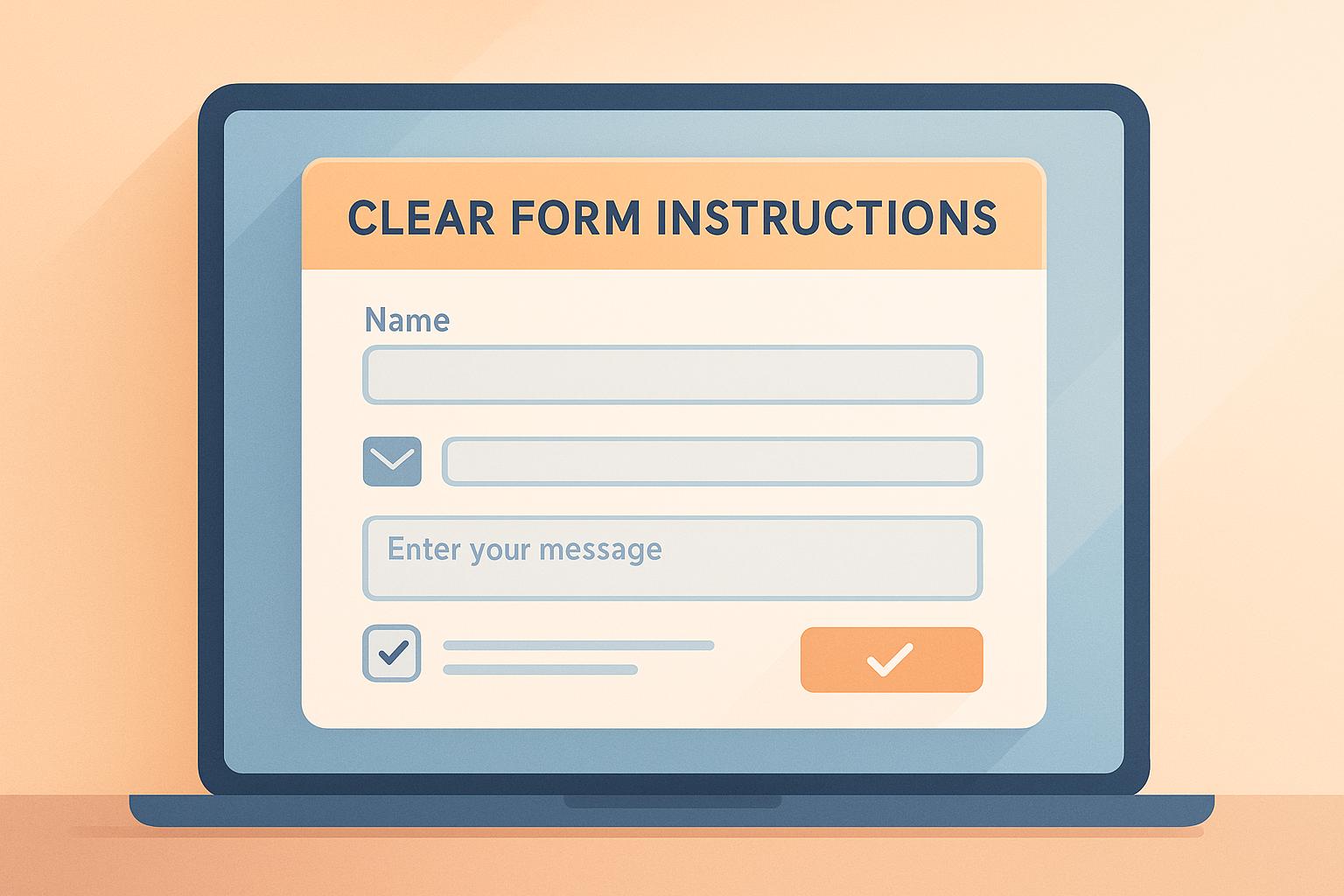
Clear form instructions are essential for improving user experience and ensuring accurate data collection. Forms with simple, direct guidance can increase completion rates, reduce errors, and boost lead quality. Here’s a quick overview of the top practices:
- Keep Forms Simple - Only include necessary fields and avoid optional ones.
- Order Fields Correctly - Start with easy questions and save complex ones for later.
- Mark Required Fields Clearly - Use asterisks or labels like "Required."
- Show Input Format Rules - Provide examples or placeholder text for clarity.
- Check Entries in Real Time - Validate user input immediately to prevent errors.
- Write Clear Error Messages - Be specific and helpful when users make mistakes.
- Highlight Current Field - Use visual cues to guide users through the form.
- Add Help When Needed - Use tooltips or inline hints for additional guidance.
- Use One Column Layout - Simplify navigation, especially on mobile devices.
- Show Progress Steps - Use indicators to keep users informed in multi-step forms.
These strategies make forms user-friendly, minimize frustration, and ensure better data quality.
UX Design Best Practices for Forms: How to Prevent Error ...
1. Keep Forms Simple
Simpler forms can increase completion rates and improve the quality of collected data by focusing on essential information while keeping users engaged.
Include Only the Necessary Fields
When designing forms, stick to fields that are critical for lead qualification. Here's how to decide what to keep or remove:
| Field Type | Keep If | Remove If |
|---|---|---|
| Contact Information | Needed for follow-up | Already stored in your database |
| Company Details | Crucial for lead qualification | Can be auto-filled or enriched |
| Budget Information | Directly impacts the sales process | Can be discussed later |
| Technical Requirements | Required for an immediate solution fit | Better addressed in follow-up |
For instance, just collecting an email address can allow you to enrich lead data automatically with company details, saving users from filling out fields like company size or industry.
Once you've identified the essentials, simplify the form further by cutting out unnecessary details.
Eliminate Optional Fields
Optional fields can make forms feel overwhelming and discourage users from completing them.
"Easily customize your form with your branding and select the fields that matter most to your lead qualification process." - Reform.app
When deciding on optional fields, keep these tips in mind:
- Focus on data that's critical for immediate qualification.
- Use automation to gather additional information wherever possible.
- Only include fields that genuinely improve the user's experience.
For example, skip optional fields for social media profiles or secondary phone numbers. Instead, prioritize gathering essential contact details and collecting extra information during follow-up conversations.
2. Order Fields Correctly
Arranging form fields in the right order can improve both completion rates and the quality of the leads you collect.
Start With Easy Questions
Kick things off with simple, straightforward questions. This approach helps users feel comfortable and keeps them moving through the form. Here’s how you can structure it:
| Type | Examples | Why It Works |
|---|---|---|
| Personal Identity | First name, Last name | No effort or research needed |
| Basic Contact Info | Email, Phone number | Instantly available to users |
| Quick Selections | Industry, Role | Easy dropdowns or radio buttons |
Save the more detailed questions for later when users are already engaged.
Save Complex Questions for Last
Once users are invested in completing the form, you can introduce more complex fields. These might include:
- Detailed project descriptions
- Budget-related questions
- Technical specifications
- Open-ended responses
- File uploads
Here are a few ways to make these tougher sections less intimidating:
-
Break It Down
Split complex questions into smaller, manageable steps. -
Save Progress
Allow users to save their progress and return later to finish. -
Use Conditional Logic
Show only the fields relevant to each user’s answers.
Even if users don’t finish the form, you can still gather useful data. Reform’s analytics tool captures partial responses, giving you insights into where users might drop off when faced with more challenging questions.
3. Mark Required Fields Clearly
Making it easy to spot required fields can prevent frustration and reduce form abandonment. Clear markers help users quickly figure out what information they need to provide.
Show Required Field Markers
Use simple, effective visual cues to indicate required fields. Here are some practical methods:
| Visual Indicator | Best Practice | Why It Works |
|---|---|---|
| Asterisk (*) | Place an asterisk before or after the field label | Recognized universally as a required field symbol |
| Color Contrast | Use high-contrast colors | Ensures visibility for all users |
| Text Label | Add "(Required)" to the label | Makes it explicitly clear |
| Visual Weight | Bold or highlight required fields | Draws attention to important inputs |
When adding these markers, ensure they align with accessibility standards. For example, high-contrast colors and clear labels help users relying on screen readers or other assistive tools.
"Reform is a simple, fast forms solution. A no-brainer to reach for anytime I need to (quickly!) throw up a form without hacking around with code. I like that it's customizeable too. Awesome tool!" - Brian Casel, Founder, ZipMessage
While required fields should be marked, optional fields also need proper labeling to avoid confusion.
Mark Optional Fields
1. Use Clear Labels
Add "(Optional)" after the field label to make it obvious that the input is not mandatory.
2. Field Guidelines
| Field Type | Recommendation | Why It Matters |
|---|---|---|
| Critical Data | Mark as required | Ensures key information is collected |
| Additional Details | Mark as optional | Reduces unnecessary pressure on users |
| Marketing Preferences | Always optional | Builds user trust and comfort |
3. Visual Hierarchy
Differentiate optional fields from required ones by using design elements such as:
- Lighter text colors for optional fields
- Smaller font sizes for optional labels
- Grouping optional fields separately from required ones
These strategies help users navigate forms more easily, improving their overall experience.
4. Show Input Format Rules
Once you've marked required fields, make sure users know how to provide the correct data by clearly outlining input formats. This helps reduce errors and confusion during data entry.
Add Example Text
Use placeholder text to guide users on how to input data properly:
| Field Type | Example Format | Why It Works |
|---|---|---|
| Phone Numbers | (555) 123-4567 | Displays exact spacing and punctuation |
| Dates | MM/DD/YYYY | Clarifies the U.S. date format |
| Credit Cards | XXXX-XXXX-XXXX-XXXX | Shows the grouping pattern |
| Postal Codes | 12345 or 12345-6789 | Covers both valid formats |
Ensure placeholder text is visible until users start typing, uses realistic examples, has enough contrast for readability, and doesn’t interfere with user input.
Display Format Instructions
Provide format instructions exactly where users need them - during data entry. Here are some effective methods:
- Inline Help Text - Place short instructions directly below or beside input fields. This eliminates the need for users to scroll or search for guidance.
-
Dynamic Validation Messages - Offer immediate feedback as users type. For example:
Input Type Validation Message When It Appears Password "Strong: Includes uppercase, number, and symbol" As the user types Email "Valid email format" After entering "@" Username "Available username" After completing the field -
Field-Specific Guidelines: Tailor instructions to the selected field. For instance:
- Passwords - "Must be at least 8 characters, include 1 number, and 1 uppercase letter."
- Usernames - "Use 3–15 characters. Letters and numbers only."
- Phone Numbers - "Enter 10 digits, including the area code."
These techniques make it easier for users to input accurate data in every form field.
5. Check Entries in Real Time
Providing feedback as users fill out forms helps reduce errors and ensures accurate submissions. Let’s explore how to show errors immediately and confirm correct entries as users type.
Show Errors Immediately
Instant error detection allows users to fix mistakes on the spot, improving form accuracy. Here's how to handle common error scenarios:
| Error Type | When to Show | Message Example | User Benefit |
|---|---|---|---|
| Format Mismatch | While typing | "Please use only numbers." | Prevents incorrect data entry |
| Invalid Entry | After the field blur | "Email format is incorrect." | Ensures proper contact information |
| Missing Required | On field exit | "This field is required." | Reduces form abandonment |
| Character Limit | During input | "Maximum 50 characters" | Guides proper input length |
Focus on applying real-time checks to critical fields to maintain high data quality.
Confirm Correct Entries
Equally important is confirming when users input the correct information. This not only ensures accuracy but also builds user confidence. Consider these methods:
| Confirmation Type | Visual Indicator | Purpose |
|---|---|---|
| Green Checkmark | ✓ | Indicates field completion |
| Success Message | "Email verified" | Confirms valid entry |
| Progress Bar | Filling bar | Tracks form completion |
| Field Highlight | Green border | Shows correct format |
Best Practices for Real-Time Validation
- Use concise messages - Keep error and confirmation messages short and actionable.
- Place feedback effectively - Display messages near the relevant fields for clarity.
- Validate at the right time - Ensure checks occur after input is complete or when appropriate.
- Prioritize accessibility - Make sure feedback is screen-reader friendly for all users.
Real-time validation not only improves the user experience but also ensures higher-quality submissions.
sbb-itb-5f36581
6. Write Clear Error Messages
Clear error messages help users fix issues when filling out forms, reducing frustration and the likelihood of them abandoning the process.
Describe the Error
Error messages should make it easy for users to identify and fix problems. Here's how you can improve common error messages:
| Error Type | Current Message | Improved Message | Why It Works |
|---|---|---|---|
| Invalid Email | "Invalid format" | "Please include an @ symbol in your email address." | Clearly identifies the missing part of the email. |
| Password Requirements | "Password invalid" | "Password must contain at least 8 characters with 1 number" | Clearly lists what the password needs. |
| Phone Number Format | "Wrong format" | "Please enter a 10-digit phone number (555-555-5555)" | Shows the expected format for US numbers. |
| Required Field | "Required" | "Please enter your shipping address to continue." | Explains why the information is needed. |
For effective error messages:
- Be specific - Clearly state what needs fixing.
- Use plain language - Avoid technical terms that might confuse users.
- Indicate location - Show exactly where the issue occurred.
Keep Messages Helpful
Helpful error messages turn a frustrating moment into a constructive experience. Consider these examples:
| Current | Replace With | Benefit |
|---|---|---|
| "Invalid credit card" | "Please check your card number – we'll charge your card after order confirmation." | Builds trust while asking for a correction. |
| "Username taken" | "This username is already registered. Try adding numbers or using a different name." | Suggests alternatives instead of just stating the issue. |
| "Form submission failed" | "We couldn't process your form. Please review the highlighted fields." | Directs users to problem areas for quick resolution. |
| "Invalid date" | "Please enter a future date for your appointment (MM/DD/YYYY)" | Provides clear format and logic instructions. |
Key tips for crafting helpful messages:
- Focus on solutions - Let users know how to fix the problem.
- Use a positive tone - Avoid making the message sound harsh or critical.
- Provide clear next steps - Tell users exactly what they need to do next.
These solution-oriented messages work hand-in-hand with real-time validation, creating a smoother user experience.
7. Highlight Current Field
Using visual cues can make forms easier to navigate and help users complete them more accurately.
Highlight Active Fields
These design elements can guide users' attention and improve their interaction with forms:
| Element | How to Implement | Benefit |
|---|---|---|
| Border Color | Change from gray (#ECECEC) to blue (#0066FF) | Makes the active field stand out |
| Background Shade | Lighten background to off-white (#F9F9F9) | Highlights the current field |
| Field Shadow | Add a box shadow when focused | Adds a sense of depth |
These adjustments enhance the user experience and complement techniques like real-time validation and error messaging.
Add Field-Specific Help
Providing immediate, relevant help for each field can guide users through the form more effectively:
| Help Type | When to Show | Content Example |
|---|---|---|
| Format Hints | Phone Number Field | Display "(555) 555-5555" as the user types |
| Character Count | Bio/Description Fields | Show "50/280 characters used" |
| Validation Rules | Password Fields | List requirements as users type |
| Input Examples | Address Fields | Display "123 Main St, Apt 4B" |
Help text should stay visible while the user focuses on the field, be easy to read with good contrast, and work with screen readers. Showing this guidance immediately upon field focus creates a smoother, more intuitive experience.
8. Add Help When Needed
Adding contextual help to your forms can make the process smoother and less frustrating for users. When done right, it guides users effectively without overwhelming the interface.
Include Help Buttons
Help buttons and tooltips should be easy to find but not distracting. Here are some common types and how to use them:
| Help Type | How to Implement | Best Use Case |
|---|---|---|
| Info Icons (?) | Small circle with a question mark | For fields needing detailed explanations |
| Tooltips | Appears on hover or tap | Quick hints or format requirements |
| Expandable Help | Collapsible text below the field | For longer text that provides in-depth guidance |
| Contextual Hints | Inline text that appears on focus | For time-sensitive or immediate guidance |
Position these help elements consistently - usually to the right of field labels - so users can easily recognize and rely on them throughout the form.
Show Field Examples
Field examples are a simple way to show users exactly what kind of input is expected. Here's how you can use them:
| Example Type | Display Method | Example Content |
|---|---|---|
| Placeholder Text | Light gray text in the field | "Enter your work email" |
| Format Pattern | Below the field label | "MM/DD/YYYY" for dates |
| Sample Answer | Helper text | "e.g., Senior Marketing Manager" |
| Input Mask | Dynamic formatting | "(___) _-__" for phone numbers |
Make sure these examples are clear, relevant, and accurate. They should reflect scenarios users are likely familiar with, making the form feel intuitive.
Lastly, ensure all help elements are accessible. Screen readers should be able to read the help text, and the color contrast must be sufficient for visibility. These small details ensure everyone can navigate your forms with ease.
9. Use One Column Layout
Single-column layouts are a staple in form design. They provide a clear visual path, helping users complete forms with less effort. This layout also works well on mobile devices, ensuring a smooth experience across all screen sizes.
Keep Forms Linear
A single-column format naturally guides users step by step, making the form easy to follow. Here's how it helps:
| Layout Element | Benefit | User Experience |
|---|---|---|
| Visual Flow | Top-to-bottom structure | Minimizes unnecessary eye movement |
| Field Order | Logical sequence | Keeps users moving smoothly through the form |
| Screen Space | Efficient use of vertical space | Avoids horizontal scrolling |
| Form Scanning | Matches reading habits | Aligns with how users process information |
This layout simplifies navigation on desktops and transitions effortlessly to mobile screens.
Optimize for Mobile
Single-column forms are inherently better suited for mobile devices. They ensure that forms are easy to interact with, regardless of the device being used, while meeting accessibility requirements.
| Mobile Aspect | Advantage |
|---|---|
| Screen Space | Makes full use of the screen width |
| Touch Inputs | Provides enough room for easy tapping |
| Zoom-Free | No need to pinch or zoom |
| Keyboard Navigation | Smooth movement between fields |
This design approach ensures a consistent, user-friendly experience across all platforms.
10. Show Progress Steps
Progress indicators make multi-step forms easier to follow and improve the chances users will complete them.
Add Progress Indicators
Using visual tools to show progress helps guide users through the form. Here are some key elements:
| Element | Purpose | Benefit |
|---|---|---|
| Numbered Steps | Displays total steps and current position | Let users know how much is left to complete |
| Completion Bar | Shows percentage completed | Encourages users to keep going |
| Step Labels | Name each section of the form | Sets clear expectations |
| Current Position | Highlights the active step | Keeps users oriented |
Once these indicators are in place, make sure users can easily move through the form.
Simplify Step Navigation
Smooth navigation is essential for multi-step forms. Features like back/forward buttons, clickable step links, and auto-save options make the process more user-friendly. Here's how to create a seamless experience:
| Feature | Implementation | User Benefit |
|---|---|---|
| Back/Forward | Add navigation buttons | Makes it easy to review or edit entries |
| Step Links | Use clickable progress indicators | Allows users to jump directly to sections |
| Save Progress | Enable auto-save functionality | Ensures no data is lost |
| Resume Later | Keep progress saved for later | Supports users who need to pause |
These tools help users feel confident and stay on track, reducing the likelihood of form abandonment.
Conclusion: Form Instruction Tips
Summary of Tips
Clear and well-structured instructions can significantly improve form completion rates, potentially leading to a 215% increase in qualified leads. Here's a breakdown of effective practices:
| Best Practice | How to Apply | Why It Works |
|---|---|---|
| Field Organization | Arrange fields from simple to complex | Encourages users to finish the form |
| Visual Clarity | Highlight active fields | Helps users navigate easily |
| Error Prevention | Use real-time validation | Reduces mistakes during submission |
| Mobile Optimization | Opt for a single-column layout | Makes forms easier to use on mobile devices |
| Progress Tracking | Add visual progress indicators | Motivates users to complete the form |
These strategies can help you design forms that not only look good but also perform better.
Next Steps
To see immediate results, try incorporating these ideas into your forms. Feedback from users like David Hehenberger highlights the value of these techniques:
"I've been using Reform for a couple months now. Beautiful forms that are easy to brand with company colors and logo. Simple UI. Definitely recommended!"
Here are a few actionable steps to improve your forms further:
- Turn on real-time validation to catch errors as users type.
- Add auto-save functionality for longer forms to prevent data loss.
- Use clear progress indicators for multi-step forms to keep users informed.
- Set up conditional routing to better qualify leads.
- Include brief, helpful instructions for specific fields when necessary.
Corey Haines, Co-founder of Conversion Factory, also notes:
"Reform is amazing! You all ship so fast and the design is absolutely fantastic. In the past I've always been apprehensive about sending a form but now I love it 👌"
FAQs
How do I determine which fields are necessary and which ones to remove from my form?
To decide which fields are essential for your form, start by identifying the specific information you need to achieve your goal, such as collecting contact details or processing a request. Eliminate any fields that are optional or might cause confusion or frustration for users.
Focus on minimizing the number of fields to reduce friction and improve completion rates. If you’re unsure about a field’s importance, ask yourself: Does this directly help me achieve my form’s purpose? If the answer is no, consider removing it. Keeping your form concise and user-friendly is key to maximizing submissions.
How can I make sure users understand the required input format for each form field?
To ensure users understand the required input format for each field, provide clear and specific instructions near the input area. Use placeholder text or helper text to show examples (e.g., 'MM/DD/YYYY' for dates). You can also use tooltips or brief descriptions to clarify expectations without cluttering the form.
For critical fields, consider adding real-time validation or error messages to immediately alert users if the input format is incorrect. This helps reduce confusion and improves the overall user experience.
Why is a single-column layout better for forms, especially on mobile devices?
A single-column layout is ideal for forms because it simplifies the user experience by presenting questions in a clear, linear flow. This layout is particularly effective on mobile devices, where screen space is limited, as it prevents users from having to scroll horizontally or zoom in to read and complete fields.
By keeping everything in one column, you reduce cognitive load, minimize errors, and make it easier for users to focus on one task at a time. This approach not only improves accessibility but also increases the likelihood of form completion, leading to better conversion rates.
Related posts
Get new content delivered straight to your inbox

The Response
Updates on the Reform platform, insights on optimizing conversion rates, and tips to craft forms that convert.


Drive real results with form optimizations
Tested across hundreds of experiments, our strategies deliver a 215% lift in qualified leads for B2B and SaaS companies.
