
.webp)
7 Microcopy Tips for Reducing Form Friction


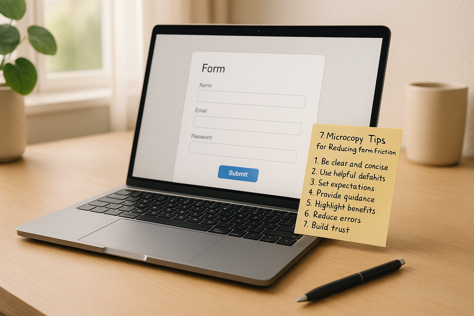
Microcopy can make or break your forms. These small bits of text - like field hints, button labels, and error messages - help users understand what’s expected, reduce confusion, and encourage completion. If your forms are unclear, users might abandon them, especially on mobile devices. Here’s how to make your forms smoother and more user-friendly:
- Show field requirements clearly (e.g., "MM/DD/YYYY" for dates).
- Address privacy concerns upfront (e.g., "We’ll only use this for updates").
- Use action-oriented button text ("Get My Quote" instead of "Submit").
- Write helpful error messages ("Include an @ in your email" instead of "Invalid email").
- Break forms into smaller steps with clear progress indicators.
- Use simple, familiar language to avoid confusion.
- Explain how data will be used to build trust.
Generate more leads with clear microcopy for your website
What Form Friction Is and How Microcopy Helps
Form friction occurs when users encounter obstacles that slow them down or discourage them from completing a form. These hurdles can lead to frustration and abandonment, ultimately reducing the likelihood of conversions.
The impact of friction is undeniable. If users struggle to understand what’s being asked or feel uneasy about sharing their personal information, conversion rates can plummet. Even a single confusing field can drive users away, especially on mobile devices where limited screen space and cumbersome typing make the experience more challenging.
This friction often arises from assumptions made by designers. What seems straightforward to someone who created the form might be unclear or intimidating to a first-time user. This disconnect between the designer's intentions and the user’s perspective is a major contributor to form abandonment.
How Microcopy Reduces Friction
Microcopy acts as a guide, helping users navigate forms more smoothly. It answers questions before they’re asked and provides clarity exactly when needed. Instead of leaving users guessing, microcopy eliminates uncertainty by offering clear, actionable instructions.
When done well, microcopy makes forms feel more like a conversation than an interrogation. For example, when a password field includes a note like, "Must be at least 8 characters with one number", users instantly know what’s expected. This avoids the annoyance of trial-and-error submissions.
Effective microcopy works both proactively and reactively. Proactive microcopy, like displaying password requirements upfront, prevents confusion before it happens. Reactive microcopy, such as a message saying "Great! That email format works" after input, reassures users as they go.
It also builds trust by addressing potential concerns. For instance, when asking for a phone number, adding a line like "We’ll only use this for order updates" can ease privacy worries that might otherwise cause users to hesitate.
Understanding how to implement these strategies is crucial, especially when addressing the specific points where users tend to struggle.
Where Users Get Stuck in Forms
Field labels can be a source of confusion. Vague labels like "Name" leave users wondering if they should enter their full name, just their first name, or even a username. Similarly, "Phone" might not clarify whether an area code is needed or if international formats are acceptable. These small ambiguities can lead to big frustrations.
Unclear required field indicators add to the problem. A red asterisk might show that a field is required, but it doesn’t explain why the information is needed or what happens if it’s left blank. This lack of context can cause users to abandon the form altogether.
Error messages often fail to help. Messages like "Invalid input" don’t tell users what went wrong or how to fix it. By the time users see these errors, they’ve already experienced the frustration of a failed submission.
Button text can create hesitation at the final step. Generic labels like "Submit" or "Send" don’t convey what will happen next, leaving users unsure about whether they can review or edit their information later.
Progress indicators in multi-step forms can be misleading. A bar showing "Step 2 of 5" doesn’t tell users whether the remaining steps are quick or time-consuming, making it hard for them to decide if they want to continue.
Uncertainty about data use is another major barrier. Without a clear explanation of how their information will be used, stored, or shared, privacy-conscious users are more likely to abandon the form than take a risk.
These challenges are even more pronounced on mobile devices. Small screens make helper text harder to read, autocorrect can interfere with specific input formats, and touch keyboards make certain characters tricky to access. What might work fine on a desktop often becomes frustrating on mobile unless microcopy is carefully tailored to the experience.
7 Microcopy Tips to Reduce Form Friction
These seven microcopy strategies tackle common user frustrations, making forms easier and faster to complete. Each tip addresses specific challenges that often cause users to abandon forms.
1. Show Field Requirements Next to Input Fields
Provide clear instructions right next to input fields to minimize guesswork and reduce errors.
For example, date fields should display the exact format, like "MM/DD/YYYY", near the input box. For phone numbers, include a placeholder like "(555) 123-4567" or helper text. If you're asking for currency, add a dollar sign ($) or specify "Enter amount in USD" to avoid confusion.
Password fields especially benefit from specific instructions. Instead of vague requirements, write something like: "8+ characters, include 1 number and 1 special character (!@#$%)." This prevents users from repeatedly guessing and failing.
Use placeholders, helper text, or inline instructions to make expectations clear and visible.
2. Address User Concerns Before They Ask
Reassure users about privacy and time upfront to ease hesitation when filling out sensitive fields.
For email fields, include text like "We'll send your receipt here - no spam, ever" or "Used only for order updates." If you're asking for a phone number, add, "For delivery notifications only" or "We'll text you when your order ships."
For multi-step forms, let users know how long it will take: "This takes about 2 minutes" or "Just 3 quick steps." If the form is lengthy, break it down: "Step 1 of 3 (30 seconds)."
When requesting optional information, explain why it’s helpful. Instead of just marking fields as "optional", use phrasing like "Optional: helps us recommend better products" or "Skip this if you prefer - we’ll use defaults."
Addressing concerns upfront builds trust and encourages users to complete the form.
3. Write Clear, Action-Based Button Text
Replace generic button labels with action-oriented text to clarify what happens next.
Instead of "Submit", use labels like "Get My Quote", "Download Report", or "Start Free Trial." For purchase buttons, "Complete Order" or "Buy Now for $29" is more specific and reassuring than "Submit Payment."
Keep button text short and descriptive - 2-4 words is ideal. For instance, "Create Account" is clearer than "Sign Up", and "Save Changes" works better than "Update." On multi-step forms, use labels like "Continue to Payment" instead of "Next."
Consider the user's mindset. At the end of a contact form, "Send My Message" feels more personal than "Submit Form." For newsletter signups, "Get Weekly Tips" highlights the benefit better than "Subscribe."
4. Make Error Messages Helpful and Specific
Turn error messages into helpful guides by explaining what went wrong and how to fix it.
For example, instead of "Invalid email", write "Please include an @ symbol in your email address" or "Email addresses need a domain like .com or .org." For password errors, avoid vague messages like "Password requirements not met." Instead, specify: "Password must include at least one number" or "Add a special character like ! or @."
Place error messages near the relevant fields and make them visually noticeable. Use red text with a warning icon for critical issues, and consider orange or yellow for less urgent ones to create a hierarchy of importance.
5. Break Information into Smaller Steps
Divide long forms into manageable sections to avoid overwhelming users.
Instead of presenting 15 fields at once, group related fields into smaller chunks, like "Your Information", "Delivery Details", and "Payment." Each section should feel like a mini-task with 3-5 fields, making the process feel more achievable.
Add progress indicators to show users where they are in the process. A simple "Step 2 of 4" works well, but something like "Payment Info (Step 3 of 4)" is even better because it clarifies what’s being completed.
Multi-step forms should also save user input so they don’t feel like they’re starting over if they navigate away.
6. Use Simple Language Throughout
Stick to familiar, straightforward language to make forms accessible to everyone.
Avoid jargon and technical terms. For instance, "Billing address" is clearer than "Remittance location", and "Phone number" is simpler than "Contact digits." Consistency is also key - if you call it "phone number" in one place, don’t switch to "mobile" or "telephone" elsewhere.
Write at a 6th-8th grade reading level to ensure clarity. Use short sentences, everyday words, and active voice to make forms quick and easy to scan.
7. Explain Data Use Clearly and Simply
Be upfront about how user data will be used to build trust without overwhelming users with legal jargon.
For email fields, include explanations like, "We’ll email your receipt and order updates. Unsubscribe anytime." For phone numbers, try: "We’ll text delivery updates. Standard rates apply." This transparency reassures users about what they’re signing up for.
Use clear consent text. For example, "I agree to receive helpful tips via email" is more user-friendly than "I consent to marketing communications as outlined in the privacy policy." When asking for sensitive information like social security numbers, explain why it’s needed: "Required for identity verification" or "Needed to process your payment securely."
Clear, simple explanations make users feel more comfortable sharing personal details.
These small but impactful microcopy changes can significantly reduce friction and improve form completion rates.
sbb-itb-5f36581
Where to Place Microcopy for Best Results
Once you've crafted clear and helpful microcopy, the next step is placing it where it can make the most impact. Thoughtful placement reduces friction and guides users seamlessly through forms. The goal is to position the right text in the right spot - helpful but unobtrusive. Here's a breakdown of different microcopy types and where they work best.
Types of Microcopy and When to Use Each
Labels
Labels are positioned above or beside form fields and should be concise yet descriptive. For example, use "Email Address" instead of just "Email" to avoid ambiguity. Stick to three words or fewer when possible. Labels are essential for communicating what information is required at a glance.
Placeholders
These appear inside empty form fields and disappear once users start typing. They’re great for showing examples like "john@company.com" or "(555) 123-4567." However, placeholders shouldn’t be the sole source of guidance since they vanish as users begin entering data.
Helper Text
Helper text lives below form fields, offering additional context without cluttering the main label. It's perfect for addressing privacy concerns or giving extra guidance, like "We'll never share your email with anyone."
Tooltips
Tooltips hide extra details behind a small icon or question mark, keeping forms clean while offering optional help. These work well for technical or less commonly understood terms. For instance, a tooltip near "CVV" could explain, "This is the 3-digit code on the back of your card."
Inline Validation
This type of microcopy appears immediately after users interact with a field, providing real-time feedback. Use green checkmarks for correct entries and clear error messages for mistakes. Inline validation prevents users from encountering multiple errors only after submitting the form.
Progressive Disclosure
This approach reveals additional fields or information based on user input. For instance, if someone selects "Business" as their account type, you might display fields like "Company Name" and "Tax ID." This keeps forms streamlined while still collecting all necessary details.
How to Organize Microcopy for Easy Scanning
Once you’ve chosen the right microcopy for each field, organizing it effectively ensures a smooth user experience.
Keep microcopy close to its field.
Place helper text directly below the relevant field, with no more than 8 pixels of spacing. Error messages should be even closer, adjacent to the problematic field, and use consistent color coding for clarity.
Use visual hierarchy.
Labels should be the most prominent, followed by helper text in a lighter color or smaller font. Error messages should stand out with red text and icons, while success messages can use green. Maintain consistent font sizes for similar microcopy types.
Leverage white space.
Adequate spacing between fields helps users scan forms without feeling overwhelmed. Too little space makes forms feel cramped, while too much space can make them seem disconnected.
Align microcopy consistently.
If helper text is left-aligned under form fields, stick with that alignment throughout the form. Consistency makes scanning easier and keeps the layout visually tidy.
Follow natural reading patterns.
Users typically scan forms from top to bottom and left to right. Place critical instructions above fields where they’ll be seen first, and reserve supplementary information for below.
Avoid overloading users.
Not every field needs helper text. Combine instructions where possible to reduce clutter. For example, instead of separate helper text for "First Name" and "Last Name", use one instruction above both: "Enter your name as it appears on your ID."
Optimize for mobile devices.
Screen size matters. On mobile, helper text that works beside fields on a desktop might need to move below. Tooltips can also lose effectiveness on mobile since hover states aren’t available.
Smart microcopy placement not only improves clarity but also increases form completion rates. Tools like Reform’s no-code form builder simplify this process by optimizing microcopy positioning for all devices, ensuring users see helpful text exactly where they expect it.
How to Measure Microcopy Performance
Creating effective microcopy isn’t just about writing better text - it’s about proving that your changes make a difference. To ensure your updates improve user experience and drive results, you need to measure their impact.
What Metrics to Track
Here are some key metrics to help you evaluate microcopy performance:
- Form Completion Rate: This is your main success indicator. Start by establishing a baseline over a reasonable timeframe to account for natural variations. Even small improvements in this rate can lead to meaningful business outcomes.
- Field-Level Abandonment: Identify specific form fields where users tend to drop off. Heat mapping tools can highlight the exact points where users lose interest or encounter difficulties.
- Error Rate Per Field: Track how often users make mistakes in individual fields. For example, if many users struggle with a "Date of Birth" field, it could mean the instructions or format aren’t clear enough.
- Time to Completion: Measure how long it takes users to complete the form. Shorter times generally indicate clearer instructions, while longer times might point to confusion or overly complex microcopy.
- Support Ticket Volume: Monitor the number and types of support requests related to form completion. A decrease in questions like "How do I fill out this form?" suggests your microcopy is addressing user concerns effectively.
- Mobile vs. Desktop Performance: Since user behavior often varies by device, track metrics separately for mobile and desktop users. For instance, mobile users might find lengthy instructions frustrating, making concise microcopy essential.
These metrics provide a solid foundation for testing and refining your microcopy.
How to Test and Improve Microcopy
Once you’ve identified areas for improvement, use these strategies to refine your microcopy:
A/B Testing:
A/B testing is a reliable way to validate changes. Start with a clear goal, like increasing form completions or reducing errors in specific fields. For example, changing a call-to-action from "Get Started" to "Start Your Free Trial" might encourage more users to finish signing up. Test one element at a time to isolate its impact, run the test long enough to gather meaningful data, and ensure all variations are tested simultaneously to avoid external influences.
Qualitative Feedback:
Numbers tell part of the story, but user feedback can reveal insights that metrics might miss. Invite unbiased users to review your forms or conduct usability tests where participants talk through their experience. This can help uncover unclear or confusing language.
Iterative Improvement:
Microcopy isn’t a “set it and forget it” task. Regularly test new variations and use analytics tools to confirm whether changes are genuinely effective. As user expectations and behaviors evolve, periodic reviews ensure your microcopy stays relevant.
Using Built-In Analytics:
Platforms like Reform make it easier to monitor microcopy performance. With built-in analytics, you can track metrics like completion rates, abandonment points, and field-level performance automatically. The platform also offers integrated A/B testing tools, so you can experiment with different versions of microcopy and optimize your forms quickly without needing technical expertise.
Make Your Forms Simple and User-Friendly
Great microcopy can turn forms from being a hassle into a smooth, reliable experience. When users know exactly what they’re doing and why, they’re much more likely to complete your forms successfully.
The secret lies in clarity, relevance, and reassurance. Clarity means using short, straightforward language for labels, hints, and buttons, steering clear of jargon or confusion. Relevance is about offering guidance exactly where it’s needed - next to fields, through quick tooltips, or with progress indicators for multi-step forms. Reassurance helps ease user concerns, like adding a note such as, “We’ll only use your phone number for delivery updates,” to build trust and reduce hesitation. Here’s how you can put these principles into action.
Stick to U.S. formats - use the dollar sign ($) for currency and MM/DD/YYYY for dates - to avoid any confusion. Include specific examples formatted for U.S. users. Clear, field-level instructions can significantly improve form completion rates.
For multi-step forms, clear segmentation is a must. Break the process into manageable chunks with progress indicators and micro-summaries. Use simple language like "Step 2 of 4: Shipping" or "Takes about 2 minutes." Replace long-winded helper text with concise, just-in-time hints next to fields, such as "No PO boxes for overnight shipping." These small tweaks provide users with context and control without overwhelming them.
When dealing with sensitive fields, add brief purpose statements. For example, next to a Social Security Number field, you could say, "SSN is only used to verify your identity", or near payment fields, "Cards processed securely. We don’t store your card number." These targeted reassurances help reduce hesitation while keeping the process smooth.
Since many users fill out forms on their phones, simplicity is even more important. Make your mobile forms easy to scan by keeping labels short, placing critical hints directly below fields, and using progressive disclosure only when absolutely necessary. Break longer instructions into bite-sized pieces and guide users with clear next-step indicators like "Next: Shipping".
Before launching any form, go through this quick checklist: labels should be simple and focus on one concept without jargon, hints should provide clear, one-line examples in U.S. format, buttons should state both the action and the outcome (e.g., "Create Account" instead of "Submit"), and error messages should offer specific, friendly fixes right by the field in question. Don’t forget to include trust signals near sensitive fields and progress indicators for longer forms.
Reform’s no-code form builder makes it easy to apply these best practices. It includes multi-step layouts, inline hints, real-time validation, and conditional routing. Plus, its real-time analytics let you test and refine your form copy to boost completion rates and improve lead quality.
FAQs
How does microcopy help reduce friction in forms and enhance the user experience?
Microcopy plays a crucial role in making forms user-friendly by offering clear, straightforward instructions to guide users through each step. It breaks down complex tasks, clarifies unfamiliar terms, and ensures users understand exactly what they need to do. This reduces confusion and helps users complete forms with ease.
It also tackles common user worries, such as concerns about data privacy or frustration with errors, by providing reassurance and instant feedback. This not only builds trust but also makes the process feel smoother and more approachable, leading to higher completion rates and a better overall experience.
How can microcopy address user privacy concerns in forms?
Microcopy plays a key role in easing user privacy concerns by using straightforward and reassuring language. Simple phrases like “Your privacy is our priority” or “Your information is secure with us” can go a long way in building trust with users. It's also helpful to clearly explain how data will be used, such as “We only use your data to improve your experience” or “By submitting this form, you agree to our Privacy Policy.”
Adding short, easy-to-understand details about how data is stored or shared can further reassure users. This not only addresses their concerns but also shows a commitment to openness, making them more comfortable with completing the form.
Why is it important to use clear and simple language in form microcopy, and how does it affect completion rates?
Using clear, straightforward language in form microcopy is crucial because it helps users understand what’s needed without any guesswork. When instructions feel simple and familiar, users are less likely to get frustrated or make mistakes, which naturally leads to more completed forms.
Good microcopy also eases mental effort and reassures users they’re doing things correctly. This doesn’t just enhance the overall experience - it can also boost form submissions and conversions. By keeping the wording brief and user-friendly, you make it easier for people to complete their tasks without a hitch.
Related posts
Get new content delivered straight to your inbox

The Response
Updates on the Reform platform, insights on optimizing conversion rates, and tips to craft forms that convert.


Drive real results with form optimizations
Tested across hundreds of experiments, our strategies deliver a 215% lift in qualified leads for B2B and SaaS companies.
