
.webp)
How Font Size Impacts Landing Page Conversions


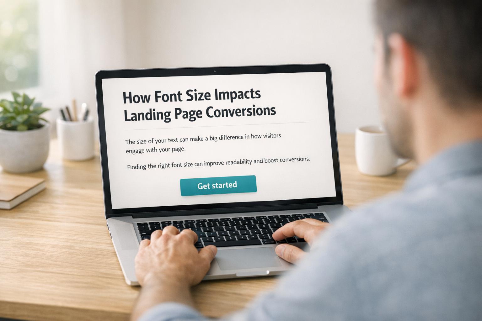
Font size directly affects how users interact with your landing page - and it can boost conversions by 20–35%. Here’s why:
- First Impressions Matter: Typography shapes how visitors perceive your brand. Larger, readable fonts build trust, while smaller fonts can frustrate users.
- Readability Drives Retention: Fonts below 16px alienate users, especially older audiences, making your content harder to engage with.
- Mobile Optimization is Key: With over 60% of web traffic coming from mobile devices, font sizes must be easy to read without zooming or straining.
- Testing Works: A/B testing font sizes for elements like headlines, body text, and CTAs helps identify what drives engagement and conversions.
For best results:
- Use 35–50px for desktop headlines and 28–40px for mobile headlines.
- Keep body text at least 16px (18–24px recommended on desktop).
- Set CTA text to 18–22px for clarity and impact.
Typography isn’t just about style - it’s about making your content accessible, readable, and conversion-friendly.
The only FONT SIZES you MUST KNOW for any website design
How Font Size Affects Landing Page Conversions
Font size does more than just influence the look of your landing page - it plays a key role in shaping how visitors perceive your brand and whether they trust you enough to take action. Typography impacts more than aesthetics; it affects credibility, emotional connection, and user behavior.
Readability and User Retention
If your font size is too small, visitors may struggle to read your content, creating unnecessary frustration. This "cognitive friction" can lead users to leave your page before fully engaging with your offer.
The numbers back this up. One study found that reading speeds improved by 35% when users viewed text in their "fastest" font compared to their "slowest" font. On top of that, well-designed typography can make readers feel like they've spent less time reading - by as much as 3 to 5 minutes - keeping them more engaged with your content.
Smaller font sizes also alienate a chunk of your audience, especially older users. By age 40, the retina receives only half the light it did at age 20, and by 60, this drops to just 20%. Fonts below 16px can make your content inaccessible to a significant portion of potential customers. Pairing small fonts with low contrast only worsens the issue, as poor readability is one of the top complaints users have about online content.
Font Size and First Impressions
Font size goes beyond readability - it shapes the initial impression of your brand. Larger fonts are often linked to sleek, professional designs that build trust. On the flip side, small or hard-to-read fonts can make users question your brand's credibility.
"Typography is body language. It's what makes the first impression." - Tommy Walker, former Editor-in-Chief, CXL
Readable, clean fonts suggest professionalism, while overly ornate or difficult-to-read fonts can drive users away. For instance, research by The New York Times revealed that readers were 1.5% more likely to agree with a statement when it was shown in Baskerville compared to fonts like Comic Sans or Helvetica.
Larger fonts also help create an emotional connection. When visitors can easily scan headlines and absorb the key benefits, they’re more likely to feel positively about your brand and take the next step toward conversion.
Font Size Guidelines for Landing Page Elements
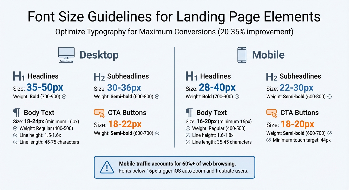
Font Size Guidelines for Landing Page Elements: Desktop vs Mobile
Typography plays a huge role in boosting conversions, and getting the font sizes right is key to creating a clear visual hierarchy that guides users seamlessly through your landing page. Each element has a distinct purpose, and its font size should reflect its importance.
Headlines and Subheadlines
For H1 headlines, aim for 35-50px on desktop and 28-40px on mobile, paired with bold font weights (700-900) to grab attention right away. H2 subheadlines should step down slightly in size - 30-36px on desktop and 22-30px on mobile - with semi-bold weights (600-800). This ensures your subheadlines support the main headline without overshadowing it.
Maintaining a clear contrast between heading levels is crucial. Using ratios like the Perfect Fourth (1.333) or Major Third (1.250) can help you create harmonious proportions across your headings.
Body Text
Body text should be at least 16px to avoid accessibility issues, such as iOS Safari's auto-zoom feature. Ideally, use 18-24px for desktop and 16-20px for mobile, especially for text-heavy pages like blog posts or detailed descriptions. This range ensures readability without overwhelming the user.
For line height, stick to 1.5-1.6 times the font size, and keep your line length between 45-75 characters on desktop and 35-45 characters on mobile. This setup prevents eye strain and makes reading more comfortable. Use regular font weights (400-500) for body text, as heavier weights can be tiring to read in longer passages.
Calls-to-Action (CTAs)
CTA button text demands extra attention - it’s where conversions happen. Use 18-22px on desktop and 18-20px on mobile, with semi-bold weights (600-700), to make your buttons stand out. The size should be large enough for users to read at a glance, and the button itself needs a minimum touch target of 44px to ensure easy tapping on mobile devices.
Optimizing typography for CTAs can lead to conversion improvements of 20-35%. When your call-to-action is both readable and easy to interact with, users are much more likely to take the next step.
Up next, we’ll explore how to adapt these font sizes for consistent performance across both desktop and mobile devices.
sbb-itb-5f36581
Font Sizes for Desktop and Mobile Devices
Typography needs to work seamlessly across both desktop and mobile screens. Desktop users typically view content from a greater distance, while mobile users interact with their devices up close. Add in differences in screen resolution and navigation styles, and it becomes clear that your typography must adjust to fit the context.
The main challenge? Ensuring text is easy to read without requiring users to zoom in or strain their eyes. With mobile traffic accounting for over 60% of web browsing, optimizing for mobile isn't optional - it’s essential. A landing page that looks great on a desktop can quickly turn into a frustrating experience on a phone if it doesn’t account for touch navigation and smaller viewports.
Mobile Readability Challenges
Small screens bring their own set of hurdles. A common mistake is setting body text below 16px on mobile. This forces users to zoom in, leading to frustration and, often, page abandonment. Text inputs with smaller font sizes can also trigger issues. On iOS, for example, if input text is under 16px, the browser automatically zooms in on the left side of the field, cutting off content and forcing users to manually zoom out.
"If your text inputs have a smaller font size than [16px], iOS browsers will zoom in on the left side of the text input, often obscuring the right side and forcing the user to manually zoom out." – Erik D. Kennedy, Learn UI Design
To avoid these pitfalls, tools like Reform can help ensure your forms meet these guidelines, creating a smoother experience for mobile users.
Another tip: keep mobile line lengths to 35–40 characters. Longer lines can cause users to accidentally reread lines, slowing them down. For touch-based interactions, buttons should be at least 44–48px to ensure accurate taps.
Responsive Typography Methods
The old method of using fixed breakpoints with media queries can lead to awkward jumps in font size when users resize or rotate their devices. Instead, rely on relative units and fluid scaling for smoother transitions. Using rem units instead of pixels is a good starting point - it respects user browser settings and scales text proportionally.
The CSS clamp() function is another great tool for fluid typography. For instance, font-size: clamp(1rem, 2.5vw, 2rem); lets text automatically scale between a minimum and maximum size based on the viewport width. This keeps headlines balanced and designs consistent without needing multiple fixed breakpoints.
For mobile readability, slightly increasing line height can make a big difference. Aim for values between 1.6 and 1.8 on mobile (compared to 1.5 to 1.6 on desktop). And don’t just rely on theory - test your responsive typography on actual devices. Text that looks fine on a desktop monitor might feel cramped or oversized on a phone. These adjustments lay the foundation for a better reading experience, paving the way for further optimization in the next steps.
Testing and Optimizing Font Sizes
Picking the right font size isn’t about guessing - it’s about using data to inform your decisions. A/B testing is a powerful way to compare two versions of your landing page, showing each version to random visitors to see which one performs better. This approach removes personal bias and gives you hard evidence about what resonates with your audience.
A/B Testing Font Sizes
When testing font sizes, focus on one element at a time. For example, if you’re increasing your headline size from 35px to 42px, keep everything else on the page the same. This way, you can pinpoint the exact cause of any changes in performance. Real-world examples show how impactful font size adjustments can be: The New York Times increased their click-through rate (CTR) by 20% with larger headlines, Google saw a 15% CTR boost in organic search results, and HubSpot improved conversions by 21% by tweaking their call-to-action (CTA) font size.
But don’t stop at just conversion rates. Pay attention to secondary metrics like bounce rate, time on page, and scroll depth. For instance, if a font size change leads to a higher bounce rate, it might mean the text feels overwhelming to users. Tools like Hotjar or Crazy Egg can provide heatmaps to show whether larger fonts are drawing attention to key elements like CTAs. Session recordings can also give you clues - watch for users struggling to read, zooming in, or squinting. These insights offer a deeper understanding of how font sizes impact user behavior across different devices.
Analyzing Conversion Data
Once you’ve gathered your test results, dive deeper by analyzing them by device type. This ties back to the earlier point about mobile readability challenges. Mobile users often need larger font sizes compared to desktop users. A font size that looks great on a large monitor might be too small for a smartphone. For instance, if your mobile bounce rate is climbing but desktop metrics remain steady, it’s a sign that your mobile font size might need adjustment. Tools like Reform can help ensure mobile-friendly text, like maintaining the 16px minimum for input fields to avoid iOS auto-zoom issues.
Numbers alone don’t tell the full story - look at the behavior behind them. If users are spending more time on the page but conversions stay flat, they might be reading more but missing a clear call to action. On the other hand, if conversions jump while time on page drops, larger CTAs might be grabbing attention at the expense of the body text. Try different combinations, such as pairing larger headlines with standard-sized body text, to find the balance that drives both engagement and conversions.
Conclusion
Font size isn't just a detail in design - it’s a key factor that can boost landing page performance by 20–35%, reduce bounce rates, and help establish trust with your audience. If users struggle to read your content, they’ll leave. But when headlines are easy to scan, body text flows naturally, and calls-to-action (CTAs) stand out, conversions tend to follow.
Start with the basics. For body text, aim for at least 16px, paired with a 1.5x line height for readability. Headlines on desktop should typically fall between 35–50px, while CTAs perform well at 18–22px. These numbers aren’t random; they’re based on accessibility standards and real-world user behavior. With these as your foundation, you can refine your approach through testing and adjustments.
Remember, guidelines are a starting point - not a one-size-fits-all solution. Your audience, industry, and design specifics will dictate what works best, which makes testing essential. Tweak one element at a time - like a headline or CTA - and track the impact on engagement and conversions.
Don’t overlook mobile users, either. Fonts smaller than 16px in form input fields can trigger auto-zoom on iOS browsers, creating a frustrating experience that can hurt conversions. Tools like Reform can help you maintain mobile-friendly font sizes while keeping forms clean and functional. Always test your pages on actual devices to ensure a seamless experience.
Brands such as HubSpot and The New York Times have shown how effective typography testing can lead to measurable increases in engagement and conversions. By optimizing every element - headlines, body text, and CTAs - you can create a landing page that performs at its best. Font size may seem like a small detail, but it’s the foundation that ties everything together.
FAQs
How does font size affect user trust and how people view your brand?
Font size isn’t just about aesthetics - it directly impacts how users perceive your brand and interact with your content. Using larger, well-chosen fonts enhances readability and accessibility, which can make your website feel more polished and trustworthy. When visitors find your content easy to read, they’re more likely to feel confident engaging with it.
On the flip side, small or inconsistent font sizes can frustrate users. Poor readability not only reduces accessibility but can also make your site seem less credible. To avoid this, opt for clean, modern fonts in sizes that are easy on the eyes. This simple choice communicates professionalism and approachability, both of which are key to building trust and increasing conversions.
What font sizes should I use on my landing page for better readability and conversions?
For better readability and improved conversions, stick to a minimum font size of 16px for body text to keep it accessible for all users. For headings, aim for 28-40px on mobile and 35-50px on desktop to make them stand out. Body text should fall between 16-20px on mobile and 18-24px on desktop, depending on your layout and audience needs. Always adjust font sizes to create a clear visual hierarchy and ensure your design works well across various screen sizes for a seamless user experience.
Why is it important to optimize font sizes for mobile landing pages?
Getting font sizes right on mobile landing pages is a game-changer for readability and user experience. Since mobile users view content up close, fonts need to be large enough to avoid eye strain and eliminate the hassle of zooming in. For a solid starting point, aim for 28-40px for titles and 16-20px for body text - this range keeps everything clear and easy to read.
Readable font sizes also make your page more accessible, allowing users to quickly scan and absorb information. With shorter attention spans on mobile, clear text can reduce frustration and keep users engaged. The payoff? Better usability, fewer people leaving your page, and a higher chance of turning visitors into customers.
Related Blog Posts
Get new content delivered straight to your inbox

The Response
Updates on the Reform platform, insights on optimizing conversion rates, and tips to craft forms that convert.


Drive real results with form optimizations
Tested across hundreds of experiments, our strategies deliver a 215% lift in qualified leads for B2B and SaaS companies.
