
.webp)
Mobile Landing Page Design: Ultimate Guide


Want more conversions from mobile users? Start by designing landing pages that prioritize speed, simplicity, and usability. Mobile users are often on the go, have shorter attention spans, and demand seamless interactions. If your landing page doesn’t meet their expectations, they’ll leave - fast.
Here’s what matters most for mobile landing pages:
- Speed: Pages should load in under 3 seconds - optimize images and reduce scripts.
- Simplicity: Clean layouts, clear text, and minimal distractions keep users focused.
- User-friendly forms: Use multi-step forms, large fields, and autofill to reduce friction.
- Effective CTAs: Buttons should be easy to tap, highly visible, and action-oriented.
- Accessibility: Ensure readability, proper contrast, and compatibility with assistive tools.
- Testing: Use A/B testing, heatmaps, and scroll depth metrics to refine performance.
Key takeaway: Mobile-first design means building for small screens first, ensuring smooth navigation and fast load times. Focus on one primary goal - whether it’s sign-ups, downloads, or purchases - and eliminate anything that gets in the way.
This guide covers practical tips for crafting mobile landing pages that convert, from optimizing forms to meeting U.S. compliance standards. Let’s dive in.
Optimize Your Landing Pages For Mobile
Core Principles of Mobile-First Design
Mobile-first design flips the traditional approach by starting with the smallest screen and scaling up. This method forces you to focus on what users truly need, cutting out unnecessary clutter that can bog down mobile performance. Instead of shrinking a desktop design to fit mobile, you build for mobile first and expand outward. This ensures a cleaner, more efficient experience for users.
Mobile-First vs. Responsive Design
Mobile-first design begins with mobile devices as the foundation and then adapts to larger screens. Responsive design, however, typically starts with desktop layouts and modifies them for smaller screens. While both approaches have their merits, mobile-first design often results in better experiences for the majority of users.
With mobile-first, you prioritize key elements and avoid features that don’t translate well, like hover effects. Since users rely on touch rather than a mouse, designs must cater to thumb-friendly navigation and one-handed use - the way most people interact with their phones.
Responsive design can sometimes lead to issues like cramped content, hidden menus, or tiny buttons. Mobile-first design sidesteps these problems by ensuring every element is optimized for small screens first. As you scale up, you’re enhancing the design rather than trying to fix what doesn’t work.
This approach naturally leads to simpler layouts and faster-loading pages, both of which are critical for mobile users.
Simple Design and Fast Loading
Speed matters - a lot. Mobile users expect pages to load in under 3 seconds, and delays can drive visitors away. Simple design isn’t just about looking clean; it’s about performance.
A streamlined layout with plenty of white space reduces mental strain for users navigating smaller screens, often in distracting environments. Every element on your mobile page should have a clear purpose, and fewer elements mean faster load times.
To improve speed, optimize images and minimize scripts. Large, uncompressed images are a common culprit behind slow pages. Use modern formats like WebP and responsive images that adjust to the user’s device. A massive hero image that looks great on a desktop might be unnecessary for a mobile screen.
Consider whether flashy animations or interactions are worth the trade-off in speed. Often, simpler solutions can achieve the same effect without slowing things down.
Once performance is optimized, focus on presenting information clearly and effectively.
Clear Text and Visual Elements
Readable text is non-negotiable on mobile. Text that works on a desktop can become impossible to read on a phone. Use a minimum font size of 16px for body text to avoid forcing users to zoom in. Anything smaller creates frustration and increases the risk of losing visitors.
High contrast between text and background is crucial for accessibility and visibility. Mobile users often view screens in challenging lighting conditions, like bright sunlight or dim rooms. What looks fine in your office might be unreadable outdoors.
Break up dense text into short paragraphs or bullet points, and ensure proper line spacing. Large blocks of text can overwhelm users on small screens.
On mobile, visual hierarchy is even more important. Use bold text, varying font sizes, and strategic spacing to draw attention to key information. Your headline should grab attention immediately, your value proposition should stand out, and your call-to-action should be impossible to miss.
Interactive elements like buttons should be at least 44px by 44px to accommodate touch. Space them out to prevent accidental taps - remember, fingers aren’t as precise as a mouse.
Images and icons should reinforce your message. On mobile, every pixel counts, so visuals should work hard to communicate your value or guide user actions. Decorative elements that don’t serve a purpose are better left out to keep the design clean and focused.
Key Components of High-Converting Mobile Landing Pages
To turn visitors into leads, every element on a mobile landing page must work together to create a smooth, distraction-free experience that naturally guides users toward taking action.
Strong Calls-to-Action (CTAs)
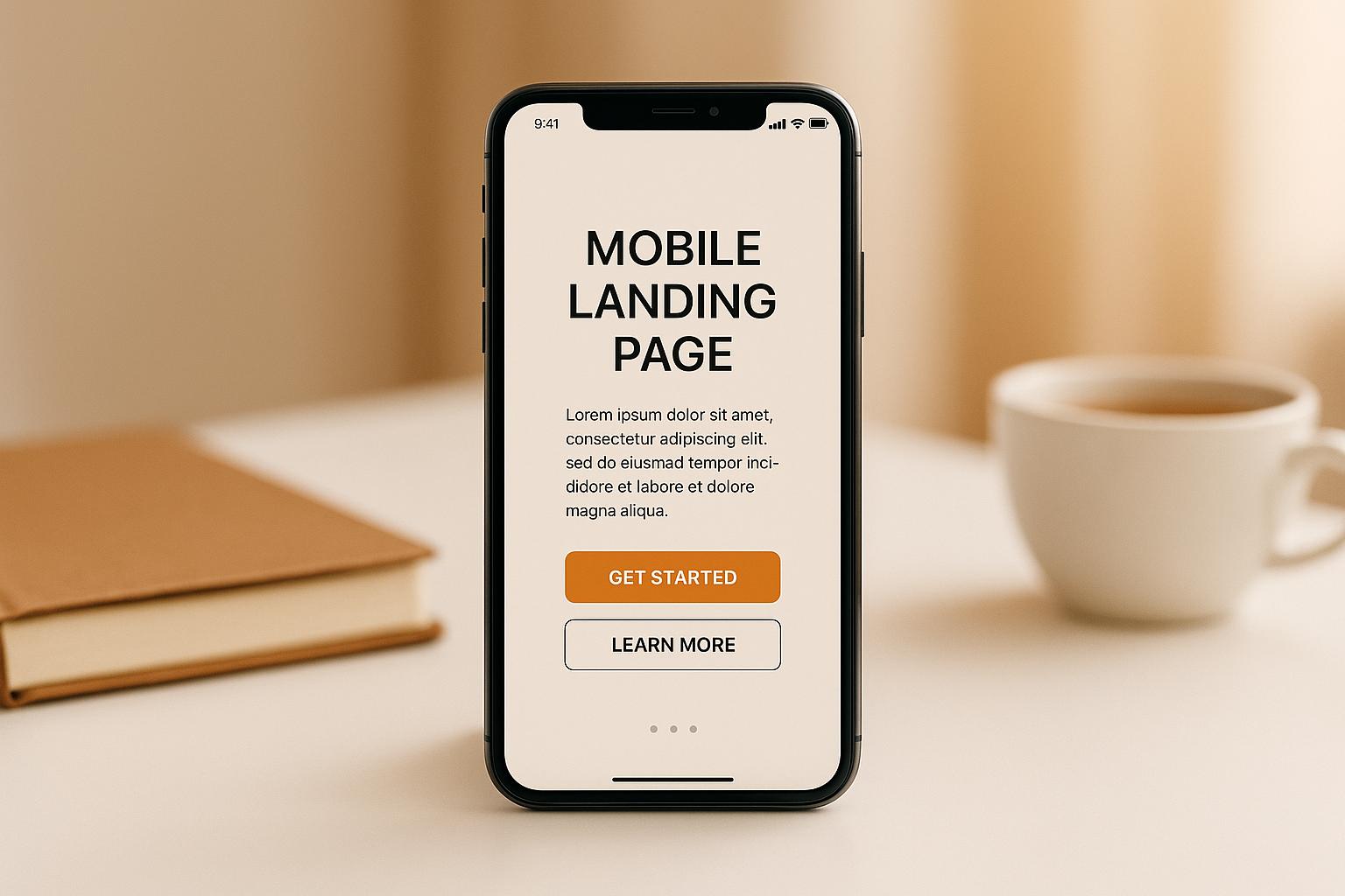
The call-to-action (CTA) is where interest becomes action. On mobile, it needs to stand out and be easy to tap. The most effective CTAs use action-driven language that sparks urgency - phrases like "Get Started", "Claim Your Spot", or "Download Now" perform better than vague options like "Submit" or "Click Here."
Design your CTAs with mobile users in mind:
- Thumb-friendly sizing: Buttons should be at least 44px to ensure easy tapping.
- Prominent placement: Position them above the fold so users see them immediately.
- High-contrast colors: Make sure the button pops against the background.
Sticky CTAs are another smart move. These buttons stay anchored at the bottom of the screen as users scroll, keeping the conversion opportunity within reach at all times. This way, users can explore your content and act whenever they’re ready - no need to scroll back up.
For longer pages, consider adding multiple CTAs. Place one near the top for quick converters, another after your main value proposition, and a final one at the bottom. Keep the design and wording consistent to avoid confusion.
Once your CTAs are ready, the next step is ensuring your forms are just as user-friendly.
Better Form Design
Traditional single-page forms can be a headache on mobile, often leading to abandonment. Instead, break forms into smaller steps with only 2-3 fields per screen, and include a progress bar to show users how close they are to finishing.
Multi-step forms are especially effective on mobile. By dividing complex requests into manageable chunks, they make the process feel less overwhelming. Completing each step builds momentum, encouraging users to finish the form.
Platforms like Reform offer tools that make mobile forms even smoother:
- Conditional routing: Adjusts questions based on previous answers, creating a personalized experience that feels relevant.
- Autofill capabilities: Automatically populates fields using device or browser data, reducing the need for typing.
- Lead enrichment: Gathers additional details automatically, cutting down on the number of fields users need to fill out.
To further improve usability, ensure form fields are large enough for easy typing and keep labels visible while users type to avoid confusion. Real-time validation is also key - catch errors like incorrect email formats or missing required fields as users type, rather than waiting until they hit "submit."
Reform also includes spam prevention and email validation features to ensure you’re capturing high-quality leads without adding extra steps for users.
White Space and Clear Copy
On mobile, every inch of screen space counts. Using white space effectively can make your page feel clean and easy to navigate. It’s not just empty space - it’s a tool to guide attention and reduce visual clutter.
Generous spacing between text, buttons, and images prevents accidental taps and gives users room to focus. When elements are crammed together, it’s harder for users to process information quickly.
Your headline should grab attention in just 3-5 words. Mobile users often skim while multitasking, so avoid long, complex messages. Instead, focus on the most compelling benefit your product or service offers.
For additional clarity:
- Use bullet points to highlight key benefits. They’re easier to scan than paragraphs and help users grasp the value at a glance.
- Break up content with subheadings that act as signposts, helping users quickly find what they’re looking for.
- Keep sentences short and paragraphs brief. Large text blocks can feel overwhelming on small screens.
When incorporating social proof - like testimonials or customer logos - place them thoughtfully. These elements build trust but shouldn’t overshadow your primary message or CTA. Use them as supporting details, not the main focus.
Every design and content choice should serve one purpose: guiding users toward conversion. On mobile, where distractions are everywhere, keeping things simple and focused is the key to success.
Mobile Landing Page Optimization Methods
Once your mobile landing page is live, the work isn’t over. Optimization is a continuous process that takes a good page and makes it even better through testing, quality checks, and user feedback.
A/B Testing and Data Analysis
A/B testing is one of the most effective ways to improve your mobile page's performance. Start by testing high-impact elements like headlines, call-to-action (CTA) buttons, and form layouts. Focus on one element at a time to figure out what drives conversions.
Pay attention to mobile-specific elements. For example, button size is critical on touchscreens - test different dimensions to ensure buttons are easy to tap without overwhelming the design. Similarly, test CTA colors across devices since contrast can vary depending on the screen type and lighting conditions.
Use heatmaps to see how users interact with your page. Are they tapping on elements that aren’t clickable? Are they skipping over key content? This data can help you rearrange your layout to better match how people actually use your page.
Scroll depth metrics are another valuable tool. If users consistently stop scrolling at a certain point, it’s a sign that something’s off. Maybe your form appears too soon, or your message isn’t clear enough by that stage.
Don’t overlook load time testing. Mobile users often deal with slower connections, and even a one-second delay can hurt your conversion rates. Simulate different network speeds to see how your page holds up. Faster load times mean fewer drop-offs.
If you’re using tools like Reform, features like real-time analytics can help you pinpoint where users abandon forms or encounter friction. This kind of data highlights areas where you can improve both the user experience and lead quality.
Better Lead Quality and Spam Protection
High conversion rates are great, but they don’t mean much if the leads aren’t useful. Mobile forms are especially prone to spam, so it’s important to use tools that block bad submissions without frustrating real users.
Real-time email validation can catch typos and block fake addresses, saving you from wasting time chasing invalid leads. Similarly, phone number validation ensures you can actually reach the people filling out your forms.
Using multi-step forms can also help. Bots and low-quality leads are more likely to drop off after the first step, while serious prospects will continue. This simple filtering process improves lead quality without adding unnecessary hurdles.
For added protection, tools like Google reCAPTCHA (especially the invisible version) can block bots without disrupting the user experience. The invisible version works in the background, only stepping in when suspicious activity is detected.
You can also use qualifying questions to filter leads. Instead of just collecting contact details, ask questions about budgets, timelines, or specific needs. This approach not only improves lead quality but also gives you valuable insights into your prospects.
Platforms like Reform also offer built-in features for spam prevention and lead enrichment, which can automatically gather extra information about prospects. This reduces the number of fields users need to fill out while still providing you with detailed lead data.
Brand Consistency and User Testing
Your mobile landing page isn’t just a standalone piece - it’s part of your overall brand experience. To build trust and recognition, make sure the page aligns visually with your brand. Use the same colors, fonts, and messaging style that appear in your ads, emails, and other marketing materials.
Test your page across different devices and platforms to ensure it works smoothly everywhere. Mobile forms, dropdown menus, and file uploads can behave differently on iOS, Android, or various browsers. Make sure everything functions seamlessly, no matter how users access your page.
User testing is another valuable step. Watching real people navigate your page can uncover issues that analytics might miss. You’ll see where users hesitate, what confuses them, and what encourages them to take action. Even a handful of user testing sessions can lead to meaningful improvements.
Don’t forget about accessibility. Mobile users often browse in less-than-ideal conditions - bright sunlight, one-handed scrolling, or while multitasking. Your design should accommodate these scenarios. For U.S. audiences, ensure your page meets ADA compliance standards by using proper contrast ratios, readable font sizes, and navigation that works with assistive technologies like screen readers.
Finally, set up regular performance monitoring to catch issues before they hurt your conversions. Mobile users are quick to abandon slow-loading pages, so it’s essential to stay on top of load times and fix problems as soon as they arise.
sbb-itb-5f36581
U.S. Compliance and Localization Requirements
Creating mobile landing pages for U.S. audiences isn’t just about sleek design - it’s about meeting specific standards for formatting, privacy, and accessibility. These details not only enhance user experience but also ensure your business stays compliant with U.S. regulations.
U.S. User Localization
To make a professional impression, use formatting that aligns with U.S. conventions. For example:
- Dates: Use the MM/DD/YYYY format.
- Prices: Display amounts as $1,299.99, with commas separating thousands.
- Phone Numbers: Format numbers as (XXX) XXX-XXXX or XXX-XXX-XXXX. Many tools, like Reform, can handle this formatting automatically.
When it comes to addresses, split fields into street, city, state, and ZIP code. Use dropdown menus for states, listing them by their two-letter abbreviations (e.g., CA, NY, TX). This not only streamlines form completion but also reduces errors.
For measurements, default to imperial units such as feet, inches, pounds, and Fahrenheit. However, in technical contexts, consider offering metric conversions for users who might need them.
Language matters, too. Stick to American English spelling and avoid slang or regional references that could confuse users from different parts of the country. Details like these help your page feel tailored to U.S. audiences.
Privacy and Accessibility Rules
U.S. privacy laws, like the California Consumer Privacy Act (CCPA), require transparency about data collection. If your mobile forms ask for personal details like email addresses or phone numbers, clearly explain why you’re collecting this information. Always display a privacy policy prominently and ensure users can easily give or withhold cookie consent without interfering with their experience.
For tools that enrich lead data, such as those that pull in company details or social profiles, it’s essential to disclose this automated data collection. Platforms like Reform often include features to help you stay compliant in these areas.
Accessibility is equally crucial - and legally required for many businesses. Mobile accessibility presents unique challenges, as users may be navigating with one hand, using voice commands, or relying on assistive technologies like screen readers.
Here are some key considerations:
- Color Contrast: Ensure text is easy to read in both bright sunlight and dim lighting. Use tools to test contrast ratios and meet WCAG standards.
- Touch Targets: Make clickable elements at least 44x44 pixels and space them far enough apart to avoid accidental taps.
- Screen Reader Compatibility: Use proper HTML structure and include alt text for images. Avoid relying solely on placeholder text for form field labels, as it disappears when users start typing and isn’t always accessible to assistive technologies.
- Keyboard Navigation: Ensure users can navigate all elements logically using only a keyboard.
- Voice Input: Optimize for voice commands by using intuitive field names and avoiding formats that voice recognition tools might misinterpret.
Regular compliance audits are essential to keep up with changing standards. Mobile interfaces often need adjustments due to operating system updates, so review your pages quarterly. Test them with accessibility tools and, if possible, gather feedback from real users who rely on assistive technology. Staying proactive helps you catch potential issues before they become bigger problems.
Building Better Mobile Landing Pages
To create effective mobile landing pages, you need to blend mobile-first design principles, compliance standards, and smart conversion tactics. The ultimate goal? Deliver an exceptional user experience while driving conversions.
Start by embracing a mobile-first mindset. Instead of shrinking desktop designs to fit smaller screens, design specifically for mobile from the ground up. Focus on fast load times (under 3 seconds is ideal) and a streamlined user journey. Keep it simple by centering on one main conversion goal - this ensures users aren’t distracted or overwhelmed.
Forms are critical for conversions, but they can also be a major pain point. Keep them short and sweet. Use smart, automated tools like Reform to simplify formatting, reduce user effort, and prevent spam. Features like lead enrichment can help you collect quality information without requiring users to fill out long, tedious forms.
Testing and iterating is what sets the best mobile landing pages apart. Dive into your analytics to identify problem areas - if users are abandoning the page at a specific step, that’s your cue to optimize. And don’t just rely on browser simulators; test your designs on actual mobile devices. Real-world conditions, like slower networks or smaller screens, can reveal issues you might otherwise miss.
Accessibility is non-negotiable. Beyond being a legal requirement, it’s simply good business. Designing with accessibility in mind improves the experience for everyone, not just users with disabilities.
A mobile-first approach means designing for the realities of mobile use. People browse on the go - whether it’s under bright sunlight, one-handed while juggling coffee, or in the middle of multitasking. To meet these challenges, use high-contrast colors, large touch-friendly buttons, and text that’s easy to scan, even at a glance.
Instead of adding unnecessary features, focus on removing barriers. Prioritize clarity over clever design tricks, and always keep the user’s experience front and center. A clean, intuitive design is what drives results.
FAQs
What’s the difference between mobile-first and responsive design, and how do they affect user experience?
Mobile-First vs. Responsive Design
Mobile-first design begins with small screens in mind, ensuring a seamless experience for mobile users before scaling up to larger devices. This method focuses on usability for the growing number of people who primarily access websites through their phones.
Responsive design, however, takes a different route. It uses a single layout that adjusts fluidly to fit any screen size, from mobile to desktop. While this approach offers versatility, it can sometimes create usability hiccups on certain devices if not executed with care.
The main distinction lies in their starting points: mobile-first prioritizes the needs of mobile users, while responsive design aims for a consistent look and feel across all devices. Deciding which approach to use often comes down to understanding your audience and the devices they rely on most.
How can I design a mobile landing page that is accessible to everyone, including users with disabilities, without compromising on simplicity?
Creating a mobile landing page that is easy to use and visually appealing starts with embracing inclusive design principles. Choose high-contrast color combinations to make text easier to read, and ensure your text can be resized without losing clarity - this is especially helpful for users with visual impairments. Use clear, descriptive headings and labels to guide navigation, and design touch targets to be at least 9x9mm so they’re easy to tap on small screens.
Don’t rely solely on images or videos to convey important information. Always include text alternatives to ensure everyone can access your content. It’s also a good idea to test your page with tools like screen readers to confirm it works well with assistive technologies. These adjustments help create a seamless experience for all users while keeping your design modern and accessible.
How can I optimize my mobile landing page to improve performance and boost conversion rates?
How to Optimize Your Mobile Landing Page
To boost your mobile landing page's performance and drive more conversions, start with the basics: speed matters. Compress your images, trim down unnecessary scripts, and clean up your code to ensure your page loads quickly. No one likes waiting, especially on mobile.
Next, prioritize responsive design. Use fonts that are easy to read and make sure buttons are large enough to tap without frustration - this small detail can make a big difference in user experience.
Testing is another critical step. Experiment with key elements like headlines, call-to-action (CTA) buttons, and forms to see what grabs attention and works best for your audience. Keep your forms short and straightforward to minimize drop-offs. A clutter-free, user-friendly form can significantly improve your conversion rates.
Use analytics tools to track how your page is performing. Dive into metrics to understand user behavior, and tweak your content or layout based on what the data tells you. For example, if users consistently drop off at a certain point, it might be time to simplify that section.
Lastly, don’t treat optimization as a one-and-done task. It’s an ongoing process. Regularly review your page, adapt to changing user preferences, and make sure it continues to align with your business goals. Staying proactive will keep your landing page performing at its best.
Related posts
Get new content delivered straight to your inbox

The Response
Updates on the Reform platform, insights on optimizing conversion rates, and tips to craft forms that convert.


Drive real results with form optimizations
Tested across hundreds of experiments, our strategies deliver a 215% lift in qualified leads for B2B and SaaS companies.
