
.webp)
4 Principles For Better Form UX


Forms are where users take action - buy, sign up, or share info. But bad forms? They push users away. Here’s what works:
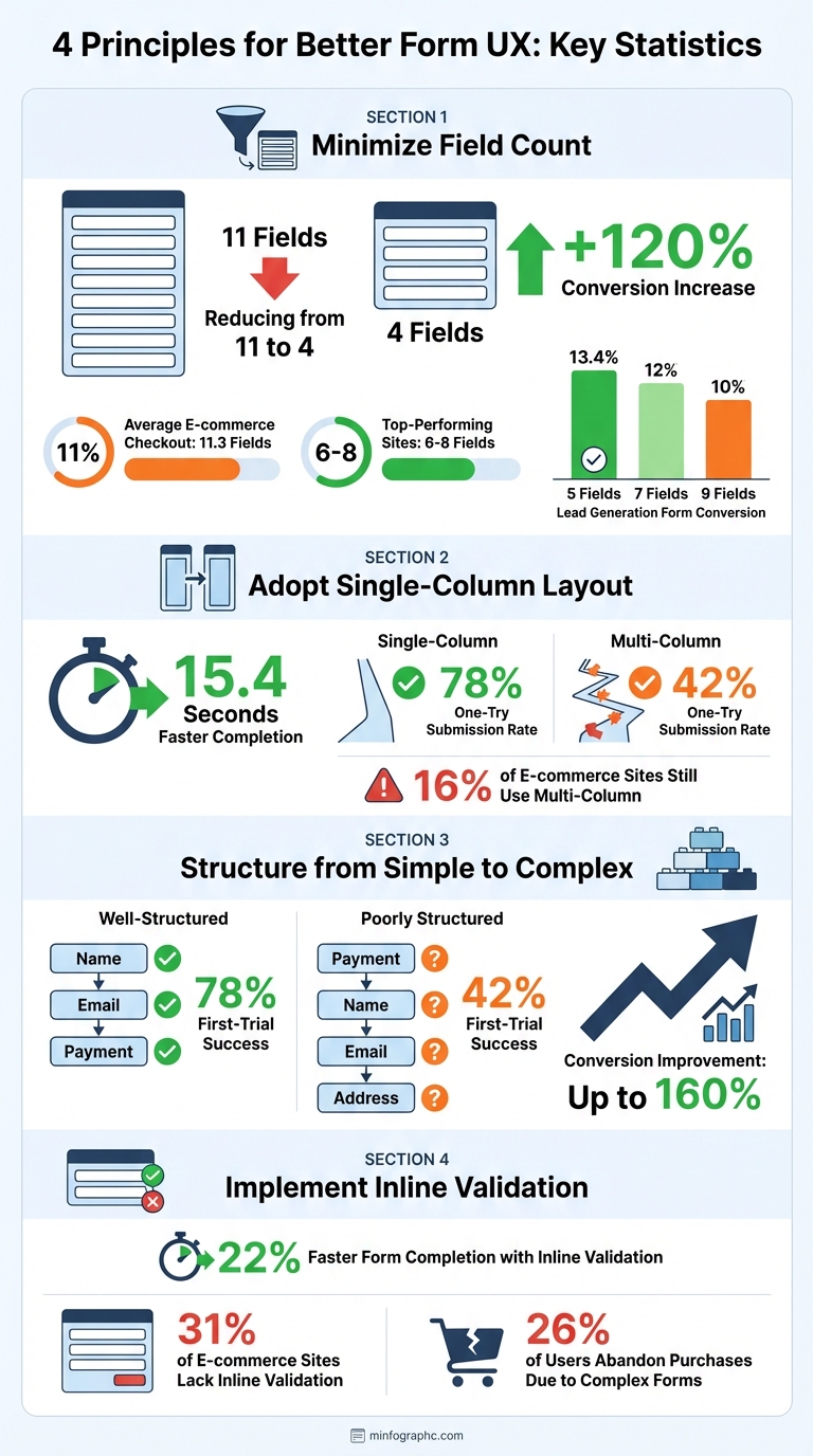
- Fewer fields = more conversions: Cutting fields from 11 to 4 can boost conversions by 120%.
- Single-column layout wins: It's faster and easier to follow than multi-column forms.
- Start simple, end complex: Begin with easy fields (like name/email) and save harder ones (like payment) for last.
- Inline validation helps: Show users errors as they type to save time and reduce frustration.
These steps make forms easier to complete and improve user experience, which means fewer drop-offs and better results.
Form UX Statistics: How Field Count and Layout Impact Conversion Rates
Form Design Best Practices: Webinar w/ Vitaly Friedman
1. Keep Form Fields to a Minimum
Adding more fields to a form can hurt your conversions. Research reveals that reducing form fields from 11 to just 4 can increase conversion rates by a staggering 120%. Despite this, the average e-commerce checkout still asks for 11.3 fields, while top-performing sites manage to complete transactions with only 6 to 8 fields.
A study by Marketing Experiments highlights this further: a lead generation form with 5 fields converted at 13.4%, compared to 12% for 7 fields and just 10% for 9 fields. Huei-Hsin Wang from NNGroup explains it perfectly:
"Every question is a withdrawal, and if you ask too many unnecessary or intrusive questions, you risk losing user trust".
To streamline your forms, use the "Three Ds" approach:
- Delete fields that aren't absolutely necessary.
- Delay questions that can be asked after the initial conversion.
- Deliver clear value for the fields you keep.
You can also follow the EAS method to refine your forms:
- Eliminate non-essential questions.
- Automate inputs (e.g., derive city from a ZIP code).
- Simplify the remaining fields.
Guest checkout is another way to reduce friction. Let users create accounts after their purchase, and clearly mark optional fields so they know what can be skipped. If sensitive information like phone numbers is required, explain why it’s needed - for instance, "Phone number for delivery updates only" - to ease concerns and build trust.
Remember, shorter forms are great for maximizing leads, while longer forms can help filter for higher-quality submissions. As Ivan Schneiders puts it:
"Questions cost conversions - every extra question beyond necessity costs the business".
Consider tools like Reform to help design streamlined forms that balance simplicity with effectiveness.
2. Use a Single-Column Layout
Multi-column forms can slow users down. A study by CXL found that participants completed single-column forms 15.4 seconds faster on average compared to multi-column versions. Why? Because our eyes naturally move vertically, not in a zigzag pattern. A clear vertical flow reduces mental effort and makes forms easier to follow.
Side-by-side fields also create confusion about the order of completion. Should users move horizontally across the row first or vertically down the column? This uncertainty increases the mental load and can even lead to skipped fields. As Huei-Hsin Wang from Nielsen Norman Group puts it:
"A single column provides a clear, vertical path that's easy to follow and scale across devices".
The numbers back this up: single-column forms boast a 78% one-try submission rate, compared to just 42% for multi-column forms. Despite this, 16% of e-commerce sites still rely on multi-column layouts, which contributes to checkout abandonment.
Stick to one field per row as the default. The only exceptions are closely related fields, such as City/State/ZIP or Credit Card Expiration/CVC. Pair this with top-aligned labels to make scanning even faster.
Single-column layouts also shine on mobile. They simplify navigation for mobile users and enhance accessibility for those using screen magnifiers. Tools like Reform make it easy to create single-column forms that maintain this streamlined vertical flow across all devices.
sbb-itb-5f36581
3. Start with Simple Fields, End with Complex Ones
The order of fields in a form can make or break the user experience. Starting with easy, familiar fields - like name and email - helps users ease into the process. Once they’ve invested time in these straightforward steps, they’re more likely to stick around and complete even the more challenging sections. This approach builds momentum and keeps users engaged.
Think of it like a conversation: you wouldn’t start by asking someone deeply personal or complicated questions right away. As Huei-Hsin Wang, Senior User Experience Specialist at Nielsen Norman Group, puts it:
"Structuring a form is like having a conversation. The order of the form questions can impact flow and comprehension."
Save the heavy lifting - like employment history or payment details - for the end. These fields require more effort and can slow users down, so it’s better to introduce them after trust has been established. The U.S. Web Design System supports this approach, advising designers to "progressively disclose information, guiding the user from simple to more difficult questions."
The benefits of this strategy are clear. Forms designed with user-friendly sequencing see a 78% successful first-trial submission rate, compared to just 42% for poorly structured forms. Even better, conversion rates can improve by up to 160% when forms are thoughtfully designed.
To make the process even smoother, let users know upfront if they’ll need specific materials, like documents or payment details. Tools like Reform can help by implementing progressive disclosure, revealing only the fields that are relevant as users move through the form. Start simple - name, email, ZIP code - and gradually lead into the more complex questions. It’s a small change that can make a big difference.
4. Add Inline Validation and Group Related Fields
Nobody enjoys filling out a form only to be hit with a list of errors after hitting "Submit." That’s where inline validation comes in - it flags errors as users type, saving them from the frustration of discovering issues after investing time and effort.
Inline validation isn’t just about convenience; it improves form completion speed by an average of 22%. Edward Scott, Research Lead at Baymard Institute, puts it well:
"Positive inline validation removes some cognitive load from users since they don't have to review and validate the form for errors before submitting it".
Yet, despite its benefits, 31% of e-commerce sites still lack inline validation, creating unnecessary friction for users.
Pairing inline validation with grouped fields makes forms even easier to navigate. Breaking a form into logical sections - like "Personal Information" and "Payment Details" - turns a daunting process into smaller, more manageable steps. Clear headings and consistent spacing help users quickly identify related fields, applying the Law of Proximity: elements placed near each other are naturally seen as connected. This reduces mental effort and allows users to process information faster.
The timing of validation is just as important. Trigger error messages when the user moves out of a field (on the "blur" event) rather than while they’re typing. And when you display an error, make it clear and actionable. For example, say, "Enter a 5-digit ZIP code" instead of something vague like "Invalid". This approach keeps users focused and minimizes frustration.
Tools like Reform can simplify the process of implementing inline validation and grouped fields, making forms more intuitive. When these strategies are combined, the results are striking: users are nearly twice as likely to complete the form correctly on their first attempt - 78% compared to 42% for poorly designed forms.
Conclusion
These four principles can turn frustrating forms into smooth, user-friendly experiences. By focusing on minimizing fields, adopting a single-column layout, organizing fields from simple to complex, and incorporating inline validation, you can significantly improve form completion rates. In fact, well-structured forms have been shown to boost conversion rates by as much as 160% compared to poorly designed ones. As Huei-Hsin Wang from NN/g aptly puts it, "Forms are mental work". These principles are designed to ease that mental load at every step.
When you prioritize user-centered design, you remove barriers between users and their goals. This approach not only improves the experience but also delivers higher-quality leads and better conversion rates. Considering that about 26% of users abandon purchases due to overly complex forms, optimizing your forms is more important than ever.
Once you've embraced these principles, the next logical step is to use a tool that makes implementation seamless. Reform offers features like multi-step forms, conditional logic, and real-time analytics, transforming complex data collection into a natural, conversational process.
FAQs
Why does reducing the number of form fields boost conversion rates?
Reducing the number of form fields can significantly improve conversion rates because it makes the process faster and easier for users. When people see fewer fields, they feel less overwhelmed and are less likely to abandon the form out of frustration.
Shorter forms also appear more approachable and simple, encouraging users to complete them. By asking only for the most important information, you create a streamlined experience that keeps users engaged and more likely to finish the process.
Why is a single-column layout better for user-friendly forms?
Using a single-column layout for forms can make a big difference in how users interact with them. It’s especially helpful on mobile devices, where space is limited. Studies have found that single-column forms are not only faster to complete but also result in fewer mistakes compared to layouts with multiple columns.
This design approach works because it guides users to focus on one field at a time, cutting down distractions and reducing mental effort. By keeping things simple and straightforward, single-column forms often lead to more people finishing the form and having a smoother experience along the way.
What is inline validation, and how does it improve form usability?
Inline validation is a feature in form design that gives users real-time feedback as they fill out a form. Instead of waiting until the form is submitted, it flags issues right away - like an invalid email or a wrongly entered credit card number. This immediate feedback makes it easier for users to spot and fix mistakes, creating a smoother and less frustrating experience.
When done right, inline validation can improve usability, reduce the chances of users abandoning the form, and boost completion rates. To make it work well, it’s crucial to avoid triggering errors too early, clear error messages once the issue is fixed, and make sure the feature is accessible to everyone.
Related Blog Posts
Get new content delivered straight to your inbox

The Response
Updates on the Reform platform, insights on optimizing conversion rates, and tips to craft forms that convert.


Drive real results with form optimizations
Tested across hundreds of experiments, our strategies deliver a 215% lift in qualified leads for B2B and SaaS companies.
