
.webp)
Form Length Optimization: Best Practices


Want more conversions from your forms? Start by optimizing their length.
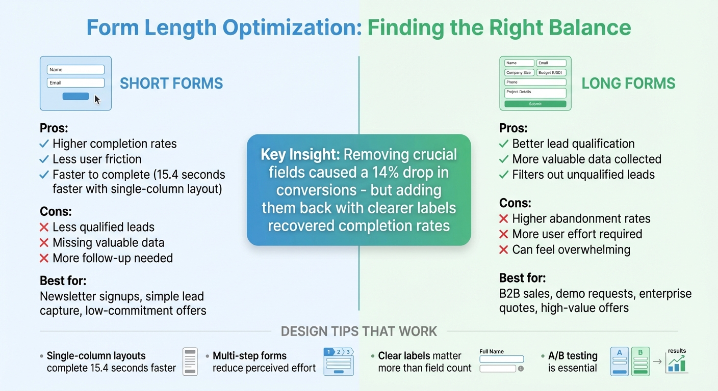
Shorter forms often get completed more, but they can miss out on valuable details. Longer forms may qualify leads better but risk higher abandonment rates. The key is balance.
Here’s what you need to know:
- Form length isn’t just about the number of fields - layout, spacing, and whether it’s single or multi-step matter too.
- Short forms (like name and email) boost submissions but may attract less qualified leads.
- Longer forms (with fields like budget or company size) filter leads better but reduce submissions.
- Smart design (like single-column layouts or multi-step forms) reduces friction and improves completion rates.
- Testing is essential. Use A/B tests to find the right mix of fields and layout for your audience.
Tools like Reform help you test, analyze, and adjust forms in real time. Whether you want higher completion rates or better lead quality, proper form design can make the difference.
Short vs Long Form Comparison: Completion Rates and Lead Quality
How Form Length Affects User Behavior
The Psychology Behind Form Completion
Every additional field in a form adds to the mental effort required to complete it. When users are faced with too many questions, they can feel overwhelmed and abandon the process altogether. Each field represents a decision point, and too many of these can lead to cognitive fatigue.
But it’s not just about the number of fields. How users perceive the effort involved is equally important. For instance, a ten-field form with clear labels, ample spacing, and a simple single-column layout can feel easier than a six-field form that’s cluttered, poorly worded, or spread across multiple columns. Forms that require excessive scrolling or have dense layouts amplify the perceived difficulty - even when the actual effort is the same.
Breaking forms into multiple steps can help ease this perception. Multi-step forms take advantage of commitment bias - users who begin with a few simple questions feel invested and are more likely to continue. By presenting only a small portion of the form at a time, these designs prevent users from feeling overwhelmed by a long list of fields. This demonstrates how even minor design adjustments can significantly influence completion rates.
What Research Shows About Form Length
Studies consistently reveal that shorter forms improve completion rates by reducing friction. For example, CXL found that single-column forms were completed 15.4 seconds faster than multi-column versions, underscoring the impact layout can have on user behavior. However, simply cutting fields isn’t always the solution.
One case study highlights this point: removing crucial fields from a form initially caused a 14% drop in conversions. When those fields were reinstated - with clearer labels - the completion rates recovered. This example emphasizes that the relevance and clarity of fields matter more than their sheer number. The challenge lies in balancing brevity with the need for essential information.
When to Use Longer Forms
While shorter forms tend to perform better in terms of completion rates, longer forms are sometimes necessary - especially when lead quality takes precedence. In scenarios like B2B sales, where users request demos or pricing quotes, detailed forms help filter out unqualified leads. Fields asking for specifics, such as company size or budget range (in USD), provide valuable insights that improve lead quality.
Longer forms are also expected in situations where users see a high return on their effort. For instance, someone downloading a free checklist might balk at ten questions, but a person applying for a $50,000 credit line or requesting a custom enterprise quote is more willing to invest time. The key is ensuring the form is well-designed and clearly communicates what happens next, so users feel their effort is worthwhile.
Form Optimization Tip 3: Reduce Form Length
How to Prioritize and Structure Form Fields
Creating a well-structured form is key to ensuring a smooth experience for users. By carefully prioritizing and organizing fields, you can make forms more efficient and user-friendly.
Separating Required Fields from Optional Ones
Start by identifying the form's purpose - whether it's for a newsletter signup, demo request, or trial. Then, include only the fields necessary to achieve that goal. For example, a newsletter signup typically only requires an email address, while sending a physical sample might also need a mailing address. Anything beyond that should be optional.
Optional fields can be useful for collecting additional qualifiers that enhance follow-up efforts. For instance, a sales consultation form might include optional fields for company size or budget range (in USD). However, if the information won’t impact how you respond, qualify leads, or route inquiries within 30–60 days, consider leaving it out. Alternatively, you can gather that data later through CRM tools or follow-up surveys. Every required field should have a clear purpose and contribute to either lead quality or operational efficiency.
If your form includes both required and optional fields, make the distinction clear. Use consistent markers like an asterisk (*) or the word "Required" next to the label. Ideally, label optional fields rather than required ones to simplify the design and reduce cognitive load. Place these indicators right next to the field label so users can easily spot them.
Once you've identified the essential fields, focus on trimming unnecessary ones.
Removing and Combining Fields
Audit your forms regularly to eliminate fields that don’t add value. Questions that aren’t used in workflows or reporting should be removed. Avoid asking for highly personal details, like income or a phone number, unless they are absolutely critical.
You can also use lead enrichment tools to reduce form length. These tools can automatically infer details like company name, size, industry, or location based on an email domain or IP address. This approach keeps the visible form short while still providing your team with the data they need.
Another way to streamline forms is by combining related fields. For example, you can place first and last name on a single line or group city, state, and ZIP code together. This reduces the vertical space while keeping everything easy to understand. For U.S. users, use familiar formats like state dropdowns with two-letter abbreviations and standard phone number formatting to minimize confusion.
How to Order and Group Fields
Once fields are optimized, their order and grouping can further improve the user experience. Start with simple, low-effort questions like a first name or role. These build confidence and commitment early on. Save more demanding or sensitive fields - like phone number, budget, or detailed project descriptions - for later, once users are more engaged. This "easy-to-hard" sequence helps maintain momentum and reduces the chances of early abandonment.
Group related fields into logical sections, such as personal information, company details, or project specifics. This prevents users from constantly switching mental gears, which can cause hesitation. Use clear headings and ample white space to visually separate these groups.
When it comes to layout, research shows that single-column forms perform better than multi-column ones. A study by CXL found that single-column forms were completed 15.4 seconds faster on average than their multi-column counterparts. The simplicity of a single-column design reduces eye movement and confusion.
For desktop users, you can align related fields like first and last name or city and ZIP code on the same line to save vertical space. On mobile devices, stick to a strict single-column layout. Ensure each field group fits within one or two screen heights to minimize scrolling and improve usability.
sbb-itb-5f36581
Design Practices That Improve Form Usability
A well-designed form can make all the difference in how quickly and easily users complete it, no matter how many fields it contains. By focusing on smart layouts, intuitive interaction patterns, and mobile-friendly features, you can reduce friction and help users move through forms smoothly.
Layout and Interaction Best Practices
Research highlights that single-column layouts are more effective for guiding users through a form. Why? They create a clear, linear flow that’s easier to scan and requires less eye movement, helping users complete forms faster.
Adding white space around form fields minimizes visual clutter, allowing users to focus on one question at a time. Pair this with left-aligned labels and consistent field widths for better readability and a seamless flow down the form. Grouping related fields under headers like "Personal Information" or "Company Details" can also make the form feel more structured and manageable.
While single-column designs are the go-to, you can place closely related fields - such as first and last name or city and ZIP code - on the same row to save vertical space. However, avoid overcomplicating things with multi-column layouts, as they disrupt the natural reading flow and slow users down.
For more complex forms, multi-step designs can be a game-changer.
When and How to Use Multi-Step Forms
Multi-step forms shine when you need to collect a lot of information without overwhelming users. They’re particularly useful for processes like event registrations, B2B demo requests, or detailed signups - situations where users are willing to invest time because they see value in the outcome.
By breaking the form into logical sections - such as “Contact Info → Company Details → Preferences” - you show fewer questions at once, making the process feel easier, even if the total number of fields remains the same. This format also helps with lead qualification: you can gather essential details upfront and reserve more specific questions for later stages, keeping only the most motivated users engaged.
Keep multi-step forms simple, with three to five stages at most. Each step should feel like a natural part of the process. Progress indicators are essential - they let users see how far they’ve come and how much is left, reducing the chances of them abandoning the form. Reform’s multi-step forms, for example, include built-in progress tracking and allow you to control how many questions appear per page, giving you flexibility to adapt to your needs.
Designing Forms for Mobile Devices
To ensure a smooth experience on mobile devices, these usability principles need to be adapted for smaller screens. Stick to a single-column layout and avoid placing fields side by side or requiring horizontal scrolling. Use large touch targets - buttons and input fields at least 44 pixels high - with enough vertical spacing to prevent accidental taps.
Optimize input types to reduce typing effort. For example, use numeric keypads for phone numbers and ZIP codes, and email-specific keyboards for email addresses. This not only speeds up the process but also minimizes errors - something especially important on mobile. Keep labels visible above fields so users don’t lose context when the on-screen keyboard pops up.
Make things even easier with dropdown menus, radio buttons, or auto-complete options for inputs like U.S. addresses. Fast load times are critical on mobile, so test your forms on real devices to catch issues that desktop testing might miss.
Testing and Improving Form Length
Fine-tuning the length of your forms requires ongoing testing and analysis. Striking the right balance between simplicity and gathering enough information is key to ensuring ease of use while maintaining lead quality.
Metrics to Track
To understand how your forms are performing, keep an eye on completion rate (submissions divided by starts) and abandonment rate, which help identify where users face friction. Another important metric is time to complete, which can reveal whether users find your form too long or complex. However, speed alone doesn’t tell the whole story. You also need to monitor lead quality by linking submissions to downstream actions like sales-qualified leads, demo attendance, trial activations, or revenue. This allows you to assess whether shortening the form sacrifices critical data, or if longer forms are deterring users and limiting volume.
These metrics provide the foundation for running systematic A/B tests.
Running A/B Tests on Form Variations
A/B testing is one of the most effective ways to determine the ideal form length for your audience. Test shorter and longer forms - for instance, four fields versus eight - while keeping other variables constant. You can also experiment with single-step versus multi-step layouts for forms with the same total number of fields. Multi-step designs often lead to higher completion rates for longer forms.
Consider testing different field combinations by removing low-value or high-friction questions, changing required fields to optional, or deferring some questions to a later step after users have already committed. Use conditional logic to show follow-up questions only when relevant. Ensure your tests run long enough to achieve statistical significance, and limit the number of variants if traffic is low.
These controlled experiments will give you clear, actionable data to refine your forms.
Analyzing Results and Making Changes
Once testing is complete, confirm that your sample size is large enough and covers typical user behavior over time. Compare key metrics like completion rate and time to complete across variants, and evaluate downstream key performance indicators (KPIs) such as MQL rate, opportunity rate, and revenue per lead.
If shorter forms lead to more completions but harm lead quality, consider a hybrid approach. For example, use a shorter form upfront and gather additional details through post-submission tools like profile enrichment. Analyze field-level data to identify which questions cause friction and explore whether rephrasing or repositioning them can reduce drop-offs while still capturing essential information.
Segment your results by factors like device type, traffic source, and whether users are new or returning. Pair quantitative data with qualitative insights, such as session recordings or usability tests, to see exactly where users hesitate. Document not only which variant performed best but also why - for instance, “splitting the form into three steps reduced perceived effort on mobile.” These insights help turn individual experiments into broader design principles.
Reform’s real-time analytics and A/B testing tools simplify this process. The platform even captures data from abandoned submissions, allowing you to analyze where users dropped off and why. This level of detail helps pinpoint friction points and informs your next round of improvements.
Conclusion
Main Takeaways
Optimizing form length is all about striking the right balance between user effort and the quality of data you collect. Focus on gathering only the information you need to deliver what you promise - whether that's access to a resource, scheduling a call, or starting a trial. Research shows that single-column forms are completed 15.4 seconds faster than multi-column ones, and cutting out unnecessary fields often leads to higher conversions. That said, removing fields without considering their purpose can backfire. For instance, one study found that eliminating certain fields caused a 14% drop in conversions because users felt critical context was missing.
Clarity in design is key. Use clear labels, mark required fields prominently, and arrange questions in a logical order. Multi-step layouts can make forms feel less overwhelming, especially on mobile devices. Above all, don’t rely on guesswork - test your forms. Run A/B tests to evaluate field count, layout, and order, and track metrics like completion rates, abandonment rates, and lead quality indicators such as SQL conversion rates or revenue per lead. For example, a simple newsletter signup form might only need a name and email, but a B2B demo request form may require more detailed information like company size and budget in USD for proper qualification.
Regularly review your forms to ensure they stay relevant. Retire fields that no longer add value, update options like U.S. ZIP codes or currency, and adjust to align with your current business goals. Even small tweaks - like removing a low-value question or breaking a long form into steps - can significantly improve conversion rates and lead quality.
These strategies lay the groundwork for creating forms that are both effective and user-friendly.
Using Reform to Build Better Forms

Reform makes implementing these best practices straightforward. Its multi-step forms break lengthy processes into manageable sections with progress indicators, while conditional logic ensures users only see questions that apply to them. Lead enrichment automatically fills in fields using publicly available data, reducing the number of questions users need to answer without losing critical details. Real-time analytics help you track completion and abandonment rates at every step, and built-in A/B testing allows you to compare different versions and make data-driven improvements. Reform even captures abandoned submissions, giving you insights into where users drop off so you can refine your approach. Whether you’re designing a simple email capture form or a detailed qualification form, Reform provides the tools you need to create forms that balance high conversion rates with quality leads.
FAQs
How do I determine the right number of fields for my form?
When designing a form, start by pinpointing its main purpose. Include only the fields that directly align with that goal. Stick to questions that yield actionable insights, and steer clear of asking for extra information that might overwhelm or deter users from completing the form.
Experiment with different form lengths to find what works best for your audience. Tools like Reform can help you track user behavior and refine your form to improve completion rates and conversions over time.
Why are multi-step forms more effective than single-step forms?
Multi-step forms work well because they simplify complicated tasks by dividing them into smaller, easier-to-handle steps. This approach makes the process feel less intimidating, keeping users engaged and increasing the chances they’ll finish filling out the form.
Another advantage is conditional routing, where the form adjusts based on the user’s answers. This creates a more personalized experience, making users feel understood while helping businesses gather more accurate and relevant information. By making the process smoother and more user-focused, multi-step forms can lead to noticeably higher conversion rates.
How does the layout of a form affect completion rates?
The way a form is laid out can significantly impact whether users complete it or abandon it midway. A clean and intuitive design ensures users feel at ease, making the process less overwhelming. Using multi-step forms or presenting one question per page can break the task into smaller, more manageable chunks. This reduces mental effort and keeps users engaged.
Placing the most important fields at the beginning and keeping the form as brief as possible can also prevent users from dropping off. Adding features like the ability to save progress and ensuring the form is accessible to everyone can further boost completion rates. Thoughtful design isn't just about aesthetics - it directly influences user experience, leading to better results and happier users.
Related Blog Posts
Get new content delivered straight to your inbox

The Response
Updates on the Reform platform, insights on optimizing conversion rates, and tips to craft forms that convert.


Drive real results with form optimizations
Tested across hundreds of experiments, our strategies deliver a 215% lift in qualified leads for B2B and SaaS companies.
