
.webp)
How Heatmaps Improve Form Conversions


Struggling with low form completion rates? Heatmaps can help.
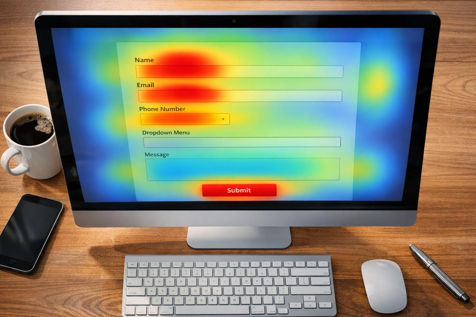
Heatmaps visually display user behavior on your forms, showing where people click, scroll, or abandon. This data pinpoints problem areas - like confusing fields, unresponsive buttons, or poor layouts - that discourage users from completing forms. Businesses using heatmaps often see conversion rate increases of 15–30%.
Key Takeaways:
- Identify Friction: Spot issues like rage clicks or ignored fields.
- Improve Layouts: Rearrange elements to guide users smoothly.
- Boost Mobile Performance: Fix tiny buttons or excessive scrolling.
- Track Drop-Offs: Use scroll maps to see where users lose interest.
Heatmaps provide actionable insights to fix design flaws and improve user experience, ensuring more visitors complete your forms and convert into customers.
Heat Map Analysis: How to Analyze Heatmaps to Improve Conversion?
How Heatmaps Improve Form Conversions
Heatmaps provide a visual way to understand user behavior, making it easier to identify why people abandon forms. By leveraging these insights, businesses can make targeted improvements that enhance form performance. In fact, companies that regularly use heatmaps report conversion increases of 15–30%. Let’s explore how heatmaps help pinpoint and resolve user friction.
Finding Friction Points
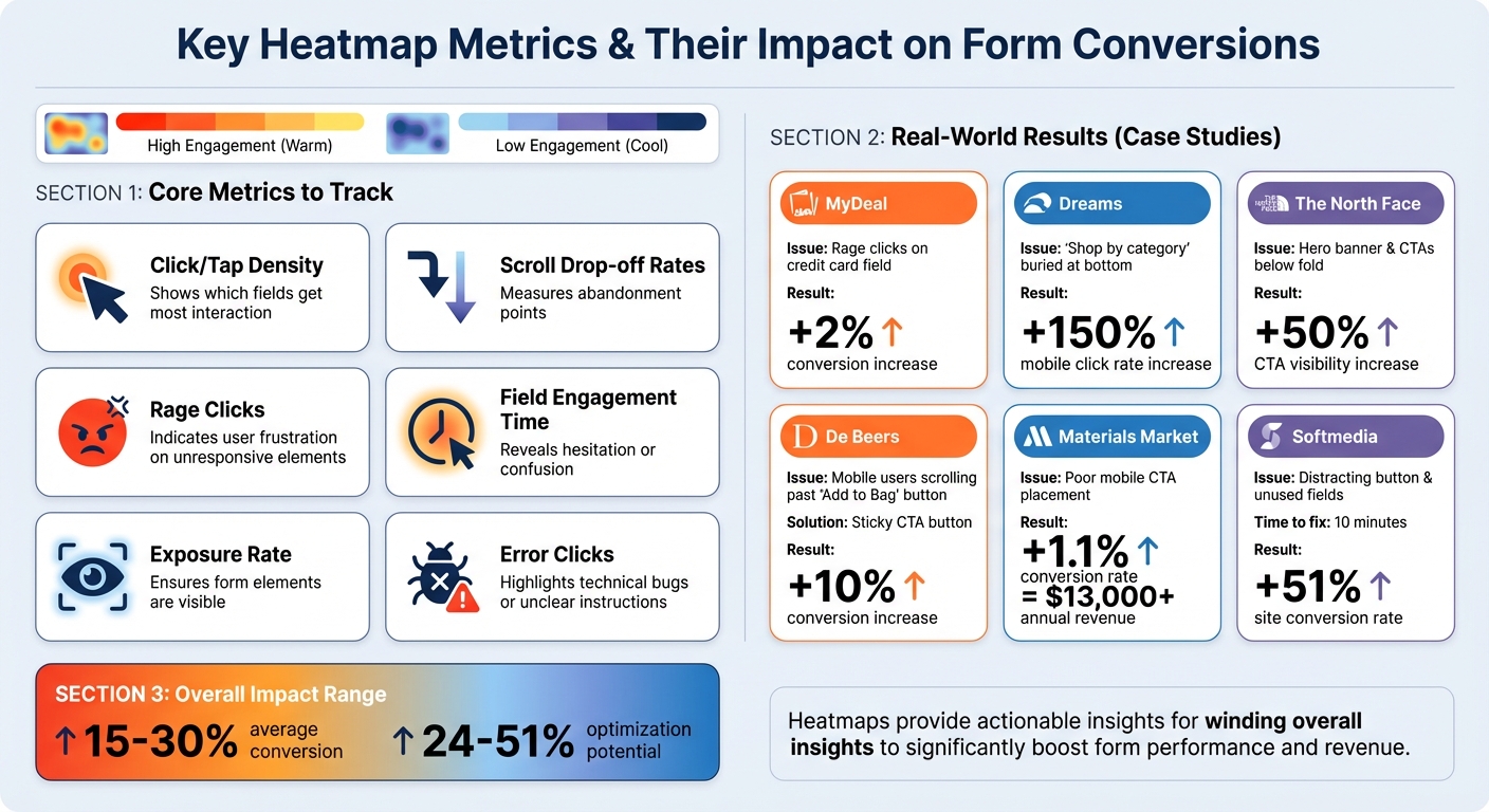
Heatmaps can uncover user frustrations that traditional analytics might overlook. For instance, repeated clicks on the same spot - known as rage clicks - may signal issues like broken form fields or unresponsive buttons. An example of this comes from MyDeal, an Australian retailer, which noticed rage-clicking on a credit card field during checkout. After fixing the issue, they saw a 2% boost in conversions.
Another common issue heatmaps highlight is "dead clicks", where users interact with elements they mistakenly believe are clickable. Mouse-tracking maps also reveal hesitation patterns, such as users hovering over a field without completing it. This behavior often points to unclear labels or confusing instructions.
Identifying Underperforming Elements
Click maps are invaluable for spotting form elements that users completely ignore. These "cold zones", often shaded in blue or purple, highlight areas that fail to grab attention. For example, Dreams, a UK retailer, analyzed their Black Friday mobile landing page and discovered that their "Shop by category" feature - despite being the most-clicked element - was buried at the bottom of the page. By moving it to a more prominent spot, they achieved a 150% increase in mobile click rates.
Heatmaps can also show when users are distracted by less important elements. If decorative images or secondary text receive more clicks than your call-to-action (CTA) button, it might be time to rethink your page layout. In addition to ignored fields, heatmaps can reveal where users stop engaging with the form entirely.
Tracking Where Users Leave
Scroll maps are particularly useful for identifying where user engagement drops off. A sharp decline often indicates that users either lost interest or mistakenly thought they’d reached the end of the page. For instance, The North Face used scroll heatmaps on their "Gift Guide" page and realized that their hero banner and primary CTAs were below the fold. By repositioning these elements higher on the page, they increased CTA visibility by 50%.
Mobile browsing behavior can differ greatly from desktop usage. With mobile ecommerce accounting for about 68% of global online spending, optimizing for smartphones is crucial. De Beers, the luxury jeweler, noticed that mobile users were scrolling past the "Add to Bag" button on product pages. They introduced a sticky button that stayed visible as users scrolled, which resulted in a 10% increase in conversions.
"Heatmaps matter because they expose invisible friction that quantitative metrics alone cannot diagnose." - SolidGrowth
How to Use Heatmaps with Reform Forms

Choosing a Heatmap Tool
When picking a heatmap tool, focus on one that tracks key metrics like field clicks, scroll depth, and rage clicks. Tools like Microsoft Clarity and Matomo work seamlessly with Reform through lightweight scripts and include essential features. Opt for tools that combine heatmaps with session replays - this pairing allows you to see exactly how users interact with conditional routing or multi-step forms. Look for software that integrates easily via JavaScript snippets or iframes, as Reform supports these embedding options natively. Once you've selected your tool, integrate it through Google Tag Manager (GTM) to ensure effective data capture on your forms.
Setting Up Heatmaps on Your Forms
After choosing your tool, set it up on your Reform forms using GTM. Start with high-traffic forms that have conversion rates below 20%. To integrate, go to the Integrations page in Reform, locate Google Tag Manager, and click "Add integration". Reform automatically sends events like onFormLoaded, onInputChanged, and form_step_#_complete to GTM's data layer. These events allow your heatmap tool to track and analyze user behavior, especially on multi-step forms. This setup makes it easier to identify exactly where users drop off during the form completion process.
Reading Heatmap Data
Heatmap data on Reform forms provides valuable insights. A single click signals smooth interaction, while repeated clicks often indicate user confusion. Pay attention to color codes - warm shades highlight areas of engagement, while cooler tones show neglected sections. Scroll heatmaps are especially useful for spotting drop-off points. For example, if only 63% of users reach the submit button, it might be time to reposition important fields or break the form into smaller steps. Additionally, if analytics show a high abandonment rate at a specific field and heatmaps reveal rage clicks there, you've pinpointed a clear friction point that needs fixing.
Making Changes Based on Data
After identifying problem areas, use Reform's drag-and-drop interface to rearrange fields and simplify the user flow. Remove unnecessary elements and move key fields, like email addresses, to earlier positions to reduce drop-offs. If users are skipping critical sections, take advantage of Reform's multi-step feature or use conditional routing to hide irrelevant fields based on user responses. For example, Softmedia analyzed their quote request form with heatmaps over 12 days. By removing a distracting button and unused fields, they boosted their site conversion rate by 51% after just 10 minutes of adjustments. Use these insights to fine-tune your form layout and improve conversion rates, ensuring a smoother experience for your users.
sbb-itb-5f36581
Key Metrics to Track with Heatmaps
Heatmap Metrics for Form Optimization: Key Statistics and Results
Metrics for Form Optimization
When analyzing forms with heatmaps, certain metrics can provide a wealth of insights into user behavior and form performance.
- Click and tap density: This reveals which fields and buttons are getting the most interaction. Ideally, your submit button should be the main hotspot. If users are clicking on non-interactive elements, those "dead clicks" might indicate distractions that need addressing.
- Scroll drop-off rates: These measure how far users scroll before abandoning the page. If a significant number of visitors never reach the submit button, it might be time to reposition critical fields or even split the form into smaller, more digestible sections.
- Rage clicks: If users are rapidly clicking on an unresponsive element, it’s a clear sign of frustration. For instance, in 2024, Australian retailer MyDeal discovered customers were rage-clicking on a credit card form field. After fixing the issue, they saw their conversion rate improve by 2%.
- Field engagement time and hover patterns: These metrics help identify hesitation or confusion, offering clues about which fields might need clearer instructions or better design.
- Exposure rate: This ensures all form elements are visible to users, which is crucial for usability.
- Error clicks: Tracking these can quickly highlight technical bugs or unclear instructions that might be frustrating users.
Together, these metrics offer actionable insights to fine-tune your form design and improve conversions.
Before-and-After Comparisons
One of the most effective ways to measure the success of your optimizations is by comparing these metrics before and after making changes. By doing so, you can clearly see the impact of your adjustments.
For example, luxury jeweler De Beers analyzed their mobile product pages and noticed users were scrolling past the "Add to Bag" button. To address this, they introduced a sticky call-to-action (CTA) that remained visible as users scrolled. The result? A 10% boost in conversions.
A simple table can help track improvements in metrics like:
- CTA exposure rate: The percentage of users who actually see your submit button.
- Rage click frequency: A measure of user frustration.
- Click distribution: Whether user attention is focused or scattered.
- Scroll depth: The percentage of users who reach critical form sections.
Another example comes from Materials Market, a construction supplier. Using scroll map insights, they adjusted the placement of their main CTA on mobile. This small change led to a 1.1% increase in conversion rates, adding over $13,000 in annual revenue.
Conclusion
Heatmaps make form optimization a precise, data-driven process by showcasing user behavior - like clicks, scrolls, and drop-offs - and can boost conversions by anywhere from 24% to 51%. By identifying problem areas, such as distracting elements, poorly placed CTAs, or confusing form fields, you can make targeted changes that lead to noticeable improvements.
Take action on these insights right away. With Reform's drag-and-drop interface, multi-step forms, and conditional logic, you can quickly tweak fields, reposition CTAs, and streamline any steps that might confuse users. Plus, real-time analytics let you monitor the impact of your changes as they happen, helping you create forms that guide users effortlessly to completion.
To get started, pair a heatmap tool with your Reform forms to identify dead zones, rage clicks, or areas where users drop off early. Then, adjust field placements, eliminate unnecessary steps, and use before-and-after heatmaps to confirm your updates are working.
FAQs
How can heatmaps help identify why users abandon forms?
Heatmaps provide a clear picture of how users interact with your form, making it easy to see which areas grab attention and where users lose interest. Cooler colors, such as blue, represent areas with less interaction, while warmer colors, like red, highlight spots where users tend to disengage. By analyzing these patterns, you can identify fields or sections that might be causing confusion or frustration. This insight allows you to make targeted adjustments to your form, reducing drop-offs and boosting conversion rates.
How can I use heatmaps to improve conversions on mobile forms?
Heatmaps are an excellent tool for understanding how users interact with your mobile forms. They visually highlight where users tap, scroll, or abandon, offering clear guidance on areas that need improvement. To get started, use a heatmap tool capable of tracking taps and scroll depth on mobile forms. Once it’s set up, allow it to collect data from a few hundred sessions before diving into the analysis.
Here are some key insights to focus on:
- Low-tap areas: If certain fields or buttons are being overlooked, consider making them larger, increasing the spacing around them, or moving them to more prominent positions.
- Drop-off points: If users abandon the form at specific sections, think about simplifying lengthy fields, adding real-time error messages, or using conditional logic to hide unnecessary questions.
- Scroll depth: If users fail to reach the bottom of the form, try breaking it into smaller steps, adding progress indicators, or placing the most important fields at the top.
Use these insights to test updates, like adjusting layouts or resizing buttons, and track how these changes impact conversions. Tools like Reform’s no-code builder make it easy to implement updates and monitor performance in real time, helping you optimize your forms for better results.
How do I use heatmaps to improve form performance with Reform?
You can integrate heatmaps with your Reform forms to get a clearer picture of user behavior and make smarter decisions to boost conversions. Here's how: start by choosing a heatmap tool that offers a tracking script. Then, enable the Google Tag Manager (GTM) integration in your Reform dashboard. Once that's set up, you can add the heatmap provider’s tracking code either in the form’s Custom Scripts section or by creating a tag in GTM.
Reform takes it a step further by automatically pushing events like onFormLoaded and onFormCompleted to GTM. These events can be used to trigger heatmap recordings for specific user interactions. Once everything is in place, you can review the heatmap data to pinpoint which areas of your form are engaging users the most - and which ones might need some attention. Use these insights to tweak your form’s layout, wording, or step sequence, making it easier for users to navigate and more likely to convert.
Related Blog Posts
Get new content delivered straight to your inbox

The Response
Updates on the Reform platform, insights on optimizing conversion rates, and tips to craft forms that convert.


Drive real results with form optimizations
Tested across hundreds of experiments, our strategies deliver a 215% lift in qualified leads for B2B and SaaS companies.
