
.webp)
How Interactive Forms Improve Landing Page Conversions


Interactive forms can dramatically improve landing page conversions by guiding users step-by-step, presenting one question at a time, and providing real-time feedback. Unlike static forms, which overwhelm users with all fields at once, interactive forms simplify the process, reduce friction, and keep users engaged.
Here’s the impact:
- Conversion rates: Interactive forms average 47.3%, compared to 2.8% for traditional forms.
- Mobile success: 62% completion for interactive forms vs. 18% for static ones.
- Error reduction: Real-time feedback cuts form errors by 22% and speeds up completion by 42%.
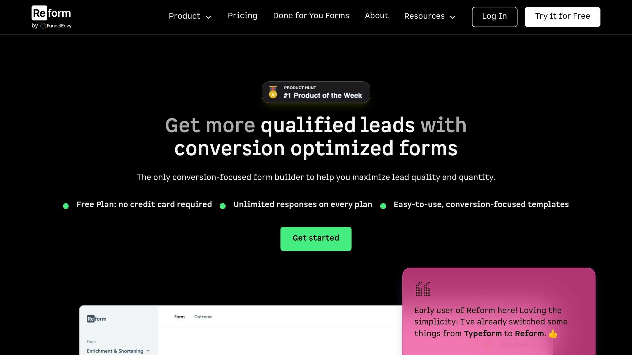
These forms leverage psychological principles like the sunk cost effect and goal gradient effect to keep users moving forward. Tools like Reform make creating multi-step, conditional forms easy - without coding. The result? Higher engagement, cleaner data, and better leads.
Learn how to design, optimize, and measure interactive forms to transform your landing pages into conversion powerhouses.

Interactive vs. Static Forms: Key Performance Stats
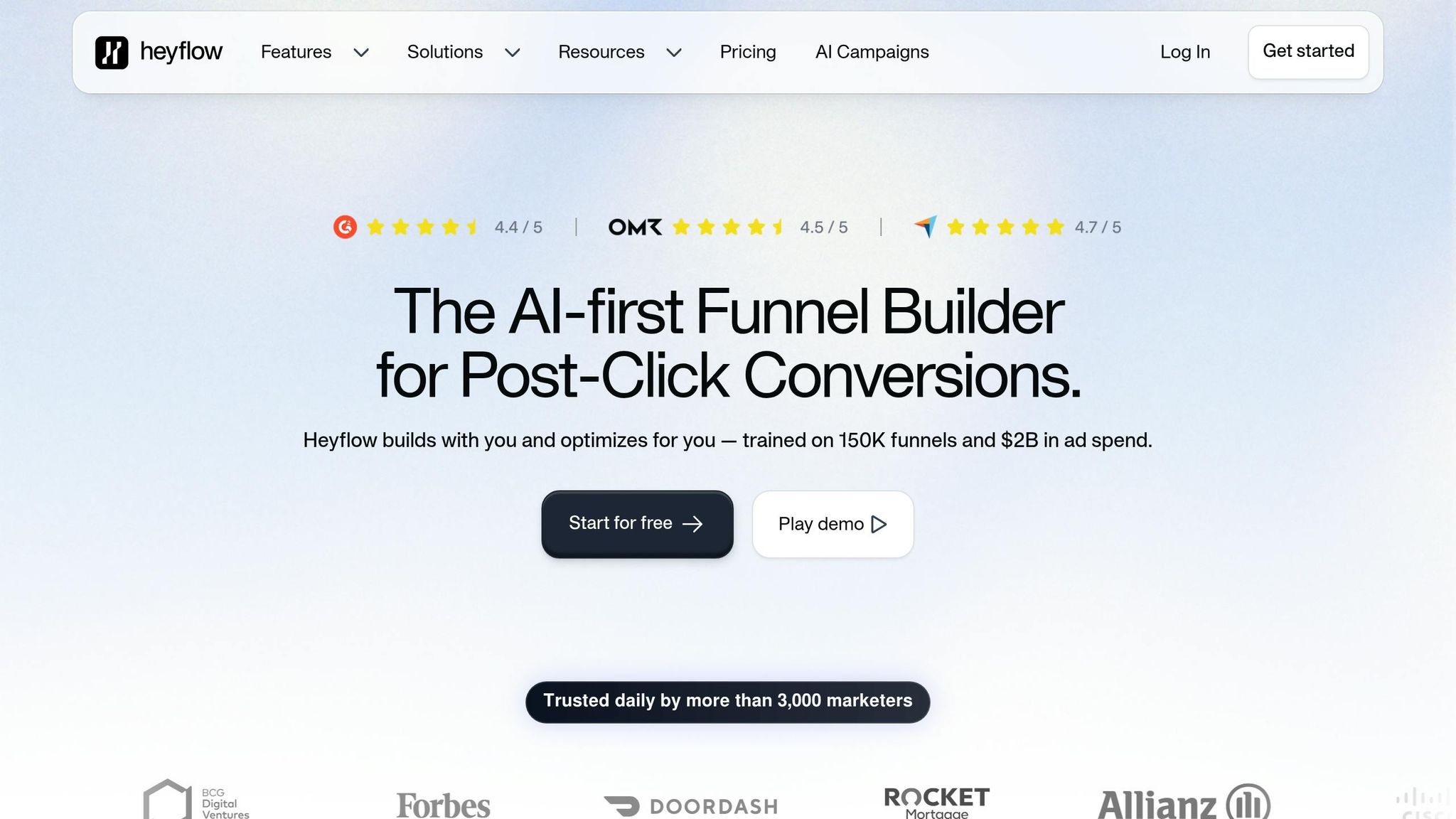
Interactive Landing Pages for Lead Generation Made Easy: No Coding Required with Heyflow
sbb-itb-5f36581
The Psychology Behind Interactive Forms
Understanding why interactive forms are effective starts with how our brains handle tasks. When faced with a long form packed with multiple fields, many people instinctively back away. This reaction stems from a natural desire to avoid feeling overwhelmed. By tapping into basic psychological principles, interactive forms streamline the user experience and significantly improve landing page conversions.
How Multi-Step Forms Ease Mental Effort
Our working memory has its limits. A single-page form with 11 fields can overwhelm users, creating resistance before they even begin. Multi-step forms tackle this issue by breaking the process into smaller, manageable sections. By presenting just a few fields at a time, users can focus on one task at a time, reducing friction.
The data speaks volumes: multi-step forms boast an average conversion rate of 13.85%, compared to only 4.53% for single-page forms. That’s a massive difference. Even trimming the number of fields from 11 to 4 can boost conversions by 120%. This highlights how the "wall of fields" effect can drive users away. By lightening the mental load, multi-step forms encourage users to stay engaged and complete the process.
How Small Commitments Keep Users Moving Forward
Once a user completes the first step of a form, they’re more likely to stick with it. Why? Because abandoning the process would mean wasting the effort they’ve already put in. This is the sunk cost effect in action, and it’s a powerful motivator.
Another key factor is the endowed progress effect, which shows that people are more driven to finish tasks when they feel like they’ve already made progress. A 2006 study illustrated this perfectly: loyalty cards with two stamps pre-filled had a 34% higher completion rate than those without pre-filled stamps, even though the effort required to complete the cards was identical. Forms work the same way. Starting with one or two simple questions gives users a sense of progress, making quitting feel like a setback instead of a neutral choice.
"A form progress bar does the same thing as those pre-stamped loyalty cards: it tells people they've already begun, and finishing is closer than they think." - Bohdan Khodakivskyi, Founder of Fomr
This momentum-building approach becomes even more effective when paired with immediate feedback.
Why Real-Time Feedback Keeps Users Engaged
Progress indicators and inline validation are game-changers for user experience. Showing "Step 2 of 4" or a progress bar gives users a clear sense of where they are in the process, making them feel in control. This leverages the goal gradient effect, where motivation increases as people see the finish line approaching, often leading them to speed up as they near completion.
Inline validation adds another layer of support. Instead of being hit with a wall of error messages after submission, users get instant feedback as they fill out each field. This approach reduces form errors by 22% and shortens completion time by 42%. Forms with real-time feedback also achieve 78% error-free first submissions, compared to just 42% for those without it. The result? A smoother, more satisfying experience for users and cleaner data for you.
How to Design Effective Interactive Forms
Creating well-thought-out interactive forms can make a big difference in landing page conversions. The way you organize, label, and build your form determines whether users complete it or abandon it halfway.
How to Structure Multi-Step Form Flows
The key to effective multi-step forms? Start simple and build gradually. Begin with low-stakes questions like a name or email address - these are easy for users to answer and help establish momentum. Once they’re engaged, you can move on to more detailed or sensitive fields, such as phone numbers or budgets.
Organize questions into logical sections, like "Contact Info", "Company Details", or "Project Requirements." This approach creates a natural flow, making the form feel less like a random string of questions. Ideally, each step should contain no more than 3–5 fields, with 2–3 fields often working best. For example, in Reform, you can manage these sections as "Pages", rearranging blocks or adding new ones with just a click.
A solid structure is just the beginning - minimizing friction is what keeps users moving forward.
How to Reduce Friction at Each Step
Small design tweaks can make a huge difference in how quickly users complete your form. For instance, placing labels above input fields (rather than beside them) improves readability and speeds up scanning. Research shows that single-column layouts shave off an average of 15.4 seconds compared to multi-column designs. On mobile, ensure buttons and touch targets are large enough - 48×48 pixels is a good benchmark - to make tapping easier.
Features like autocomplete and smart defaults also help. Think address suggestions, pre-filled fields, or email domain hints - these reduce typing and make the process smoother. When requesting sensitive information, a brief note of reassurance - like "We'll only use this to send your quote" - can ease user concerns and build trust.
"Interactive forms solve a problem that static forms have had for years: they ask too much, show too much, and give too little feedback." - Bogdan Sandu, Web Designer
While reducing friction is critical, interactive elements can take user engagement to the next level.
Interactive Features That Keep Users Engaged
Interactive elements are game-changers for boosting engagement and conversions. Conditional logic is one standout feature - it allows forms to adjust dynamically based on a user’s input. For example, if a user indicates their company revenue is under $1 million, you can direct them to self-service options instead of a sales consultation page. This kind of personalization makes the form feel tailored to their needs.
Progress indicators are another powerful tool. They show users how far along they are, which can increase completion rates by 20–30%. In Reform, progress indicators can be customized with labels like "Your Details" or "Almost Done", giving users a clear sense of direction. Real-time validation is equally important - it catches errors like a mistyped email address instantly, preventing frustrating error messages after submission. This not only improves user experience but also ensures cleaner, more accurate data.
The best part? Reform offers all these features without requiring any coding skills, making it easier than ever to design forms that users actually want to complete.
How to Measure and Improve Form Performance
Designing the perfect landing page form is just the beginning. To truly succeed, you need to measure its performance and address any issues that arise.
Key Metrics to Track
Relying solely on the overall conversion rate can hide valuable insights. Instead, focus on these metrics to understand your form's performance:
| Metric | What It Tells You |
|---|---|
| Form Conversion Rate | The percentage of visitors who complete and submit the form. On average, this is about 17.5% on desktop and 12.7% on mobile. |
| Step Completion Rate | For multi-step forms, this highlights which specific step is causing the most drop-offs. |
| Field Abandonment Rate | Identifies the exact question or field where users stop and leave. |
| Time to Completion | Helps determine if your form feels too lengthy or confusing. |
| Mobile vs. Desktop Rate | A difference of more than 10–15 percentage points could signal mobile usability problems. |
It's worth noting that 67% of users will abandon a form entirely if they encounter usability issues. By monitoring these metrics, you can identify and resolve problems before they impact your conversions.
How to Find and Fix Problem Areas
Once you've identified drop-off points, it's time to figure out what's causing them. The nature of the drop-off often reveals the issue:
- Long input time with high drop-off: Simplify the field's label or include a brief helper note for clarity.
- Short input time with high drop-off: The question might feel too invasive, or the form may appear overwhelming at first glance.
- Frequent errors with high drop-off: This suggests overly strict validation rules or unclear formatting requirements.
"Submission counts tell you the end result. Form analytics tells you why. And the 'why' is where all the actionable improvements live." - Bohdan Khodakivskyi, Founder of Fomr
Start by addressing the step or field with the highest drop-off rate. Fixing that one issue first can provide the greatest improvement with minimal effort. When making changes, adjust only one element at a time so you can clearly see what drives results. To measure the impact of any changes, gather data from at least 100–200 submissions.
Tools like Reform can simplify this process, offering built-in analytics and A/B testing to help you optimize your forms.
Using Reform's Analytics and A/B Testing
Reform eliminates the need for guesswork with its real-time analytics. It tracks exactly where users drop off - down to the individual field - so you don’t need an additional analytics tool. The Pro plan's abandoned submission tracking feature even captures partial submissions, showing how far users got before they left.
Reform also supports A/B testing, allowing you to compare two versions of a form - like a three-step versus a five-step version - to see which one performs better. Test one variable at a time, using the completion rate as your key metric, and gather enough data before making conclusions. This step-by-step approach ensures your forms are always improving and driving better results.
Implementation Checklist for Interactive Forms with Reform
Planning and Scoping Your Form
Before diving into Reform to start building, take a moment to clarify your conversion goal. Whether you're aiming to book demos, qualify leads, or capture signups, focus on one clear objective. Every field you include should directly contribute to that goal.
Next, map out the user journey. Determine how many steps the process needs, what information to collect at each stage, and what users receive at the end. A good rule of thumb: if a field doesn’t help qualify the lead or improve the user experience, leave it out. Shorter, more focused forms tend to perform better than lengthy ones.
Building and Launching in Reform
Once you’ve outlined your plan, you’re ready to start building in Reform. Use the "Add Page" button to break your form into manageable steps, referred to as "Pages" in Reform. You can easily rearrange fields by dragging and dropping them. If you need to change a field type, click the gear icon and select "Turn into" to switch it.
Leverage conditional logic to guide users based on their responses. For instance, if a user indicates a high annual revenue, you can direct them to schedule a meeting, while others might be routed to a self-service resource. This ensures each user gets the most relevant experience without manual intervention.
Customizing the form is straightforward. Upload your logo, set your brand’s primary color for the CTA button, and personalize the form’s URL slug. Enable the Progress Bar in the Form Settings and add custom labels like "Contact Info" or "Details" to make each step feel intentional. Before publishing, use the Preview feature to double-check that email validation and conditional logic are functioning as expected.
Monitoring and Ongoing Optimization
Once your form is live, keep an eye on its performance to improve conversion rates. Regularly check the Responses tab for trends. If you’re on Reform’s Pro plan, you’ll also have access to data on abandoned submissions, helping you pinpoint where users drop off without needing extra analytics tools.
If a specific field is causing users to leave, consider tweaking its label, switching it to a dropdown, or adding a helper note for clarity. Be patient - wait until you’ve gathered enough data before making major changes. Even small adjustments can lead to big results. For example, increasing a form’s conversion rate from 2% to 3% on a site with 70,000 monthly visitors translates to 700 extra leads per month.
"The more questions you ask, the more you learn. Great, but what's the catch? Longer forms have lower completion rates. Thankfully, Reform still collects the answers when someone leaves before finishing." - Reform.app
Don’t forget to revisit your conditional routing rules periodically. As your product or offers evolve, the criteria for identifying high-value leads might change. Keeping these rules updated ensures users always end up on the most relevant path, whether that’s scheduling a live demo or viewing a recorded walkthrough. These ongoing refinements help transform your form from a basic tool into a finely-tuned conversion machine.
Conclusion
Interactive forms are more than just a design tweak - they're a game-changer for landing page performance. The numbers speak for themselves: while static forms typically see conversion rates of 2–3%, interactive forms can skyrocket that figure to as much as 47.3%. On mobile, completion rates jump from 18% to an impressive 62%, according to industry research. Beyond boosting conversions, these forms gather crucial data like budget ranges, pain points, and buying intent, enabling your sales team to focus on the most promising leads with precision.
Reform eliminates the complexity of creating high-performing forms. Its features - like multi-step pages, conditional routing, progress indicators, incomplete response tracking, and real-time analytics - make it easy to design and optimize forms without needing a developer. No matter which plan you choose, Reform equips you with tools to enhance your landing pages and capture high-quality leads.
Turning a lackluster form into a conversion machine is all about thoughtful design and continuous improvement - something Reform makes entirely achievable.
FAQs
How many steps should my form have?
Breaking a form into multiple steps can make it feel less overwhelming for users. The sweet spot for multi-step forms is usually 3 to 7 steps, depending on the form's purpose. Each step should ideally include 5 to 9 fields, as this balance helps reduce friction and encourages users to complete the process.
To keep users engaged, consider adding features like:
- Progress indicators: Show users how far they've come and how much is left.
- Conditional logic: Tailor questions based on previous answers to make the form more relevant.
- Real-time feedback: Provide instant validation or error messages to guide users as they go.
These elements make the process feel smoother and more approachable, which can lead to higher completion rates and better conversions.
What should I ask first in a multi-step form?
Start by asking a straightforward question that feels easy to answer - something like their industry or a general category they belong to. This simple step helps create a sense of ease and encourages participation. By starting with less personal or detailed information, you build trust and make users more comfortable completing the form.
How do I know which form step causes drop-offs?
To figure out which step in your form is causing users to drop off, leverage analytics tools to monitor user behavior throughout the process. Multi-step forms with progress indicators are particularly helpful - they can show exactly where users abandon the form, making it easier to spot problem areas.
Conducting regular audits and analyzing performance data can reveal steps with high abandonment rates. With these insights, you can refine those specific steps, making the process smoother and boosting your overall conversion rates.
Related Blog Posts
Get new content delivered straight to your inbox

The Response
Updates on the Reform platform, insights on optimizing conversion rates, and tips to craft forms that convert.


Drive real results with form optimizations
Tested across hundreds of experiments, our strategies deliver a 215% lift in qualified leads for B2B and SaaS companies.
