
.webp)
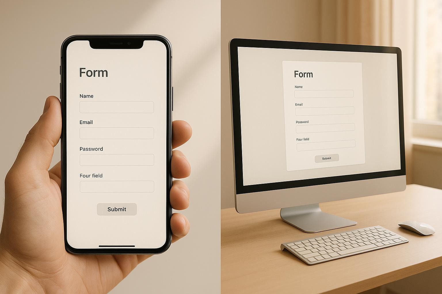
Mobile vs. Desktop: Form Performance Comparison


Did you know desktop forms convert 14% better than mobile forms on average? While mobile drives 64% of web traffic, it struggles with lower conversion rates and higher cart abandonment. Here's a quick breakdown:
Key Insights:
- Conversion Rates - Desktop (3.2%) outperforms mobile (2.8%).
- Cart Abandonment - Mobile users abandon carts 16% more often.
- Add-to-Cart Rates - Mobile slightly leads (6.4% vs. 6.2% for desktop).
Why?
- Behavior - Mobile users browse quickly, while desktop users have longer, focused sessions.
- Challenges - Small screens, slower load times, and touch-based inputs make mobile forms harder to complete.
Quick Comparison:
| Metric | Mobile | Desktop |
|---|---|---|
| Conversion Rate | 2.8% | 3.2% |
| Cart Abandonment | 79.0% | 68.1% |
| Add-to-Cart Rate | 6.4% | 6.2% |
| Bounce Rate | 67.4% | 32.0% |
Improving mobile forms is crucial since 88% of users won’t return after a bad experience. The article explores practical tips to optimize forms for both devices.
Mobile vs Desktop Form Conversion Data
Current Conversion Statistics
Recent insights into device-specific form performance reveal intriguing trends across industries. Desktop forms boast a higher conversion rate of 3.2%, compared to 2.8% for mobile forms. However, the gap becomes even more pronounced when broken down by industry.
Here’s a closer look at the 2025 retail sector data:
| Industry Sector | Mobile Conversion | Desktop Conversion | Traffic Share |
|---|---|---|---|
| Retail | 1.2% | 3.6% | 63.7% mobile |
| Electronics | 2.16% | 3.6% | 37.3% mobile |
| Personal Care | 4.22% | 6.8% | 62.1% mobile |
| Food & Beverages | 2.67% | 4.94% | 54.4% mobile |
This data underscores the need for industry-specific strategies to optimize form design. The differences between mobile and desktop conversions are not just about numbers - they reflect unique user behaviors and challenges.
What Drives Conversion Differences
One of the primary reasons mobile users abandon forms is frustration with delays or overly complex processes. Smaller screen sizes also play a major role, with users being 31% more likely to complete forms on larger screens.
Behavioral factors further explain these disparities. Desktop users often multitask, keeping 4–7 tabs open during a session to research and compare options. In contrast, mobile users average just 3 tabs, suggesting a more focused but often hurried browsing experience.
Device Conversion Rate Comparison
To better understand the performance gap, let’s examine key metrics that highlight the differences between mobile and desktop conversions:
| Metric | Mobile | Desktop | Industry Impact |
|---|---|---|---|
| Average Conversion Rate | 2.49% | 5.06% | Desktop conversions are 103% higher |
| Cart Abandonment | 79.0% | 68.1% | Mobile users abandon carts 16% more often |
| Add-to-Cart Rate | 6.4% | 6.2% | Mobile slightly edges out desktop |
| Bounce Rate | 67.4% | 32.0% | Mobile users bounce 110% more frequently |
Despite mobile devices driving 63.15% of traffic, desktop users convert at more than double the rate. These differences highlight the technical and user experience challenges associated with mobile forms - challenges that demand thoughtful solutions, as we’ll explore next.
Creating a Mobile-First Design: How to Transform Your Website's User Experience
Device-Specific UX Challenges
Mobile and desktop users experience distinct challenges when interacting with forms, and these differences can significantly impact completion rates. Addressing these device-specific issues is key to improving form usability across platforms.
Touch vs. Mouse Input Differences
Interacting with forms on mobile devices involves touch-based inputs, which differ greatly from the precision of a mouse and keyboard. For instance, the average adult finger width is about 11 mm (0.43 inches), requiring larger touch targets for smooth navigation.
| Input Feature | Mobile (Touch) | Desktop (Mouse) |
|---|---|---|
| Minimum Target Size | At least 48×48 pixels | Not specifically defined |
| Input Precision | Lower accuracy due to finger tapping | High precision with a cursor |
| Field Navigation | Primarily via vertical scrolling | Typically via the tab key |
| Text Entry Speed | Slower manual entry (auto-fill can improve speed by 30% ) | Generally faster typing |
| Input Feedback | Instant visual feedback | Relies on hover states |
As Jef Raskin once emphasized, "The system should treat all user input as sacred". This principle underscores the importance of designing inputs that accommodate the challenges of different devices.
Screen Size Layout Requirements
Mobile screens bring their own set of limitations, particularly when it comes to layout. In landscape mode, the touch keyboard can take up as much as 70% of the screen space. Jamie Holst, Co-Founder of Baymard Institute, highlights this issue:
"The extreme lack of page overview caused by small screens and touch keyboards taking up as much as 50% of the user's already tiny viewport".
To tackle these challenges, there are several critical considerations for designing mobile-friendly forms:
- Viewport Management - Optimized mobile sites achieve 34% higher form completion rates. However, 94% of mobile sites fail to clearly differentiate between required and optional fields.
- Field Organization - A single-column layout with top-aligned labels and one input field per line is more effective for mobile users. Collapsible sections are also helpful for longer forms.
- Input Optimization - Integrating digital wallets can speed up form completion by 28%.
Technical Performance by Device
When it comes to conversion rates and user experience, technical performance - especially factors like load speed and display stability - can make or break the effectiveness of a form.
Form Loading Speed Analysis
Mobile pages tend to load significantly slower than desktop pages, with mobile devices lagging behind by 70–80% in speed. Take a look at the data:
| Device Type | Initial Render Time | Complete Load Time |
|---|---|---|
| Desktop | 2.8 seconds | 2.5 seconds |
| Mobile | 6.7 seconds | 8.6 seconds |
These slower load times on mobile devices have a direct impact on conversions. For example, while 40% of desktop users abandon a page if it takes longer than 3 seconds to load, this figure jumps to 53% for mobile users.
"Mobile page speed is more critical for several reasons. First, it's generally harder to score well for mobile due to the slower internet and less powerful devices. Second, over 50% of web traffic comes from mobile devices. Third, Google uses the mobile version of a website for indexing and ranking."
The impact of speed on conversions is stark. B2B websites with a 1-second load time see conversion rates that are five times higher than those with a 10-second load time. But it’s not just speed - how the content displays and remains stable is just as important.
Form Display and Stability Issues
Stable and predictable content display is key to earning user trust and encouraging form completions. With mobile devices now accounting for over 55% of global web traffic, addressing display issues is critical:
- Content Rendering - Mobile-first designs can sometimes scatter content on desktop screens, increasing cognitive effort and reducing engagement.
- Touch Targets - Buttons and other touchable elements should meet a minimum size of 44 pixels to prevent accidental taps that disrupt the user experience.
- Viewport Management - "False bottoms" - where users mistakenly think they've reached the end of a page - cause up to 69% of content to go unseen.
To enhance readability and reduce eye strain, body text should be at least 16px in size.
Tackling these challenges requires thoughtful optimization. Strategies like prioritizing above-the-fold content, optimizing images, and using lazy loading for form elements further down the page can significantly improve both speed and display stability.
sbb-itb-5f36581
Making Forms Work Better on All Devices
Smart Field Display Methods
When forms exceed six questions, completion rates tend to drop below 50%. To counter this, using smart field display techniques tailored for both mobile and desktop can make a big difference:
| Display Method | Mobile Impact | Desktop Impact |
|---|---|---|
| Single-column Layout | Speeds up form completion | Improves readability |
| Floating Labels | Saves space | Keeps context clear |
| Conditional Logic | Shows only relevant fields | Reduces clutter |
For example, conditional logic can dynamically display a 'Company Name' field only when 'Business Account' is selected. This approach minimizes unnecessary fields, reducing mental effort, especially on mobile devices.
Better Form Input Methods
Optimizing input methods can significantly improve form completion rates. In fact, Google reported in 2023 that adding autofill functionality sped up form completions by 30%.
For mobile users:
- Use the right keyboard types for specific input fields (e.g., numbers for phone numbers).
- Ensure touch targets are at least 44 x 44 pixels for better usability.
- Display password fields by default to avoid unnecessary input errors.
- Leverage native features like the camera for scanning or biometrics for authentication.
For desktop users:
- Enable smooth keyboard navigation for faster input.
- Maintain consistent focus states to guide users visually.
Mobile Form Field Progress
Combining smart display methods with better input techniques, tracking field progress can further enhance the mobile form experience.
Research by Luke Wroblewski in 2009 demonstrated that inline validation improved form performance by increasing success rates, user satisfaction, and reducing both completion times and unnecessary eye movements.
To ensure mobile forms perform at their best:
- Progressive Disclosure: Break lengthy forms into smaller, logical sections, showing one group of fields at a time.
- Visual Progress Indicators: Add progress bars or step counters to keep users informed and reduce form abandonment.
- Smart Defaults: Pre-fill fields using browser data or previously entered information, cutting input time by up to 30%.
With mobile devices now driving 75% of e-commerce traffic, these strategies help close the gap between mobile and desktop conversions while delivering a smoother, more efficient user experience.
Reform's Cross-Device Form Features

Reform tackles the challenges of creating forms that work seamlessly across mobile and desktop devices, offering features designed to improve user experience and boost conversion rates.
Auto-Adjusting Form Design
Reform's responsive design ensures that forms look and function perfectly on any screen size. It automatically adjusts various elements to fit the device, keeping the experience smooth and consistent with your brand.
Here’s how it adapts:
- Dynamic field resizing to match different screen dimensions
- Automatic text scaling for better readability
- Smart spacing to make forms visually appealing and easy to navigate
- Flexible column layouts that adjust effortlessly
These features work together to make forms user-friendly, no matter the device.
Mobile-Ready Form Elements
Reform takes a mobile-first approach to form design, ensuring that every element performs flawlessly on touchscreens while also excelling on desktops. All components are built to meet accessibility standards, making them functional for everyone.
| Feature | Mobile Optimization | Desktop Optimization |
|---|---|---|
| Smart Input Fields | Context-aware keyboards | Tab navigation for faster input |
| Touch-Friendly Buttons | Large, easy-to-tap targets | Precise cursor interactions |
| Floating Labels | Space-saving design | Clear field context |
| Responsive Dropdowns | Simple thumb selection | Mouse-friendly menus |
This dual optimization ensures a smooth experience, whether users are tapping on their phones or clicking with a mouse.
Form Performance Tracking
Reform goes beyond design by offering detailed performance tracking to help users refine their forms. Real-time analytics provide insights that drive continuous improvements.
"Reform is the leading form builder for non-technical marketers, lead gen specialists, growth, and demand gen managers seeking to maximize lead quality and streamline lead generation."
With Reform's A/B testing tools, teams can experiment with different field arrangements, layouts, calls-to-action (CTAs), and form lengths. Plus, embedding options - ranging from traditional iframes to modern web components- make it easy to track performance across platforms.
These tracking capabilities allow teams to fine-tune their forms and adopt best practices for any device.
Conclusion: Best Practices for All Devices
Did you know mobile devices now account for 62.54% of global website traffic? This statistic highlights how crucial it is to tailor your design strategies to work seamlessly across all devices.
One key takeaway is that mobile forms come with their own set of challenges. For example, while desktop users are more comfortable managing longer forms, mobile users often need streamlined designs. To ensure your forms perform well on any device, here are a few strategies worth considering:
| Key Optimization | Impact on Performance |
|---|---|
| Touch-friendly targets (44x44px) for mobile | Reduces input errors |
| Single-column layout | Speeds form completion by 15.4 seconds |
Another game-changer? Inline validation. It can cut completion times by 42% and increase success rates by 22%. Plus, users who interact with your site on multiple devices demonstrate conversion rates that are a staggering 230% higher than average.
The goal is to create a unified experience across devices. Mobile users prioritize speed and simplicity, making touch-optimized designs essential. Meanwhile, desktop users often expect more detailed input options, allowing for richer interactions. By addressing these preferences, you can cater to both groups effectively.
FAQs
Why do mobile forms typically convert less than desktop forms, even though more people browse on mobile devices?
Mobile forms typically see lower conversion rates compared to their desktop counterparts, and there are a few clear reasons for this. For starters, smaller screens on mobile devices can make forms harder to navigate, leading to user frustration or even abandonment. On top of that, mobile users are often multitasking or browsing while on the move, which makes it harder for them to focus and commit to completing a form.
On the other hand, desktop users are usually in a more stable setting, giving them the time and focus to engage with forms more thoughtfully. Even though mobile traffic keeps climbing, desktop forms continue to lead the way in conversion rates, thanks to these differences in usability and user behavior.
How to Optimize Forms for Mobile Users
When designing forms for mobile users, simplicity and ease of use should be your top priorities. Start by cutting down the number of fields to only what's absolutely necessary - shorter forms are much easier to navigate on small screens. You might also consider using multi-step forms. These divide the process into smaller, more digestible parts, making the overall experience feel less overwhelming.
Stick to a single-column layout for better readability, and ensure buttons are large enough for users to tap comfortably. Responsiveness is key - your forms should adjust flawlessly to different screen sizes, ensuring a smooth experience across all devices. Also, keep the area around the form distraction-free by removing any extra images or text. This helps users stay focused and increases the likelihood they'll complete the form.
By streamlining your forms with these tips, you can create a more user-friendly mobile experience and see better conversion rates.
What are the key differences in how mobile and desktop users interact with online forms, and how can businesses optimize their forms for each device?
Mobile and desktop users approach online forms differently, primarily because of variations in screen size and input methods. Mobile users often lean toward shorter, simplified forms since smaller screens and touch-based navigation make entering large amounts of information more cumbersome. Meanwhile, desktop users, with the advantage of larger screens and keyboards, are generally more open to completing detailed forms.
For mobile-friendly forms, stick to single-column layouts, limit fields to the essentials, and ensure the design is responsive and easy to interact with using touch. Features like auto-fill and real-time validation can make the process smoother and help prevent user frustration. On desktops, while you can include extra fields if necessary, it’s still important to prioritize clarity and keep navigation intuitive to maintain strong conversion rates.
Adapting your form design to suit the specific needs of mobile and desktop users ensures a user-friendly experience that encourages engagement and boosts conversions on any device.
Related posts
Get new content delivered straight to your inbox

The Response
Updates on the Reform platform, insights on optimizing conversion rates, and tips to craft forms that convert.


Drive real results with form optimizations
Tested across hundreds of experiments, our strategies deliver a 215% lift in qualified leads for B2B and SaaS companies.
