
.webp)
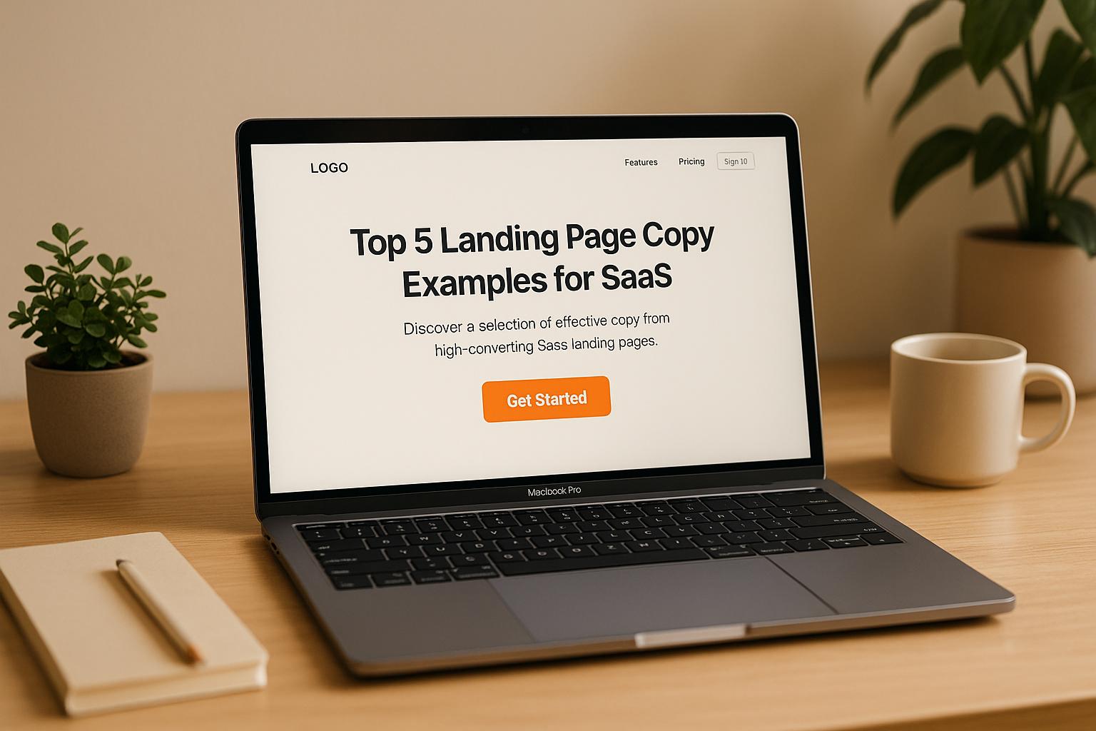
Top 5 Landing Page Copy Examples for SaaS


Your SaaS landing page copy can make or break your conversions. Well-crafted copy answers three critical questions for visitors: What’s in it for me? Can I trust you? How do I get started? The best examples focus on clear, outcome-driven headlines, concise messaging, and trust-building social proof.
Here are five standout SaaS landing page examples:
- Reform: Simplifies form creation with a headline like “Easily create and integrate high-converting forms without a single line of code,” paired with measurable outcomes like a 215% lift in leads.
- Asana: Highlights workflow improvements with focused, distraction-free CTAs.
- Hotjar: Tackles user pain points, using testimonials and logos to build trust.
- HubSpot: Balances simplicity and depth, catering to varied audiences with multiple CTAs.
- Semrush: Modular design emphasizes measurable results like improved search rankings, with bold CTAs.
Quick Comparison
| Company | Headline Focus | Social Proof | CTA Style | Audience |
|---|---|---|---|---|
| Reform | No-code, lead quality | Metrics, testimonials | Clear, action-oriented | Businesses needing better forms |
| Asana | Workflow clarity | Logos, case studies | Single, bold | Teams managing projects |
| Hotjar | User behavior insights | Testimonials, logos | Problem-solution flow | Website optimizers |
| HubSpot | Marketing solutions for all | Case studies, logos | Multiple tailored options | Wide range of users |
| Semrush | Measurable SEO results | Testimonials, partnerships | Modular, bold CTAs | SEO professionals, marketers |
Key Takeaways:
- Use headlines that emphasize benefits, not features.
- Keep messaging brief and outcome-driven.
- Add trust elements like testimonials and success metrics.
- Make CTAs clear and easy to act on.
Well-optimized SaaS landing pages can boost conversions by over 10%, far exceeding the industry average of 2–5%. Focus on clarity, user needs, and trust to drive results.
7 CRUCIAL Things Every SaaS Landing Page Should Have (with examples)
What Makes SaaS Landing Page Copy Work
A winning SaaS landing page boils down to three main elements: clear headlines, concise value-driven messaging, and strong social proof. Let’s break down how each of these works.
Clear Headlines That Highlight Benefits
Your headline is the first thing visitors see, so it needs to immediately communicate how your product will help them. Instead of diving into features, focus on outcomes. B2B buyers are always asking themselves, "What’s in it for me?"
The best headlines are straightforward and memorable, sparking curiosity while addressing user needs. Take ClickUp’s headline, "See why teams choose ClickUp over Trello." It’s direct, outcome-focused, and immediately positions the product as a better alternative. Similarly, Semrush uses headlines that highlight the transformation users can expect, making it clear what results they’ll achieve.
To stand out, avoid jargon and zero in on specific pain points. B2B buyers are looking for solutions to real challenges - acknowledge those challenges upfront, and they’ll keep reading. Once you’ve captured their attention, it’s time to deliver your value proposition.
Concise Messaging That Communicates Value
High-performing SaaS landing pages are designed to get the message across quickly. They use a modular layout that gives visitors the freedom to explore details at their own pace without feeling overwhelmed.
Semrush nails this by showcasing multiple use cases, each paired with a specific benefit. Their messaging is visually scannable and easy to digest, ensuring users can quickly find what’s relevant to them.
A great way to structure your page is through progressive disclosure: start with your main value proposition and let users dive into details as needed. For instance, Potis keeps their sections brief, pairing clear copy with high-quality visuals. This approach reduces cognitive load, making it easier for visitors to absorb information and take action.
Tailoring your message to your audience is also critical. Technical users lean toward straightforward, detail-rich language, while business decision-makers respond better to messaging that emphasizes outcomes and return on investment (ROI). Once your message is clear, it’s time to build trust.
Social Proof That Builds Trust
Social proof - like testimonials, user stats, or recognizable brands - can increase conversions by as much as 34%. But not all social proof is created equal. The most effective examples provide specific, measurable results rather than vague praise.
Take Reform’s landing page, which highlights metrics like, "Trusted by thousands of marketers" and, "215% lift in qualified leads for B2B and SaaS companies". These numbers give visitors concrete reasons to believe in the product.
Resend takes it a step further by combining testimonials with logos of well-known customers, instantly boosting credibility. When potential buyers see familiar brands, it reduces their perceived risk and reassures them of the product’s reliability.
Kajabi goes all-in with a multi-layered approach: testimonials, star ratings, user counts, and quantifiable earnings from real customers. This variety addresses different buyer concerns, offering reassurance no matter where someone is in the decision-making process.
The most effective trust signals blend recognizable customer logos, specific success metrics, and authentic testimonials from real people with titles or companies visitors will recognize. Together, these elements build the confidence buyers need to justify their decision to stakeholders.
Top 5 SaaS Landing Page Copy Examples
Here are five standout SaaS landing pages that excel in delivering clear messages, persuasive value, and effective social proof - essentials for driving conversions.
Reform: Form Builder Copy That Converts
Reform keeps its messaging simple yet impactful, focusing on clarity and results. The headline, "Easily create and integrate high‑converting forms without a single line of code," directly addresses a key pain point - dependency on developers.
The page breaks the process into three easy steps: Choose a template, Customize, and Integrate. This straightforward structure makes the platform approachable, even for non-technical users. Reform also backs up its claims with measurable outcomes, like a "215% lift in qualified leads for B2B and SaaS companies".
What sets Reform apart is its ability to present advanced features - like multi-step forms, conditional routing, and spam prevention - in a way that feels simple and accessible.
The social proof is equally persuasive. A testimonial from Justin Jackson of Transistor.fm highlights the product's appeal and its ability to replace competitors:
"Early user of Reform here! Loving the simplicity; I've already switched some things from Typeform to Reform. 👍"
This quote reinforces Reform's value as an intuitive, results-driven alternative.
Asana: Simple Workflow Messages

Asana’s landing page tackles visitor frustrations by offering clear, problem-solving messages. The headline and subtext focus on outcomes like improved teamwork, better communication, and enhanced project visibility - benefits that resonate with professionals looking to streamline workflows.
The hero section features a single, bold call-to-action (CTA), minimizing distractions and reducing decision fatigue. Additional CTAs are strategically placed further down the page, capturing users at different stages of their decision-making process. This approach has been shown to improve lead capture rates by up to 20% compared to pages with multiple competing CTAs. The result? A clean, focused page that communicates value instantly.
Hotjar: Problem-Solving Copy
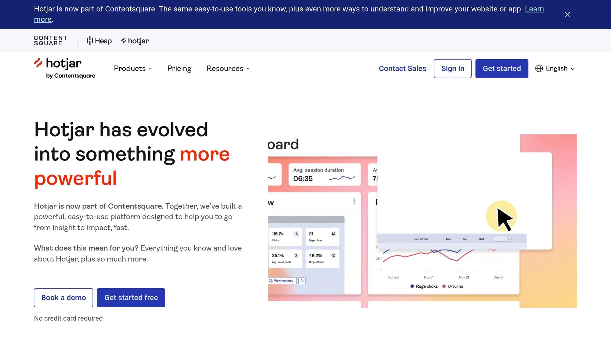
Hotjar’s landing page zeroes in on visitor pain points, such as understanding user behavior and optimizing website performance. The headline and subheadline immediately acknowledge these challenges, creating an instant connection with frustrated users.
Social proof plays a major role here, with animated testimonials and recognizable customer logos adding credibility. The page flows naturally from identifying problems to presenting solutions, ending with clear, action-oriented CTAs. This problem-first approach ensures visitors feel understood and motivated to explore the product further.
HubSpot: Multiple CTAs and Detailed Content

HubSpot strikes a balance between simplicity and depth, catering to a wide range of users. The landing page uses expandable sections to provide detailed information without overwhelming new visitors. This design ensures accessibility for beginners while satisfying those seeking more in-depth content.
Thoughtfully placed CTAs address different needs: free trials for users ready to commit, demos for decision-makers, and downloadable resources for those conducting further research. By combining straightforward headlines with detailed explanations, HubSpot effectively engages both technical users and business leaders, maximizing conversion opportunities.
Semrush: Results-Focused Modular Copy
Semrush’s modular design highlights various use cases, each with its own results-driven headline and tailored CTA. This structure allows users to quickly find the information most relevant to their needs.
Instead of overwhelming visitors with technical jargon, Semrush emphasizes tangible outcomes like improved search rankings, better content performance, and competitive insights. Visual elements like GIFs and product screenshots enhance the experience, while bold, contrasting CTAs guide users toward action. This results-oriented approach resonates strongly with marketers focused on measurable improvements.
Each of these examples showcases a different approach to SaaS landing page copy, but they all succeed by aligning their strategies with user priorities. Reform simplifies form building for non-technical users, Asana focuses on workflow clarity, Hotjar addresses specific frustrations, HubSpot tailors content to varied audiences, and Semrush emphasizes measurable results. The key takeaway? Effective SaaS copy connects directly to what your audience values most.
Next, check out a side-by-side comparison in our detailed table.
sbb-itb-5f36581
Copy Comparison Table
This section highlights how well-crafted, concise copy plays a pivotal role in driving SaaS conversions. To illustrate this, the table below compares key copy elements from various SaaS landing pages, showcasing their approaches to headlines, value propositions, social proof, CTAs, and audience relevance.
Comparison Table: Key Copy Elements
| Company | Headline Clarity | Value Proposition | Social Proof | CTA Effectiveness | Message Relevance |
|---|---|---|---|---|---|
| Reform | Direct, benefit-focused: "Easily create and integrate high-converting forms without a single line of code" | Highlights better lead quality and seamless integration | Customer testimonials and success stories | Clear, action-oriented CTAs strategically placed | Tailored to businesses needing no-code, conversion-optimized forms |
| Asana | Simple, transformation-focused copy emphasizing workflow outcomes | Stresses improved teamwork, communication, and project visibility | Moderate use of customer logos and case studies | Single, bold CTA in the hero section | Directly addresses team workflow management challenges |
| Hotjar | Problem-first approach tackling user behavior challenges | Focuses on website optimization and user behavior insights | Strong testimonials and recognizable logos | Clear, action-oriented CTAs following a problem-solution narrative | Highly relevant to website optimization and user experience improvement |
| HubSpot | Balanced headlines catering to diverse user needs | Comprehensive marketing solutions with detailed explanations | Extensive testimonials, logos, and case studies | Multiple CTAs addressing trials, demos, and resources | Messaging tailored for both technical users and business leaders |
| Semrush | Results-driven, modular headlines focusing on measurable outcomes | Highlights improvements in search rankings and content performance | Testimonials and partnerships with well-known brands | Bright, contrasting buttons with multiple contextual CTAs | Specifically targets SEO professionals and marketers seeking measurable results |
Across the board, these companies excel at crafting clear, benefit-oriented headlines. Their use of social proof ranges from moderate testimonials to extensive case studies, while their CTAs are designed to align with audience-specific needs, boosting engagement and conversions.
For instance, Reform’s messaging speaks directly to businesses aiming to improve lead quality, while HubSpot takes a broader approach, addressing the needs of varied user groups. Semrush’s modular copy design allows users to focus on their specific goals, creating more opportunities for conversions.
These examples underline the importance of message relevance. By addressing their audience's core pain points, these companies achieve consistently high relevance scores. Research shows that SaaS landing pages with clear value propositions can improve conversion rates by up to 15% compared to generic, feature-heavy copy.
Additionally, incorporating social proof - such as testimonials or user statistics - can boost conversions by an average of 34%. These findings emphasize the importance of refining SaaS landing page copy to resonate with target audiences effectively.
Conclusion
Creating successful SaaS landing page copy hinges on three key elements: clarity, benefits, and trust. Examples from companies like Reform and Semrush highlight how addressing user pain points and showcasing immediate value can make all the difference.
One standout lesson is the impact of benefit-focused headlines. Leading SaaS companies prioritize transformation in their messaging. Take Reform's headline: "Easily create and integrate high-converting forms without a single line of code." It instantly tells visitors what they’ll achieve and how effortlessly they can do it. This formula works because it prioritizes the user’s desired results, followed by the “how”. These insights offer actionable steps for crafting compelling landing page copy.
Social proof is another conversion booster. Studies show that adding testimonials, user counts, or recognizable brand logos can increase conversion rates by up to 34%. HubSpot uses detailed case studies to build credibility, while Reform leans on customer success stories to showcase real-world results and gain trust.
Here’s how SaaS marketers can improve their landing pages:
- Write headlines that clearly communicate key benefits in seconds.
- Use concise language to emphasize specific outcomes.
- Incorporate diverse forms of social proof throughout the page.
- Make calls-to-action (CTAs) prominent, clear, and action-driven.
Streamlining signup processes is equally critical. Research shows that reducing form fields from 11 to just 4 can boost conversions by a staggering 120%.
Data also reveals that optimized SaaS landing pages achieve conversion rates of over 10%, far surpassing the industry average of 2–5%. Pages that focus on clear value propositions and strong CTAs can see conversion improvements of up to 50% compared to generic, feature-heavy designs.
To avoid common pitfalls, steer clear of vague headlines, buried CTAs, and overwhelming amounts of information. By aligning benefit-first messaging, strong social proof, and clear CTAs, your landing pages can become powerful tools for driving qualified leads and fueling long-term growth. Apply these strategies to turn your pages into conversion machines.
FAQs
What are the best ways to use social proof on a SaaS landing page to boost conversions?
To make your SaaS landing page more persuasive, use social proof strategically. Feature testimonials from satisfied customers that clearly describe the benefits or results they've experienced with your product. This helps establish trust and confidence among potential users.
Highlight key metrics, such as the number of users, businesses served, or notable success stories, to showcase your product's popularity and dependability. Including awards, certifications, or partnerships can also strengthen your brand's reputation. Additionally, displaying logos of well-known companies that use your product can leave a lasting impression and further validate your product's value.
How can I write headlines that highlight benefits instead of features?
To create headlines that highlight benefits rather than features, focus on how your product or service addresses a problem, enhances results, or simplifies life for your audience. Instead of just listing features, emphasize the value those features provide. For instance, instead of saying "Multi-step Forms Available," try something like "Effortlessly Guide Your Customers Through Forms for a Smooth Experience."
Here are a few tips to keep in mind:
- Use action-driven language to demonstrate how your product delivers results (e.g., "Get More Leads Without the Hassle").
- Speak to a specific pain point or goal that matters to your audience.
- Keep it straightforward and clear so the benefit is instantly obvious.
Your headline should connect with your audience on an emotional level while making the value they’ll receive crystal clear.
How does using a modular design on landing pages boost user engagement and conversions?
A modular design streamlines the layout of a landing page by dividing it into clear, manageable sections. This method makes it easier for visitors to locate the information they’re looking for, minimizing confusion and enhancing their overall experience.
By structuring content into distinct modules, businesses can spotlight essential details - like benefits, features, or calls-to-action - in a way that naturally leads users through the page. This approach not only keeps visitors interested but also motivates them to take specific actions, like signing up or completing a purchase. A thoughtfully crafted modular layout can make the page feel more intuitive and visually inviting, which can have a big impact on conversion rates.
Related Blog Posts
Get new content delivered straight to your inbox

The Response
Updates on the Reform platform, insights on optimizing conversion rates, and tips to craft forms that convert.


Drive real results with form optimizations
Tested across hundreds of experiments, our strategies deliver a 215% lift in qualified leads for B2B and SaaS companies.
