
.webp)
7 White Space Tips for Landing Pages



White space can help more people finish your form. In this article, I break down 7 ways to use spacing to make landing pages easier to scan, easier to tap, and easier to complete.
Here’s the short version:
- I use more space around hero copy so the offer is easier to read
- I keep labels close to fields and add room between form groups
- I give the main CTA space on all sides so it stands out
- I place trust signals near points of doubt instead of scattering them
- I separate desktop sections with clear vertical gaps
- I tighten and simplify mobile spacing for touch
- I stick to one spacing scale like 8px, 16px, 24px, and 48px
A few numbers stand out:
- Better form spacing has been tied to a 28% lift in completion , often by switching to multi-step designs
- More space around a main button helped one page get 34% more quote requests
- Security concerns account for 29% of form abandonment
- Mobile tap targets should be at least 44–48px tall
In other words: I’m not treating white space as decoration. I’m using it to guide attention, lower friction, and help users move from the headline to the form to the button with less effort.
If a landing page feels crowded, these 7 tips give me a simple way to fix it fast.
Please leave a gap. The importance of White Space in Web design.
sbb-itb-5f36581
1. Add White Space Around Hero Headlines and Subheads
The hero section is where people make a snap choice: keep reading or bounce. If the headline and subhead are packed too tightly, the value proposition can get lost in the clutter. Good spacing fixes that and keeps the route to your CTA clear from the first glance.
Give headings more space above than below. That helps the eye read the headline as the start of a new idea. If the spacing is the same on both sides, the heading can feel oddly disconnected from the copy underneath.
A simple rule works well here:
- Use 24–32px between the headline group, subhead, and CTA
- Keep at least 40px between the subhead and CTA
- If your hero has heavier text, use a gap around 2x the body text size - for example, 32px for 16px body text
Next, bring that same spacing discipline to form fields and labels.
2. Structure White Space Within Form Fields and Labels
Once the hero gets attention, the form should make the next step feel easy. Spacing does a lot of that work.
Keep spacing tight where people need to scan fast, and add more room between groups so the form feels less cramped and easier to finish. In plain English: keep labels close to fields, use medium spacing between related fields, and leave wider gaps between form sections.
Top-aligned labels are usually easier to scan. Left-aligned labels slow people down because the eye has to move left to right before it can move down the page.
For section spacing, 24–32px is a solid range. WCAG 1.4.12 also recommends keeping paragraph and section spacing at least twice the font size - 32px for 16px text. That lines up with what many teams see in practice: more room between sections helps the form feel simpler without making it look sparse.
One fintech onboarding flow boosted completion rates by 28% after keeping labels and fields close while giving sections more room.
Error messages should sit directly below the field they belong to. That way, users can fix the issue without losing their place. Inline validation also cuts errors and speeds completion.
Next, use white space to make the primary button stand out.
3. Use White Space to Isolate Primary Buttons
After the form, the CTA should feel like the next clear move. White space helps do that. It puts a clean boundary around the primary button and separates it from the rest of the page, so people can spot the main action without hesitation.
A good starting point is at least 40px of breathing room on all sides of your primary CTA. That space can make a big difference. In one redesign, adding that spacing and removing nearby distractions led to a 34% increase in quote requests within the first month. In another case, simply expanding the negative space around the primary button - without changing the copy - moved the selection rate from 18% to 41%.
The problem usually shows up when a secondary link sits too close to the main button. At that point, the page starts pulling users in two directions. The fix is simple: make secondary actions less prominent and place them farther away. That way, the primary button still feels like the obvious final step. On mobile, this matters even more because tight layouts can lead to accidental taps.
Use these spacing ranges as a starting point:
| Spacing Type | Recommended Range | Why It Matters |
|---|---|---|
| CTA margin | 40px+ on all sides | Isolates the CTA from surrounding content |
| Button padding (internal) | 12px–20px | Keeps the label legible and the target comfortable |
| Gap from form group to CTA | 60px–100px | Reduces friction before submission |
| Mobile touch target | 44px–48px minimum | Reduces accidental taps on nearby elements |
Next, use white space to separate trust signals so they support the CTA instead of crowding it.
4. Use White Space to Position Trust Signals
Once the CTA is clear, the next job is to ease doubt.
Trust signals - testimonials, security badges, privacy notes - can help, but only if people actually see them. If they’re jammed together or tucked into a busy layout, they stop feeling reassuring and start looking like clutter. That matters because security concerns drive 29% of form abandonment.
Placement does a lot of the work here.
Put each trust signal next to the field that causes hesitation. A privacy note should sit right below the email field. A security badge should sit near a payment field. This lines up with the Gestalt Law of Proximity: when reassurance appears close to the point of friction, people link the two without having to think about it.
Testimonials work best a little later in the flow. A short proof strip under the main CTA often does the job well. It reaches people right at the decision point without getting in the button’s way. On mobile, keep it lean - one short review or one guarantee icon is plenty. Big testimonial sections can crowd a small screen and flatten the visual hierarchy.
| Trust Signal | Placement | Spacing Range |
|---|---|---|
| Privacy notes | Directly below the relevant input field | 8–12px from the field |
| Security badges | Near sensitive fields (email, payment) | 16–20px from the field |
| Proof strip | Below the primary CTA | 24–32px from the button |
| Section dividers | Between major content blocks | 24–32px |
There’s a catch: more trust signals don’t always build more trust. Too many badges or notes can do the opposite. They add noise and make the page harder to scan. Following multi-step form design best practices can help you organize these elements without overwhelming the user. It’s better to choose the signals your audience cares about most and give each one room to stand on its own.
Next, use white space to separate the larger desktop sections and keep the page rhythm clean.
5. Use White Space to Separate Desktop Sections and Keep Visual Rhythm
After the CTA and trust signals, macro spacing plays a big role in how clean the rest of the page feels on desktop. If the hero, benefits, social proof, and form all blur together, the page starts to feel cramped and harder to scan.
Use macro spacing to show clear section breaks and guide the eye toward the CTA. Without that breathing room, visitors have to work harder to tell where one block ends and the next begins. That extra effort adds friction before they even get to the form.
A simple way to handle it is to use three spacing levels:
- tight spacing inside elements
- medium spacing between related blocks
- wide spacing between major sections
For the biggest gaps between sections, 40px to 80px or more gives each block enough room to stand on its own as a separate section.
It also helps to give desktop section headings more space above than below. That small shift makes each section feel like a new step instead of just another paragraph on the page.
When used with care, wider desktop spacing helps visitors spot each step faster and move to the CTA with less friction.
Next, adjust that same spacing logic for mobile, where screen size and touch behavior change what works.
6. Adjust White Space for Mobile Touch and Scanning
On mobile, spacing plays a different job. It’s less about visual rhythm and more about tap accuracy first, scanning second.
The two main priorities here are simple: helping people tap the right thing and helping them move through the page fast. Interactive elements like input fields and buttons should be at least 44–48px tall to cut down on missed taps. Around the primary CTA, leave at least 40px of space so it stays easy to notice and press.
Forms need tight, clear spacing too. Put labels directly above their inputs. Top-aligned labels scan faster than left-aligned labels. Keep the space between a label and its field tight, around 8–12px. Then use 16–24px between separate field groups so related inputs feel grouped together and the form feels shorter.
For bigger page sections, 24–32px of vertical space is usually enough to separate blocks without wasting room on a small screen. That rhythm matters: tighter spacing inside elements, more room between groups, and the most space between sections. Done well, it keeps a mobile landing page orderly and helps users get to the form faster.
That rhythm should still follow one spacing scale.
7. Apply a Consistent Spacing System for Minimalist Design
Uneven spacing adds visual noise. A set spacing scale gives each element a clear spot in the page hierarchy: tight inside elements, medium between related blocks, and wide between major sections. That same scale helps connect the hero, form, CTA, and trust signals into one clear path.
A consistent scale can make long forms feel shorter and easier to finish. In practice, that helps people keep moving toward submission with less friction.
Use this scale as the baseline. The quick-reference tables below turn it into a simple checklist.
Quick-Reference Spacing Tables
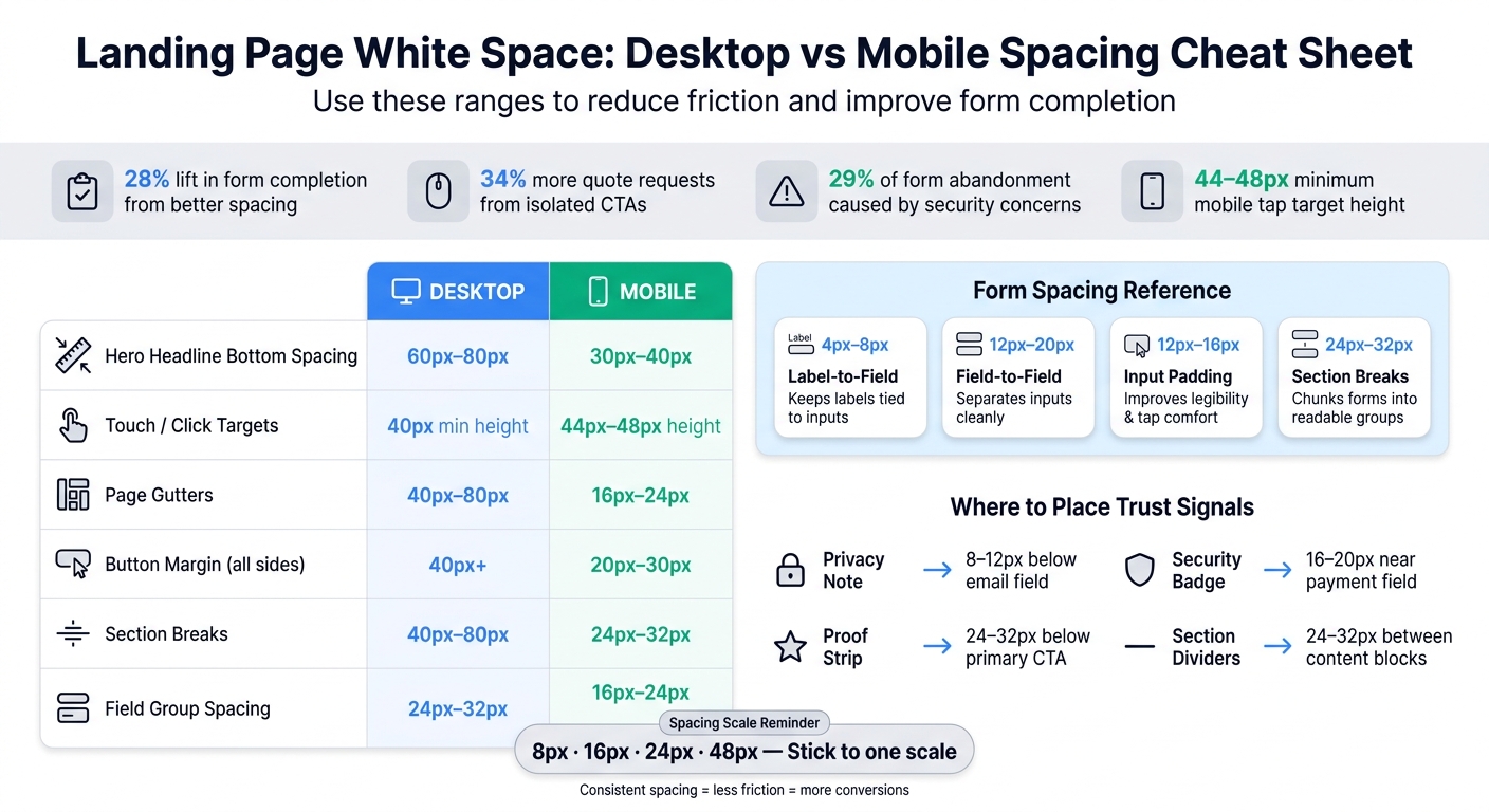
Landing Page White Space: Desktop vs Mobile Spacing Cheat Sheet
Use these tables as a fast spacing check. They help you catch layout gaps across the hero, form, CTA, and mobile view. The goal is simple: make pages easier to scan, easier to use, and easier to complete.
Form spacing reference table
| Element | Recommended Spacing Range | Why It Matters |
|---|---|---|
| Label-to-Field | 4px–8px | Keeps labels visually tied to inputs |
| Field-to-Field | 12px–20px | Separates inputs without slowing the scan |
| Input Padding | 12px–16px | Improves legibility and tap comfort |
| Section Breaks | 24px–32px | Chunks longer forms into readable groups |
Use the same logic on desktop and mobile. On mobile, tighten spacing a bit for touch and screen size.
Desktop vs. mobile spacing table
| Spacing Area | Desktop Range | Mobile Range | Notes |
|---|---|---|---|
| Hero headline bottom spacing | 60px–80px | 30px–40px | Tighter mobile spacing keeps the CTA visible sooner |
| Touch Targets | 40px height min | 44px–48px height | Larger targets on mobile prevent tap errors |
| Page gutters | 40px–80px | 16px–24px | Narrow mobile gutters maximize input field width |
| Button margin | 40px+ (all sides) | 20px–30px (all sides) | Desktop spacing isolates the CTA; mobile spacing supports tap targets |
A good way to think about it: desktop gives you more room to spread things out, while mobile forces every pixel to earn its place. That’s why these ranges work well as a quick gut check when a form feels cramped, messy, or harder to finish than it should be.
Conclusion
White space is a conversion tool. It guides attention, cuts friction, and helps visitors get to the form with less effort. That matters most on pages with one clear job: move visitors from interest to high-converting lead forms. When spacing is used well, the main elements stand out and feel easier to use.
The takeaway is simple: use spacing to guide attention, cut friction, and make the form easier to finish.
Key takeaways
Some of the biggest wins come from small changes. Start with top-aligned labels, isolated CTAs, and mobile spacing that's easy to tap. Those three moves are a smart first pass when you audit a page.
Next step for testing
Pick one landing page and clean up the crowded areas. Standardize spacing, then track form starts, completion rate, and scroll depth before and after. Use the same spacing scale across the hero, form, CTA, and mobile sections. If your pages rely heavily on forms, Reform can help keep layouts, spacing, and branding consistent across lead generation pages.
FAQs
How do I know if my landing page feels too crowded?
Check user behavior and layout signals. If visitors have a hard time scanning the page or seem overloaded, the issue may be tight layouts, too many form fields, or uneven spacing.
Watch for signs like a high bounce rate, low scroll depth, users zooming in, or people missing your main call to action. If the page looks crowded, add more padding around text and keep spacing steady - for example, 16 to 24 pixels between form fields.
Which spacing fixes should I test first?
Start by adding more breathing room so the form feels easier to scan. Use 16–24px between form fields and 24–32px between grouped sections.
Keep the layout to a single column with top-aligned labels. Give headings more space above than below so each section feels clearly separated. Place the CTA along a clear visual path, and tighten spacing on mobile to help cut down on errors.
Should desktop and mobile spacing be different?
Yes. Spacing should change between desktop and mobile because people use each device in a different way. The overall design style should stay the same, but the spacing needs to shift to keep the interface easy to read and easy to use.
On mobile, pay close attention to touch-friendly targets. They should usually be 44 to 48 pixels high so people can tap without as many input mistakes. Mobile line height should also be a bit larger: 1.6 to 1.8, compared with 1.5 to 1.6 on desktop.
Related Blog Posts
Get new content delivered straight to your inbox

The Response
Updates on the Reform platform, insights on optimizing conversion rates, and tips to craft forms that convert.



Drive real results with form optimizations
Tested across hundreds of experiments, our strategies deliver a 215% lift in qualified leads for B2B and SaaS companies.
