
.webp)
10 Best Practices for Multi-Step Form Navigation


Multi-step forms can simplify data collection and improve user experience by breaking long forms into smaller, digestible sections. This approach reduces overwhelm, boosts completion rates, and ensures users stay engaged. Here are the top practices to make your multi-step forms more effective:
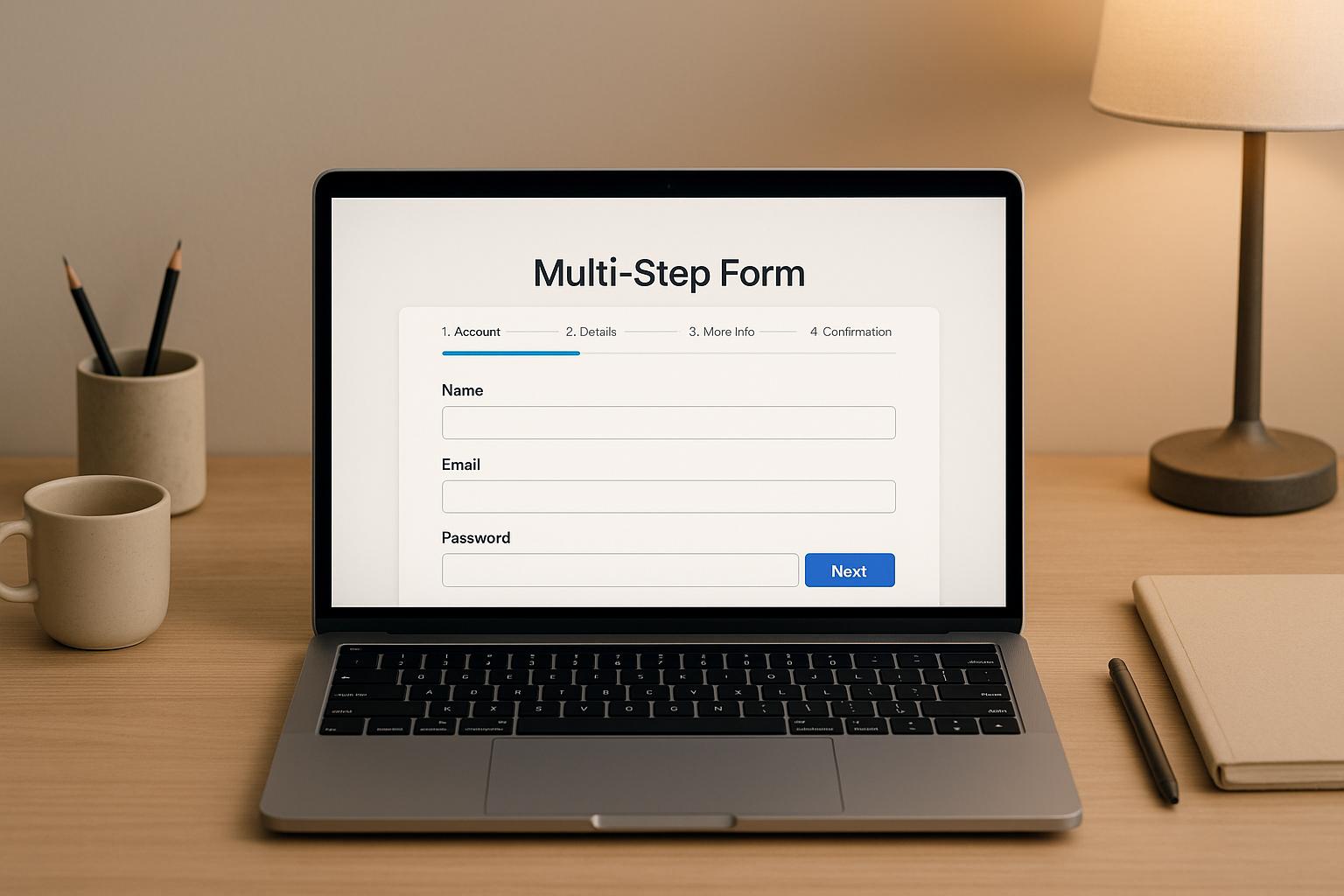
- Show Progress Indicators: Use clear visual cues like progress bars or step counters to guide users.
- Keep Design Consistent: Maintain the same branding, colors, and layout across all steps to avoid confusion.
- Simplify Navigation Controls: Use intuitive buttons with clear labels like "Next" and "Back", and ensure they are mobile-friendly.
- Group Related Fields: Organize fields into logical sections (e.g., personal info, payment details) to improve flow.
- Validate in Real-Time: Flag errors as users fill out fields to reduce frustration and increase accuracy.
- Optimize for Mobile: Ensure forms are easy to navigate on smaller screens with touch-friendly elements.
- Allow Editing of Previous Steps: Provide users the ability to review and update earlier responses without losing progress.
- Clearly Mark Required Fields: Use clear labels like asterisks for mandatory fields and "optional" for others.
- Ensure Accessibility: Design forms to be usable by all users, including those relying on screen readers or keyboards.
- Be Transparent About Privacy: Explain how user data will be collected, stored, and used to build trust.
These simple strategies can help you create user-friendly forms that improve completion rates and data quality. Tools like Reform can assist in implementing these practices with features like real-time validation, save-and-resume options, and built-in accessibility support.
Multi Step Form UX: Best Practices In Multi Step Form Design To 2x Your Leads
1. Show Clear Progress Indicators
Progress indicators act like a roadmap, guiding users through multi-step forms. When people know exactly where they are and how much more they need to complete, they’re more likely to stick with the process. This clarity eases any anxiety and makes even longer forms feel less daunting.
By providing clear visual cues, users feel more in control and motivated to finish.
Design Clear Visual Cues
The best progress indicators rely on familiar visual elements. Progress bars are a popular choice because they quickly show how far along a user is. A simple bar that fills from left to right as users move through steps offers a satisfying sense of achievement.
Numbered step counters are another effective option. Displaying something like "Step 2 of 5" gives users a clear idea of what’s left to complete. Adding color can enhance these indicators - for example, use your brand colors for completed steps, a distinct color for the current step, and neutral tones for unfinished ones.
You can also use visual icons to complement these indicators. Simple and widely recognized symbols work best: a checkmark for completed steps, a highlighted circle for the current step, and empty circles for upcoming steps. These create a natural flow that guides users without overwhelming them.
Make sure your progress indicators are easy to spot and align with your brand. Use contrasting colors to ensure they’re visible to all users, including those with visual impairments.
Place Indicators for All Devices
Where you place progress indicators can significantly impact the user experience. For the best results, position them at the top of your form so they stay visible as users scroll through fields. This steady presence reassures users and reduces confusion.
Mobile forms need extra attention because of limited screen space. Ensure the indicators stay visible, even when keyboards or other elements pop up. On desktops, fixed-position indicators work well, providing a stable reference point as users move between steps.
Think about the overall layout of your form. The progress indicator should be prominent enough to catch attention but not so bold that it distracts from the form itself.
Reform’s no-code form builder makes this process easier. It automatically adjusts the placement of progress indicators for different devices, ensuring they work seamlessly on desktops, tablets, and smartphones. This built-in responsiveness saves you from the hassle of manually optimizing for cross-device compatibility.
Finally, make sure your progress indicators update instantly as users advance. Any lag or inconsistency can lead to confusion and undermine the trust you’ve built.
These clear progress indicators set the stage for the intuitive navigation controls covered in the next section.
2. Keep Visual Design the Same Across All Steps
Consistency in design isn’t just about making things look good - it’s about building trust and reducing mental effort. When users see familiar colors, fonts, and layouts throughout a multi-step form, they feel reassured that they’re still on the right path. Changing visual elements mid-process can confuse users and increase the likelihood of them abandoning the form.
Use the Same Branding Throughout
Your brand identity should shine through every step of your form. This means keeping button styles, fonts, and colors consistent. A lack of uniformity can make the experience feel fragmented, potentially confusing users and weakening the overall impression of your brand.
But it’s not just about buttons and text. Background colors, accent hues, and even border shades should remain steady. This kind of visual harmony projects professionalism and a sense of reliability.
"Beautiful forms that are easy to brand with company colors and logo. Simple UI. Definitely recommended!" - David Hehenberger, Founder, Flamingo
Spacing and layout matter too. Consistent margins and padding around form fields create a rhythm that users intuitively recognize, making the form easier to navigate and more pleasant to use.
Create Branded Forms with Reform
Reform makes it simple to maintain a cohesive design for multi-step forms. You can set your brand colors, upload custom fonts, and define button styles just once. These settings are then applied automatically across every step of your form - no coding needed. This ensures your forms align perfectly with your brand guidelines.
The platform’s real-time preview feature is a game-changer. It allows you to see exactly how your forms will look on various devices - whether it’s a desktop, tablet, or smartphone - before you publish. This eliminates any guesswork and guarantees your forms look polished and professional everywhere.
Reform also offers a handy template system. Once you’ve nailed the styling for one form, you can save it as a template and reuse it for future forms. This means all your forms will share the same cohesive branding, ensuring a unified experience for users across all your lead generation efforts.
Up next, we’ll dive into how optimizing navigation controls can further streamline the user journey.
3. Make Navigation Controls Easy to Use
Navigation buttons are the backbone of multi-step forms, guiding users through the process. When these controls are unclear or confusing, users are more likely to abandon the form altogether. By designing navigation that’s straightforward and intuitive, you help users stay focused on completing the form rather than struggling to figure it out.
Use Clear Button Labels and Placement
The labels on your buttons matter - a lot. Instead of generic terms like "Submit" at every stage, opt for specific, action-oriented labels like "Continue to Payment", "Review Your Information", or simply "Next". These labels eliminate confusion and make it clear what users can expect when they click.
Consistency in button placement also plays a big role in creating a smooth experience. Stick to predictable positions: place the "Next" button in the bottom right corner and the "Back" button in the bottom left. This layout should remain consistent across all steps of the form:
- On the first step, only display a "Next" button.
- For middle steps, include both "Previous" and "Next" buttons.
- On the final step, show "Previous" alongside a submission button labeled with a clear action, like "Submit Order" or "Complete Registration".
Avoid common pitfalls, such as using "Submit" prematurely or placing buttons in inconsistent locations. These missteps can confuse users and lead to unintentional abandonment.
Visual design also plays a part in guiding users. Make the primary action button (usually "Next") stand out with bold colors or larger sizing, while keeping secondary actions like "Back" more subtle. This visual hierarchy naturally directs users toward completing the form.
Optimize Navigation for Mobile Users
Mobile users bring a unique set of challenges to the table, especially when navigating multi-step forms on smaller screens. To create a seamless mobile experience, your navigation controls need to be thoughtfully designed.
First, ensure buttons are large enough for easy tapping - at least 44 pixels tall. This accommodates different finger sizes and minimizes the risk of accidental presses. Similarly, leave enough space between buttons like "Back" and "Next" to prevent frustrating mis-taps, which can derail the user's progress.
It’s also important to check that buttons are fully visible without requiring horizontal scrolling, regardless of screen orientation. This ensures users can always access navigation controls without extra effort.
Consider how people hold their phones. Many users navigate with one hand, using their thumb, so placing buttons within thumb-friendly zones makes interaction more comfortable. Additionally, extend the touch-sensitive area beyond the visible button - this invisible padding makes tapping easier and more forgiving on touch screens.
4. Group Related Information Together
Grouping related information in forms is crucial for creating a smooth and intuitive experience. When fields are scattered without a clear structure, users can become frustrated trying to navigate through unrelated questions. By organizing information into logical sections, you reduce mental effort, improve focus, and keep users engaged.
Organize Information by Type
A well-organized form doesn't just look better - it works better. Logical grouping ensures that each step feels manageable and relevant. According to research from HubSpot, forms with 3–5 fields per step tend to achieve the highest conversion rates. Adding conditional logic - where only relevant fields appear based on prior answers - can make the process even more efficient.
Start by mapping out all the data you need and grouping similar fields together. For instance:
- Personal details: Name, date of birth, etc.
- Contact information: Email, phone number.
- Payment details: Credit card information, billing address.
This approach avoids abrupt shifts between unrelated topics, like jumping from personal details to payment information, which can disrupt the user flow. Conditional logic is particularly effective here, helping to show only what’s necessary and keeping the form concise.
The impact of thoughtful grouping is clear in real-world examples. In 2023, Big Brothers Big Sisters of Lone Star revamped their volunteer application by reorganizing it into logical steps - personal information, background checks, and references. They also added a save-and-resume feature. The result? Fewer incomplete applications and happier users.
This kind of structure not only improves the user experience but also sets the stage for smoother validation and error handling in later steps.
Follow U.S. User Expectations
Beyond logical grouping, aligning with U.S. user expectations for form design is key. Familiar formatting and conventions make forms easier to complete. For example:
- Addresses: Include fields for ZIP codes and follow standard U.S. formats.
- Phone numbers: Use the (XXX) XXX-XXXX format.
- Dates: Stick to the MM/DD/YYYY format.
- Payment details: Arrange credit card numbers, expiration dates, and CVV codes in the expected order. Offering a checkbox to copy the shipping address to the billing address can add convenience.
For measurements, use imperial units like feet, inches, and pounds. Also, stick to standard U.S. spelling conventions to ensure clarity.
The Web Accessibility Initiative emphasizes the importance of splitting forms into logical groups and repeating key instructions on each page to improve accessibility. Testing your groupings with real users and analyzing form abandonment rates can also highlight areas for improvement. If a particular step has high drop-off rates, it may be a sign that the grouping needs adjustments.
5. Validate Fields and Show Error Messages Immediately
Real-time validation ensures users are alerted to errors as they fill out each field, rather than waiting until they've completed an entire form. This approach not only makes the process smoother but also significantly improves form completion rates. In fact, research shows that users are 22% more likely to finish forms when errors are flagged immediately instead of at the end. By providing instant feedback, you can keep the user experience seamless and frustration-free.
This method becomes even more essential in multi-step forms, where users invest more time and effort. Imagine the frustration of reaching the final step only to discover errors scattered across earlier sections - it’s a surefire way to derail completion rates.
Write Helpful Error Messages
Once errors are caught, how you communicate them can make or break the user experience. Generic messages like "Invalid input" or "Error" leave users confused and unsure how to proceed. Instead, effective error messages should clearly explain the issue and provide actionable steps to resolve it.
For example:
- Replace "Invalid format" with "Please enter your phone number as (XXX) XXX-XXXX."
- Swap "Required field" for "Your email address is required to send a confirmation."
These specific instructions remove ambiguity and reduce the mental effort users need to fix mistakes. Additionally, use polite and supportive language. For instance, "Please check your ZIP code format" is far more user-friendly than "ZIP code is wrong."
Place error messages directly next to the relevant field so users can quickly identify and address the issue. Use visual cues like red borders or warning icons to draw attention. On mobile, ensure error messages are visible without requiring users to scroll, keeping the process smooth.
Validate U.S. Data Formats
Tailoring field validations to common U.S. data formats can significantly reduce user frustration. Real-time validation should recognize and accommodate these formats while also correcting minor errors automatically.
- Phone Numbers: Accept formats like (XXX) XXX-XXXX and XXX-XXX-XXXX, and auto-format entries for consistency.
- ZIP Codes: Support both 5-digit codes (90210) and the extended ZIP+4 format (90210-1234). If a specific format is required, auto-convert valid entries rather than rejecting them.
- Dollar Amounts: Allow entries with or without the dollar sign and automatically add commas for thousands separators (e.g., $1,234.56). Both numeric (1000) and formatted ($1,000.00) inputs should work seamlessly.
- Dates: Clearly indicate the expected MM/DD/YYYY format near the field. Accept variations like 12/25/2024, 12-25-2024, or 12.25.2024 to match user preferences.
- Email Addresses: Validate email formats in real time, ensuring the structure is correct (e.g., @domain.com) and even checking if the domain exists. This helps catch typos like "gmail.con" before they become delivery issues.
- State Names: Accept both full state names (California) and two-letter abbreviations (CA). For addresses, be flexible with apartment or suite number formatting as long as all necessary components are captured.
The goal is to strike a balance between accuracy and user-friendliness. Overly strict validation that rejects valid entries can frustrate users, while overly lenient rules can compromise data quality. Testing your validation rules with real users is essential to finding the right balance for your audience and use case.
sbb-itb-5f36581
6. Make Forms Work Well on Mobile Devices
As we've discussed the importance of clear navigation and consistent branding, it's equally critical to tailor your forms for mobile users. With over 60% of web traffic in the U.S. coming from mobile devices, ensuring your multi-step forms are mobile-friendly isn't optional - it's essential. Small screens and touch navigation present unique challenges, especially for multi-step forms, which demand more time and effort than single-page forms. Addressing these challenges can make or break the user experience.
Design for Touch Screens
Creating a touch-friendly design goes beyond simple responsiveness. Buttons should measure at least 48x48 pixels, as recommended by Apple's Human Interface Guidelines, to make them easy to tap. Input fields should also be large enough and spaced apart to avoid accidental taps.
When it comes to layout, single-column designs are ideal for mobile forms. They eliminate the need for horizontal scrolling and make the form easier to read. Placing fields side-by-side might seem like a space-saving move, but on smaller screens, it often leads to cramped, hard-to-navigate interfaces.
Dropdowns and checkboxes need extra attention, too. Standard dropdown menus can be tricky on mobile devices, so consider using native mobile input types or enlarging touch areas for smoother interactions.
Position navigation buttons like "Next" and "Previous" at the bottom of the screen - right where users' thumbs naturally rest. This placement makes it easier for users to move through the form. Once you've implemented these touch-friendly features, test them thoroughly on actual devices to ensure they work as intended.
Test on Multiple Devices
While device emulators are a good starting point, they don't catch everything. Testing on real devices is crucial to identify issues that emulators might miss. Focus on the devices most popular with your audience. In the U.S., this often means testing on the latest iPhones and Android models, as well as older devices with slower processors or display quirks.
Analytics can help pinpoint problem areas. If you notice a significant drop-off in form completion at a specific step, that's a red flag indicating the need for optimization tailored to mobile users.
Testing shouldn't stop at appearance. Check loading times, confirm that form validation works across various mobile browsers, and ensure that save-and-resume functionality operates smoothly. This feature is especially valuable for mobile users who might need to pause and return later to complete the form.
For deeper insights, consider usability testing with real users on their own devices. Watching how people interact with your form can reveal unexpected pain points, like confusing navigation or issues with specific input types.
Tools like Reform can simplify mobile optimization by automatically adjusting your forms to fit different screen sizes. Their responsive design capabilities ensure your forms maintain touch-friendly elements, helping create a seamless experience that encourages users to complete the form.
7. Let Users Review and Edit Previous Steps
When users can't easily go back and edit earlier responses in a form, it often leads to frustration, mistakes, and even abandonment. Giving users the ability to review and update previous steps is a simple yet powerful way to improve both completion rates and data accuracy.
Why does this matter? When users know they can revisit earlier sections without losing progress, their confidence grows. This confidence translates into higher completion rates and fewer errors. In fact, HubSpot reports that forms broken into steps with about five fields each tend to perform best, and adding review and edit options can make them even more effective.
Here’s how to make it work: include a clear "Previous" button on every step beyond the first. This button should let users move backward without losing their inputs. To achieve this, you’ll need proper state management - whether that’s through client-side storage (like JavaScript variables or browser storage) or server-side session handling.
For longer forms, consider adding a "save and resume" feature. This allows users to pause their progress and return later, which is especially helpful if they need time to gather information. Reform, for example, offers a "Finish Later Option" that automatically saves progress, letting users pick up where they left off whenever it’s convenient for them.
When users revisit earlier steps, make sure any validation errors are clearly marked with helpful messages. Real-time validation is key here - it flags issues as users make updates, cutting down on submission errors and keeping frustration to a minimum.
Don’t overlook accessibility. Navigation controls should work seamlessly with keyboards and screen readers, and progress indicators should update in real time. These details ensure the form is user-friendly for everyone.
Finally, regular usability testing is essential. Testing helps uncover issues like confusing navigation or unclear progress indicators, ensuring that your review and edit features deliver a smooth, frustration-free experience while boosting completion rates.
8. Mark Required and Optional Fields Clearly
When designing multi-step forms, one of the simplest ways to improve user experience is by clearly labeling required and optional fields. Few things frustrate users more than spending time on nonessential fields or guessing which ones are mandatory. Without clear distinctions, users can become confused, waste time, and may even abandon the form entirely. Clear labeling is a straightforward way to boost completion rates and make the process smoother.
Studies consistently show that reducing the number of required fields increases form conversion rates. When users know exactly what’s needed, they complete forms faster and with greater confidence.
Use Clear Visual Markers
To make required fields stand out, use an asterisk (*) - a symbol widely recognized in the United States as indicating mandatory information. For optional fields, explicitly label them as "optional." This combination eliminates any guesswork for users.
Add a simple legend at the top of your form, such as: "Fields marked with * are required." This quick clarification sets expectations upfront, sparing users the frustration of figuring out your system as they go.
For accessibility, visual markers should be paired with ARIA attributes. The W3C Web Accessibility Initiative (WAI) advises highlighting optional fields and providing a "skip" option whenever possible. For required fields, use attributes like aria-required="true" so screen readers can identify them. Avoid relying solely on color to indicate field status - users with color vision deficiencies may not perceive these distinctions clearly.
Consistency is key. If you use red asterisks for required fields in step one of your form, don’t switch to blue asterisks in step three. A consistent marking system helps users build a mental model of the form, making navigation easier.
Reduce User Confusion
Breaking forms into logical steps and clearly labeling fields can significantly reduce abandonment rates and improve data quality, as highlighted by FormAssembly research.
Here are some practical tips:
- Place required fields at the beginning of each section.
- Only make fields mandatory if they are absolutely essential. If a field isn’t crucial to your goal, consider making it optional or removing it altogether.
- Test your labeling with real users. What seems clear to you might not be obvious to them. Common pitfalls include inconsistent symbols, failing to explain markings, or not labeling optional fields, which often leads users to assume that every field is required.
Reform’s form builder helps maintain consistent field markers across devices, ensuring a smooth and accessible user experience. It also adheres to accessibility guidelines, making it easier to create forms that are both user-friendly and compliant.
Clear labeling does more than just guide users - it builds trust. When users understand exactly what’s expected of them, they’re more likely to complete the form and provide accurate information. This transparency enhances the overall experience and results in better data quality for your business. It’s a small but impactful way to strengthen your form design while complementing the navigation principles discussed earlier.
9. Make Forms Accessible to All Users
Creating accessible multi-step forms isn’t just a nice-to-have - it’s essential for reaching a broader audience and staying compliant with U.S. laws. With 26% of U.S. adults living with disabilities, accessible design expands your reach and ensures usability for everyone. Plus, it benefits users with temporary impairments or situational challenges, like a broken arm or poor lighting.
Accessibility also makes good business sense. Forms designed with accessibility in mind can boost completion rates by up to 50% compared to forms that aren’t accessible. Why? Because clear navigation, logical structure, and intuitive design help all users - not just those with disabilities. Let’s break down the key elements that make forms user-friendly for everyone, including those relying on alternative input methods.
Support Keyboard and Screen Reader Navigation
To ensure smooth navigation, your multi-step forms must work seamlessly for users who rely on keyboards or screen readers. Many people, whether due to motor disabilities, visual impairments, or personal preference, navigate forms using only a keyboard. That means every interactive element - like input fields, buttons, dropdowns, and navigation controls - must be accessible through the Tab key, Shift+Tab, Enter, and Space bar.
The tab order should follow the visual flow of the form logically, moving from top to bottom and left to right without jumping around. Focus indicators are critical here. Users need a clear visual cue to know which element they’re interacting with. While the default browser focus outline works, custom high-contrast styling often enhances the experience.
Screen readers, which read form content aloud, require proper structure to function effectively. Use semantic HTML elements like <form>, <fieldset>, and <label> to make your forms understandable to assistive technologies. Labels should be explicitly tied to input fields using the "for" attribute, and instructions should be clear and descriptive.
Progress indicators are another key area for screen reader users. Text-based progress updates work better than visual-only indicators. ARIA attributes like aria-live can announce changes, such as moving to the next step or showing validation messages. Similarly, error messages should be linked to their corresponding input fields using ARIA attributes to ensure clarity.
Follow ADA Compliance Guidelines
Beyond best practices, adhering to ADA and WCAG standards ensures your forms meet legal requirements. The Americans with Disabilities Act (ADA) and Section 508 of the Rehabilitation Act mandate that digital content must be accessible to people with disabilities. Both laws reference the Web Content Accessibility Guidelines (WCAG) 2.1 as the technical standard for compliance. Ignoring these standards can be risky, as ADA-related lawsuits have surged by over 300% between 2017 and 2022.
WCAG 2.1 lays out clear requirements for accessible forms. For example, ensure sufficient color contrast and avoid relying solely on color to convey information. Time limits can be problematic for users with disabilities, so either eliminate them or provide an easy way to extend the time.
The W3C Web Accessibility Initiative (WAI) offers detailed tutorials and examples for building accessible multi-step forms. Their recommendations include grouping related fields logically, repeating key instructions at each step, and making optional sections easy to skip.
Real-world examples show how these practices can deliver results. In 2023, Big Brothers Big Sisters of Lone Star added a save-and-resume feature to their volunteer application form. This change made the form more accessible for users who needed extra time or assistive technology. The result? Higher completion rates and glowing user feedback.
Testing is a crucial part of ensuring accessibility. Automated tools like axe, WAVE, or Lighthouse can catch technical issues, but don’t stop there. Use screen readers like NVDA, JAWS, or VoiceOver to experience your form as a visually impaired user would. Try navigating the form using only a keyboard - no mouse or trackpad allowed. Most importantly, get feedback from real users with disabilities to uncover practical usability insights.
Reform’s form builder simplifies accessibility with built-in features that support semantic HTML, ARIA labeling, and keyboard-friendly navigation patterns. These tools align with WCAG 2.1 standards, making it easier to create forms that work for everyone while reducing the risk of legal issues. By focusing on accessibility, you’re not just meeting compliance requirements - you’re building forms that genuinely serve all users.
10. Be Transparent About Data Security and Privacy
Data privacy isn’t just about following the law - it’s also a chance to build trust. With 72% of Americans believing nearly all their online activities are tracked, being upfront about how you collect, store, and use data can turn skepticism into confidence, encouraging more people to complete your forms.
Instead of burying privacy details in lengthy policies, weave transparency into your forms. Provide clear, concise explanations of your data practices right where users need them, offering reassurance without overwhelming them.
Address User Privacy Concerns
Transparency goes hand in hand with addressing privacy concerns directly. Users want straightforward answers about how their data is handled, not a scavenger hunt through dense privacy policies.
Start by being upfront about data collection. For example, if you’re asking for sensitive information like Social Security numbers or phone numbers, explain why. A simple statement such as, "We use your phone number to send appointment reminders and updates," can go a long way in building trust.
Make consent mechanisms clear and specific. Replace vague agreements like "I agree to the terms and conditions" with something more direct, such as, "I agree to receive email updates about my application status and related services." This empowers users to make informed decisions about their data.
Showcase security features without clutter. Trust indicators like SSL certificates, security badges, or brief encryption notes near sensitive fields can reassure users. A line like, "Your information is protected with industry-standard encryption," offers peace of mind while keeping the form clean.
For users who want more details, use progressive disclosure - present key privacy information upfront and provide links to more in-depth explanations. This approach balances the needs of those seeking quick reassurance with those who prefer to dive into the details.
These steps not only enhance user trust but also complement secure, intuitive multi-step forms, ensuring a seamless experience while aligning with legal requirements.
Follow U.S. Privacy Laws
Privacy laws in the U.S. vary from state to state, so knowing which regulations apply to your business is crucial. For example, the California Consumer Privacy Act (CCPA), which came into effect in 2020, grants California residents significant control over their personal data. Even if your business isn’t based in California, you may still need to comply if you serve California customers.
Under the CCPA, your forms must inform users about the types of personal information collected, why it’s collected, and their rights - such as the ability to access, delete, or opt out of the sale of their data. Providing clear ways for users to exercise these rights, like dedicated contact forms or privacy request email options, is essential.
Data minimization is another key requirement - and a smart practice. Only collect what you truly need. For instance, if you’re offering a software demo, a full mailing address probably isn’t necessary. Asking for less not only simplifies compliance but also makes your forms easier to complete.
Other states, like Virginia, Colorado, and Connecticut, have enacted similar privacy laws. Many businesses adopt a unified strategy that meets the strictest standards across all applicable jurisdictions.
To stay compliant, document your data practices thoroughly. Create records that trace how form data is collected, stored, and eventually deleted. These records can help demonstrate compliance to regulators and reassure users.
Reform’s form builder includes built-in features designed to support privacy compliance, such as customizable consent options, data retention controls, and tools for maintaining audit trails. These features make it easier to design forms that respect user privacy while meeting legal obligations.
Finally, schedule regular compliance reviews. Check that privacy notices are up to date, consent mechanisms work as intended, and data handling aligns with your stated policies. With 71% of U.S. adults believing the government should do more to regulate how companies use data, staying ahead of privacy laws isn’t just about avoiding fines - it’s about earning and keeping user trust.
Conclusion: Improve Results with Better Multi-Step Form Design
Multi-step forms can significantly enhance lead conversion rates and improve the quality of the data you collect. By applying the best practices outlined earlier, you’re not just simplifying the user experience - you’re creating a smarter, more efficient lead generation process.
For instance, instant validation and clear error messages have been shown to reduce form abandonment by 22%. When forms require a lot of information, breaking them into logical steps helps users avoid feeling overwhelmed. Features like save-and-resume functionality tackle one of the biggest frustrations users face with longer forms.
Take the example of Big Brothers Big Sisters: after implementing save-and-resume functionality, they saw a noticeable increase in completed applications and higher user satisfaction. Beyond just boosting completion rates, these strategies also improve the quality of your leads. Multi-step forms naturally filter and qualify leads, providing your sales and marketing teams with better data to work with. When users commit to completing multiple steps, it’s a strong indicator of genuine interest rather than casual browsing.
Using tools like Reform makes implementing these practices straightforward. With its no-code platform, Reform offers features like conditional routing, real-time validation, and built-in accessibility compliance. It also includes tools for spam prevention, email validation, and tracking abandoned submissions, ensuring you collect actionable leads without compromising the user experience.
Well-designed forms do more than just gather information - they build trust from the very first interaction. They lead to more qualified prospects, reduce the need for follow-ups, and improve the overall quality of your data. Better forms mean better results for your business.
FAQs
How can I make my multi-step form accessible for users with disabilities?
To ensure your multi-step form is accessible, it’s crucial to align with Web Content Accessibility Guidelines (WCAG). This means incorporating clear and descriptive labels, enabling full keyboard navigation, and making sure screen readers can accurately interpret each part of the form.
On top of that, provide straightforward instructions and error messages that are easy to understand. Don’t overlook the importance of color contrast - it should meet accessibility standards to assist users with visual impairments. Finally, test your form using assistive technologies to uncover and address any barriers that might hinder usability for individuals with disabilities.
What are the best practices for designing mobile-friendly multi-step forms?
To make multi-step forms work smoothly on mobile devices, aim for simplicity and ease of use. First, ensure the form is fully responsive, so it adjusts seamlessly to different screen sizes. Use large, easy-to-tap buttons and clear, legible fonts to simplify navigation on smaller screens.
Break the form into short, manageable steps to avoid overwhelming users. Add a progress indicator to show users exactly where they are in the process. Reduce the need for typing by incorporating dropdown menus, checkboxes, or pre-filled options wherever possible. Lastly, focus on fast load times and thoroughly test the form on a variety of devices to catch and resolve any usability issues.
Why should users be able to review and update their responses in a multi-step form?
Giving users the ability to review and update their responses in a multi-step form is crucial for creating a seamless and user-friendly experience. It allows them to correct errors or adjust their information if something has changed along the way.
This kind of flexibility not only minimizes frustration but also boosts the chances of completing the form. When users feel they have control over their input, they’re more likely to stick with the process. In the end, this leads to more accurate data and a smoother overall experience.
Related Blog Posts
Get new content delivered straight to your inbox

The Response
Updates on the Reform platform, insights on optimizing conversion rates, and tips to craft forms that convert.


Drive real results with form optimizations
Tested across hundreds of experiments, our strategies deliver a 215% lift in qualified leads for B2B and SaaS companies.
