
.webp)
10 Mobile Form Design Tips for Better UX


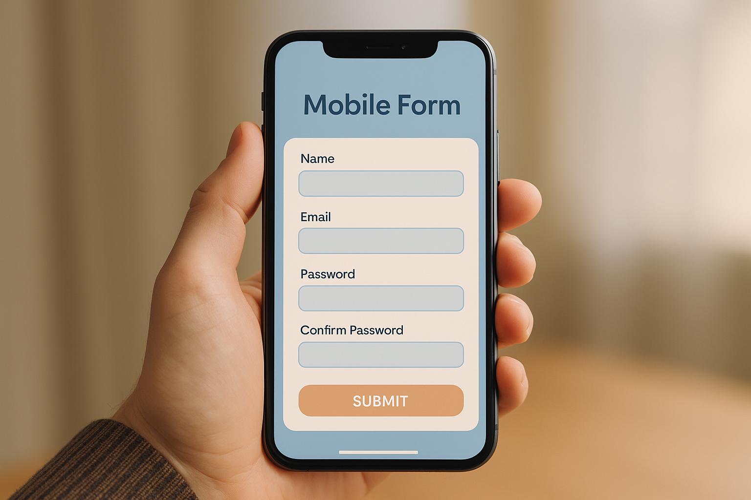
Want to make mobile forms easier to use and more effective? Here's how you can improve user experience and boost completion rates:
- Simplify Forms - Remove unnecessary fields to make forms quicker and easier to fill out.
- Responsive Design - Ensure forms adjust seamlessly across all screen sizes.
- Touch-Friendly Controls - Use large buttons and fields for easy tapping.
- Readable Text - Choose clear fonts, proper spacing, and high-contrast colors.
- Accessibility - Design forms that everyone, including users with disabilities, can use.
- Helpful Feedback - Add real-time validation and clear error messages.
- Keyboard Optimization - Use the correct keyboard type for each input field.
- Easy Navigation - Use features like 'Finish Later' and conditional logic to simplify progress.
- Progress Indicators - Break long forms into steps and show a progress bar.
- Test on Real Devices - Test forms on multiple devices to catch usability issues.
These strategies help create mobile forms that are fast, user-friendly, and accessible. Whether you're designing for sign-ups, surveys, or checkouts, these tips ensure a better user experience.
UI/UX | Design Better Forms - 5 Tips For Designing Mobile ...
1. Remove Extra Form Fields
Too many form fields can turn mobile users away. Simplifying your forms makes them easier to complete, especially when typing on small screens is tricky.
Research shows that trimming down form fields can boost qualified leads by as much as 215% for B2B and SaaS companies. This happens because you're focusing on collecting only the most important details.
Why Fewer Fields Work Better
- Less mental effort: Every field asks users to think and act. Cutting unnecessary ones makes the process smoother.
- Faster submissions: Shorter forms mean less typing, which is a big plus on mobile devices.
- Fewer drop-offs: Simplified forms reduce the chances of users abandoning them midway.
"Reform is a simple, fast forms solution. A no-brainer to reach for anytime I need to (quickly!) throw up a form without hacking around with code. I like that it's customizeable too. Awesome tool!" - Brian Casel, Founder, ZipMessage
Tips for Streamlining Forms
- Review your fields - Look at each one and ask, "Do I really need this right now?"
- Start small - Gather basic info first, then request more details later if needed.
- Use automation - Tools can pull in public data, reducing the need for users to fill out every detail.
You can also speed things up by using smart defaults and enabling auto-fill options. Regularly check your mobile form analytics to spot issues and fine-tune your setup. Lastly, make sure your forms adjust perfectly to any screen size for a smooth user experience.
2. Make Forms Work on All Screen Sizes
Designing forms that function well across all screen sizes is essential for mobile usability. If a form doesn’t scale properly, it can frustrate users and result in incomplete submissions.
Tips for Effective Design
Responsive Layout Guidelines:
- Ensure forms adjust seamlessly between portrait and landscape orientations.
- Use layouts that adapt - for example, switch a two-column layout on larger screens to a single column on smaller ones.
- Provide enough spacing between elements to avoid accidental taps.
- Maintain consistent branding across all screen sizes.
- Size input fields to match typical user entries.
- Place call-to-action buttons where they’re easy to tap.
- Choose typography that remains clear and readable on any device.
Integration Options for Responsive Forms
Here are some methods to enhance your form’s adaptability:
| Integration Method | Best For | Main Advantage |
|---|---|---|
| iFrame Embedding | Quick setup | Automatically adjusts to screen size |
| Web Components | Custom designs | Better alignment with brand styling |
| Headless Integration | Advanced needs | Offers maximum control and flexibility |
Using responsive templates that reflect your brand’s identity can further improve the user experience.
3. Add Mobile-Friendly Touch Controls
Making touch controls easy to use is key to improving mobile form usability.
Interactive elements like buttons and fields should be large enough to tap without difficulty. This reduces mistakes and makes filling out forms less frustrating.
Position these controls within easy-to-reach areas, often referred to as "thumb-friendly zones", so users can navigate forms one-handed. These adjustments ensure mobile forms are practical and straightforward to use.
4. Make Text Easy to Read
Readable text is key to creating a smooth experience for mobile users. If users struggle to read your form, they may zoom in or, worse, give up entirely.
Font Size and Spacing
Choose font sizes large enough to be easily read on mobile screens. Both form fields and labels should be clearly visible without requiring any zooming. Use 1.5 line spacing to make the text easier on the eyes.
Color and Contrast
Stick to high-contrast combinations, like dark text on a light background, to ensure readability. This also helps you meet accessibility standards.
Typography Tips
- Opt for familiar system fonts that render well on mobile devices.
- Left-align your text for a more natural and comfortable reading experience.
These small tweaks can make a big difference in creating a user-friendly mobile form.
5. Build Forms Everyone Can Use
Making mobile forms accessible means following ADA and WCAG guidelines. This includes using clear labels, supporting keyboard navigation, and providing effective error handling. These steps ensure that everyone can navigate and complete forms without barriers.
Use Clear Field Labels
Each form field should have a clear, descriptive label that works seamlessly with screen readers. Use semantic HTML to properly link labels to their input fields, ensuring clarity and usability.
Support Keyboard Navigation
Users should be able to navigate forms entirely with a keyboard. This means:
- Ensuring a logical tab order through fields
- Highlighting focus and active states clearly
- Avoiding keyboard traps that prevent smooth transitions between fields
Meet Color and Contrast Standards
To meet accessibility standards, pay attention to contrast ratios:
- Text should have at least a 4.5:1 contrast ratio
- Large text (18pt or 14pt bold) requires a 3:1 contrast ratio
- Avoid relying on color alone to convey information - use additional visual cues
These adjustments also improve how errors are communicated visually.
Provide Clear Error Messages
Error handling is crucial. Effective error messages should:
- Be accessible to screen readers
- Use both color and icons to highlight errors
- Clearly explain what went wrong
- Offer actionable steps to resolve the issue
Ensure Compatibility with Assistive Technologies
"Ensure your forms are easy to navigate for all users, complying with accessibility standards to reach a wider audience." - Reform.app
Using proper markup, such as ARIA labels, ensures that assistive technologies like screen readers work as intended.
Allow for Flexible Timing
Give users enough time to complete forms by offering extended session durations and a save-progress feature. This way, users can return and finish at their own pace.
Incorporating these practices will make your forms easier for everyone to use, enhancing the overall mobile experience.
6. Show Helpful Hints and Error Messages
Building on earlier tips for keeping fields simple and ensuring responsive design, real-time validation offers immediate feedback that helps users avoid mistakes and stick with the form.
Use Real-Time Validation
Let users know instantly if their input is correct or needs fixing by validating entries as they type. This method allows users to:
- Spot and fix mistakes right away
- Avoid losing data while correcting errors
- Fill out forms correctly the first time
For example, when someone enters an email address, instantly checking the format and showing a green checkmark for valid input reassures them and keeps them moving forward. This simple feedback keeps users engaged and makes mobile forms easier to complete.
Create Clear Error Messages
As mentioned in Section 5, error messages should be easy to understand and accessible. Once you've validated inputs in real-time, go a step further by providing helpful, context-specific hints.
Add Helpful Field Hints
When a user clicks or taps on a field, show hints that explain what’s needed. Use visual cues like checkmarks or progress indicators to confirm correct entries. Effective field hints should:
- Explain the format required
- Outline specific rules or criteria
- Provide examples of valid entries
- Appear only when the field is active
Make Fixing Errors Simple
If a user makes a mistake, make it easy to recover by:
- Keeping any data they've already entered
- Clearly marking where the error happened
- Letting them continue where they left off
- Giving clear instructions on how to fix the issue
Allow Progress Saving
For longer forms, include an auto-save feature to:
- Save progress automatically
- Let users return to finish later
- Protect against losing data
- Resume from where they stopped
This is especially useful for mobile users who might get interrupted or lose their connection while filling out the form.
sbb-itb-5f36581
7. Use the Right Mobile Keyboard Types
Choosing the right keyboard layout can make data entry faster and more accurate.
Match Keyboards to Input Types
Each input field should use the appropriate keyboard layout based on the type of data being entered. HTML input types can automatically trigger the most suitable keyboard. Here's how they align:
| Input Type | Best For | Keyboard Features |
|---|---|---|
type="email" |
Email addresses | Prominent @ symbol and .com shortcut |
type="tel" |
Phone numbers | Large number pad for quick numeric entry |
type="number" |
Numeric values | Numeric keypad for easy input |
type="date" |
Calendar entries | Built-in date picker interface |
type="url" |
Website addresses | Quick access to URL elements like "/" and "." |
Using these specific keyboard layouts makes data entry smoother and reduces user frustration.
Smart Keyboard Optimization Tips
When designing mobile forms, keep these strategies in mind:
-
Numeric Fields - For inputs like credit card numbers or zip codes, use
type="number"ortype="tel". This ensures a numeric keypad appears, preventing accidental non-numeric entries. -
Email Fields - Use
type="email"to bring up a keyboard tailored for email entry, complete with a visible @ symbol and .com shortcut. - Date Selection - Replace manual date entry with a date picker. This triggers the device's native calendar interface, simplifying the process for users.
These small adjustments can lead to a much better user experience on mobile devices.
8. Speed Up Form Navigation
Quick and easy navigation is key to keeping users engaged with mobile forms. When navigation feels natural, even complex forms become much simpler to complete.
Add a 'Finish Later' Option
Including a 'Finish Later' feature allows users to pause and return to longer forms without losing progress. This keeps the experience smooth and ensures users can pick up right where they left off.
Use Conditional Logic
Streamline the process by skipping irrelevant sections based on user responses. For instance, if someone answers "No" to having a business address, the form can automatically skip over address-related fields. This saves time and reduces unnecessary steps.
With these navigation tweaks, completing forms becomes faster and less frustrating. The next sections will explore even more ways to improve the user experience.
9. Show Form Progress Steps
Long forms can feel overwhelming, often leading users to abandon them halfway through. Breaking forms into smaller, clear steps with progress indicators can keep users engaged and increase completion rates.
Use Visual Progress Bars
Adding a progress bar at the top of your form instantly shows users where they are in the process. It offers two major benefits:
- Gives a sense of control - Users can see how much is left, which reduces anxiety.
- Boosts motivation - Seeing progress encourages users to complete the form.
Label Steps Clearly
Avoid generic labels like "Step 1" or "Step 2." Use descriptive labels such as "Contact Info", "Shipping Details", or "Payment." This approach helps users:
- Know what information is required at each step.
- Prepare their responses ahead of time.
- Navigate through the form more efficiently.
Keep Steps Manageable
Divide your form into sections that users can finish in about 2-3 minutes each. Smaller chunks prevent users from feeling overwhelmed and help maintain their focus.
For example, a service signup form could be organized like this:
| Step | Content | Estimated Time |
|---|---|---|
| Basic Info | Name, Email, Phone | 1 minute |
| Business Details | Company, Industry, Size | 2 minutes |
| Preferences | Package Selection, Requirements | 2 minutes |
Save Progress Automatically
One of the most frustrating experiences for users is losing their progress. Ensure your form automatically saves entries so they can return later if needed. This is especially helpful for longer forms where users might need time to gather additional information or documentation.
Finally, make sure your progress indicators work seamlessly across all devices. A responsive design ensures users always know where they are, whether they’re on a desktop, tablet, or phone. This small detail can make a big difference in the overall user experience.
10. Check Forms on Real Mobile Devices
Testing forms on actual mobile devices is essential for identifying usability issues that emulators might miss. This hands-on testing connects design ideas with how they actually perform, reinforcing earlier advice about responsive layouts and intuitive controls.
Key Items to Review for Form Functionality
When testing, focus on these critical aspects to ensure smooth functionality:
- Touch targets - Check sizes and spacing for easy interaction.
- Keyboard behavior - Confirm input types and proper keyboard display.
- Field visibility - Ensure users can see fields without needing to zoom.
- Auto-fill - Test if auto-fill works correctly across devices.
- Screen orientation - Verify forms adjust when switching between portrait and landscape.
- Loading times - Check how forms perform on different network speeds.
Common Issues to Watch For
| Issue Type | What to Check | Why It Matters |
|---|---|---|
| Visual Layout | Look for text wrapping and field alignment | Prevent broken layouts |
| Touch Controls | Ensure button spacing and tap accuracy | Minimize input errors |
| Performance | Test loading and submission speeds | Keep completion rates high |
| Keyboard | Verify input field focus and keyboard types | Simplify data entry |
Accounting for Device-Specific Behaviors
Different devices can behave uniquely. For example, iOS might auto-zoom on input fields, while Android may not. Testing across various devices ensures users have a consistent experience regardless of their platform.
Testing Essentials
- Use different network connections like 4G, 5G, and Wi-Fi to check loading performance.
- Test how forms work with accessibility features enabled, such as screen readers or high-contrast settings.
Screen Size Considerations
Forms should adapt seamlessly to both phones and tablets. Pay attention to:
- Visibility of field labels and error messages.
- Button sizes and their placement for easy access.
- Proper spacing between form elements.
- Text readability without requiring zoom adjustments.
How Reform Improves Mobile Forms
Reform tackles the challenges of mobile form design head-on, offering practical solutions that make forms easier to use and more effective at collecting data. With features designed to improve user experience, Reform ensures your mobile forms are functional and optimized for conversions.
Reform addresses common mobile form issues, helping to increase both completion rates and data accuracy.
Multi-Step Form Technology
Reform’s multi-step form feature divides lengthy forms into smaller, more manageable sections, making it easier for users to complete them on mobile devices. Unlike rigid designs that force one question per page, Reform allows for flexible layouts.
"One question per page is great for some forms, but it's a silly constraint. Sometimes a single page works better. If you want more than one question per page, that's cool too."
Smarter Lead Routing and Automation
Reform streamlines the user experience with tools like conditional routing and automated data enrichment. Here's how these features work:
| Feature | How It Helps |
|---|---|
| Conditional Logic | Shows only relevant questions based on prior answers, keeping forms focused and concise. |
| Lead Enrichment | Fills in certain fields automatically using web data, reducing the need for manual input. |
| Progress Saving | Allows users to save their progress, giving them the flexibility to complete forms later. |
Accessibility-Focused Design
Reform ensures its forms are accessible to everyone, including those using assistive technologies. Features like screen reader compatibility, touch-friendly controls, high-contrast options, and keyboard navigation make forms easy to use for all audiences. These thoughtful design elements align with Reform’s goal of providing a seamless, mobile-first experience.
More Features for Better Usability
Reform also offers customizable, responsive layouts that adjust to fit any device. This ensures your forms look great and maintain brand consistency, no matter where they’re accessed. These layouts are designed to make completing forms on mobile devices as smooth as possible.
Mobile Input Types Guide
Choosing the right input types for mobile forms improves usability and encourages users to complete forms more effectively.
Text Input Types
Different input types cater to specific data entries, making forms easier to use:
| Input Type | Purpose | User Experience Benefits |
|---|---|---|
| text | Names, addresses | Displays a full keyboard |
| Email addresses | Offers an email-ready keyboard with the "@" symbol | |
| tel | Phone numbers | Provides a numeric keypad with phone-specific symbols |
| number | Numeric values | Displays a numbers-only keypad |
| search | Search fields | Includes a search keyboard with a "Go" button |
Date and Time Selection
Using native date pickers in forms has clear advantages:
- Built-in calendars prevent users from selecting invalid dates.
- Automatically adjusts to local date formats for better clarity.
- Designed for touchscreens, making them easy to use on mobile devices.
Special Input Types
Specialized input fields improve the overall form-filling experience:
- Password fields - Mask sensitive input for security.
- URL fields - Provide a keyboard optimized for web addresses, including a ".com" shortcut.
- Color pickers - Allow users to select colors directly from a native interface.
- File uploads - Enable access to the device's camera or gallery for uploading media.
Smart Input Enhancements
Incorporating smart features can streamline form interactions and reduce user errors:
| Feature | Implementation | Benefit |
|---|---|---|
| Autocomplete | Address fields | Reduces typing effort |
| Input masks | Phone numbers | Ensures proper formatting |
| Pattern matching | Credit cards | Provides instant format validation |
| Real-time validation | All fields | Offers immediate feedback on errors |
These enhancements, when paired with accessibility best practices, create a smoother experience for all users.
Accessibility Considerations
Ensure your input types are compatible with:
- Screen readers for visually impaired users.
- Voice input for hands-free interactions.
- External keyboards for those who prefer physical typing.
- Other assistive technologies to accommodate diverse needs.
Conclusion
Designing mobile-friendly forms plays a key role in enhancing user experience and increasing conversions. By applying proven strategies, businesses can see measurable improvements in how users interact with their forms.
The focus is on a few core elements - streamlined fields, responsive layouts, and easy-to-use touch controls - all of which directly influence how likely users are to complete a form.
Key points to remember:
- Minimize friction by removing unnecessary fields.
- Optimize for all screen sizes to ensure forms look great on any device.
- Use proper input types to make interactions smoother on mobile.
- Make accessibility a priority to cater to all users.
- Include real-time validation and clear error feedback for a better experience.
These practices work together to create forms that are simple to use and effective at driving results. By focusing on these essentials, businesses can improve completion rates while collecting more accurate data.
"Reform is a simple, fast forms solution. A no-brainer to reach for anytime I need to (quickly!) throw up a form without hacking around with code. I like that it's customizeable too. Awesome tool!" - Brian Casel, Founder, ZipMessage
FAQs
Why does simplifying form fields on mobile improve user experience and completion rates?
Simplifying form fields on mobile makes it easier for users to complete forms quickly and without frustration. By reducing the number of fields and focusing only on essential information, you minimize cognitive load and create a smoother experience.
Features like multi-step forms can break lengthy forms into smaller, more manageable sections, keeping users engaged. Prioritizing accessibility and intuitive design ensures that forms are easy to navigate for all users, further boosting completion rates.
How can I make mobile forms more accessible for users with disabilities?
To make mobile forms accessible, focus on creating a design that is easy to navigate and inclusive for all users. Use clear labels and instructions for form fields, and ensure the form is compatible with screen readers.
Additionally, provide keyboard navigation options and maintain proper color contrast to accommodate users with visual impairments. Following accessibility standards, like the Web Content Accessibility Guidelines (WCAG), can help ensure your forms are usable by a broader audience.
Why is it important to test mobile forms on real devices, and what issues should you look for during testing?
Testing mobile forms on real devices is crucial because it ensures the form works as intended across different screen sizes, operating systems, and hardware capabilities. Simulators can't fully replicate the actual user experience, such as touch interactions or performance on slower devices.
During testing, check for common issues like:
- Responsiveness - Ensure the form adapts properly to various screen sizes.
- Touch usability - Verify buttons, fields, and interactive elements are easy to tap and not too small.
- Performance - Look for delays or lag, especially on older devices.
- Autocorrect and autofill handling - Test how the form manages these features to avoid user frustration.
- Error handling - Confirm error messages are clear and easy to understand.
By testing on real devices, you can catch potential problems early and deliver a smoother user experience.
Related posts
Get new content delivered straight to your inbox

The Response
Updates on the Reform platform, insights on optimizing conversion rates, and tips to craft forms that convert.


Drive real results with form optimizations
Tested across hundreds of experiments, our strategies deliver a 215% lift in qualified leads for B2B and SaaS companies.
