
.webp)
How Color Impacts Form Completion Rates


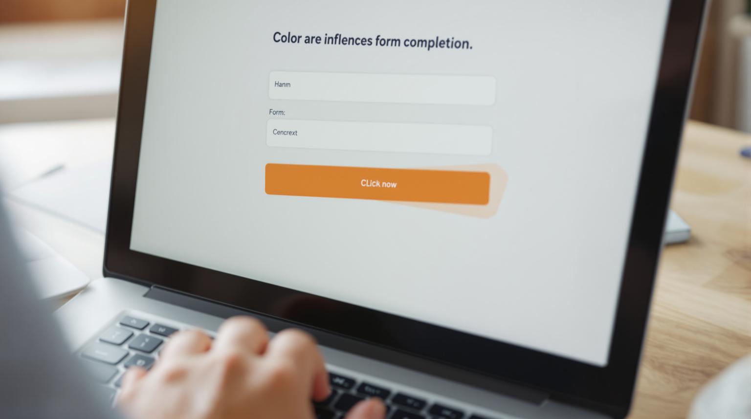
When designing forms, color choices can make or break user engagement. Here's what you need to know:
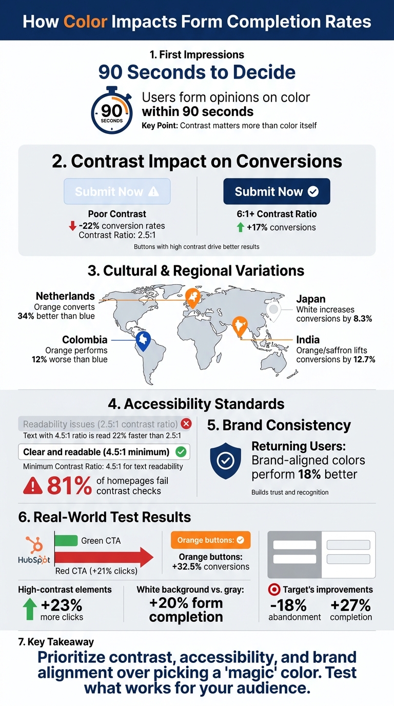
- First Impressions Matter: Users form opinions on color within 90 seconds, and contrast often matters more than the color itself.
- Contrast Drives Conversions: Buttons with a contrast ratio of 6:1 or higher can boost conversions by 17%. Poor contrast can reduce rates by up to 22%.
- Cultural and Demographic Preferences: Color effectiveness varies by region and age group. For example, orange performs well in the Netherlands but not in Colombia.
- Accessibility is Key: Maintaining a minimum contrast ratio of 4.5:1 ensures better readability for all users, including those with disabilities.
- Brand Consistency Builds Trust: Forms using brand-aligned colors perform 18% better with returning users.
Key takeaway: Prioritize contrast, accessibility, and brand alignment over picking a "magic" color. Test what works best for your audience.
How Color Contrast and Accessibility Impact Form Conversion Rates
Color Psychology and User Behavior
Research on Color and Decision-Making
Color psychology delves into how different hues affect emotions, moods, and actions - like deciding whether to complete or abandon a form. Interestingly, our brains react to colors almost instantly. Light wavelengths trigger neural responses that shape how we feel and behave, often before we’ve even processed the text on a page. In fact, research reveals that people take just 90 seconds to form an opinion about a product. These snap judgments often influence how much trust or competence we assign to what we’re seeing.
"Color psychology involves the research of how color influences an individual's mood, emotions, and decision-making." – FormAssembly
What’s more important than the specific color? Contrast. High contrast in design has a stronger impact on conversions than the hue itself. This ties into the Isolation Effect (Von Restorff effect), which explains why elements that visually stand out are easier to remember and act upon - making contrast a key factor for effective call-to-action (CTA) design.
How Color Shapes First Impressions
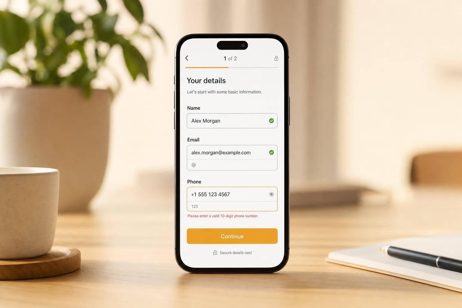
The first few seconds a user spends with a form are crucial. During this time, the form’s visual design - including its color choices - helps users decide whether to trust it or not. For example, small visual cues like a field turning green after correct input can reassure users and encourage them to keep going.
However, cultural and industry norms play a big role in how colors are perceived. For instance, in the U.S., blue is often associated with trust, while in Japan, white can increase conversions by 8.3%. In contrast, saffron or orange lifts conversions by 12.7% in India. Even within Europe, preferences shift: orange converts 34% better in the Netherlands but performs 12% worse in Colombia compared to blue.
Age also shapes color preferences. Younger users, aged 18–24, are drawn to bold, bright colors like neon pink or electric blue. On the other hand, people over 50 tend to favor high-contrast, more traditional tones such as dark blue or burgundy. These differences highlight the importance of tailoring color schemes to match the audience’s preferences and expectations.
"Color is a multiplier, not a foundation." – Matthew Stafford, Founder, BGS
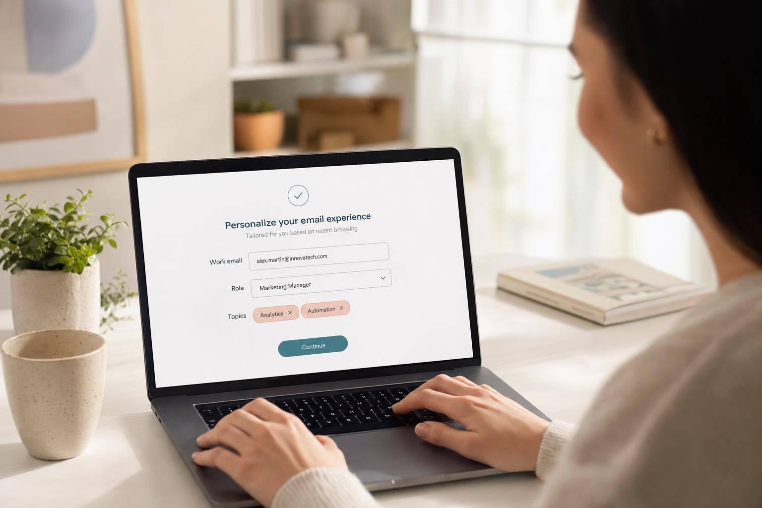
Consistency is another critical factor, especially for returning visitors. Forms that use brand-aligned colors outperform those with generic "high-converting" palettes by 18% for repeat users. Recognizable colors create a sense of familiarity, making the process feel smoother and less intimidating.
These findings emphasize how thoughtful color choices can directly impact user confidence, conversion rates, and form completion success.
sbb-itb-5f36581
Color's Effect on Conversion Rates
CTA Button Color Tests and Results
Data from real-world experiments shows just how much color can influence user behavior, especially when it comes to call-to-action (CTA) buttons. Take HubSpot's famous A/B test, for example: their red CTA button outperformed a green one by an impressive 21% in total clicks. The reason? The red button created a stronger contrast against HubSpot's predominantly green branding, making it more noticeable.
But here's the catch - there's no one-size-fits-all color. In a study by Build Grow Scale, which analyzed 2,847 A/B tests from high-revenue stores (earning over $300,000 monthly), red only outperformed green in 38% of cases, while green won 35% of the time. What really stood out was the importance of contrast. For example, when a supplement brand increased the contrast of its button from a 2.8:1 ratio to 6.1:1, their conversion rate jumped from 2.3% to 2.7%, generating an extra $8,400 in monthly revenue.
Other colors also showed strong results. Orange buttons, for instance, boosted conversions by 32.5%. Meanwhile, companies like Amazon and Netflix saw significant lifts with red CTAs - 23% and 19%, respectively.
These findings underline how color impacts more than just clicks; it also plays a role in reducing form abandonment and improving user engagement.
Color Contrast and Form Abandonment
Low contrast can hurt conversions by making elements harder to notice or read, driving users away. High-contrast elements, on the other hand, attract 23% more clicks. For instance, black text on a white background offers 70% better readability compared to less distinct color pairings.
Even small tweaks to background colors can make a difference. Switching from a gray to a white background has been shown to boost form completion rates by 20%. This improvement comes from reducing eye strain and allowing users to process information more quickly - after all, the brain can interpret color in just 90 milliseconds.
Accessibility plays a big role here, too. The Web Content Accessibility Guidelines suggest a minimum 4.5:1 contrast ratio between text and background colors. This isn't just about accommodating users with visual impairments; it enhances the experience for everyone. For example, when Target increased the contrast on their digital forms and adjusted error message colors, they cut abandonment rates by 18% and improved form completion by 27%.
"The right color contrast doesn't only benefit people with disabilities - it can make the entire experience better for everyone filling out your form." – FormAssembly
The bottom line? A well-chosen CTA color, paired with thoughtful contrast adjustments, can drive sales increases of over 35%. But success comes from looking at the bigger picture - it's not just about picking the "right" color but ensuring it fits the overall design and context.
Color Accessibility for All Users
Contrast Ratios and Readability
Contrast ratio measures the brightness difference between foreground elements (like text or buttons) and their background. It ranges from 1:1 (e.g., white on white) to 21:1 (black on white). According to WCAG 2.1/2.2 guidelines, normal text should maintain a minimum contrast ratio of 4.5:1, while large text (18pt or 14pt bold) and UI elements like buttons or form borders require at least a 3:1 ratio.
Research supports these standards: text with a 4.5:1 contrast ratio is read 22% faster compared to a 2.5:1 ratio. Additionally, low-contrast borders can lead to a 36% increase in input errors. Alarmingly, a 2025 study revealed that 81% of homepages fail detectable contrast checks.
"Contrast ratio is the technical name for readability. If your product is hard to read, your product is hard to use." – Refact
High-contrast design benefits everyone, not just users with visual impairments. It improves usability for people using devices in bright sunlight, those with age-related vision changes, and users with lower-quality screens. A common mistake is using light gray placeholder text (e.g., #999999) on white backgrounds, which often fails contrast tests. Opting for darker shades like #595959 ensures better readability . Poor contrast doesn’t just affect accessibility - it can significantly reduce user engagement.
How Poor Color Accessibility Reduces Completions
Contrast isn’t just about readability - it directly impacts user behavior. Pages with contrast issues see 24% higher bounce rates on mobile devices. On the other hand, call-to-action buttons with contrast ratios of 4.5:1 or higher generate 14% to 21% more clicks than low-contrast versions.
Accessibility concerns are widespread. About one in four U.S. adults has some form of disability, and around 8% of men and 0.5% of women experience color vision deficiencies. Relying solely on color (e.g., a red border) to indicate errors creates barriers for users with color blindness. To make forms more inclusive, pair color changes with icons or text labels . Additionally, form field borders and focus indicators should meet at least a 3:1 contrast ratio . Addressing these issues can lead to a 10% to 15% boost in conversions across all users.
"Accessible form design makes forms better for everyone. Clear labels help sighted users too... High-contrast text is easier to read on a phone in direct sunlight." – Bohdan Khodakivskyi, Founder, Fomr
How to Choose Form Colors
Selecting CTA Button Colors
When it comes to CTA (Call-to-Action) button colors, contrast is king. It’s not just about picking a specific hue - it’s about ensuring the button stands out in its surroundings. For instance, if your website leans heavily on blue tones, a bold orange or red button will naturally grab attention. Color psychology also plays into this: red can evoke urgency and excitement, making it perfect for time-sensitive offers. Blue, on the other hand, suggests trust and dependability, while green gives off a sense of growth and signals "go". These subtle cues can significantly impact user behavior.
To make your CTA buttons pop, consider using complementary colors - those directly opposite your site’s primary color on the color wheel. Consistency is also key; using the same color for all primary CTAs helps users quickly identify where to click. Pair this with simple, high-contrast text (like black or white) for readability, and surround the button with 20–30 pixels of whitespace to make it visually distinct. And don’t forget: A/B testing is your best friend. What works for one brand may not work as effectively for another.
"The principle is simple: your CTA button should be the most visually prominent element in its immediate context." – KISSmetrics Editorial
Strategic use of color doesn’t stop at buttons - it can guide users through the entire form experience.
Using Color to Direct User Actions
Beyond CTAs, color can help guide users step-by-step through your form. Progress bars are an excellent example, leveraging the Goal Gradient Effect - the closer users feel to completion, the faster they act. Using your brand’s primary color for the filled portion of the bar, alongside a neutral gray for the unfilled section, makes progress immediately clear. Steer clear of red or orange for unfilled portions, as they can unintentionally signal errors or warnings, potentially increasing user hesitation.
Adding a progress bar can boost multi-step form completion rates by 10% to 15%. Studies on the Endowed Progress Effect have shown that when users see a task as partially complete (even artificially), they’re more likely to finish it. For instance, a loyalty card that appeared 20% complete saw a 34% higher completion rate compared to a blank one, even though both required the same effort. To maximize this effect, start your form with shorter, simpler steps so users see quick progress early on. Smooth animations (200–300ms) for progress bar transitions can also provide a satisfying sense of accomplishment.
Maintaining Brand Colors in Forms
After optimizing your CTA elements, ensure your entire form stays visually aligned with your brand. A consistent color scheme not only reinforces trust but also makes the experience feel seamless. Using your brand’s primary color for CTA buttons often works well, provided it contrasts sharply with the form’s background. If you’re unsure about the overall color scheme, a neutral palette for the form body paired with bold accents from your logo and CTA buttons is a safe bet.
Consistency in brand colors, combined with thoughtful contrast and psychological principles, can significantly improve conversion rates. Research shows that brands can boost sales by over 35% simply by ensuring their CTA buttons stand out from the rest of the page. Stick to bold, solid colors for primary buttons, and use low-contrast, "ghost" styles for secondary actions to avoid confusion. When highlighting errors or required fields, always pair color changes with clear, descriptive text to maintain accessibility for all users.
Decoding Color Psychology for Design | High On Design
Conclusion
The combination of contrast, accessibility, and brand consistency is at the heart of effective form design. Color isn’t just about aesthetics - it’s a functional tool that can directly influence whether users complete your forms. Research highlights that contrast ratios often matter more than the specific color itself. For example, high-contrast call-to-action (CTA) buttons can deliver a 17% increase in conversions compared to low-contrast options. Simply boosting CTA contrast can lead to higher conversion rates and meaningful revenue gains.
"Color is a multiplier, not a foundation." – Matthew Stafford, Founder, BGS
Accessibility plays a critical role in driving conversions. Alarmingly, 83.6% of home pages fail basic color contrast checks, potentially excluding millions of users. Adhering to WCAG guidelines (requiring at least a 4.5:1 contrast ratio for text) ensures your forms are usable for everyone, including the 61 million adults in the U.S. living with disabilities. But accessibility doesn’t just benefit those with disabilities - high-contrast text is easier for everyone to read, especially on mobile devices in bright conditions.
Consistency with your brand’s visual identity also fosters trust, especially with returning customers. While a high-contrast orange button might convert 14% better with first-time visitors, sticking to brand-aligned colors can drive a 15% improvement among repeat users. The challenge is finding the right balance: maintaining brand identity while ensuring CTAs remain visually distinct.
The best way to determine what works? Test and refine. A/B testing with real user data can uncover the color strategies that resonate most with your audience. Preferences can vary widely by region - orange, for instance, outperforms blue by 34% in the Netherlands but underperforms by 12% in Colombia. Let user behavior guide your decisions to maximize impact.
With Reform’s no-code form templates, you can easily test, tweak, and optimize your forms to boost conversions and improve lead quality.
FAQs
How do I measure contrast ratio for my form?
To make sure your form complies with WCAG 2.2 standards, use a color accessibility checker. These guidelines specify a minimum contrast ratio of 4.5:1 for regular text and 3:1 for large text. Checking contrast not only ensures accessibility but also enhances usability, making your forms easier to navigate and more likely to convert users effectively.
What CTA button color should I test first for my audience?
Start by choosing a color that contrasts sharply with your form's background. Why? Because contrast plays a bigger role in driving conversions than the actual color itself. Bold, high-contrast colors like orange or green tend to work well. The key is to make sure your button is highly visible and grabs attention, encouraging users to take that next step and complete the form.
How can I keep brand colors while staying accessible?
To ensure your brand colors remain prominent while keeping accessibility in mind, focus on using high-contrast color combinations. This improves readability and ensures your content is accessible to a wider audience. Additionally, always check color contrast ratios to meet accessibility standards.
For further clarity, combine colors with labels or patterns to convey information. This way, even users with color vision deficiencies can easily understand your forms. These small adjustments make forms more inclusive and user-friendly for everyone.
Related Blog Posts
Get new content delivered straight to your inbox

The Response
Updates on the Reform platform, insights on optimizing conversion rates, and tips to craft forms that convert.


Drive real results with form optimizations
Tested across hundreds of experiments, our strategies deliver a 215% lift in qualified leads for B2B and SaaS companies.
