

Fix Klaviyo Form Display on Shopify Mobile


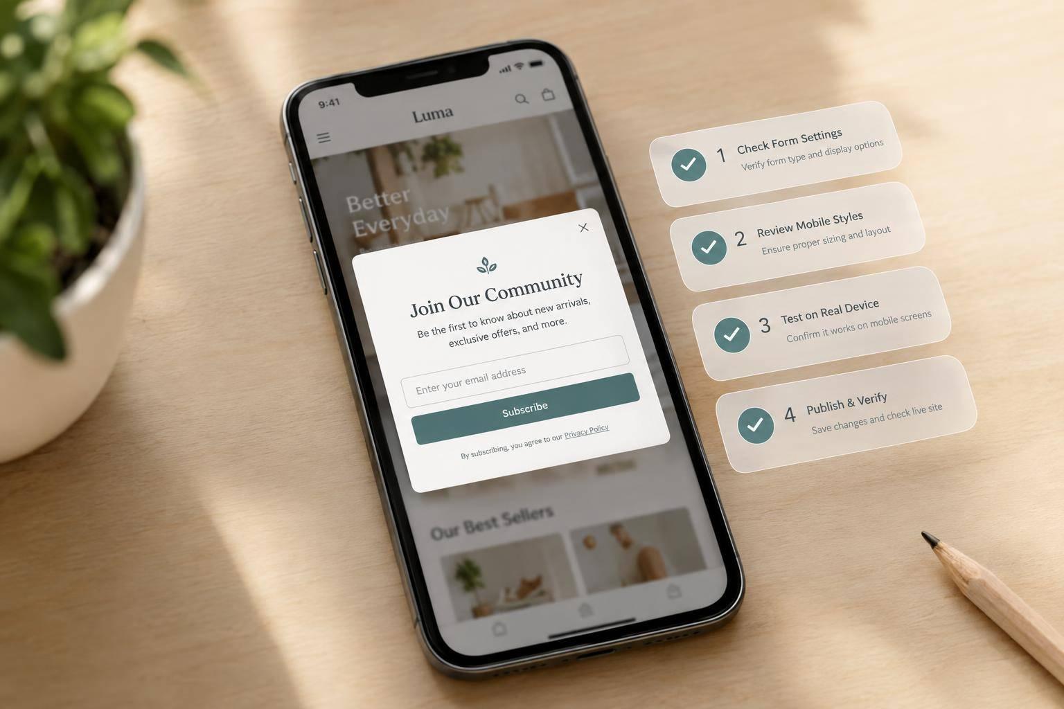
To fix a Klaviyo form on Shopify mobile, I start with its display rules and placement - not CSS. I confirm the app embed is enabled, the form is live, and mobile visitors meet its targeting rules.
Then I work through four checks:
- Form setup: Identify whether it’s an embed, popup, or flyout, and check for duplicate scripts.
- Shopify placement: Check the form ID, hidden sections, spacing, and container limits.
- Theme CSS: Fix confirmed width or clipping conflicts in a duplicated theme.
- Live testing: Test mobile and desktop, then submit a test email and check consent and follow-up.
I change one setting at a time. <u>The fix isn’t done when the form just looks right</u> - it also needs to scroll properly and accept submissions on the live store.

Fix Klaviyo Forms on Shopify Mobile: 4 Checks
1. Check Klaviyo Installation and Form Status
In Shopify, go to Online Store > Themes > Customize, enable the Klaviyo app embed, and save. Then check that the form in Klaviyo is Live, not Draft.
Don’t add a second tracking script. Search theme.liquid and other theme files for older Klaviyo snippets, and remove only confirmed duplicates. Test the published storefront in a new private or incognito window - not just the theme preview.
Check Mobile Targeting and Display Rules
If the form is live but missing on mobile, check whether the visitor meets its display rules. Under Targeting & Behavior, allow mobile visitors and review URL rules and timing triggers, including immediate display, delay, or exit intent.
Use a test session that meets those rules. A private window helps reduce cached-session data and previous dismissal effects, but it doesn’t bypass targeting rules.
Review the Mobile Form Layout
If the form should appear but doesn’t, check its mobile layout settings. Pay attention to Lock page scrolling: when enabled, it can prevent mobile scrolling if the form fails to render.
Save and publish the form after any changes, then test again. If the issue persists, check its Shopify placement next.
sbb-itb-5f36581
2. Check Shopify Form Placement and Visibility
If Klaviyo is live and targeting is correct, check placement and visibility in Shopify or use a conversion-focused form builder to simplify the process.
For an embedded form, open the page template in Shopify’s theme editor. Find the app block or Custom Liquid container, then match the form ID in Shopify’s embed code to the ID in Klaviyo’s Sign-up Forms > Embed Code. Popups don’t need an embedded-form block - Klaviyo’s onsite script triggers them.
Check spacing and container size before changing the form’s styles.
Fix Section Spacing and Container Limits
In mobile preview, check the padding and margins above and below the form. Then inspect its wrapper and parent section for fixed widths, fixed heights, or overflow rules that cut off content.
Use browser developer tools to find the rules causing clipping. Remove unneeded height limits and check whether the mobile wrapper needs width: 100%. Don’t hide page overflow to cover up a width problem.
Check for Hidden Sections and Blocks
Make sure the section or app block is enabled and included in the template assigned to the page you’re testing. Check the theme’s visibility controls, too.
If the form is missing on mobile, inspect its parent containers for desktop-only classes, a hidden attribute, or mobile media queries at 767px and below that set display: none. A hidden parent hides the form too, so fix the parent rule.
3. Find Custom CSS Conflicts
If the form is in the right place but still breaks on mobile, check the CSS next. Test changes in a duplicated theme before editing the live stylesheet. Then find the exact selector causing the conflict.
Inspect Mobile CSS and Parent Containers
Use your browser’s developer tools to find the form’s class or ID and check its parent containers. Target only that Klaviyo selector, and identify the theme stylesheet rule overriding its mobile styles. Replace the conflicting fixed rule with a responsive one.
Replace Fixed Sizes With Responsive Styles
If a fixed width causes the mobile issue, add width: 100%; max-width: 100%; to that selector at the bottom of the duplicated stylesheet or in Custom CSS. Avoid global form or input selectors.
Use !important only to override a confirmed conflict.
4. Test Display and Form Submissions
After each change, preview the draft theme in Shopify’s Theme Editor on both mobile and desktop. Check that the fix hasn’t broken the desktop layout or changed which visitors the form targets.
Test on Phones That Match Targeting Rules
After fixing section spacing, hidden blocks, or CSS conflicts, use the same live page to check mobile targeting and scroll behavior.
Before publishing, test on a real phone in sessions that match the form’s targeting rules. Change one setting at a time, then retest. Run the test again in a second mobile browser, and wait 10 seconds for delayed forms to appear.
If scrolling stops but the form stays hidden, unpublish suspected forms one at a time and retest after each change.
Verify Submissions and Follow-Up
Once the form appears on mobile, submit a test email address. Check field validation, the success message, and the correct Klaviyo profile and list status.
If double opt-in is enabled, complete the email confirmation step before checking list membership or follow-up. Check flow entry only after the profile meets the trigger and filters. Submitting the form doesn’t automatically make every profile eligible.
Conclusion: Confirm the Fix and Record the Cause
After testing, check the live Shopify page in a private or incognito window. Confirm that the app embed is enabled, the form is published, mobile targeting matches the intended audience, and the form appears on the page.
Record the form name or ID, the setting that caused the issue, and any CSS selector or file path you edited. Save these notes so you can check the embed after theme updates and avoid the same issue later.
Mark the issue resolved only when the live form displays correctly and a test lead triggers the expected consent and follow-up.
FAQs
How can I tell if my theme is hiding the form?
Right-click where the Klaviyo form should appear and select Inspect. In your browser’s developer tools, look for display: none, visibility: hidden, or a low z-index on the form’s container. Check its parent elements for overflow: hidden, too. Temporarily turn off these CSS rules to see if the form appears.
If the form works on a default page template but not your current template, your theme’s layout or CSS is likely causing the issue.
Why does my form work on Android but not iPhone?
Browser rendering differences, CSS conflicts, or device-targeting settings could cause this issue. In the Klaviyo form editor, open Targeting & Behavior and confirm that mobile display is enabled for both platforms.
Test the form in Safari and Chrome or Firefox on iOS to check for browser-specific issues. On smaller screens, also check whether hidden elements, sticky headers, or promo bars are covering the form.
Can a theme update break my form’s mobile layout?
Yes. Theme updates can affect your form even when the embed code is correct. Changes to CSS or page layouts can override the form’s styles, hide it, or alter its dimensions. Theme scripts can also disrupt how forms load on smaller screens.
Use your browser’s developer tools to check the form container for style conflicts, including display: none or z-index issues. After any theme change, always test the form in a private browsing window.
Related Blog Posts
Get new content delivered straight to your inbox

The Response
Updates on the Reform platform, insights on optimizing conversion rates, and tips to craft forms that convert.


Drive real results with form optimizations
Tested across hundreds of experiments, our strategies deliver a 215% lift in qualified leads for B2B and SaaS companies.
