
.webp)
How Inline Validation Improves Form UX


Inline validation helps people finish forms with fewer mistakes and less backtracking. When a form checks entries at the right moment, people complete it 42% faster, make 22% fewer errors, and report 31% higher satisfaction.
If I had to sum it up in a few points, it would be this:
- Show feedback early, but not while someone is still typing
- Use blur-based checks for most fields
- Use live feedback only when it helps, like password rules or username checks
- Write error messages that tell people exactly what to fix
- Support screen readers and don’t rely on color alone
- Track field errors, completion time, and drop-off after launch
A simple example: instead of saying “Invalid phone number,” I’d say “Enter a 10-digit U.S. phone number, like 555-123-4567.” That tells the user what’s wrong and what to do next.
Here’s the core idea in one glance:
| Area | What I’d do |
|---|---|
| Timing | Validate on blur for most fields; show fix confirmation right away |
| Live feedback | Use for password strength, character counts, and async checks |
| Messages | Be plain, specific, and include an example when needed |
| Accessibility | Add text, icons, aria-describedby, aria-invalid, and aria-live="polite" |
| Field choice | Start with email, phone, ZIP code, date, password, and required fields |
| Measurement | Watch completion rate, error rate, time to complete, and mobile drop-off |
What stands out most to me is that inline validation works best when it feels like guidance, not punishment. Reward early, flag late is the rule I’d follow: confirm fixes fast, but wait until the user leaves a field before showing the first error.
That keeps multi-step forms easier to finish, keeps data cleaner, and helps more people reach submit.
Inline Validation design best practices (with examples) - Vitaly Friedman
sbb-itb-5f36581
Why Inline Validation Improves UX and Conversion Rates
Most people want feedback before they hit Submit. And when a form starts to feel clunky, many leave. In fact, 75% of users expect a form to notify them of a mistake before submission. That number shows something simple: timing matters just as much as the message itself.
Less Friction, Fewer Errors, More Trust
When someone finishes a field and sees a clear success state, they can move on without pausing to wonder if they got it right. That small moment helps a lot. Positive inline validation cuts mental effort because users don’t have to review every field on their own before submitting.
This is especially useful for lead fields like email and phone number. Better input at the start means cleaner lead data later, with less manual cleanup and fewer follow-up mistakes. Forms that use inline validation have been linked to a 22% decrease in errors made and a 31% increase in user satisfaction.
But feedback has to show up at the right time, or it can backfire.
Why Timing Matters as Much as Accuracy
If an error appears while someone is still typing, it breaks their rhythm. Instead of feeling guided, they feel corrected mid-action. That’s frustrating.
A better approach is simple:
- Trigger validation on blur, not while the user is still typing
- Clear the message as soon as the field is fixed
- Don’t interrupt typing
Next, we'll look at multi-step form design and the core rules for timing, wording, and accessibility.
Core Rules for Effective Inline Validation
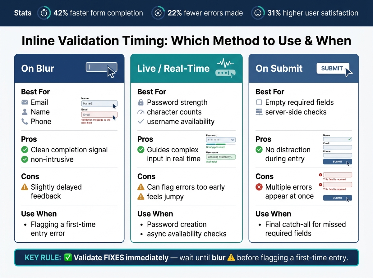
Inline Validation Timing Methods: When to Use Each Approach
Good inline validation comes down to three things: timing, clear messages, and accessibility.
Choose the Right Validation Timing for Each Field
Different fields need different timing. If you validate too soon, the form feels jumpy. If you wait too long, people miss the cue and hit a wall at submit.
| Method | Best For | Pros | Cons |
|---|---|---|---|
| On blur | Email, name, phone | Clean completion signal | Slightly delayed feedback |
| Live | Password strength, character counts, username availability | Guides complex input | Can flag errors too early |
| On submit | Empty required fields, server-side checks | No distraction during entry | Multiple errors appear at once |
A good rule is simple: validate fixes right away, but wait until blur before flagging a first-time entry.
Write Error Messages Users Can Act On Right Away
Tell people what went wrong and how to fix it. Keep the language plain and direct.
Instead of "Phone number is invalid," write: "Enter a 10-digit U.S. phone number, like 555-123-4567."
That kind of message leaves no guessing. It shows the issue and gives an example in the same breath. Also, keep the user’s typed value visible. No one wants to re-enter a whole field because the form wiped it out.
Make Validation Accessible and Realistic
An error state should never rely on color by itself. A red border might stand out to some people, but users with color blindness can miss it. Pair color with an icon and clear text. Keep error text at a contrast ratio of at least 4.5:1 to meet WCAG 1.4.3.
On the code side, link the message to the input with aria-describedby, and set aria-invalid="true" when a field has an error. That way, screen readers announce the issue when the field gets focus. For messages that update during entry, use aria-live="polite" so the update is announced without cutting the user off.
"As long as the input is unambiguous, shouldn't we accept pretty much any kind of input, in a form that users would prefer, rather than the one that the system expects?" - Vitaly Friedman, UX Consultant
That idea matters more than a lot of teams think. If the intent is clear, the form should work with people instead of against them. Accept ZIP+4, international phone numbers, and valid business email formats. Let people paste values. Trim leading and trailing spaces. And if a check is uncertain, don’t block the user by default. Valid users shouldn’t get stuck because the form is being too rigid.
Use these rules to decide which fields should validate on blur, live, or submit before you set up the form.
How to Implement Inline Validation Step by Step
Audit Fields and Define Clear Validation Rules
Once you’ve set the timing rules, the next move is simple: match them to the fields that trip people up most.
Look for fields with lots of re-typing, slow completion, or a high number of failed submissions. Those are the places where inline validation should show up first.
Start with the fields most likely to hurt contact data quality: email, phone, ZIP code, date, and password. Spell out the required format, what’s optional, and whether each check should happen in the browser or on the server. For most fields, blur-based checks work best unless a field needs live feedback while the user is typing. Use client-side checks for format and required fields. Use server-side checks when the data needs to be matched against your database.
| Field | Validation Rule | Error Message | Rationale |
|---|---|---|---|
| Format check (regex) on blur | "Enter a valid email address (e.g., name@example.com)" | Ensures the lead can be contacted and the data is usable | |
| Phone | 10 digits; ignore spaces/dashes | "Enter a 10-digit phone number (e.g., 555-123-4567)" | Standardizes contact data without blocking common formats |
| Required fields | Non-empty check on blur and submit | "This field is required to proceed" | Catches omissions early without interrupting typing |
| Password | Complexity check on input | "Must be at least 8 characters and include a number" | Real-time feedback helps users meet requirements without guessing |
A good rule of thumb: if a field often blocks submission, fix that pain point first. That gives you the biggest win with the least effort.
Configure Inline Validation in Your Form Builder
Once the rules are set, put them into the form settings.
In a no-code form builder, that usually means setting up required fields, pattern checks, and conditional rules in the interface. Then add clear error messages for each one. Short, plain messages tend to work best because people shouldn’t have to decode what went wrong.
Reform lets you set up these rules in a no-code builder with built-in email validation, spam prevention, conditional routing, and multi-step form support.
Test with Real Users and Refine with Analytics
After launch, check the field-level data to see if the rules are helping.
Track field-level error rates, step completion time, and abandonment by step. These numbers show which rules help users move through the form and which ones slow them down. Watch whether validation cuts errors and shortens completion time. If one field keeps causing friction, try a looser rule or rewrite the message so it’s clearer.
Sometimes the problem isn’t the rule itself. It’s the way the rule is explained. A small wording change can make a big difference.
Advanced Patterns, Common Mistakes, and How to Measure Results
Avoid Noisy or Overly Strict Validation
Once your core rules are set, the next job is tuning them for messy, high-friction flows.
If a form throws an error on every keystroke, it gets distracting fast. It points out problems before the user has even finished typing. A better approach is reward early, punish late: show that a fix worked right away, but wait until blur before flagging a first-time entry.
For server-side checks like email availability, add a debounced delay of about 500 ms to 1 second. That cuts down on extra network requests and helps avoid UI flicker.
Formatting matters too. Instead of rejecting valid input variations, normalize them. If someone enters a phone number with spaces or dashes, strip those extra characters on the backend and keep going. This is an implementation tactic, not a new rule. It keeps validation logic clean without making the form harder to use.
Handle Multi-Step Forms and Async Checks Carefully
These patterns matter most when a form stretches across several steps or depends on server-side checks.
Only block a step change when the current step still has unresolved errors. Conditional fields need extra care too: validate a field only if it’s visible right now. Hidden fields shouldn’t throw errors from the sidelines.
Here’s a quick view of common advanced validation patterns, what they help with, and how hard they are to build:
| Pattern | UX Benefit | Implementation Complexity | When to Use |
|---|---|---|---|
| Password Strength Meter | Provides progressive, helpful feedback during input. | Low to Medium | During password creation/reset. |
| Async Email Check | Prevents duplicate account errors before submission. | Medium (Requires API) | Sign-up or registration flows. |
| Progressive Disclosure | Reduces cognitive load; hides irrelevant fields. | Medium | Complex forms with conditional logic. |
| Reward Early/Punish Late | Minimizes frustration; provides instant fix confirmation. | High | All standard text input fields. |
Reform supports these patterns with email validation, conditional routing, and real-time analytics.
Measure UX and Conversion Impact After Launch
After launch, look at field-level data to make sure your rules reduced friction instead of adding more of it.
Focus on metrics tied directly to conversion:
- Completion rate
- Time to complete
- Error rate
- Satisfaction
- Warnings users bypass
A high bypass rate usually means one of two things: your rules are too strict, or your error messages don’t tell people what to do next.
Also, split the data by device. Mobile-optimized forms can hit an 86% completion rate, compared with 34% for non-optimized designs. That gap is huge, so mobile should get its own review. If one field keeps producing lots of errors, loosen the validation rule or rewrite the message so it’s more action-oriented.
Conclusion: Key Rules for Better Inline Validation
The best inline validation comes down to four things: timing, clarity, accessibility, and measurement.
Use the right timing for each field. For most inputs, validate on blur. Show live feedback only when it helps. Save submit-time checks for empty required fields.
Keep messages plain and specific to the field. Place them directly below the input. And never use color alone to show an error.
The data backs this up. Inline validation improves completion, cuts errors, and lifts user satisfaction. Those gains feed straight into high-converting lead forms.
But the job doesn’t end after launch. You need to keep watching field-level data over time. Track field-level error rates, completion times, and warning bypass rate. If people keep dropping off at the same field, that’s a clear sign something is off. Maybe the rule is too strict. Maybe the message needs to be rewritten so the field is set up the right way. When inline validation is handled well, it keeps people moving and helps more of them finish the form. This is a critical step when you design a landing page form for maximum impact.
FAQs
When should inline validation appear?
Show inline validation after the user leaves a field - on blur, not while they’re typing.
That timing gives people feedback soon enough to fix mistakes, but it doesn’t get in their way mid-thought or make the form feel pushy.
Which fields should use live validation?
Use live validation for fields where fast feedback helps people feel sure they’re on the right track and catch mistakes early. Good examples include password strength, username availability, and other inputs that are harder to get right on the first try.
That said, timing matters. To avoid annoying people, validation should usually happen on blur or after typing has paused for a moment.
How can inline validation remain accessible?
Keep validation messages tied to each field with aria-describedby. That way, screen readers can announce both the input and its message together, which makes the whole interaction much clearer.
Place the message close to the field too - usually right below it or right beside it. If the message is off in some random part of the page, people can miss it.
Also, make sure error text has strong color contrast so it’s easy to see. And use ARIA live regions like aria-live="assertive" so errors are announced right away when they appear.
Related Blog Posts
Get new content delivered straight to your inbox

The Response
Updates on the Reform platform, insights on optimizing conversion rates, and tips to craft forms that convert.


Drive real results with form optimizations
Tested across hundreds of experiments, our strategies deliver a 215% lift in qualified leads for B2B and SaaS companies.
