
.webp)
Mobile Multi-Step Forms: Responsive UX Guide


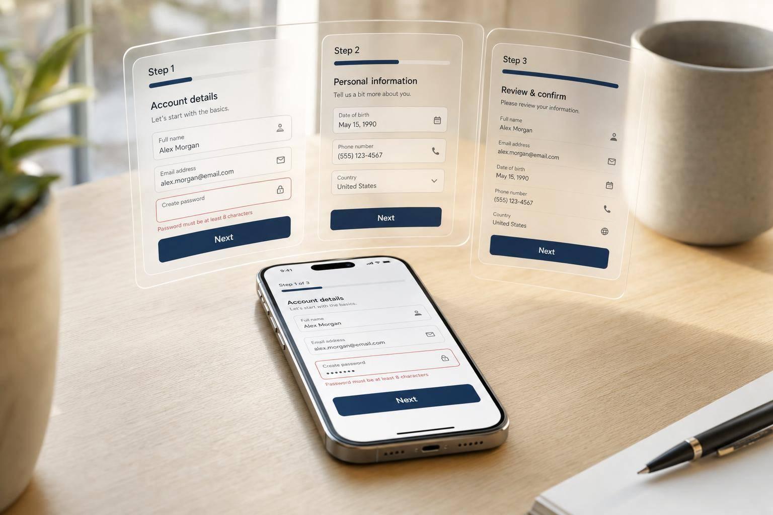
If your mobile form is long, split it into steps. On phones, forms with 2–5 steps often beat one long page, and some reports show multi-step forms can convert 86% higher.
Here’s the short version: I’d keep each screen to 3–5 related fields, use a single-column layout, place labels above inputs, and keep Next or Submit in a sticky bottom bar. I’d also use the right mobile input types for U.S. fields, show a simple progress cue like Step 2 of 4, and validate fields at the right time so people can fix errors without retyping everything.
What matters most:
- Use steps when the form has more than 6–8 questions
- Stack fields in one column on screens under 768 px
- Keep tap targets at 44–48 px
- Leave 8–16 px between controls
- Show short progress feedback
- Save data between steps so users don’t lose their place
- Cut extra steps with conditional paths
A long mobile form feels like work. A short step-by-step flow feels lighter, easier to scan, and easier to finish.
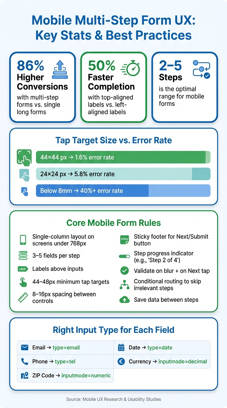
Mobile Form UX: Key Stats & Best Practices at a Glance
Multi Step Form UX: Best Practices In Multi Step Form Design To 2x Your Leads
sbb-itb-5f36581
Step Structure and Responsive Layout Rules
These rules cut down on scrolling, thumb movement, and extra typing on smaller screens.
Use a Single-Column Layout with Labels Above Fields
On screens under 768 px, use a single-column stack with labels above fields. Put each label directly above its input. Users complete forms 50% faster with top-aligned labels than with left-aligned labels.
Once the form shifts to a vertical layout, keep each step tight. A few related fields are enough.
Group Fields into Logical Steps with 3–5 Inputs Each
Aim for 3–5 fields per step and group related fields together. Each step should handle one clear task. That keeps the form easier to scan and less tiring to finish on a phone.
Set Up Inputs for Mobile Keyboards and U.S. Data Formats
Use type="email" for email, type="tel" for phone, and inputmode="numeric" for ZIP codes.
After grouping steps, match each field to the right mobile input. This helps bring up the keyboard people need instead of making them hunt for symbols or numbers.
| Field | Recommended input |
|---|---|
| Email address | type="email" |
| U.S. phone number | type="tel" |
| ZIP code | inputmode="numeric" |
| Date | type="date" |
| Currency amount | inputmode="decimal" |
Touch Targets, Spacing, and Sticky Navigation
Once the layout and input types are set, the next mobile test is simple: can people tap the right thing without effort? A lot of mobile form problems start here. Buttons get too small, fields sit too close together, and navigation disappears as soon as the user scrolls.
Size Buttons and Fields for Reliable Tapping
Keep primary controls at least 44–48 px square, especially for Next, Back, and Submit.
The numbers make the case pretty clearly. 44×44 px targets lead to about a 1.6% error rate. Cut that down to 24×24 px, and the error rate jumps to 5.8%. Go below 8 mm, and error rates can climb past 40%. In a multi-step flow, even small tap errors can pile up fast.
Also, make the entire field container tappable, not just the text label or a small icon. That gives users a bigger hit area and helps cut down on mistaps. It's also a better setup for people with limited dexterity or motor impairments.
Use Consistent Field Spacing to Separate Actions from Inputs
Leave 8–16 px between interactive elements so fields, checkboxes, and buttons stay clearly separate. That space helps prevent mis-taps and makes each step easier to scan at a glance.
Keep Next and Submit Buttons in a Sticky Footer
After target size and spacing, button placement plays a big role in whether users keep going or pause. Put the primary action in a full-width sticky footer at the bottom of the screen. This keeps the button on screen while the user scrolls, so they don't have to stop and hunt for it between fields.
The Back action should stay close by, but it should look clearly secondary. Using a lead gen multi-step template can help ensure these navigation elements are correctly positioned out of the box. A text link or an outlined button usually does the job well. Fixed placement also helps when step length changes, because the button stays in the same spot across steps even if the number of fields changes.
Progress Feedback and Drop-Off Reduction
After sticky navigation, the next job is to make progress easy to see and errors easy to fix. Once your layout, touch targets, and sticky buttons are set, add progress cues, inline validation, and conditional routing to help mobile users keep moving.
Use Simple Progress Indicators That Fit Small Screens
On mobile, less is more. A thin progress bar works well, along with a compact label like Step 2 of 4. Skip full step names on small screens, where they can crowd the layout and add noise. Highlight the current step so users always know where they are in the flow.
Validate at the Right Time and Keep Error Messages Next to Fields
Timing matters here. Validate inline on blur, then check again when the user taps Next. If there's a problem, move focus to the first error, place the message right next to the field, and keep all entered data in place.
That last part matters more than teams sometimes think. If someone has to retype information on a phone, frustration kicks in fast.
Cut Abandonment with Conditional Steps, Speed, and Analytics
Every extra step gives people one more chance to leave. So remove any step that doesn't help completion. Use conditional routing to shorten the path for each user, and keep each step lightweight so pages load fast on cellular connections.
It also helps to track where people slow down or quit. Watch step-level drop-off and incomplete submissions to spot friction points, since step-level drop-off shows where mobile users stall.
Conclusion: The Mobile UX Rules That Matter Most
On mobile, the pattern that works best is pretty simple: single-column steps, labels above fields, 2–4 related inputs per screen, large tap targets, and clear spacing. Get that base right first. Then focus on the next thing that keeps people moving: progress feedback and early error handling.
Progress indicators and inline validation help users stay on track. People can see where they are, what’s left, and what needs fixing before mistakes stack up. That kind of visibility reduces friction and makes the form feel easier to finish.
Another big gain comes from cutting the flow itself. If a step doesn’t need to be there, it shouldn’t be there.
Conditional routing does a lot of the heavy lifting here. When a form skips steps that don’t match a user’s earlier answers, the whole experience feels tighter and less draining. Reform’s no-code builder, conditional routing, analytics, and abandoned submission tracking make these patterns much easier to put into practice.
Every screen should be easy to read, easy to tap, and easy to finish.
FAQs
When should I split a mobile form into steps?
When a mobile form starts to feel long, split it into steps. That way, each part feels easier to handle and should take about 2–3 minutes to finish.
Group related fields in a clear way. For example:
- Basic Info
- Business Details
It also helps to show a progress indicator. People want to know where they are and how much is left. That small bit of context can make the form feel less heavy and may help cut drop-off.
How many fields should go on each mobile form step?
Aim for about 2–5 fields per mobile form step. On a small screen, too many fields can feel like a lot all at once.
A good starting point is 5–6 fields, then adjust based on testing.
What is the best way to reduce mobile form drop-off?
Simplify the form and make the path feel easy to follow. Use fewer, low-effort fields, start with simple questions, break the flow into smaller steps, and add a progress indicator.
Conditional logic also helps a lot. People should only see questions that apply to them, not a long wall of fields that don’t. And when something goes wrong, show clear inline error feedback right where the issue is.
Reform also recommends showing the progress bar from the second step, not the first, to make the form feel less demanding at the start.
Related Blog Posts
Get new content delivered straight to your inbox

The Response
Updates on the Reform platform, insights on optimizing conversion rates, and tips to craft forms that convert.



Drive real results with form optimizations
Tested across hundreds of experiments, our strategies deliver a 215% lift in qualified leads for B2B and SaaS companies.
