
.webp)
5 Tips for Designing Multi-Step Forms in Wix


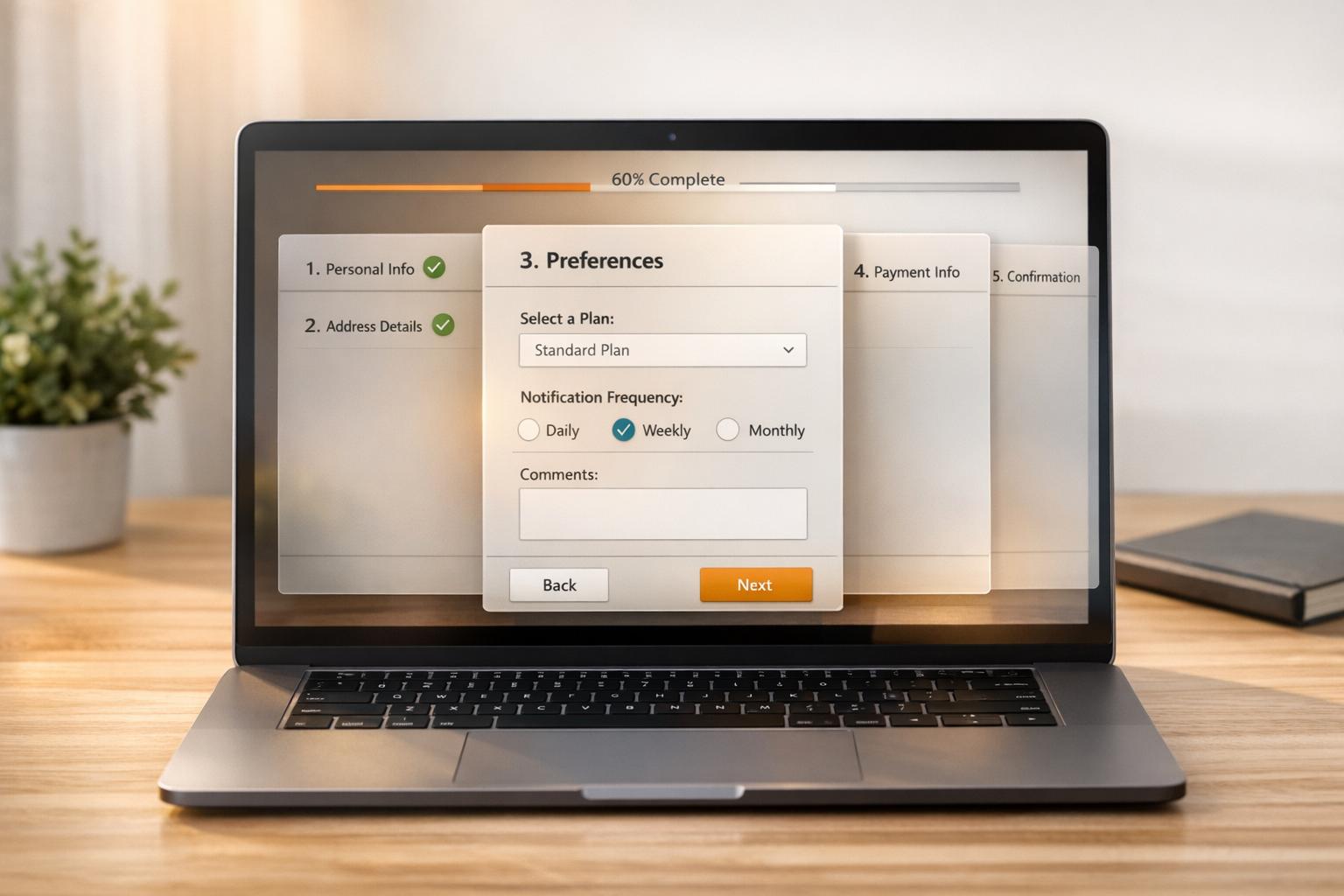
Multi-step forms make long forms easier to complete by breaking them into smaller sections. This approach improves user experience and increases completion rates by creating optimized conversion paths. Here's how you can create effective multi-step forms in Wix:
- Use Multi-State Boxes: Keep the form on one page with smooth transitions between steps.
- Add Progress Indicators: Show users where they are in the process and how much is left.
- Include Next and Previous Buttons: Allow users to move back and forth easily to review or edit their answers.
- Validate Each Step: Check for errors at every stage to reduce mistakes and incomplete submissions.
- Match Styling to Your Brand: Ensure the form design aligns with your website for a polished look.
These strategies help simplify complex forms, guide users through the process, and minimize abandonment rates, all while maintaining a professional appearance.

5 Essential Steps for Designing Multi-Step Forms in Wix
Wix Forms: Adding and Setting Up a Multi-Step Form
sbb-itb-5f36581
1. Use Multi-State Boxes for Form Structure
Multi-state boxes in Wix offer a seamless way to create high-converting landing page forms. Instead of redirecting users to new pages or reloading the current one, these boxes allow visitors to move through different form steps on the same page. This setup not only keeps users focused but also provides a modern, uninterrupted experience.
From a technical perspective, setting up multi-state boxes is simple. Each state operates as an independent section, which you can design using the "Manage States" panel. The actual switching between states is handled with the changeState() function, keeping the coding minimal and efficient.
Ease of Navigation for Users
Once the structure is in place, navigation becomes critical for a smooth user experience. Multi-state boxes give you complete control over how users progress through the form. For example, you can implement conditional navigation to ensure users can't move to the next step until all required fields in the current step are completed. This feature helps prevent incomplete submissions before they occur.
Additionally, the flexibility of multi-state boxes supports non-linear navigation. Users can be routed to different states depending on their answers, making them ideal for scenarios like qualification questionnaires or surveys with branching logic.
To improve accessibility, you can use the .focus() method to automatically place the cursor on the first input field or the "Next" button whenever a new state loads. This small detail makes the form more user-friendly for those relying on keyboards or screen readers.
Visual Clarity and Branding Consistency
Functionality aside, maintaining a visually consistent design is key to usability. Multi-state boxes ensure all steps have the same width, avoiding uneven layouts as users navigate through the form. The height of each state adjusts automatically based on its content - whether it contains three fields or ten - eliminating unnecessary white space or cramped layouts. This consistency creates a polished and professional look.
To keep your code organized and troubleshooting simple, assign descriptive IDs to each state. If you need to rearrange the flow later, the "Manage States" panel allows you to reorder states easily through drag-and-drop functionality.
2. Add Progress Indicators
Progress indicators give users a clear visual cue about where they are in the form process and how many steps are left. This helps manage expectations and reduces any potential stress. As the Wix Ideas Team explains, "This indicator helps the applicant have an idea of what forms comes next and how soon they are to conclude filling up the form". Let’s dive into how progress indicators make navigation easier and encourage users to complete forms.
Ease of Navigation for Users
Paired with multi-state boxes, progress indicators make navigating forms straightforward. A progress bar, for instance, shows users how far they’ve come and how much is left. Seeing something like "Step 2 of 4" helps set a clear expectation for the process. To enhance this, use interactive trackers that automatically update as users move through the form.
You can also prevent users from skipping ahead by activating numbered buttons only after each step is completed. This ensures no critical information is missed. By breaking a long form into smaller, more manageable sections, you reduce the perceived effort, which can significantly lower the chances of users abandoning the form altogether.
Visual Clarity and Branding Consistency
If your Wix form doesn’t include a built-in progress bar, you can manually add page numbers to each form title. For example, label a section "Contact Information - Step 1 of 4". This simple addition provides immediate context without needing any custom coding.
For forms using multi-state boxes, a progress bar integrates easily into your design. It keeps the styling and width consistent across all steps, ensuring a polished look. To maintain data accuracy, link the progress indicator to step validation by disabling the "Next" button until all required fields in the current step are complete. This approach not only guarantees data integrity but also reinforces a smooth, cohesive experience for users.
3. Include Next and Previous Buttons
Ease of Navigation for Users
Navigation buttons provide a straightforward way for users to move through forms, reducing errors and making the process smoother. These buttons guide users step-by-step, ensuring they can easily review or edit their data before submitting the form. The Previous button, in particular, allows users to go back and make changes, which helps minimize mistakes.
To make these buttons intuitive, you can customize their backgrounds and typography using Wix Design settings. This ensures they stand out against the form background, making it clear how to proceed. This type of structured navigation works perfectly alongside the multi-state functionality discussed earlier.
Improved Form Completion Rates
Clear and accessible Next and Previous buttons can significantly increase form completion rates. Using multi-step forms instead of static ones with clear navigation is especially useful for complex tasks like job applications, event registrations, or lead generation. The Wix Help Center emphasizes this point:
Pages help better organize your form's information and guide visitors through a multi-step process to fill out the form
Through the Pages section in the Wix Form editor, you can add, rename, or reorder steps to create a logical flow for users. For custom multi-step forms built using boxes in Wix Studio or Editor X, make sure buttons are scripted to hide the current container and display the next one smoothly. This ensures a seamless user experience.
Visual Clarity and Branding Consistency
Well-designed buttons not only enhance usability but also reinforce your brand identity. Wix allows you to customize all form buttons - Next, Back, and Submit - through the Design tab in the form settings. You can tweak button background colors, borders, and shadows to align with your site's aesthetic. Typography, including font style and color, can also be adjusted to match your branding.
For added clarity, style buttons for different states, such as Regular and Hover, to give users visual feedback. Use the Wix Mobile Editor or Studio Editor breakpoints to ensure buttons are properly sized and positioned for touch navigation. You can even customize button text to fit your brand's tone - using terms like "Back" instead of "Previous" if it feels more natural. Pair these navigation buttons with a progress bar or tracker so users always know where they are in the process.
4. Validate Each Step Before Moving Forward
Prevent Errors and Validate Data
Taking time to validate each step is key to avoiding errors and saving yourself from unnecessary headaches later. Wix helps with this by offering predefined field types like Contact, Date, and General, which ensure the data entered fits the correct format and meets basic validation rules. For more advanced needs, you can turn to Wix Functions (Velo) to set up custom validation logic and error messages tailored to your specific requirements. This layered approach not only reduces mistakes but also reassures users, making them more likely to complete the process.
Improved Form Completion Rates
Validation isn't just about catching errors - it makes the whole experience smoother for users. Picture a job application or event registration form. Breaking these into smaller, validated steps makes them feel more manageable. As the Wix Help Center puts it:
Multi-step forms allow you to organize all the information or questions in a site form into manageable steps that site visitors fill out.
When users see their data being checked as they go, they feel more confident about continuing. This reduces frustration, minimizes form abandonment, and ultimately increases completion rates. With Wix, you can use the Add Page feature in Wix Forms to create these logical, validated steps seamlessly.
Visual Clarity and Branding Consistency
Validation messages should do more than correct errors - they should also reflect your brand. While standard Wix Forms don't allow custom error messages through basic settings, you can still adjust the design of your form to align with your brand's look. Customize elements like backgrounds, fields, and buttons to keep the experience visually consistent. This attention to detail keeps users engaged and builds trust, even if they need to correct their input. A polished, branded experience encourages users to stick with the form until it's completed.
5. Match Your Form Styling to Your Brand
Visual Clarity and Branding Consistency
Your multi-step form should feel like an extension of your website. Use the Design tab to tweak elements like backgrounds, borders, and typography, ensuring they align with your brand's overall look and feel. Pay attention to field states - such as Regular, Hover, and Error - to provide users with clear visual feedback. For instance, choosing a distinct color for the Error state can highlight issues without disrupting your brand's color scheme. Don't forget to style every element, from drop-down menus to calendars, so they blend seamlessly with your chosen palette. This level of detail helps establish trust and creates a polished, cohesive experience.
Improved Form Completion Rates
A well-branded form doesn’t just look good - it performs better, too. When your form matches the design of your site, users feel more confident as they navigate through it. This consistency builds trust, improving form completion rates by encouraging users to finish the process. Make sure to customize buttons like "Next", "Back", and "Submit", including their hover states, to maintain visual harmony. Additionally, align input text and option labels, such as checkboxes and multi-choice answers, to keep everything easy to read and on-brand.
For mobile users, fine-tune field positions and font sizes using the mobile editor. You can also use the Layout tab to adjust padding and spacing, making the form feel like a natural part of the page rather than a last-minute addition. If the standard Wix Forms templates fall short, try using Multi-State Boxes with Velo by Wix to create custom forms where each state represents a step in the process. This approach allows for greater flexibility while keeping the design consistent.
Conclusion
Creating an effective Wix multi-step form involves breaking down complex data into clear, manageable steps. By incorporating features like multi-state boxes, progress indicators, intuitive navigation, step validation, and consistent styling, you can design a form that feels seamless and user-friendly. These elements work together to reduce friction, minimize errors, and guide users smoothly through the process.
Using proper validation in multi-step forms ensures higher-quality leads by preventing users from moving forward with incomplete or inaccurate information. Progress indicators help reduce uncertainty and abandonment rates, while cohesive design - where the form feels like a natural part of your website - encourages users to complete it.
While Wix provides the tools to create multi-step forms efficiently, upgrading your site may be necessary for advanced features. For businesses that need more specialized functionality, platforms like Reform offer a no-code solution with features such as conditional routing, lead enrichment, spam prevention, real-time analytics, and CRM integrations. These tools are tailored for high-performing forms that prioritize conversions, even including abandoned submission tracking.
Whether you stick with Wix or explore other form builders, the key principles remain consistent: simplify the process, offer clear feedback, and maintain visual harmony. By applying these strategies, you can turn complex data collection into a smooth, user-centered experience that encourages completion and respects your users’ time.
FAQs
How do I save answers when users go back a step in Wix?
To make sure users' answers are saved when they navigate back in a Wix multi-step form, activate the feature that keeps form progress intact. This way, their responses stay recorded as they move through the steps, avoiding data loss and creating a smoother, more user-friendly experience.
Can I add conditional logic to a multi-step form in Wix?
Yes, Wix lets you incorporate conditional logic into multi-step forms. This means you can create customizable rules that adjust the form based on user inputs. By doing so, you can design dynamic forms that feel more intuitive and engaging, making the experience smoother for users.
What’s the best way to make a Wix multi-step form mobile-friendly?
When creating a Wix multi-step form for mobile, stick to a single-column layout. This design ensures the form fits well on smaller screens and is easier to navigate. Use large touch targets for buttons and fields, making it simple for users to interact without accidental clicks.
In the Wix mobile editor, double-check that all form elements are properly aligned and optimized for mobile use. A well-adjusted layout enhances the user experience on smartphones and tablets, helping to increase form completion rates while minimizing frustration.
Related Blog Posts
Get new content delivered straight to your inbox

The Response
Updates on the Reform platform, insights on optimizing conversion rates, and tips to craft forms that convert.


Drive real results with form optimizations
Tested across hundreds of experiments, our strategies deliver a 215% lift in qualified leads for B2B and SaaS companies.
