
.webp)
10 Multi-Step Form Examples for 2025


Multi-step forms are a proven way to improve user experience and boost completion rates by breaking complex forms into smaller, focused steps. By incorporating features like progress indicators, conditional logic, and mobile-friendly designs, businesses have seen significant improvements in conversions - up to 300% higher than single-page forms. This article dives into how companies like Zendesk, Airbnb, and Stripe use these strategies to simplify form completion and engage users effectively.
Key Takeaways:
- Progress Indicators: Clear visual cues, like bars or step numbers, help users track their progress and reduce form abandonment.
- Conditional Logic: Forms dynamically adjust based on user inputs, showing only relevant questions to streamline the process.
- Mobile Optimization: Responsive designs with large touch targets and minimal scrolling improve usability on mobile devices.
- Real-Time Feedback: Instant error messages and validation keep users on track and reduce frustration.
These examples showcase how well-designed multi-step form design can make data collection smoother and more effective for both users and businesses.
Multi-Step Form Statistics: Conversion Rates and Performance Metrics 2025
7 Best Multi Step Form Examples (And How To Create Them)
sbb-itb-5f36581
Why Multi-Step Forms Work in 2025
Multi-step forms have become a game-changer for improving conversions, and here's why they shine in 2025.
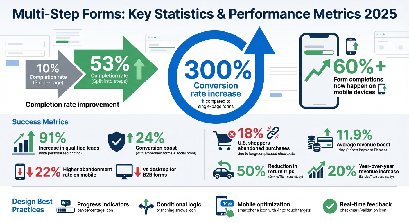
Studies reveal that breaking down long forms into smaller, logical steps can increase conversion rates by as much as 300% compared to single-page forms. Completion rates, for instance, can leap from 10% to 53% when forms are split into manageable chunks. This step-by-step approach encourages users to finish what they start, making it far more effective.
With mobile devices now accounting for over 60% of form completions, the shift to mobile-first design has never been more critical. Forms need to be thumb-friendly, using large touch targets (at least 44px) and simplified navigation. Instead of overwhelming users with full step rails on small screens, designers are opting for minimal progress indicators paired with a current step title when forms exceed three steps. This keeps the design clean and functional for mobile users.
Accessibility has also moved to the forefront. Forms must now include ARIA labels to ensure screen readers can announce each step's name and state (e.g., "Step 2 of 4, Personal Info, current"). Relying solely on color to indicate progress is no longer acceptable; designers are adding shapes, icons, or labels to assist visually impaired users. Full keyboard navigation is now standard, making both step indicators and input fields accessible for everyone. These updates not only meet accessibility requirements but also open the door for more personalized and data-driven user experiences.
Another key feature driving the success of multi-step forms is conditional logic. By integrating real-time analytics, forms can adapt dynamically to user inputs. For instance, high-value leads might be routed directly to scheduling links, while others are guided to self-service options. Tools like Reform make it easy for businesses to create branded forms that adjust seamlessly based on user responses.
Finally, modern design trends are taking user interaction to the next level. Forms now incorporate interactive elements like selectable cards, drag-and-drop uploads, micro-animations, and custom step labels to make the experience more engaging and intuitive. These features not only streamline the process but also make it more enjoyable for users, ensuring higher completion rates.
1. Reform Multi-Step Form Builder

Reform is a no-code tool that breaks forms into multiple "pages", making them easier to complete and increasing conversion rates. In fact, using Reform's features has led to qualified lead increases of 91% and 24% in specific cases. Its standout features - progress indicators, conditional logic, mobile optimization, and real-time feedback - are designed to simplify the process and keep users engaged.
Progress Indicators
Reform includes a horizontal progress bar that sits at the top of your form and automatically matches your brand's primary color. You can customize it with default labels (e.g., "Page 1", "Page 2"), no labels, or custom ones like "Contact Info" or "Details." The bar highlights the current step, helping users see where they are in the process. If you use conditional logic, the bar adjusts dynamically, showing only the steps relevant to each user.
Conditional Logic
With Reform’s conditional logic, you can guide high-value leads straight to scheduling links while directing others to self-service resources. It supports advanced And/Or conditions, allowing you to skip pages, end forms early with a custom thank-you message, or redirect users to external pages. These tools let you create detailed workflows where multiple criteria trigger specific actions, aligning with modern trends in multi-step form design. These advanced features are part of the Pro Plan, priced at $35/month or $350/year.
Mobile Optimization
Reform’s mobile-first design tackles common conversion challenges on smaller screens. It automatically adapts to mobile devices by hiding step labels while keeping the progress bar visible. This is crucial, as B2B forms are abandoned 22% more often on mobile devices compared to desktops. By dividing forms into pages, Reform eliminates the need for excessive scrolling or zooming. Combined with conditional logic, this approach shortens the process, reducing the effort required for typing on mobile keyboards.
Real-Time Feedback
Reform also provides real-time feedback features like email validation and spam prevention, helping users fix issues as they go. You can track incomplete submissions to identify where users drop off, while the real-time analytics dashboard gives you insights into your form’s performance. For those seeking even more control, the Pro Plan includes options for custom CSS and JavaScript. These tools directly support better conversion rates, a key goal of multi-step forms.
2. Zendesk Demo Request Form
Zendesk's demo request form stands out by combining simplicity with functionality. It uses an 8-step design that overlays directly onto their product demo, creating a seamless experience that encourages users to complete the process. By adopting a "one field per page" approach, the form transforms what could feel like a lengthy data collection into a smooth, conversational interaction.
Mobile Optimization
The form's single-column layout is perfect for mobile users. Displaying one question at a time eliminates the need for pinching, zooming, or navigating through cluttered screens. Studies suggest breaking long forms into smaller, logical steps can improve completion rates significantly - from 10% to 53%.
Zendesk also ensures the form is touch-friendly, with buttons and dropdown menus sized for easy tapping. This thoughtful design accommodates users on smaller screens or those with limited motor control. To simplify navigation, intuitive icons - like an envelope for email fields - reduce reliance on text. Plus, the form loads instantly, a must-have for users on slower or less reliable connections. This mobile-first design ensures a smooth, step-by-step journey for users.
Progress Indicators
Throughout the 8-step process, Zendesk includes clear progress indicators above the fields to show users exactly where they are. The progress bar highlights the current step, offering a sense of control and clarity. Instead of overwhelming users with dense prompts, the form uses conversational language that feels engaging and approachable.
These design choices align with trends in multi-step forms, allowing Zendesk to capture leads effectively without overwhelming potential customers. By focusing on user experience, the form strikes a balance between functionality and ease of use.
3. Airbnb User Registration Form
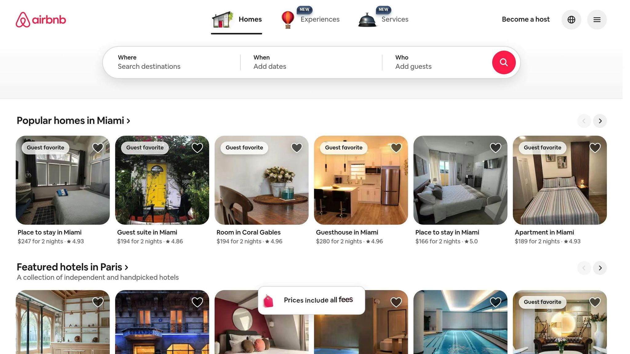
Airbnb's registration form is a great example of how modern multi-step design can make signing up feel effortless. By initially presenting only the email signup option, the form reduces complexity right from the start. This approach, known as progressive disclosure, simplifies the process and encourages more users to complete their registration.
Real-Time Feedback
The form provides immediate visual feedback to users. Completed fields are highlighted with green outlines, and there's a real-time password strength indicator. If errors occur, they're flagged right away, allowing users to fix them without frustration.
"The Airbnb sign-up form up is an excellent example of well-thought-out and effective UX design." - Aleksander Gora, Product Developer
Mobile Optimization
Airbnb's registration form is designed with mobile users in mind. Its responsive, single-column layout and thumb-friendly buttons make navigation easy. Users can even skip non-essential steps and return to them later, which adds flexibility and reduces pressure.
"That one little line [letting you know you can skip any step] takes a lot of pressure off first-time users." - Formidable Team
Progress Indicators
To keep users on track, the form includes clear progress indicators. These horizontal markers, positioned above the form, show exactly where users are in the process and how much is left. By visually breaking down the steps, the design helps reduce anxiety and lowers the chances of users abandoning the form.
4. N26 Bank Account Creation Form
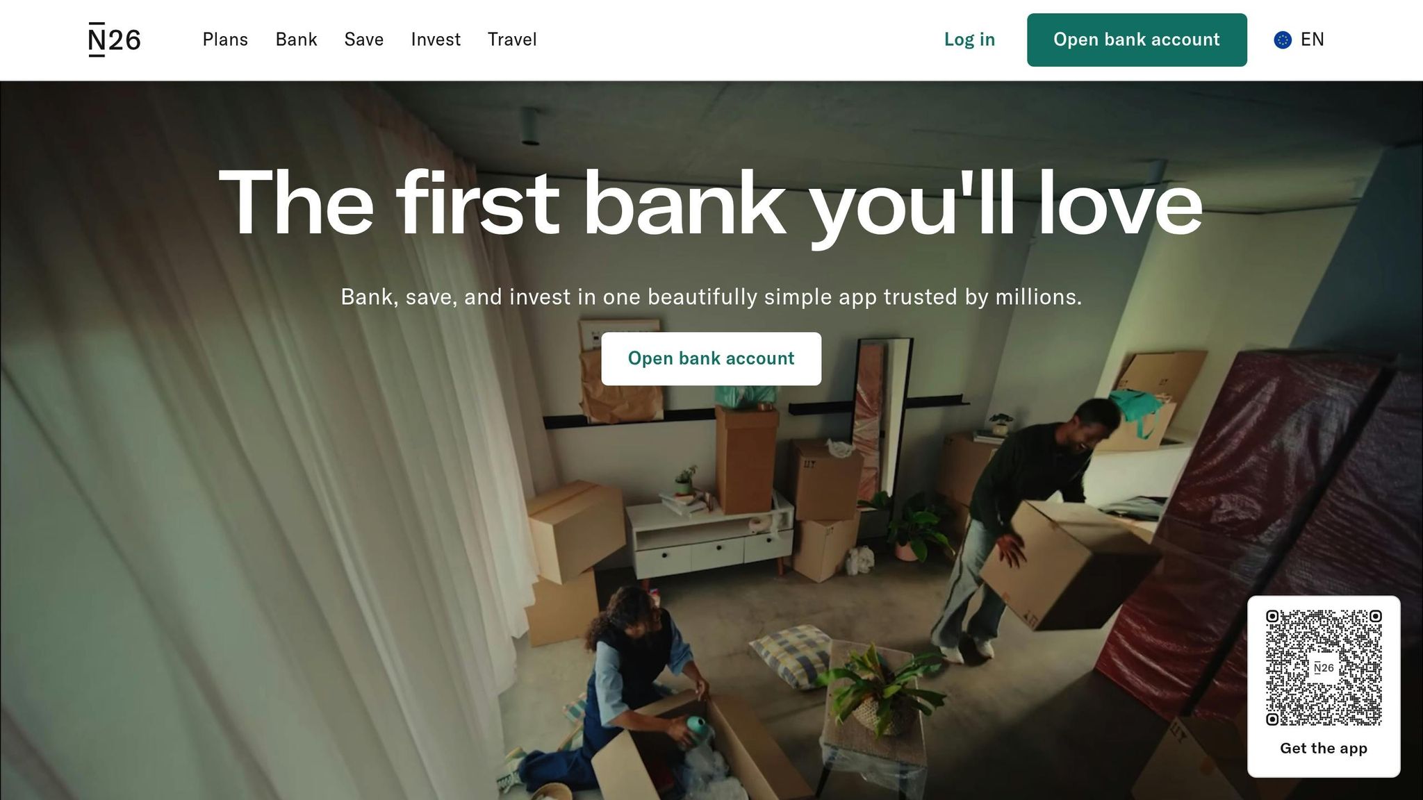
N26’s bank account creation form stands out for its user-friendly, step-by-step design that ensures clarity and smooth navigation. It’s a great example of how to simplify a complex process while keeping users engaged and informed throughout.
Progress Indicators
N26 takes a straightforward approach by clearly outlining the entire account opening process from the very beginning. Visual markers guide users through each step, giving them a clear idea of what’s ahead. This transparency helps users feel prepared and reduces any uncertainty about the process.
Conditional Logic
The form adapts dynamically based on the user’s country, showing only the fields that are relevant to their location. By cutting out unnecessary options, N26 makes the process quicker and more intuitive, which can encourage more users to complete the form.
Mobile Optimization
Designed with responsiveness in mind, the form works seamlessly across devices, whether on a smartphone or desktop. It even includes a light/dark mode toggle, making it easier to use in different lighting conditions. This attention to detail ensures a smooth experience for users, no matter how they access the form.
5. Ubersuggest Lead Magnet Quiz
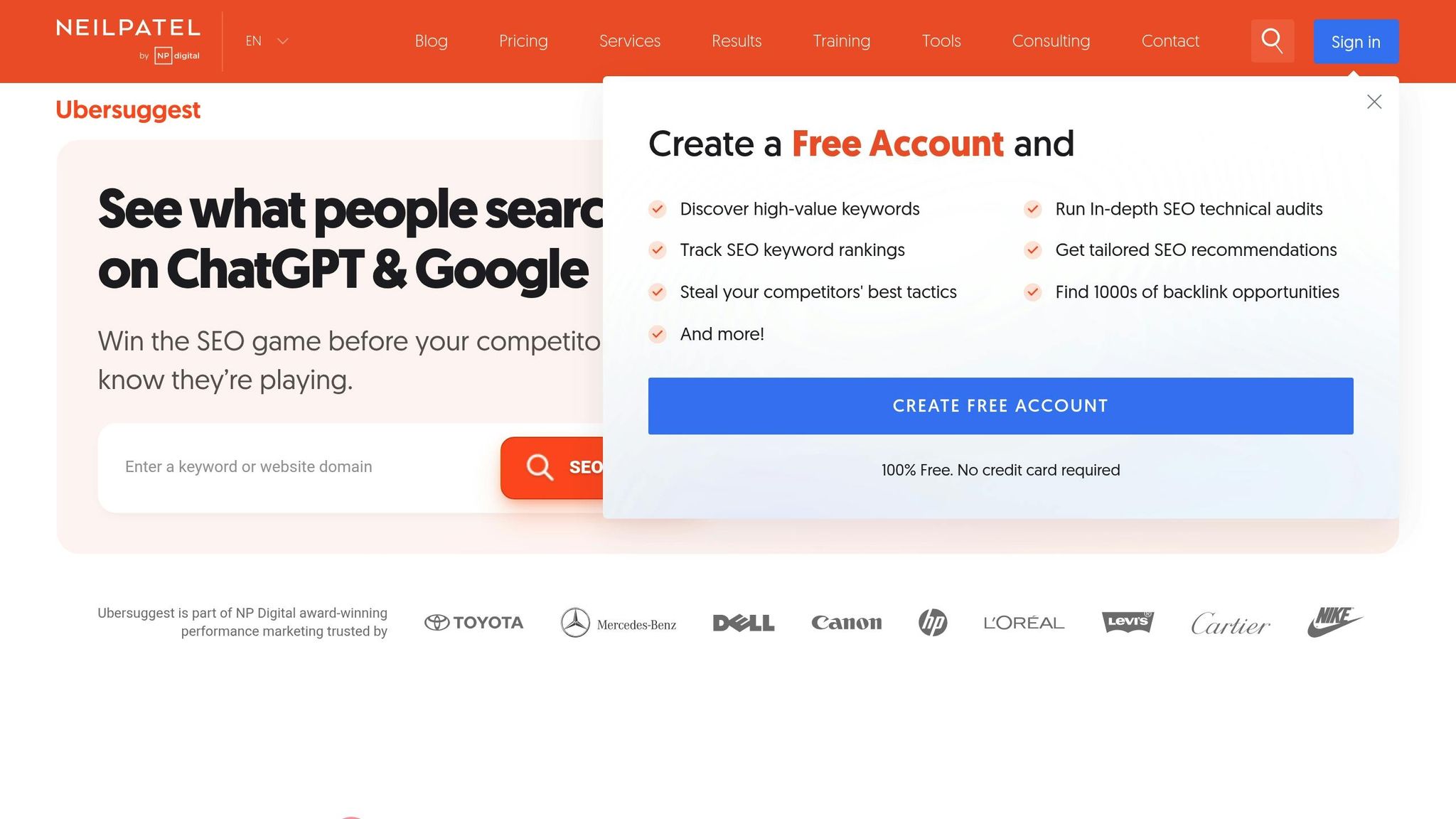
Ubersuggest's lead magnet quiz, created by Neil Patel, is a great example of how to transform a potentially tedious data collection process into an engaging and interactive experience. By presenting one question at a time, the quiz feels more like a guided consultation rather than a long, overwhelming form. This approach makes the process feel manageable and user-friendly.
Progress Indicators
The quiz uses visual progress indicators to show users exactly where they are in the process and how many steps remain. This keeps users motivated to continue. As Devon Wood from Webstacks puts it:
"A multi-step form with progress bar gives users a clear sense of where they are in the process and how many steps remain."
Additionally, the quiz taps into the Goal Gradient Effect, where users feel more driven to complete a task as they perceive themselves nearing the finish line. Neil Patel also adds reassuring explanations throughout the quiz, making the experience feel more personal and supportive.
Mobile Optimization
Designed with mobile users in mind, the quiz works smoothly on smartphones and tablets. Each question is paired with short, benefit-focused copy - perfect for capturing attention on mobile devices, where distractions are common. To further enhance the mobile experience, compressed images ensure quick load times, even on slower internet connections.
Conditional Logic
The quiz incorporates conditional logic to skip unnecessary questions and direct high-value users to scheduling links. This not only saves time but also ensures a more customized experience for every user .
This example highlights how thoughtful design elements like progress indicators, mobile optimization, and conditional logic can make multi-step forms more engaging and effective.
6. Stripe Account Onboarding Form
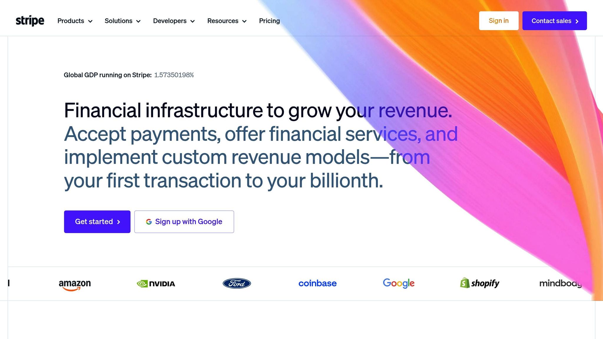
Stripe's account onboarding form stands out for its thoughtful design, which simplifies a potentially complex signup process. By focusing on real-time guidance, clear navigation, and mobile-friendly features, Stripe ensures a smoother experience for users.
Real-Time Feedback
Stripe’s form validates user input as it’s entered, catching mistakes before they become frustrating obstacles. For instance, if someone enters an email in the wrong format or forgets to include a postal code, the system flags the issue immediately within the relevant field. As Stripe explains in its documentation:
"Every form error should show up in real time, in or next to the field where the issue is. If an email format is wrong or a postal code is missing, say so immediately, not after the customer hits 'Submit'."
This approach ensures errors are addressed without interrupting the user’s progress. Clear prompts like “Please enter a valid card number” guide users effectively. Additional tools, such as address lookup and autofill, provide instant feedback and reduce manual input, making the process even more efficient.
Progress Indicators
To further ease navigation, Stripe uses clear section labels like "Contact Info", "Details", and "Confirmation." A progress bar at the top of the form visually tracks how far along users are, which helps reduce uncertainty and lowers the chance of abandonment.
Mobile Optimization
Stripe also prioritizes mobile usability by enabling numeric keypads for fields like credit card entries, minimizing input errors. This focus on mobile optimization is crucial, especially considering that 18% of U.S. shoppers in 2025 abandoned purchases due to overly long or complicated checkout processes. Businesses using Stripe’s Payment Element have seen an average revenue boost of 11.9%, underscoring the importance of such user-friendly features.
7. Motive Interactive Signup Form
Motive Interactive's signup form simplifies the registration process by dividing it into four easy-to-follow steps. This approach helps users complete the form without feeling overloaded. To make the experience more engaging, the form incorporates vibrant icons and interactive buttons, standing out from the typical, text-heavy designs. The focus here is on keeping things clear and interactive.
Progress Indicators
The four-step layout provides a clear roadmap for users. Each step focuses on a specific set of details, making it simple to track progress and see what’s left to finish. This structured flow ensures users stay on course without confusion.
Real-Time Feedback
The form reacts instantly to user inputs, transitioning smoothly between steps. Visual cues like interactive buttons and icons confirm actions, helping users stay aware of their progress and maintain a steady pace without interruptions.
Mobile Optimization
The form’s streamlined design works seamlessly on mobile devices. By keeping each step concise and using placeholder text for fields, it avoids clutter. Instead of relying on complex input types, the form uses interactive buttons, making it easier to navigate on smaller screens. This thoughtful design reduces user frustration and boosts completion rates, especially for mobile users.
8. Toptal Freelancer Matching Form

Toptal's freelancer matching form is designed to pair businesses with the right talent using a sleek, user-friendly interface. Instead of relying on traditional dropdown menus, the form features large, touch-friendly cards. Each role - like Software Developer or Designer - comes with custom icons (e.g., code brackets for developers, pen tools for designers) to make options instantly recognizable, even on smaller screens.
Progress Indicators
To guide users through the process, the form includes a horizontal progress bar at the top of the page. This bar provides a clear sense of direction, showing where users are in the process. It can include step numbers (like "Page 1") or more descriptive labels such as "Contact Info" or "Details." This visual guide helps ease any uncertainty by showing how many steps are left to complete.
Conditional Logic
The form begins by asking users to select their role, triggering conditional logic that tailors the rest of the form to their specific needs. As Toptal explains:
"Conditional logic lets you control how users navigate through your multi-step form based on their responses".
This smart segmentation ensures users are guided through questions relevant to their role, improving lead qualification. High-value leads are directed to content that matches their needs, while others may receive self-service options. This streamlined experience ensures users only see what matters to them.
Mobile Optimization
Toptal’s form is built with a mobile-first mindset. It uses simple, single-choice questions that users can answer with quick taps, reducing the need for typing. Each role is accompanied by detailed subtitles (e.g., "Web, Mobile, UI/UX, Branding" for designers) to eliminate confusion. Additionally, a trust bar displaying client logos adds credibility as users move through the steps. This thoughtful design makes the process fast, clear, and user-friendly on any device.
9. Intercom Trial Signup Form
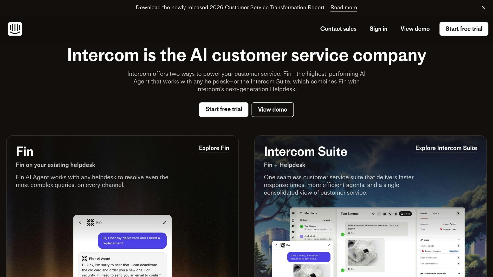
Intercom's trial signup form is designed with simplicity in mind, prioritizing a mobile-first experience. It uses a "one question per page" layout, which keeps the interface clean and minimizes mental effort for users, especially on smaller screens.
Progress Indicators
At the top of the form, there's a horizontal progress bar that matches Intercom's brand colors, creating a unified look. Beyond aesthetics, this bar serves a key purpose: it shows users how far they've come, tapping into commitment bias to encourage them to complete the process. For instance, seeing "33% complete" or "50% complete" gives users a sense of accomplishment and motivates them to finish. It also helps ease concerns about the form's length by clearly displaying their progress.
Conditional Logic
Intercom takes personalization to the next level with conditional logic. Based on user responses, the form dynamically adjusts to show only relevant questions. For example, high-value leads might be directed to schedule a call with sales, while others might receive access to product documentation or self-service tools , often built using powerful form templates to ensure a smooth handoff. This approach not only streamlines the experience but also ensures better lead qualification by avoiding unnecessary or irrelevant fields. All of this works seamlessly on mobile devices.
Mobile Optimization
Designed with mobile users in mind, the form features a blue gradient background that reinforces Intercom's branding throughout the signup process. By presenting one question at a time, the form keeps users focused and engaged, making the process feel manageable and intuitive.
10. ServiceTitan Service Request Form
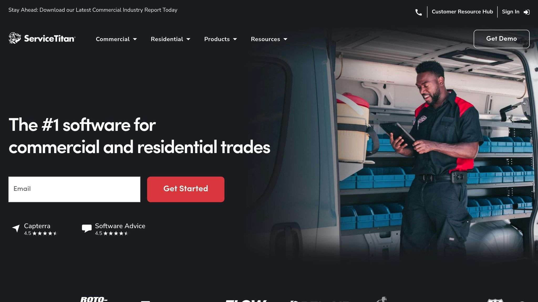
ServiceTitan's service request form is tailored for field service companies, helping technicians efficiently capture detailed data during on-site visits. By organizing workflows into section-based tracking, it simplifies complex tasks like inspections and contractor playbooks. For instance, it uses a "Section 7 of 11" progress indicator, making navigation straightforward and ensuring all steps are completed accurately.
Progress Indicators
Rather than a traditional percentage bar, ServiceTitan uses section-based progress tracking. This method divides tasks into clear stages, such as "Approaching the Customer", "Presenting Options", and "Forms in the Field". This structure is particularly effective for technicians of all experience levels, as it standardizes processes. Additionally, the system enforces Required Actions - technicians can’t proceed until they complete mandatory tasks like filling out fields, uploading photos, or capturing signatures.
Conditional Logic
The form’s conditional logic, redirects, and saving progress ensures that technicians only see fields relevant to the job at hand. For example, maintenance jobs automatically display maintenance-specific checklists, while installation jobs show entirely different sections. This keeps the form streamlined, saving time and reducing the likelihood of errors.
Mobile Optimization
Built with job sites in mind, the form is fully optimized for mobile devices. It allows technicians to upload equipment photos and gather digital signatures directly on-site. Michael Solomon of Anthem Mechanical highlighted how this feature has dramatically improved operations:
"By using ServiceTitan forms and requiring forms to be completed on jobs, we've gotten all our techs to collect the same information on each job, which has reduced go backs with incomplete information and ordering wrong parts." - Michael Solomon, Anthem Mechanical
Thanks to these improvements, Anthem Mechanical saw a 50% drop in return trips caused by incomplete data, which contributed to a 20% year-over-year revenue increase.
How to Design Effective Multi-Step Forms
Creating an effective multi-step form boils down to three main principles: keep each step simple, provide clear progress updates, and use conditional logic to personalize the process.
To start, limit each step to just one or two fields. This makes the form feel less overwhelming compared to a long, single-page format. For example, Zendesk's 8-step demo form uses one field per page, and Intercom adopts a similar approach by pairing a single question per page with a progress bar. By focusing on one task at a time, users are more likely to complete the process.
Progress indicators - such as bars, percentages, or step outlines - are another crucial element. They let users know exactly where they are in the process, helping to build trust and reduce anxiety about the time commitment. ServiceTitan's 2-step service request form is a great example of this. Users appreciated knowing how close they were to finishing, which contributed to positive feedback.
Conditional logic takes your form to the next level by showing only the fields that are relevant to the user based on their previous responses. For instance, N26’s bank account form adapts its options depending on the user’s country, while Little Passports uses conditional logic to tailor product recommendations. Tools like Reform make it easy to integrate conditional routing into multi-step forms without requiring coding expertise. This approach not only saves users time but also ensures the experience feels personalized and efficient.
Finally, real-time feedback is essential for keeping users engaged. Provide validation, error messages, and completion confirmations at each step. Stripe does this effectively by reminding users of benefits at each stage and offering clear error messages to guide corrections. Combine these features with mobile-friendly design and fast load times, and you’ll create a smooth, frustration-free experience that boosts both completion rates and conversions.
Conclusion
Multi-step forms have shown their effectiveness in 2025 by cutting down abandonment rates and increasing conversions through smarter, user-focused design. The examples we explored - from Zendesk's 8-step demo form to ServiceTitan's 2-step service request - share a few key strategies. They simplify complex tasks into manageable steps, use progress indicators to set clear expectations, and apply conditional logic to tailor the experience. Together, these elements reduce cognitive strain and keep users engaged throughout the process.
The numbers speak for themselves. Businesses that incorporate personalized pricing and trust signals into their multi-step forms have seen a 91% jump in qualified leads, while combining embedded forms with social proof has boosted conversions by 24%. These are not minor gains - they highlight the difference between forms that frustrate users and those that guide them effortlessly to completion.
If you're ready to create forms that deliver results, Reform makes it easy. With its no-code customization, conditional routing, progress bars, and real-time analytics, you can build forms like the ones discussed here - without needing any technical skills. Its drag-and-drop interface allows you to create branded forms that integrate seamlessly with your CRM and marketing tools.
To get started, apply the principles we’ve covered: keep steps simple, include clear progress indicators, use conditional logic to display only relevant fields, and offer real-time feedback. Paired with the right tools, these strategies will help you design forms that not only look polished but also drive measurable success for your business.
FAQs
How many steps should my multi-step form have?
To keep users engaged and improve form completion rates, a multi-step form generally performs best when it includes 5 to 9 steps. This range strikes a balance between simplicity and gathering sufficient information, all while maintaining user motivation to complete the process.
When should I use conditional logic in a form?
Conditional logic allows forms to adapt based on user responses, displaying or hiding questions dynamically. This makes forms more personalized and efficient, which is especially useful for tasks like:
- Lead qualification
- Surveys and quizzes
- Appointment bookings
- Compliance forms
By cutting out irrelevant fields, conditional logic simplifies the process, making it easier for users to complete forms. This not only improves the overall experience but also increases completion rates and ensures the data collected is more precise and useful.
What makes a multi-step form mobile-friendly?
Creating a mobile-friendly multi-step form means tailoring it for small screens and touch interactions to make the process smooth and frustration-free. Here’s what works best:
- Single-column layout: This design simplifies navigation, letting users scroll effortlessly without confusion.
- Large, well-spaced input fields and buttons: These ensure users can tap accurately, even on smaller devices.
- Mobile-optimized input types: For example, using numeric keyboards for phone numbers or dates makes data entry faster and easier.
Including progress indicators is a smart move, as they help users see where they are in the process and how much is left. Finally, testing the form on real devices ensures it performs well across different screen sizes and resolutions.
Related Blog Posts
Get new content delivered straight to your inbox

The Response
Updates on the Reform platform, insights on optimizing conversion rates, and tips to craft forms that convert.


Drive real results with form optimizations
Tested across hundreds of experiments, our strategies deliver a 215% lift in qualified leads for B2B and SaaS companies.
