
.webp)
How Privacy-First Error Messages Improve UX


Error messages are more than just functional - they shape user trust and experience. When users encounter errors, the way they're communicated can either ease frustration or create confusion. Privacy-first error messages strike a balance between clarity and security, ensuring users get useful feedback without exposing sensitive data.
Key takeaways:
- Generic vs. Specific Messages: Overly detailed messages (e.g., "Email not found") risk security breaches like account enumeration, while vague ones frustrate users.
- Adaptive Validation: Focus on formatting issues ("Missing @ in email") rather than confirming account data.
- Critical Areas: Login pages and payment forms require extra caution, blending privacy with actionable guidance. For complex workflows, consider using a custom experience to simplify the process.
- Timing Matters: Displaying errors after users leave a field (not while typing) reduces interruptions.
- Accessibility: Avoid relying solely on color for error indicators - use text, icons, and high-contrast designs.
UX TUTORIAL: Designing an error message the right way
sbb-itb-5f36581
The Challenge of Balancing Privacy and Clarity
Creating effective error messages is a tricky balancing act. On one hand, they need to guide users quickly and clearly. On the other, they must protect sensitive data. For example, saying "Email not found" might help users pinpoint an issue, but it also signals that the email is registered in your system - a potential security loophole.
Overly detailed messages can open the door to account enumeration, where attackers systematically test credentials to confirm valid email addresses. On the flip side, vague messages can frustrate users. Edward Scott, Research Lead at Baymard Institute, highlights this tension:
"While such a message makes it more difficult for bots or hackers to verify the validity of stolen usernames, it also makes it more difficult for returning users to successfully sign in."
When users encounter unclear error messages, they may waste time on trial-and-error fixes, leading to frustration, abandoned forms, and even lost conversions. Designing the perfect landing page form can help mitigate these issues by ensuring a smoother user experience. This is where adaptive validation comes in as a practical solution.
How to Provide Guidance Without Revealing Sensitive Data
Adaptive validation strikes a balance by focusing error messages on specific formatting issues rather than confirming whether the data matches an account in your system. For instance, messages like "Phone number is too short" or "Missing @ character in email address" tell users exactly what to fix without hinting at whether their details are already in the database.
This method works by separating formatting checks from identity verification. For example, an error stating "The state entered is not valid with the ZIP code entered" points out a mismatch without exposing sensitive account information. To back this up, security measures like rate limiting, login attempt caps, and monitoring suspicious activity can reduce risks from automated attacks. With these safeguards in place, you can offer clearer guidance in areas with lower security concerns.
Where Privacy-First Error Messages Matter Most
Privacy-first messaging becomes essential in areas where user data is most vulnerable - like login pages and payment forms. Login screens, password reset requests, and account recovery flows are particularly high-risk because they could unintentionally reveal whether an account exists. In these cases, vague messages such as "The email address and/or password could not be found" help protect against unauthorized data harvesting.
Payment forms, however, often allow for more specific feedback. Errors like "Card number incomplete" pose minimal security risk but can make the checkout process smoother for users. Similarly, specific guidance for address fields - like noting a mismatch between ZIP code and state - helps users complete their purchase without exposing sensitive details.
Interestingly, only 2% of websites currently use adaptive error messages tailored to specific validation rules. Knowing where privacy-first messaging is most critical allows businesses to focus their efforts, ensuring user-friendly error messages in low-risk areas while maintaining strong data protection in sensitive zones.
Research Findings on Privacy-Conscious Error Messages
Privacy-First Error Messages: Key Statistics and Impact on User Experience
Error Recovery Time and User Frustration
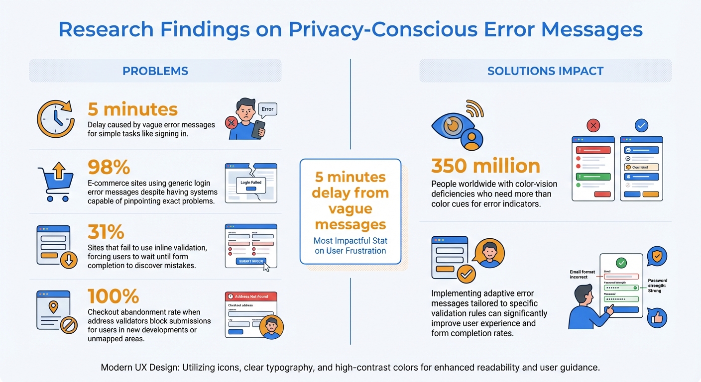
Striking the right balance between privacy and clarity in error messages can significantly impact how quickly users recover from mistakes. Research from the Baymard Institute highlights that vague error messages can delay simple tasks, like signing in, by as much as 5 minutes. On the flip side, providing clear, specific guidance dramatically reduces recovery time. The difference boils down to whether users are given actionable information or left to guess the solution themselves.
Edward Scott, Research Lead at Baymard Institute, emphasized that error messages with precise details not only improve recovery time but also reduce complete task failures. When users are told exactly what went wrong - whether it’s a missing character in a password or an invalid email format - they can fix the issue right away. Without this clarity, users often waste time troubleshooting or abandon the task altogether.
Timing also plays a crucial role. Displaying error messages while users are still typing can feel intrusive and unnecessarily critical. One test participant from the Baymard Institute expressed their frustration:
"Why are you telling me my email address is wrong, I haven't had a chance to fill it all out yet!"
A more user-friendly approach involves using inline validation that waits until the user moves to the next field. This method catches errors while the context is still fresh but avoids interrupting users mid-task, creating a smoother experience.
Form Abandonment and User Trust
Unclear error messages do more than slow users down - they can also damage trust and lead to form abandonment. Generic messages like "Invalid input" are common on login screens, with 98% of e-commerce sites relying on them despite having back-end systems capable of pinpointing the exact problem. These vague responses leave users feeling stuck and frustrated.
The problem worsens when errors are only revealed after submission. Alarmingly, 31% of sites fail to use inline validation, forcing users to wait until they’ve completed the form to discover mistakes, a common issue that multi-step forms can help solve. This disrupts the flow, requiring users to reenter information and reestablish context, which often leads to what researchers call a "complete stop."
Clear, privacy-conscious error messages can avoid these pitfalls while still respecting user data. By addressing errors early with helpful, targeted feedback - and avoiding premature validation that feels accusatory - users feel supported throughout the process. This approach not only fosters trust but also increases the likelihood of task completion. The evidence shows that prioritizing privacy alongside clear communication creates a smoother, more positive user experience.
Error Message Patterns That Protect Privacy
Error messages play a key role in guiding users while safeguarding sensitive data. Here's how different types of errors can strike that balance.
Login and Authentication Errors
Login screens often face tricky privacy challenges. For instance, revealing "This email is not registered" might help users troubleshoot but also exposes account details to potential attackers. To avoid this, 98% of e-commerce sites choose more generic messages like "The email address and/or password could not be found".
To further protect user accounts, implement measures like rate limiting to restrict login attempts per minute per IP address. For added convenience, systems can provide subtle hints - for example, if a user frequently logs in via Facebook or Gmail, display a message like: "It seems like you usually log in with Facebook or Gmail using this email."
After login, payment fields also require careful attention to privacy and clarity.
Payment Field Validation Errors
Payment fields need error messages that are both clear and secure. Instead of vague messages like "Invalid Card Number", opt for specific guidance such as "Your card number is incomplete" or "Check for typos in the card number." This helps users fix errors without exposing sensitive financial details.
When validating addresses during checkout, pinpoint mismatches clearly. For example, "The state entered is not valid with the ZIP code entered" highlights the issue while keeping stored data secure. Always allow users to override address validators. Otherwise, users in new developments or unmapped areas may face blocked submissions, leading to checkout abandonment rates as high as 100%, often caused by overwhelming forms.
Beyond payment fields, standard form fields also benefit from tailored error messaging.
Standard Form Field Errors
Standard form fields should provide targeted, actionable feedback. For instance, instead of saying "Invalid input" for an email field, specify the problem: "This email address is missing the @ character." Clear guidance like this helps users recover quickly.
Timing is another critical factor. Display format-related errors - like those for ZIP codes or email addresses - only after the user moves to the next field. As Kate Kaplan, a Senior User Experience Specialist at NNGroup, explains:
"Wait until a user moves on from a field to display an error message related to an appropriate format".
Lastly, avoid relying solely on color to indicate errors. Around 350 million people worldwide have color-vision deficiencies. Instead, combine red highlights with additional cues such as icons, bold text, or high-contrast borders. This ensures issues are visible to everyone, regardless of visual ability.
How to Implement Privacy-First Error Messages
Creating error messages that prioritize user privacy while aiding quick recovery requires a thoughtful approach. The goal is to strike a balance between security and clarity - offering users enough guidance to fix their mistakes without exposing sensitive information or system vulnerabilities. Here's how to translate research findings into actionable steps.
A Framework for Deciding What to Include in Error Messages
A good error message follows a simple three-part structure: state the issue, explain why it happened, and guide the user toward a solution. Keep the language straightforward and avoid technical jargon. As Tim Neusesser and Evan Sunwall from Nielsen Norman Group suggest:
"Error messages should be plainspoken using legible and readable text... Hide or minimize the use of obscure error codes or abbreviations; show them for technical diagnostic purposes only".
Adopt a constructive tone. For instance, instead of saying, "You entered an invalid email", opt for something like, "This email address is missing the @ character." Avoid words that might feel accusatory, such as "illegal", "invalid", or "prohibited."
When dealing with sensitive fields like login credentials, use generic messages unless robust security measures - like rate limiting or IP tracking - are in place. For less sensitive fields, such as addresses or phone numbers, more specific feedback (e.g., "ZIP code does not match state") is fine and doesn't compromise security.
To make error correction easier, preserve users' original input so they don’t have to re-enter everything. Position error messages directly above the input field they relate to, ensuring they remain visible even on mobile devices where keyboards or dropdowns might obscure them. Additionally, clearly mark required fields upfront using an asterisk or the word "required" to prevent unnecessary confusion.
Using Progressive Disclosure and Timing
Timing plays a big role in reducing frustration. Trigger validation only when users leave a field (on blur) to avoid interrupting them unnecessarily. For more complex issues, start with a brief message and provide additional details through expandable links or tooltips.
Adaptive error messages can further personalize the feedback. For example, an email field might show "missing @ character" for one error and "invalid domain" for another. Although research shows that only 2% of websites currently use adaptive messaging, it can significantly cut down recovery time.
Reserve bold styling like red text or caution icons for critical errors. After three failed attempts, consider offering more in-depth help, such as links to support resources.
Testing and Refining Your Error Messages
Identify common validation errors that lead to form abandonment and refine those messages to improve user experience. Poorly worded error messages can turn a quick task into a frustrating ordeal.
Test your error messages for clarity and accessibility. For instance, ensure users with color-vision deficiencies can understand them by pairing color cues with icons, bold text, or high-contrast borders. Use aria-describedby to link error messages to form controls, making them accessible for screen reader users.
Regular security audits are essential to ensure that detailed feedback in sensitive fields doesn’t inadvertently expose data. If you’re using adaptive messages for login credentials, implement safeguards like limiting login attempts per minute or per IP address to prevent credential scraping.
As Kate Kaplan from Nielsen Norman Group explains:
"Error messages should be expressed in plain language, communicate the problem and a solution, and make use of visual styling that will help users notice them".
Finally, evaluate your error messages with a scoring system to ensure they are visible, easy to understand, and provide constructive guidance. Make sure errors aren’t displayed prematurely. Following these steps not only protects user data but also enhances the recovery process, building trust along the way.
Conclusion
Privacy-first error messaging not only safeguards user data but also improves overall user experience. Striking a balance between security and clarity minimizes frustration, speeds up issue resolution, and strengthens trust. Research shows that vague error messages can turn a simple task into a frustrating ordeal, while clear, timely feedback helps users resolve issues much faster.
The path forward is straightforward: find the right balance. For sensitive fields like login credentials, stick to generic messages supported by strong backend protections. For standard fields - such as addresses, phone numbers, or email formats - use specific and actionable messages (e.g., "missing @ character") to significantly reduce user confusion and errors.
Rosie Allabarton from LogRocket highlights this well:
"Error messages are opportunities to reinforce your brand, even in moments of user frustration and confusion".
By designing error messages with empathy and transparency, you create a user experience where privacy and usability go hand in hand. This approach shows users that their time and data are valued at every step.
To make the most impact, start with high-priority areas like registration forms, payment pages, and login screens. Focus on refining error messages for these fields first. Test for clarity, ensure accessibility by using more than just color cues, and make sure user input is preserved to simplify corrections. Using these insights, you can continue improving your high converting forms to better serve your users.
FAQs
How can I tell if an error message is too specific?
An error message becomes ineffective when it bombards users with overly technical details or irrelevant information. Instead, focus on providing clear and actionable guidance. For example, a message like "Enter a valid email in the format: name@example.com" tells users exactly what went wrong and how to correct it. Stay away from vague statements, but keep instructions straightforward and easy to follow, avoiding unnecessary complexity that could frustrate or confuse users.
Which form fields need generic errors vs detailed ones?
When dealing with fields that are less critical or optional, generic error messages work well. For example, a simple "Please correct the errors in the form" keeps things straightforward and avoids overwhelming the user. On the other hand, for important or sensitive fields like email addresses or passwords, it's better to provide specific error messages. For instance, "Enter a valid email: name@example.com" offers clear guidance, helping users input the correct information while maintaining trust and accessibility.
How can I test privacy-first errors without hurting conversions?
To create privacy-first error messages that don’t hurt conversions, make sure they’re clear, empathetic, and easy to understand. Avoid messages that feel intrusive or leave users confused - they only lead to frustration. Instead, use tools like real-time validation to catch errors early, focus management to guide users efficiently, and provide specific, actionable advice to fix the problem. Testing these messages with assistive technologies and collecting feedback from users can help fine-tune them. This approach ensures privacy is respected while fostering trust and keeping conversions on track.
Related Blog Posts
Get new content delivered straight to your inbox

The Response
Updates on the Reform platform, insights on optimizing conversion rates, and tips to craft forms that convert.


Drive real results with form optimizations
Tested across hundreds of experiments, our strategies deliver a 215% lift in qualified leads for B2B and SaaS companies.
