
.webp)
5 Psychological Triggers Behind Multi-Step Forms


Multi-step forms work better than one-page forms because they align with how people think and behave. By breaking tasks into smaller steps, they reduce overwhelm and encourage users to finish. Here are five key psychological triggers that make them effective:
- Easing Brain Strain (Cognitive Load): Simplifies complex forms by splitting them into manageable steps, reducing mental effort.
- Commitment Bias: Once users start, they feel compelled to finish due to their initial investment of time and effort.
- Social Proof: Builds trust by showing how many others have used the form or sharing testimonials.
- Reciprocity: Encourages users to share information by offering immediate value, like tips or resources, in return.
- Emotional Connection: Uses friendly language, relatable visuals, and clear benefits to engage users on a personal level.
These strategies not only make forms easier to complete but also improve user experience and data quality. Let’s explore how they work and how to apply them effectively.
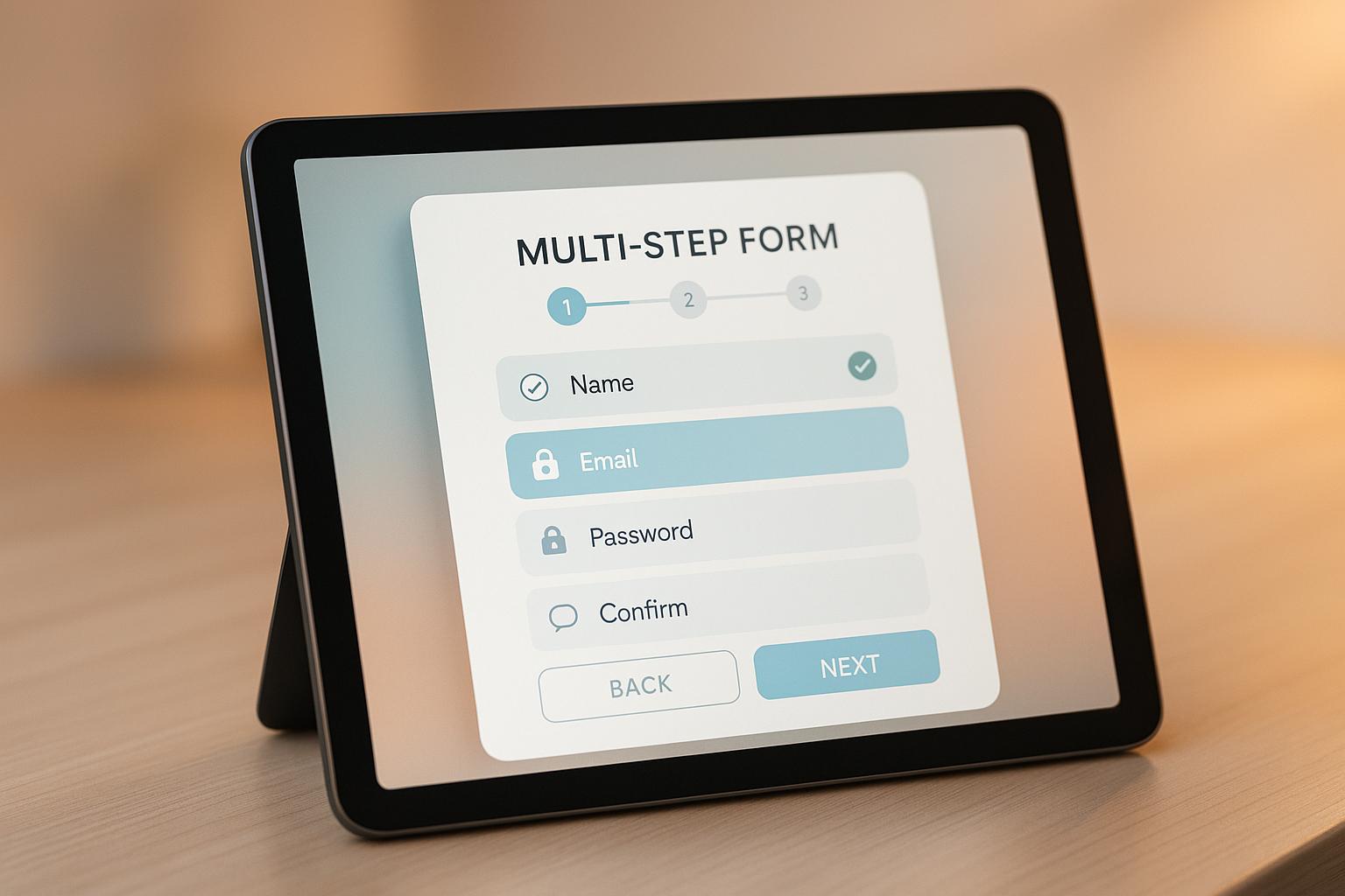
Multi-step form persuasion tactics (with examples)
Making Forms Simple to Fill
Forms with too much info can be hard for users, making it tough to fill them out. Cognitive load is the brain work needed to handle info, and big, complex forms can max out this work. Splitting these forms into smaller, easy parts - like steps in multi-step forms - can change everything.
Think of it: facing a one-page form with 20 fields is like trying to get over a huge wall. But if you turn that wall into smaller steps, like stairs, it becomes much easier. Multi-step forms ease you through, one step at a time. Let’s look into how cognitive load plays into filling forms and how we can make forms that are easy on your mind.
How Cognitive Load Changes Form Filling
When users see a form full of too many fields, they might think, "This looks too hard." This feeling alone can make them quit right there.
It gets worse if forms jump between unrelated questions - like from personal info to payment details and then preferences. This task switching makes the brain work harder, upping the mental strain. Add lots of choices and users might stop, not sure what to do next.
Multi-step forms solve these issues by focusing on one task at a time. By showing fields in smaller, logical groups, they cut down the brain work needed and make the task feel easier.
How to Make Forms That Ease the Mind
The trick to making forms easy is in careful design. Every part should aim to lower brain strain and help users move smoothly through the form. Here’s how:
- Keep each step short and on point. Keep steps to 3-5 fields. This fits how our memory works - most of us can handle 3-5 bits of info at once. Any more can be too much.
- Use clear, exact labels. Skip vague words like "Reference." Use clear asks: "How did you find us?" This cuts down on the guesswork and eases the mind.
- Show progress indicators. Let users know where they are with steps like "Step 2 of 4." Knowing what's coming lowers worry and keeps them going.
- Use dropdown menus and auto-formatting. Dropdowns keep choices simple with set options, while auto-formatting (like for phone numbers or addresses) takes away the need to think about how to format.
- Use conditional logic. Only show fields that matter to the user. For instance, if someone picks "Individual" not "Business", hide the company questions. This keeps the form neat and prevents distractions.
- Keep it visually simple. Use white space well to make a clean, neat layout. A crammed design ups brain effort, while a spacey one helps users focus on filling the form well.
Commitment Bias: Why Users Keep Going
When people start filling out a form, they often feel a need to end it. This happens due to a mind trick called commitment bias.
Know Commitment Bias
Commitment bias comes from our want to keep our acts and choices in line. Once a user hits "Start" and fills a few fields, they’ve already made a tiny promise. This makes them want to finish - leaving it half-done feels like a loss.
The more work one puts in, the harder it is to stop. Each done step pushes them to go on. For instance, after the first part, they might think, "I’ve already begun." By the next, it's, "I’m halfway there", and soon, stopping seems wrong.
Forms with many steps use this bias well. They don’t ask for all at once, but in small, easy bits. Each click on "Next" or "Continue" is a new promise to keep going. These small choices add up, making it tough to quit.
Use Commitment Bias in Forms
To use commitment bias in your forms, start with light, fun questions. These first steps set the mood and make users more likely to stay.
Here are some ways to make forms that push to end:
- Start with simple, fun questions. Don’t start with boring stuff like names or emails. Begin with things like, "What’s your big issue with [topic]?" This feels more like a talk, making users want to join in.
- Hype early wins. After the first step, show things like, "Great start! You’re 25% done." This small win gives them the push to keep going.
- Make the first step really easy. Ask for just 2-3 fields to begin with. Once they put in that little effort, they’re more set to do more.
- Ask key things in the middle. Keep big asks - like emails or phones - to the middle of the form. At that point, users have put more in and are less likely to stop.
- Show what’s next. End each part with a hint of what’s coming, like "Next: Tell us what you like" or "Almost done! Just need a few more bits." This keeps them eager and makes stopping feel off.
Commitment bias is strong but silent. Users don't think, "I must end this because I started." They just feel pulled to end, a feeling that grows with each step they take. By designing with this in mind, you can guide users to the end without them knowing it.
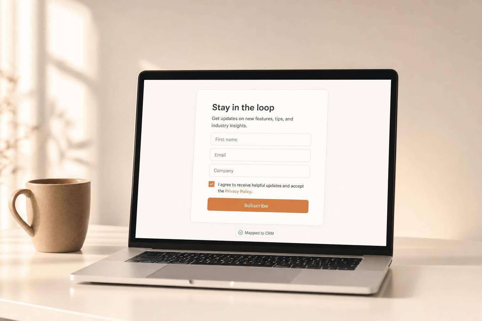
Trust from Users: Social Proof and Giving Back
Users often wonder if they can trust and see worth in forms. Two mind tricks - social proof and giving back - help a lot. Social proof shows that many have joined and gained, while giving back makes you feel good about giving info for value received. Together, they change a basic form into a trusted chat.
How Social Proof Makes Users Fill Out Forms
Social proof works since folks often look to others when they make choices. When users see lots of others have filled out a form, they relax knowing the form is safe and good. This matters more online, where it's harder to build trust.
For instance, showing counts like "Join 50,000+ marketers" feels solid and builds trust. Also, placing customer stories in the form can show the plus of filling it out. Pick stories that show how others found value - this makes new users view the form as worth their time.
Another sharp move is to show big brand logos, mostly in B2B forms. Logos of big names boost trust fast. A new business boss might link better to logos from other new businesses over big, faceless companies.
To make the most of these elements, place them smart:
- User counts at the top to build trust quick.
- Stories in the middle to show value.
- Big logos at the end to clinch the deal.
How Giving Back Drives Users
While social proof eases minds, giving back pushes users to share their info. This idea plays on our habit to give back when we get. When users feel they got something good right off, they're likely to give back by filling out the form.
The key is instant, clear value. Say, give a cool tip or tool right away before asking for details. If your form talks about marketing, maybe offer a quick tip on getting better results. For a health form, sharing a workout tip can build trust.
Personalized ideas also boost this give-and-take feel. After a few questions, users could get ideas just for them. This not only shows the chat's value but also keeps users hooked.
How you talk on your form matters too. Instead of just, "Fill out this form to get our guide," frame it like, "We’ll share our top strategies with you - just help us know your needs." This feels like you both are on the same team.
Special deals or first chance at new things can also make the effect stronger. Phrases like "Be the first to see our new study" or "Get special early access to our new feature" make users feel special, driving them to act.
Reform's step-by-step build tool makes it simple to mix in both social proof and give-and-take. You can put in feedback, user numbers, and good content at various steps, while making the feel personal to grow trust all the way. These ways not only ease hold-ups but also shape forms that spark sureness and push for action.
sbb-itb-5f36581
Feeling a Connection: Reaching Users
Feelings lead the way - people tend to fill out forms when they are excited, curious, or worried. Smart companies use this fact, applying careful words and design to touch these emotions.
The top forms do more than just collect info - they help users feel noticed and valued. This feeling of connection can turn a simple form into a chat users want to join. Now, let's look at how careful words can build this link.
Crafting Messages that Touch the Heart
Using simple, warm words helps users feel safe to share info. But cold or stiff words might lose that touch. Think of it as chatting with a friend who needs advice - keep your tone light and helpful.
Much like easing brain work or using commitment tricks, pulling at emotions can keep a user going.
Speaking to real troubles with kind, down-to-earth words can change everything. For instance, to small business owners, don’t just say "Get our marketing guide." Say, "Stop losing money on bad ads - we'll show what really works to get customers." This speaks right to their issues and gives a fix.
Urgency works well if it feels real. Saying "Join 500 others this week" adds gentle pressure but isn't too pushy. The aim is to make urgency seem real, not made up.
Stories pull more weight than just facts. Instead of "95% success rate," try "Sarah doubled her sales in 60 days with these steps." True stories click because they show outcomes people can relate to.
Looking forward helps users see the good coming their way. Phrases like, "Imagine having a steady flow of good leads" or "Think about cutting your costs in half" let them picture good changes.
Your tone should fit your crowd. For B2B forms, stay professional but warm. For things aimed at customers, a friendly and fun tone suits best. For instance, a fitness app might say, "Ready to hit your goals?" while financial service could ask, "Looking to keep your family safe future-wise?"
Visual Bits That Touch the Heart
Colors set the scene. Blue builds trust, great for money or health forms. Green points to growth and success, fitting for business tools. Orange can bring out urgency and joy, ideal for urgent offers.
Pictures and icons should mirror your audience's life. If aimed at working parents, show real families, not stock photos. For small business owners, pick pictures of real work spaces not just clean office shots. When users see their life in your pictures, they engage more.
Small micro-animations add delight. Like a little checkmark when a step is done feels rewarding, while a soft shake for a missed detail feels encouraging, not harsh. These touches keep the form lively and engaging.
Too much white space also stirs up feelings. Full forms can be too much, while simple, open ones bring calm and trust. Let your form have space, and users will feel more at rest.
Typography gives out feelings too. Neat, up-to-date fonts show a pro touch, while soft, round fonts seem warm and nice. The size of the font is key - tiny text feels fake, while big text might seem too bold.
Error messages give a chance to touch hearts. Instead of saying, "Invalid email address," try "Looks like there’s a typo in your email - could you double-check it for us?" It feels like help, not a scold.
With Reform’s tools, you can fine-tune these feeling bits with ease. No code needed, you can change colors, fonts, and space to match your brand’s vibe. The platform even lets you see how these choices look together before you start.
The aim isn’t to trick users - it’s to make an experience that feels real and caring. When your form’s words and look hit the right feelings, people fill it out because they choose to, not because they have to.
How to Use These Steps by Using Reform
Now we have talked about these steps, let's see how Reform puts them to use with its easy platform. Reform aims for more users, mixing mind tricks with useful tools to make forms that pull in users and push them to act.
Making Step-by-Step Forms with Reform
Reform turns hard forms into easy, small steps. This way does not just cut down on hard thinking but also makes the process seem more like a chat and easy to get.
Questions are set in a smart order, and the Qualification & Conditional Routing bit (also known as Skip Logic) makes it a custom visit. By showing or hiding questions based on what the user says, the form stays on point and useful, helping the user move forward and keeping them on track to end it.
Reform also lets you keep your brand's look with simple no-code ways to change things. For those who like more say, you can use custom CSS. There are clear signs of progress, letting users see how close they are to the end, which keeps them going.
But Reform goes beyond just smart look - it has high-level tools to lift your forms higher.
Using Reform's Top Tools to Get More Users
Reform's top tools aim to up your game and get results. For instance, live Analytics show you where users stop, so you can tweak your forms to keep them in.
With Abandoned Submission Tracking, you can save early answers and reach back out to users. This uses the effort users have already put in, raising the odds they'll finish.
A/B Testing lets you try different words to see what hits home with your people.
The Lead Enrichment bit pulls in more info about your leads, lessening the questions users face while still giving key bits. This keeps your forms short and easy to use.
Reform also works well with CRM and marketing tools, making sure the good time users have filling out the form keeps up in your later talks. When users fill out a form that feels close and fun, that good vibe can boost your whole plan to talk and connect.
Bits like built-in Spam Stopping, Email Checking, and easy putting in make your form work better.
For firms that want expert help, Reform has a Done for You deal. Here, pros make forms just for your crowd and aims, blending mind tricks with top design to give you forms that do very well.
Key Takeaways
Understanding and applying these five psychological triggers can completely change how users interact with your multi-step forms. When used together, these strategies make the process smoother and more engaging, encouraging users to complete the form.
Cognitive load reduction is all about making complex forms feel manageable. Breaking a form into smaller, digestible steps reduces mental effort and increases the likelihood of completion. It’s a simple way to turn what feels overwhelming into something approachable.
Commitment bias taps into our natural desire to finish what we start. Every time a user clicks "Next", they make a small mental commitment to continue. Progress bars that start at 20% instead of 0% take advantage of the "endowed progress effect", making users feel like they’re already on their way to finishing, even if they’ve just begun.
Social proof and reciprocity help build trust, which is critical for form completion. Adding elements like testimonials, recognizable logos, or certifications reassures users about the safety of sharing their information. Offering immediate value in return - like a free resource or exclusive content - creates a sense of reciprocity, motivating users to follow through.
Emotional engagement goes beyond logic to connect with users on a personal level. Forms that address specific pain points or desired outcomes feel more relevant and meaningful. This emotional connection is why even forms that ask for detailed personal information can still convert effectively.
Taking it a step further, personalization through conditional logic makes forms feel less like a chore and more like a conversation. When later questions adapt based on earlier answers, users feel acknowledged and understood. This not only improves completion rates but also ensures the information collected is more accurate and useful.
The results speak for themselves: one consulting firm saw their conversion rate skyrocket from 0.96% to 8.1% - a staggering 743% increase - just by switching from a basic contact form to a multi-step format. This approach challenges the old "golden rule" of form design by proving that collecting more information doesn’t have to mean sacrificing user experience. In fact, reducing psychological friction makes users more willing to share detailed information because the process feels effortless and worthwhile.
The key to success is combining these triggers in a thoughtful way rather than using them one by one. Start with easy, low-barrier questions, show clear progress, build trust with design and social proof, connect emotionally through your messaging, and personalize the experience as users move through each step. Together, these strategies create a seamless form experience that not only boosts completion rates but also improves the quality of the leads you capture.
FAQs
Why do multi-step forms feel easier to complete than single-page forms?
Breaking a complex task into smaller, bite-sized steps makes multi-step forms feel much easier to tackle. By presenting just a few questions at a time, users can focus without feeling overloaded or stressed. This method not only reduces mental fatigue but also creates a more fluid and engaging experience, often leading to higher completion rates and a better overall interaction.
How can commitment bias be used to improve multi-step form completion?
To take advantage of commitment bias in multi-step forms, start by asking for small, straightforward inputs right at the beginning. This creates a sense of progress and makes users more likely to continue. For instance, you could begin with simple questions like their name or email address - an easy, low-pressure way to get them started.
As users move through the form, keep reinforcing their initial decision to engage. Use a consistent tone and design to maintain a cohesive experience. Adding visual cues like a step-by-step progress tracker can also be effective. These indicators show users how close they are to completing the form, encouraging them to follow through. By subtly tapping into the human tendency to stick with prior commitments, you can significantly improve form completion rates.
Why does emotional engagement improve the success of multi-step forms?
Emotional engagement plays a big role in making multi-step forms more effective. When the experience feels personal and relatable, users are naturally more motivated to complete the process. Psychological factors like commitment bias - where people feel inclined to finish what they've started - and social proof - seeing that others have done the same - help keep users interested. On top of that, thoughtfully designed elements that resonate emotionally can make the process feel less daunting.
When users feel a sense of connection and trust in the process, they’re far more likely to stick with it, leading to higher completion rates and improved conversions. By addressing both the logical and emotional aspects of user behavior, multi-step forms create a smoother, more engaging experience that delivers real results.
Related Blog Posts
Get new content delivered straight to your inbox

The Response
Updates on the Reform platform, insights on optimizing conversion rates, and tips to craft forms that convert.


Drive real results with form optimizations
Tested across hundreds of experiments, our strategies deliver a 215% lift in qualified leads for B2B and SaaS companies.
