
.webp)
5 Best Practices for Accessible Web Forms


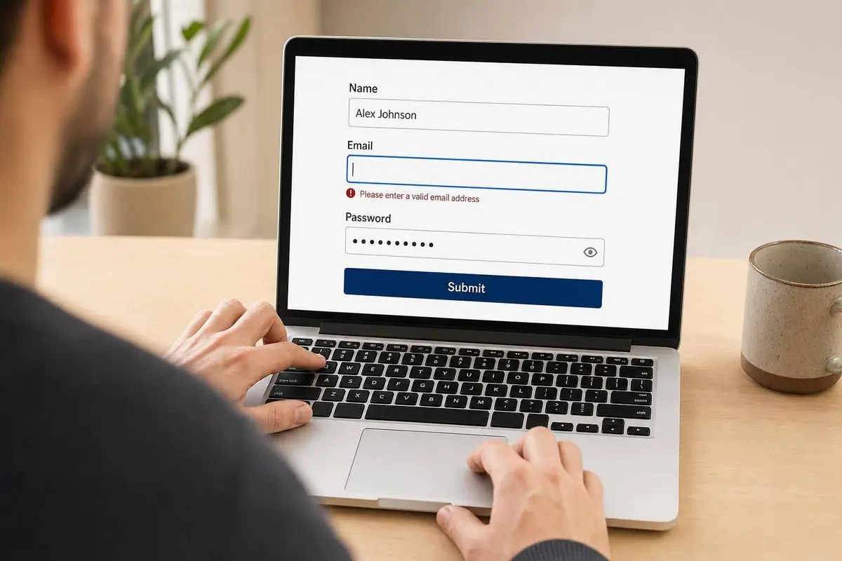
A form can look fine and still block people from finishing it. If I want more completions and fewer accessibility issues, I focus on five things first: visible labels, keyboard flow, clear error messages, color contrast, and proper HTML structure.
Here’s the short version:
- Use real labels: Placeholder text is not enough. In the source article, 59.6% of home pages had form inputs without proper labels.
- Keep keyboard use simple: People should be able to move through fields, buttons, and steps in a clear order without getting stuck.
- Make errors easy to fix: Show specific inline errors, add an error summary, and connect messages to fields with
aria-describedbyandaria-invalid="true". - Check text contrast: WCAG AA calls for 4.5:1 for standard text and 3:1 for large text.
- Use native HTML first: Elements like
<label>,<input>,<button>,<fieldset>, and<legend>give screen readers and keyboard users the structure they need.
If I had to boil the whole article down to one point, it would be this: small form mistakes can stop signups, checkouts, job applications, and support requests. That means lower completion rates, more support contacts, and more compliance risk.
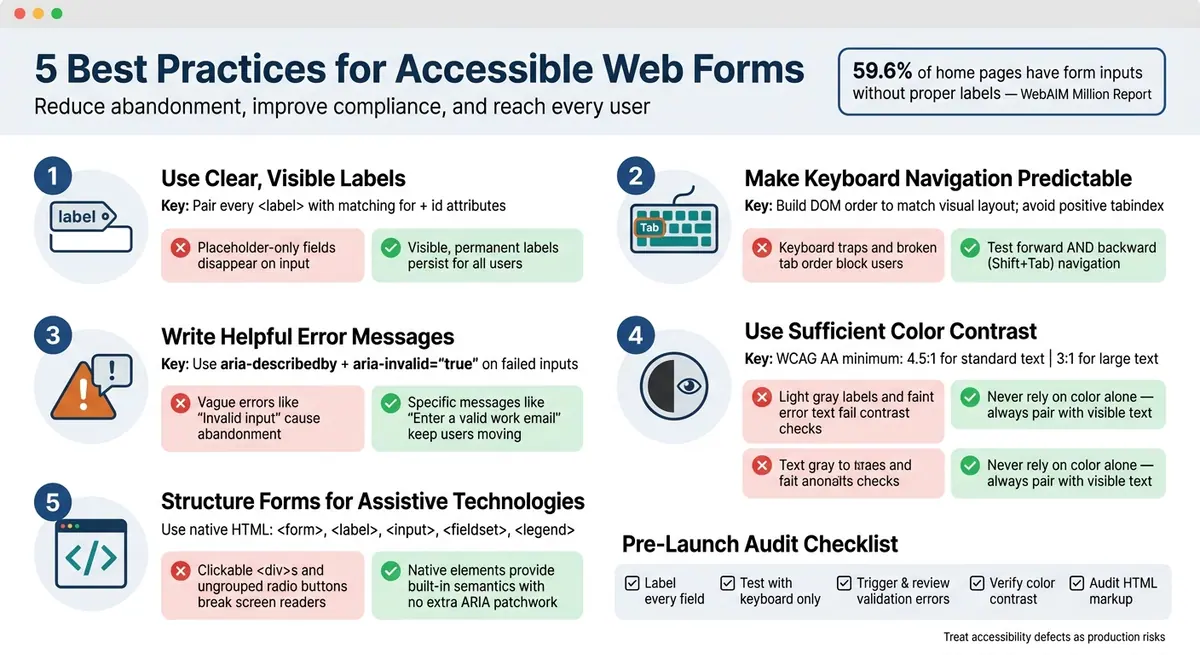
5 Web Form Accessibility Best Practices: Quick Reference Checklist
How to make accessible forms - with lots of examples!
Quick Comparison
| Practice | What I check | Common failure |
|---|---|---|
| Visible labels | Each field has a visible <label> tied with for and id |
Placeholder-only fields |
| Keyboard flow | Tab order follows the form layout; focus stays visible | Positive tabindex, keyboard traps |
| Error handling | Inline errors, summary links, aria-invalid, aria-describedby |
Vague errors like “Invalid input” |
| Color contrast | Text meets 4.5:1 or 3:1 for large text | Light gray labels or faint error text |
| Assistive tech structure | Native form controls and grouped inputs | Clickable <div>s and ungrouped radios |
I’d use this as a fast checklist before launch: label every field, test the full form with only a keyboard, trigger validation, verify contrast, and review the markup.
How Accessible Forms Improve Compliance and Completion Rates
An inaccessible form can stop a submission cold. When someone hits an error and can't tell what went wrong, the process often ends right there. Structured error handling with aria-describedby and aria-invalid helps people spot the problem, understand it, and fix it. And that comes down to a few concrete design choices.
Accessibility issues in checkout, onboarding, hiring, support, and compliance forms aren't just surface-level UI problems. They're production risks. If a person can't finish a form, they can't finish the task.
Clear labels and specific error messages help reduce bad submissions and abandonment. They also lower support volume because more people can complete tasks on their own instead of opening a ticket or calling for help.
That matters even more in core workflows like checkout, onboarding, and hiring. These are high-risk areas under the ADA because a blocked form can make a service unusable.
Accessible forms also help people far beyond the group most teams picture at first. They make life easier for mobile users and for people with memory or attention challenges. The fix isn't magic. It's the kind of stuff that removes friction:
- visible labels
- strong contrast
- predictable keyboard behavior
- short forms
The first piece is simple: clear, visible labels.
1. Use Clear, Visible Labels
A label is the field’s visible, accessible name. It tells users - and assistive tech - what belongs in each input.
This matters more than a lot of teams think. According to the WebAIM Million report, 59.6% of home pages have form input elements that lack proper labels.
WCAG-Aligned Implementation
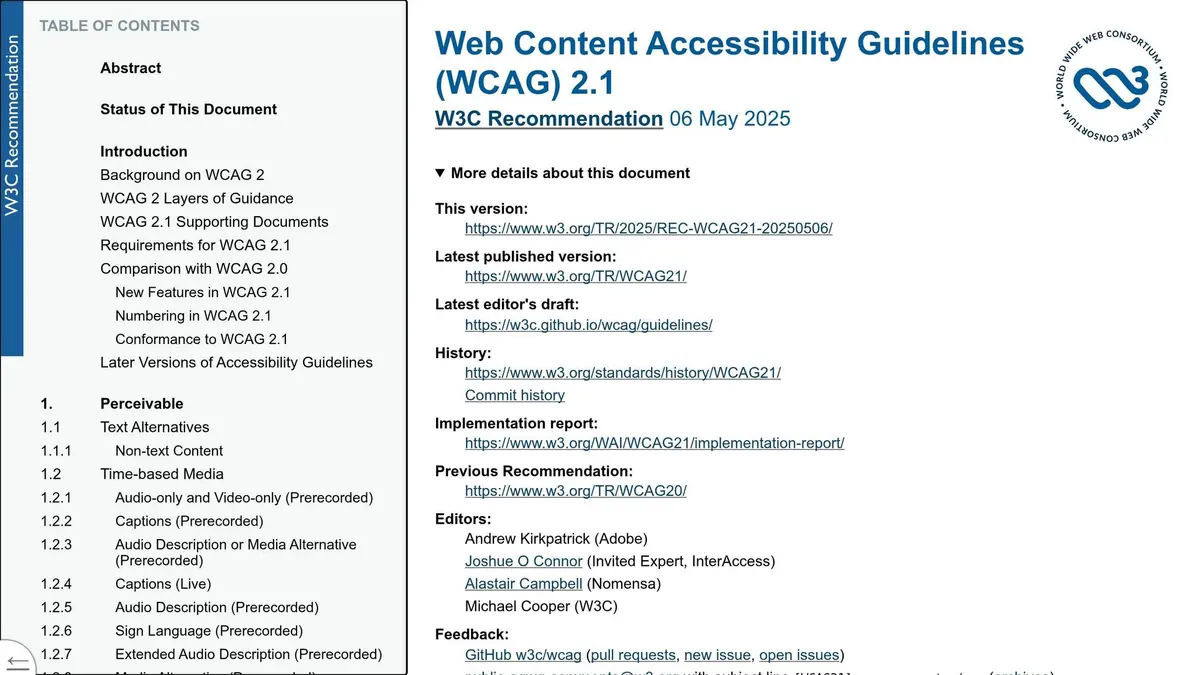
Use native HTML whenever you can. Pair each <label> with a matching for and id. If those two don’t match, the link breaks, and the field can become much harder to use.
For required fields, show it in plain text with something like (required). Also use the HTML required attribute or aria-required="true". Color by itself isn’t enough.
Screen Reader Compatibility
Placeholder text is not a label.
Why not? It disappears as soon as someone starts typing. That means users can lose context when they go back to review or fix an entry. On top of that, screen readers don’t announce placeholder text in a consistent way.
Clear User Guidance
Put labels above or next to inputs so people can spot them without effort. For related radio buttons and checkboxes, use <fieldset> and <legend> to tie the group together.
| Labeling Pattern | Accessible? | Why |
|---|---|---|
Explicit label with for + id |
✅ Yes | Persistent, programmatically linked, screen reader-friendly |
| Placeholder only | ❌ No | Disappears on input; not announced consistently by screen readers |
| Symbol-only required indicator | ⚠️ Partial | Ambiguous unless explained |
Text + aria-required="true" |
✅ Yes | Visible and announced by assistive technologies |
2. Make Keyboard Navigation Predictable
Once labels are set, users still need a clear path through the form. Predictable keyboard navigation helps people move from one field to the next, then on to submit, without getting stuck. That removes one of the most common reasons people give up on forms.
WCAG-Aligned Implementation
Build fields in the order people are meant to complete them so the DOM creates a logical tab sequence. Skip tabindex values above 0. They override the natural focus order, and they’re easy to mess up.
Logical tab order moves users through the form. Focus recovery helps when something goes wrong. If a submission fails, move focus to the error summary or the first invalid field so users can fix the issue right away.
Keyboard-Only Usability
Stick with native HTML controls like <button>, <input>, and <select>. They already support keyboard use, which saves work and avoids problems. Don’t use clickable <div>s for form actions. They don’t come with native keyboard support.
Check for keyboard traps too. Those are parts users can tab into but can’t tab back out of. And don’t just test the forward path. Test Shift+Tab as well, because people move backward through forms all the time.
Clear User Guidance
Every focusable element needs a visible focus indicator. Never remove the default focus ring unless you replace it. Use :focus-visible to show a high-contrast focus ring only for keyboard users.
Here are the most common keyboard navigation failures and the fastest fixes:
| Scenario | Recommended Focus Target | What to Avoid |
|---|---|---|
| Error submission | First invalid field or error summary | Leaving focus on the submit button |
| Opening a modal | Modal heading or first actionable control | Background page content |
| Next step in a multi-step form | New step heading or first field of the step | Browser body or hidden nodes |
Once users can move through the form without friction, the next job is helping them fix errors fast.
sbb-itb-5f36581
3. Write Helpful Error Messages
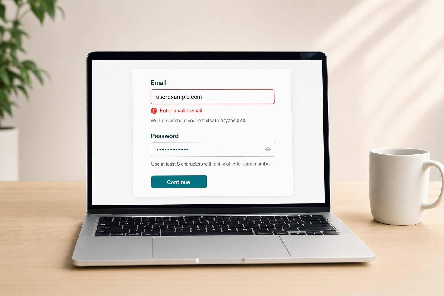
When a user makes a mistake, the error message should help them fix it right there in the form. A vague message like "Invalid input" doesn't help much. A specific message like "Enter a valid work email" tells them exactly what to change. That keeps people moving instead of making them stop, guess, or start over.
WCAG-Aligned Implementation
Use inline errors plus an error summary. Put inline messages next to the field that failed, and add an error summary at the top of the form that lists every issue that needs attention. Label that summary "Errors" and link each item to its field. Add anchor links inside the summary so users can jump straight to each problem field without hunting for it.
Then tie each message to the field so assistive tech can read it in context. Connect each error message to its field with aria-describedby, and set aria-invalid="true" on any input that fails validation.
Screen Reader Compatibility
Accessible validation only works when users can find the error, understand it, and fix it without leaving the field. When aria-describedby is set the right way, a screen reader announces the label first, then the input type or value, then the error message when the user focuses on the field.
One more thing: keep Submit enabled so users can trigger validation. If users can't submit the form, they also can't trigger the feedback they need to fix the problem.
Clear User Guidance
Never rely on color alone to show an error. A red border by itself isn't enough for users with color blindness or low vision. Pair visual cues with clear error text every time.
| Pattern | What Works | What Fails |
|---|---|---|
| Error association | aria-describedby linking text to input |
Error text placed near input with no programmatic link |
| Error state | aria-invalid="true" |
Red border or icon only |
| Error message copy | "Enter a valid work email" | "Invalid input" or "Error" |
| Error summary | Heading with "Errors" + links to fields | Generic "Form has errors" with no navigation |
Keep inputs mounted during re-renders so focus does not reset.
Once users can recover from errors, visibility becomes the next barrier.
4. Use Sufficient Color Contrast
If people can't read labels, instructions, or error messages, the form is still broken.
WCAG-Aligned Implementation
WCAG AA calls for a 4.5:1 contrast ratio for standard form text and 3:1 for large text. This applies to text smaller than 18pt (24px) regular or 14pt (18.66px) bold. When contrast is too low, people scan more slowly and make more input mistakes, especially on mobile or in bright light.
Use placeholder text only for format hints.
Clear User Guidance
Use text along with icons or labels. Never rely on color by itself to show required, optional, error, or success states. Add (required) or (optional) in the label, and treat icons as backup, not the main signal.
Readable text does more of its job when the form is also set up the right way for assistive technologies.
5. Structure Forms for Assistive Technologies
Clear labels and error messages help, but they won't save a form if the markup doesn't give assistive tech the right structure. HTML structure is what tells screen readers and keyboard users what's going on. A form can look neat on the page and still be confusing under the hood. When the markup is off, people lose context fast.
This is where native HTML, semantic grouping, and a predictable focus order matter most.
WCAG-Aligned Implementation
Start with native HTML elements: <form>, <label>, <input>, <select>, <button>, <fieldset>, and <legend>. These elements already give browsers and assistive tech the semantics they need, with no extra patchwork.
Use native grouping and control semantics first. Save ARIA for cases where HTML alone can't do the job.
Group radio buttons and checkboxes with <fieldset> and <legend> so screen readers announce the shared question once instead of forcing users to piece it together field by field.
Screen Reader Compatibility
ARIA can help, but it should support proper HTML structure, not replace it. Don't use aria-label instead of a visible <label>. A visible label also helps people with low vision and cognitive disabilities who need to see the field's purpose while typing.
Custom widgets need manual keyboard handling, focus handling, and ARIA setup. That's a lot to get right, and they often fail in screen readers.
Keyboard-Only Usability
Custom widgets can also trap keyboard users when they don't expose native focus behavior.
The table below sums up the most common markup failures and how to fix them.
Quick Reference Table: Common Form Accessibility Problems and Fixes
Most form accessibility issues come back to the same handful of mistakes. So if you're doing a quick audit, this table gives you a solid place to start for the five problems covered above.
| Common Problem | Fix | Markup |
|---|---|---|
| Placeholder-only fields | Use a visible, permanent <label> element |
Link the label to the input with matching for and id attributes |
| Color-only error states | Add clear text-based error messages | Use aria-describedby to connect the error text to the field; set aria-invalid="true" |
| Div-based custom controls | Use native HTML elements | Use <button> for actions; use <input type="checkbox"> or <input type="radio"> for selections |
| Ungrouped radio buttons | Wrap related options in a semantic group | Use <fieldset> to contain the group and <legend> for the shared question |
| Broken keyboard tab order | Match DOM order to the visual layout | Remove any positive tabindex values; rely on natural document flow |
| Missing error context | Link error text to the field | Use aria-describedby with the error element’s id |
Conclusion
Accessible forms make it easier for people to finish what they started. When you cut friction, more users complete the form.
These five practices work as a set. Skip one, and the experience gets rough fast.
"Treat accessibility defects as production risks in revenue, onboarding, hiring, support, and compliance forms."
Before you publish any form, do a quick audit. Check that every field has a visible label that’s tied to the input in code. Move through the full form with ONLY your keyboard. Trigger a validation error and make sure the message is specific and tells the user what to do next. Test your colors with a contrast checker. Then confirm your HTML uses native elements and ARIA attributes where needed.
Audit labels, keyboard flow, errors, contrast, and semantic structure before launch.
FAQs
How do I test a form with only a keyboard?
Unplug your mouse and move through the form with the Tab key. The tab order should match the way the form appears on the page, and every interactive element should have a clear, visible focus state.
Test every field, button, and error message with the keyboard alone. You should be able to move through the form without getting stuck or losing track of where you are. If focus skips items or jumps around the page, the tab order is probably off.
When should I use ARIA in a form?
Use native HTML form controls whenever you can. They already carry the right meaning and tend to work well with assistive tech.
Bring in ARIA only when plain HTML can’t provide the function or meaning you need. For more advanced forms, like multi-step flows or conditional routing, Reform helps you keep accessibility in place without building a lot of custom code.
What makes an error message accessible?
An accessible error message should say what went wrong and explain it in plain text as soon as an input error is found. That gives users, including people with cognitive or visual impairments, a clear path to fix the issue.
The message also needs to be tied to the form field itself, such as with aria-describedby. And the field should be marked with aria-invalid="true".
Related Blog Posts
Get new content delivered straight to your inbox

The Response
Updates on the Reform platform, insights on optimizing conversion rates, and tips to craft forms that convert.


Drive real results with form optimizations
Tested across hundreds of experiments, our strategies deliver a 215% lift in qualified leads for B2B and SaaS companies.
