
.webp)
Best Practices for Klaviyo Form Timing and Placement


Want to boost your email and SMS sign-ups? Timing and placement are everything. Display your forms too early, and they’ll annoy visitors. Wait too long, and you might lose them. Using multi-step forms can also help by making the process feel less overwhelming. The key is aligning form timing and placement with user behavior to maximize engagement.
Here’s what you need to know:
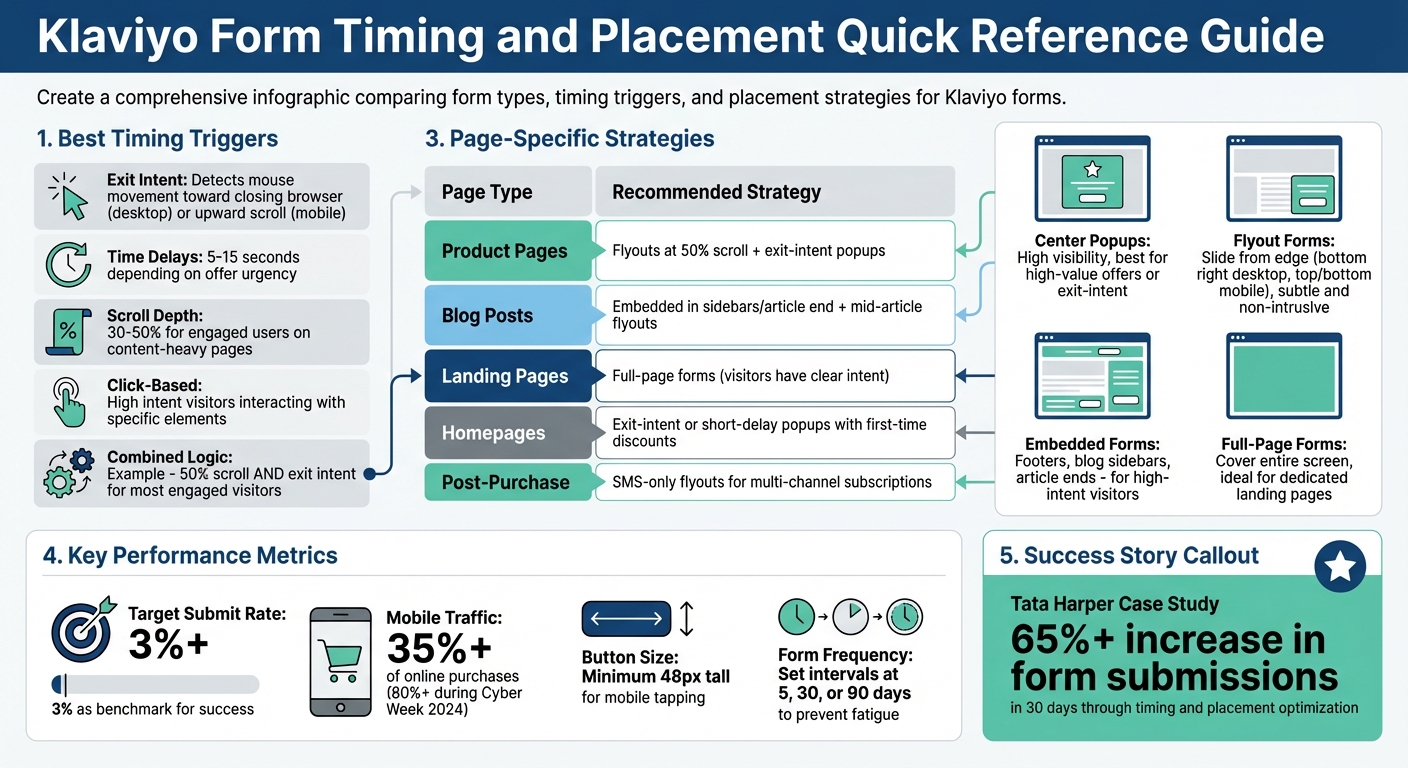
- Timing Tips: Use triggers like exit intent, time delays (5–15 seconds), or scroll depth (30–50%) to show forms at the right moment.
- Placement Strategies: Center popups grab attention, flyouts are subtle, and embedded forms work well on blog sidebars or product pages.
- Prevent Fatigue: Limit how often forms appear and avoid showing the same offer to returning users.
- Targeting Specific Users: Segment audiences based on behavior or cart contents to show relevant forms.
- Track Performance: Measure submit rates, revenue impact, and A/B test variations to refine results.
Example: Skincare brand Tata Harper tested form timing and placement, boosting submissions by over 65% in 30 days. Follow these strategies to grow your subscriber list without annoying visitors.
Klaviyo Form Types: Timing Triggers and Placement Strategies Comparison
Optimize Form Display Timing with Klaviyo AI for Higher Conversions
sbb-itb-5f36581
How to Time Your Forms Correctly
Timing is everything when it comes to displaying forms. Show them too early, and users might feel overwhelmed. Show them too late, and you risk missing the moment of engagement. The key is understanding your users and finding that sweet spot.
Analyzing User Intent and Behavior
Start by observing how visitors interact with your site. Are they scrolling through your content or bouncing off quickly? For instance, a scroll depth of 30% to 50% often signals that users are engaged. Similarly, the time spent on a page can guide your timing decisions. If you're delivering a critical message, displaying the form within 1–2 seconds might be ideal. For less urgent offers, a delay of 5–15 seconds works better. Another indicator of interest is when users browse three or more unique pages during their visit.
Best Triggers for Displaying Forms
Here are some effective triggers to consider:
- Exit Intent: Detect mouse movement toward closing the browser tab on desktop or upward scrolling on mobile.
- Time Delays: Set delays between 5–15 seconds, depending on the urgency of your offer.
- Scroll Depth: Great for content-heavy pages, where users reaching 50% of the page are likely engaged.
- Click-Based Triggers: Ideal for visitors who show high intent by interacting with specific elements.
You can also combine triggers using "AND" logic. For example, you might set a form to appear only when a user scrolls 50% of the page and shows exit intent. This ensures you’re targeting your most engaged visitors.
Preventing Form Fatigue
Even with perfect timing, overloading users with long, static forms can backfire. To maintain a seamless experience, adjust frequency settings. For example, limit how often forms appear by setting intervals like 5, 30, or even 90 days. Additionally, forms should disappear after a user submits them to avoid redundancy.
Another option is to use teasers. These are small, unobtrusive widgets that users can click to open the form whenever they’re ready. Teasers typically appear about 2 seconds after the page loads, giving users a choice in how they engage.
For mobile users, timing adjustments are essential. Because mobile visits are often quicker, longer delays or exit-intent triggers are better suited to match their browsing habits. This approach also helps avoid penalties for intrusive forms while you design the perfect landing page form.
Where to Place Forms on Different Page Types
The placement of forms on a webpage can significantly impact how users interact with them. It's not just about where they appear but also how they align with the purpose of the page. A visitor on your homepage has a different mindset than someone actively exploring a product page or reading a blog post.
High-Performing Form Positions
Some form positions consistently grab attention, but they need to be used thoughtfully:
- Center popups: These grab attention immediately. They’re highly visible but can interrupt browsing, so they work best for high-value offers or exit-intent scenarios.
- Flyout forms: These slide in from the screen's edge - commonly the bottom right on desktops or docked to the top or bottom on mobile. They’re subtle and allow users to continue browsing.
- Banner forms: Horizontal bars at the top or bottom of a page, offering constant visibility for promotions without blocking content.
- Embedded forms: Perfect for specific sections like footers, blog sidebars, or the end of articles. These are ideal for visitors with higher intent.
- Full-page forms: Covering the entire screen, these are most effective on dedicated landing pages where capturing user information through multi-step engagement is the main goal.
The key is to align these forms with the goals of each page.
Matching Placement to Page Goals
The effectiveness of a form depends on how well it fits with the purpose of the page and the visitor's intent:
- Product pages: Use flyouts triggered when users scroll halfway down the page to offer assistance or discounts. Exit-intent popups can help capture users before they leave.
- Blog posts: Embedded forms work well in sidebars or at the end of articles, allowing passive collection without disrupting the reading flow. Mid-article flyouts can re-engage readers without being overly intrusive.
- Landing pages: Full-page forms are ideal here since visitors often arrive with a clear intent tied to the campaign or offer.
- Homepages: Exit-intent or short-delay popups can work well, especially when paired with a first-time discount offer.
- Post-purchase or thank-you pages: SMS-only flyouts can encourage recent buyers to join multi-channel subscription lists.
With mobile devices accounting for over 35% of online purchases in the US, it’s crucial to optimize mobile forms. Dock flyouts to screen edges and ensure buttons are at least 48px tall for easy tapping .
Matching Timing with Placement
Getting the timing and placement of your forms right is key to keeping users engaged without annoying them. When these two elements work together, they can significantly boost conversions. For instance, a popup that appears the moment someone lands on a page might feel pushy. But if the same popup is triggered based on user behavior - like when they show exit intent - it feels more natural and helpful. Simply put, your timing should complement the placement, and vice versa.
Take a center popup on a product page as an example. To make it effective, you could use multi-condition logic: trigger it only after a visitor scrolls 50% of the page and then shows exit intent. This way, it targets shoppers who are genuinely interested, not just casual browsers. On the other hand, a docked flyout on mobile works best with a short delay - say, 15 seconds - because it’s subtle and doesn’t interrupt the experience.
Top-performing brands on Klaviyo often hit form submission rates above 3% by fine-tuning these elements. This thoughtful pairing lays the groundwork for more advanced tactics, like using conditional logic to make forms even more relevant.
Using Conditional Logic for Dynamic Forms
Klaviyo offers a feature that allows you to set forms to appear only when all selected conditions are met. This ensures forms show up at the right time, for the right audience, and avoid redundancy. For example, you can require a visitor to stay on your site for at least 15 seconds and scroll 30% of the page before displaying a flyout. Or, you can show a full-page form exclusively to visitors who land on your site through a specific Facebook ad campaign.
You can also hide forms from returning users who are already in your Klaviyo database or from specific audience segments, preventing them from seeing the same welcome offer repeatedly. For Shopify stores, forms can even be triggered based on cart contents. For example, you could display a free shipping offer when a cart’s value exceeds $75, tailoring the message to fit the shopper’s current behavior.
Example: Combining Timing and Placement
To make the most of these dynamic options, you can create configurations that seamlessly engage users. For instance, place an embedded form at the end of an article to passively collect leads, and pair it with an exit-intent popup that appears when a reader is about to leave. This strategy captures both those who finish the content and those who are on the verge of exiting.
For mobile users, a teaser-triggered docked flyout works wonders. The teaser shows up after two page views, letting visitors decide when to engage. Once clicked, the full form slides in from the bottom of the screen. This approach keeps forms visible without risking SEO penalties for intrusive interstitials. Julie Hayes, a former Klaviyo team member, highlights the value of this approach:
Setting a loading or scrolling delay creates a better experience for your visitors that's both less intrusive and disruptive. Exit intent forms in particular have been shown to perform really well for this reason.
Targeting Specific Users with Forms
Once you've nailed the timing and placement of your forms, the next step is making sure they reach the right audience. With Klaviyo, you can target specific visitor groups based on their behavior, profile details, and engagement history. This ensures you're not bombarding existing subscribers with redundant offers while delivering relevant messages to new visitors.
Segmenting Your Audience
Klaviyo offers precise targeting options, giving you full control over who sees your forms. For example, if you're running a welcome popup with a first-time discount, you can configure it to "Don't show to existing Klaviyo profiles" to avoid showing it to current subscribers. On the other hand, if you're trying to grow your SMS list, you can set the form to "Show to email subscribers only", encouraging your email audience to join your text messaging channel.
You can also fine-tune targeting using list and segment inclusions, URL-based rules, and UTM parameters. For instance, you might exclude members of your main customer list from promotional popups to avoid "form fatigue" among your most loyal shoppers.
Klaviyo's predictive segments take this a step further. You can trigger forms based on metrics like "Expected Date of Next Order", offering discounts or incentives when a customer is likely ready to shop again. Similarly, Customer Lifetime Value predictions allow you to tailor offers - like exclusive perks for high-value customers or smaller incentives for lower-value ones. Location-proximity segments let you promote local events or store openings to visitors within a specific area, such as a 30-mile radius. And for cart-based targeting, you can set up forms to appear when a Shopify cart hits a certain value - say, offering free shipping for orders over $75.
These segmentation tools lay the groundwork for more personalized and effective forms.
Customizing Forms Based on User Data
Once you've segmented your audience, the next step is customizing your forms to align with individual user characteristics. Data like location, device type, and traffic source can help you create highly personalized forms that drive conversions. For example, if you're running a multi-channel campaign, you can use hidden fields (like a $source field) to track where a subscriber signed up. This insight helps you identify which placements are bringing in the most valuable leads.
Device-specific customization is another way to improve form performance. If your analytics show that mobile submit rates lag behind desktop, try creating simplified form designs for mobile users to reduce friction on smaller screens. Similarly, location-based customization allows you to adjust language, currency, or offers depending on a visitor's geographic location.
For multi-step forms, consider capturing an email address on the first page and asking for SMS consent on the second. This way, even if a user doesn't provide their phone number, you've still secured their email. You can also target users who engage with your content but haven't made a purchase yet, triggering a form with a tailored incentive to encourage their first transaction. Additionally, identifying "chronic soft bounced" profiles through segmentation helps you maintain email deliverability by excluding them from your form targeting.
It's worth noting that advanced targeting features depend on Klaviyo's tracking cookies. Visitors who clear cookies or browse in incognito mode will be treated as new and anonymous users. For Shopify stores operating in the EU, EEA, UK, and Switzerland, Klaviyo may require explicit visitor consent to track onsite events or apply certain targeting rules.
Tracking and Improving Form Performance
When your forms go live, the work doesn’t stop there. Keeping an eye on their performance and making adjustments based on data is crucial. Klaviyo offers detailed analytics that go beyond simple view counts, helping you understand how users interact with your forms and the value they bring to your business.
Metrics to Track
Once you’ve fine-tuned timing and placement, it’s time to measure how well your forms are performing. Start with the submit rate - this shows the percentage of viewers who actually complete your form. For popups and flyouts, aim for a submit rate of 3% or higher. Klaviyo even provides a benchmark status (Poor, Fair, Good, or Excellent) to compare your results with similar businesses over the past three months.
Pay attention to "Viewed Form" to gauge your reach and use the "Step Funnel" to see where users drop off. If people are abandoning partway through, it might be a sign to simplify your form or optimize your multi-step form design.
Revenue-related metrics are just as important as list growth. Keep track of "Total Revenue", "Orders", and "Average Order Value (AOV)". These numbers tell you whether your forms are attracting valuable customers or just discount-seekers. Adjust lookback windows (from 15 minutes to 24 hours) to tie form submissions to purchases.
For A/B testing, focus on metrics like "Win Probability" (how likely a variation is to outperform the control) and "Submit Rate Lift" (the percentage improvement). Use "Unique Views" and "Unique Submits" to avoid inflated data caused by repeat visitors.
| Metric | What It Measures | Why It Matters |
|---|---|---|
| Submit Rate | Submissions ÷ Views | Key indicator of form effectiveness |
| Step Funnel | Completion rate for each form step | Pinpoints where users lose interest |
| Total Revenue | Revenue linked to form submissions | Tracks monetary value of leads |
| Win Probability | Likelihood a variant beats the control | Helps determine success in A/B tests |
| Unique Views | Individual users who saw the form | Prevents skewed data from repeat views |
Testing Different Timing and Placement Options
Once you’ve established baseline metrics, use A/B testing to refine your forms. Test one variable at a time - if you change both timing and incentives at once, it’ll be hard to pinpoint what caused the improvement.
For example, when experimenting with display timing (like a 5-second delay versus exit intent), use metrics like "Eligible Unique Views" and "Eligible Submit Rate" to ensure fair comparisons. These metrics focus on people who could have seen the form, making your results more reliable.
A great example comes from Tata Harper, a natural skincare brand. By systematically testing timing and placement, they improved their forms significantly. Alexandra Barlowe, DTC Email and SMS Marketing Director, shared:
"Our AI testing experience definitely made me excited to play with the other new Klaviyo AI features, because it was so hands-off and delivered immediate results."
For larger accounts (over 400,000 profiles), Klaviyo offers AI-driven optimization tests. These tests automatically experiment with time delays, exit intent, and scroll percentages to find the best-performing combination. Tests can run for up to 90 days or until the AI recommends a winning variation three times.
Using Analytics to Refine Your Approach
Turn raw data into actionable insights by breaking down performance by device type or UTM parameters. For example, if mobile submit rates lag behind desktop, consider designing simpler forms for smaller screens to reduce friction.
To streamline your workflow, create a "Forms Performance" card in Klaviyo’s Analytics Dashboard. Use the Overview tab for general metrics and the A/B test results tab to compare variations.
Take inspiration from baby boutique Caden Lane, which tested 30 popup variations on their website. By adding fields to learn whether shoppers were buying for a newborn or older child, they increased Klaviyo-attributed revenue by 157.3% year-over-year. This example highlights how personalization and testing go hand in hand to improve results.
During testing, avoid making changes until you reach statistical significance or gather enough data. Once a winner is clear, set your A/B tests to automatically apply the best variation, ensuring you maximize conversions for the rest of the test period.
Lastly, Klaviyo’s improved bot and crawler filtering, implemented on April 1, 2025, means you might notice fewer "Viewed Form" counts but more accurate submit rates. This ensures your metrics reflect real human behavior.
Key Takeaways
To get the most out of your Klaviyo forms, focus on strategies that align with visitor behavior and leverage data-driven optimizations.
Start by timing and placing forms strategically. A visitor casually reading a blog post isn’t as likely to convert as someone actively exploring product pages. As Jacob Sappington, Director of Strategy at Homestead Studio, puts it:
"With a user who's on your blog, a completely separate part of your website - do they have the same intent as someone who's actually on your website shopping? The answer is no."
Use tools like exit intent, 15-second delays, or scroll-depth triggers to time your forms effectively. For websites with heavy traffic - think 400,000 profiles or more - Klaviyo’s AI optimization can test different timing setups automatically, saving you the hassle of manual adjustments.
When testing, focus on one variable at a time, such as timing or placement. This way, you can pinpoint exactly what’s driving improvements. For instance, Tata Harper saw a 65% jump in form submissions in just 30 days through AI-backed testing.
Pay special attention to mobile users, who now dominate online traffic. During Cyber Week 2024, over 80% of traffic came from mobile devices. Mobile forms need specific adjustments, like disabling "click outside to close" to avoid accidental dismissals. Docked flyouts at the top or bottom of the screen can also make the experience smoother.
Lastly, track meaningful metrics, not just submission rates. Look at total revenue, average order value, and where users drop off in multi-step forms. High submission numbers mean little if they don’t translate into high-value customers.
FAQs
How can I choose the best trigger for my form?
To find the most effective trigger for your form, rely on data-driven strategies like AI testing. This approach helps determine the optimal timing and method for displaying your form.
Using behavior-based triggers - like monitoring cart contents or tracking specific page visits - can help you connect with users who are already engaged. Additionally, custom triggers, such as those based on time or specific events, allow for more personalized interactions.
By blending AI testing with behavioral insights and timing strategies, you can display forms in a way that resonates with your audience and maximizes engagement.
What form type works best on each page?
The most effective type of form depends on the page's purpose and how users interact with it. Pop-ups or flyouts are great for grabbing attention on landing pages or product pages, encouraging quick engagement. On the other hand, embedded forms are better suited for content-heavy pages, like blogs, where a seamless integration enhances the reading experience. For pages with a significant mobile audience, mobile-optimized forms are a must to ensure usability. Timing also plays a big role - forms triggered by exit intent or a short delay often yield better results, as they focus on visitors who are already engaged without interrupting their browsing.
How can I prevent repeat visitors from seeing the same form?
When using Klaviyo, you can prevent repeat visitors from seeing the same form repeatedly by enabling collision prevention. This feature ensures that forms don’t overlap or appear too frequently, creating a better experience for your audience.
You can choose from options like:
- Don’t show multiple forms at the same time: Ensures only one form appears at any given moment.
- Show only one form per session: Limits forms to one per browsing session.
- Show next form after a time delay: Adds a delay before showing another form.
These settings help keep your website clean and user-friendly.
Related Blog Posts
Get new content delivered straight to your inbox

The Response
Updates on the Reform platform, insights on optimizing conversion rates, and tips to craft forms that convert.


Drive real results with form optimizations
Tested across hundreds of experiments, our strategies deliver a 215% lift in qualified leads for B2B and SaaS companies.
