
.webp)
Checklist for Cross-Browser Integration Testing


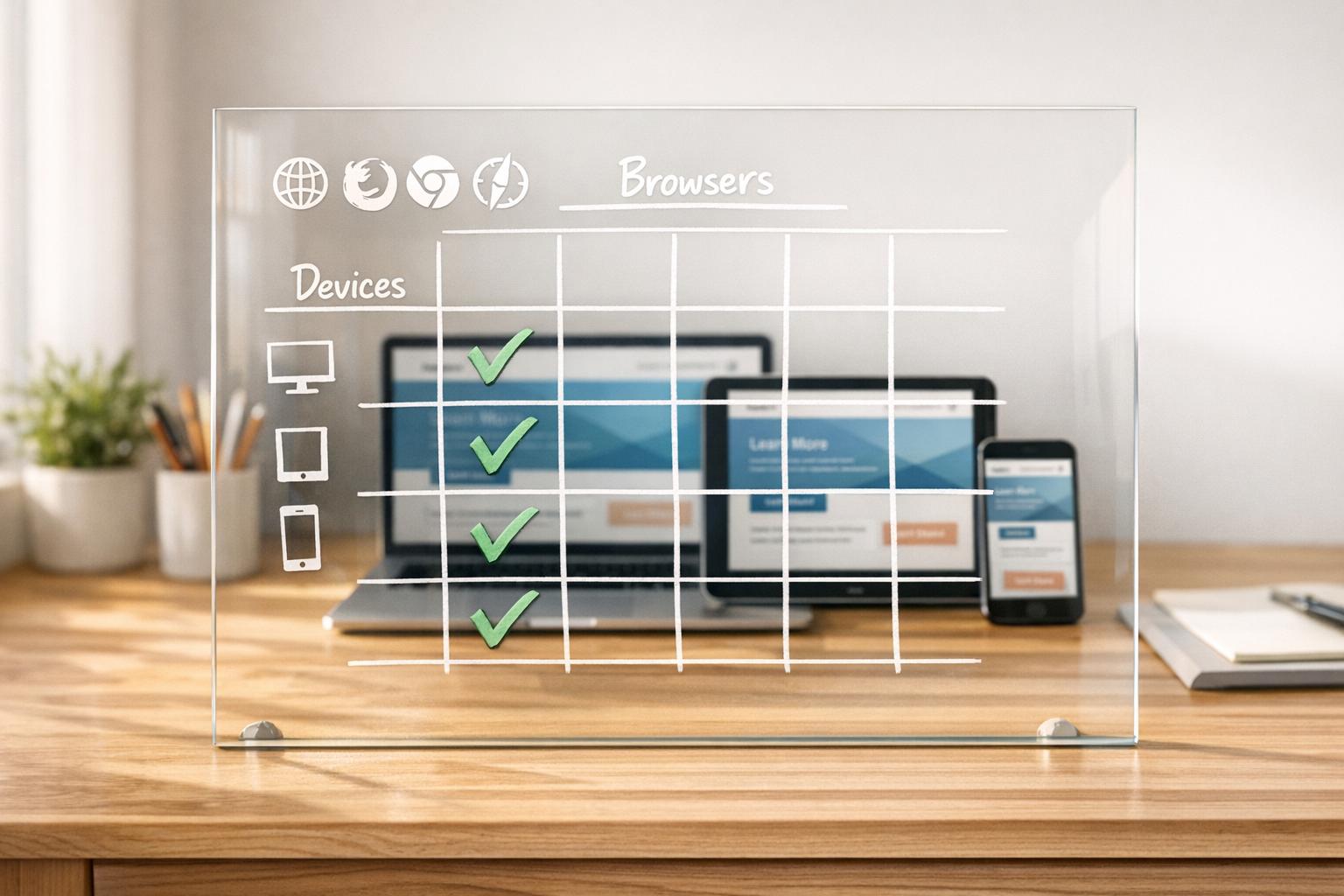
Cross-browser integration testing ensures your website works consistently across browsers, devices, and operating systems. Here's what you need to know:
- Why It Matters: Browsers interpret code differently. A site that works on Chrome might break on Safari, affecting user experience and revenue.
- Key Stats: Safari is expected to account for 25% of global mobile traffic by 2026. Neglecting major browsers risks losing users and damaging credibility.
- Tools to Use: Platforms like BrowserStack and automation frameworks like Selenium or Playwright simplify testing across thousands of browser and device combinations.
- Steps to Follow:
- Identify target browsers/devices (e.g., Chrome, Safari, Firefox).
- Create a testing matrix prioritizing setups based on traffic.
- Validate HTML, CSS, and JavaScript standards.
- Test forms, layouts, and dynamic content for consistency.
- Check performance under high traffic and responsiveness across screen sizes.
- Debug issues using browser developer tools and track bugs effectively.
Pro Tip: Automate repetitive tests within your CI/CD pipeline to catch issues early and save time. Manual testing is still necessary for complex workflows.
Takeaway: A well-executed cross-browser testing strategy ensures your website reaches the widest audience, avoids bugs, and maintains user trust.

Cross-Browser Testing Workflow: 6-Step Implementation Checklist
Preparation Steps for Cross-Browser Testing
Identify Target Browsers and Devices
Start by analyzing your web analytics to pinpoint the browsers, versions, and devices your audience uses most. A good rule of thumb is to apply the 80/20 rule - focus on the 3–5 browser and device combinations that account for 80% of your traffic. This usually ensures around 95% coverage overall. Typically, this means prioritizing the latest versions of Chrome, Safari, Firefox, and Edge across major platforms like Windows 10/11, macOS, iOS, and Android.
Tailor your focus based on the nature of your project. For example, B2B applications often see heavy usage of Edge and Chrome on Windows, while e-commerce platforms should emphasize mobile browsers, as mobile traffic often exceeds 60% in this space, often requiring impressive multi-step form design to maintain conversion rates. If your target audience is in specific regions, adjust your testing matrix accordingly. For instance, you might include UC Browser or Samsung Internet for markets in Asia.
Once you’ve identified the key platforms, create a testing matrix to guide your efforts.
Create a Testing Matrix
A testing matrix helps you map out browsers, devices, operating systems, and screen resolutions. For desktop testing, include major browsers like Chrome, Firefox, Safari, and Edge, all in their latest versions. For mobile, focus on Safari for iOS, Chrome for Android, and Samsung Internet. Don’t forget to factor in common resolutions like 1920×1080 for desktops, 1366×768 for laptops, 390×844 for smartphones, and 768×1024 for tablets.
To streamline your testing, use a tiered priority system:
- P0 combinations: High-priority setups tested on every build, such as Chrome on desktop, Safari on iOS, and Chrome on Android.
- P1 combinations: Secondary setups tested on every release, including browsers like Firefox and Edge.
- P2 combinations: Lower-priority setups for weekly smoke tests, such as Samsung Internet.
- P3 combinations: Rarely used browsers or legacy versions tested monthly or per release.
Keep in mind that all browsers on iOS, including Chrome and Firefox, rely on the WebKit rendering engine. This means testing Chrome on a desktop won’t replicate the Chrome experience on iOS.
Platforms like BrowserStack and LambdaTest provide access to thousands of real devices and browsers, making it easier to execute your testing plan.
Set Up Your Testing Environment
With your testing matrix ready, the next step is setting up an environment that supports it. Depending on your budget, you can choose between cloud platforms or physical devices. Cloud services like BrowserStack, LambdaTest, and Sauce Labs offer access to a wide range of browser and OS combinations without the hassle of maintaining physical devices.
For mobile testing, prioritize real devices over emulators. Real devices capture nuances like touch gestures, soft keyboard behavior, and actual rendering performance that emulators might miss. If your testing involves internal or staging environments behind firewalls, tools like BrowserStack’s local testing feature can securely handle these scenarios.
Finally, automate your testing process by integrating tools like Playwright, Selenium, or Cypress. Connect these frameworks to your CI/CD pipeline using platforms like GitHub Actions. This setup allows you to run cross-browser tests automatically with every pull request or merge, helping you catch issues before they reach production.
sbb-itb-5f36581
Core Cross-Browser Integration Testing Checklist
Validate HTML, CSS, and Script Standards
Make sure every page includes a proper DOCTYPE to avoid quirks mode. Use the W3C Markup Validation Service to catch issues like open tags, nesting errors, or other syntax problems that might disrupt rendering.
For CSS, validate your styles with the W3C tool. Automate vendor prefixing using autoprefixer with a browserslist, and leverage @supports queries to detect browser capabilities for modern properties like gap or subgrid. This ensures better fallback handling compared to relying on browser version assumptions.
When it comes to JavaScript, prioritize runtime feature detection for built-in APIs like fetch, Map, or Intl instead of relying on user-agent sniffing. Configure @babel/preset-env with useBuiltIns: "usage" to include only the polyfills your project needs. This keeps your bundle light while maintaining compatibility.
"Cross-browser incompatibilities are the single most common cause of last‑minute regressions that hit production." - Stefanie, Compatibility Tester, beefed.ai
If you encounter layout issues, isolate the problem by progressively disabling sections of your CSS or JavaScript. Once your code is validated, check that rendered layouts behave consistently across different browsers.
Check Layout and Design Consistency
Ensuring visual consistency means testing how each rendering engine interprets your styles. Be mindful of default browser styles - Chrome, Safari, Firefox, and Edge apply different margins, padding, and borders to elements like form controls. Use DevTools to compare "Computed" and "Author" styles, identifying where user-agent stylesheets might be overriding your design.
Pay attention to spacing, alignment, and typography across browsers. Keep in mind that Chrome on iOS uses WebKit instead of Blink, so testing on desktop Chrome won't reveal iOS-specific rendering issues.
Test Form Functionality and Submission Flows
Once code standards and visual consistency are confirmed, focus on interactive elements like forms. Check that fields and labels align properly across screen sizes, and ensure dropdown menus display all options. Test both client-side and server-side validations to confirm consistent error messaging and required field checks.
Monitor the browser console for JavaScript errors, such as uncaught TypeErrors or missing functions, that could silently disrupt form submissions. Use the Network panel to verify that submissions return a 200 status code and aren't blocked by CORS or Content Security Policy restrictions. For multi-step forms or conditional logic, ensure smooth transitions and proper functionality across browsers.
Don't forget to test keyboard navigation and touchscreen responsiveness on real devices. Virtual keyboards on mobile browsers can sometimes interfere with form layouts.
Verify JavaScript and Dynamic Content
After static validations, dynamic content needs rigorous testing as well. Ensure animations, transitions, and interactive components work as expected without errors. Keep an eye on the console for warnings about deprecated APIs or missing features that could lead to failures.
Check that AJAX calls complete successfully and update the DOM dynamically. Confirm that event listeners trigger correctly and that any third-party JavaScript libraries are compatible with your target browsers. Use feature detection to address API support gaps instead of assuming uniform browser capabilities.
Test Third-Party and Plugin Integrations
Finally, verify that all external integrations function smoothly alongside your custom code. Ensure external scripts load properly and that APIs are compatible across your browser matrix. For hardware-dependent APIs like Geolocation, WebRTC, or Clipboard API, test on real devices to catch issues that might not appear in desktop environments.
Validate that media players and embedded content support the necessary codecs for each browser. Also, confirm that SSL certificates work correctly across all targeted browsers.
| Integration Component | Verification Method | Risk Level |
|---|---|---|
| JavaScript APIs | Feature detection and Polyfills | High |
| Third-Party Plugins | Functional testing across browser matrix | High |
| Media Codecs | Format support validation (HLS/DASH) | Medium |
| Web APIs (WebRTC/Geo) | Real device testing on cloud platforms | Medium-High |
| SSL/Security | Certificate validation per browser version | High |
Use tools like CSS.supports() or check for API existence before executing third-party code. Employ services like polyfill.io or core-js to provide fallbacks for missing features. Integrate these tests into your CI/CD pipeline to catch issues early, avoiding integration failures in production.
Cross Browser Testing - Ultimate Guide (Start to Finish) [With Checklist]
Performance and Responsiveness Testing
These tests ensure your application performs well and remains responsive across various devices and traffic scenarios.
Measure Page Load Times and Network Performance
Browser developer tools are your go-to for spotting network-related bottlenecks. Open the Network panel in Chrome, Firefox, Safari, or Edge to identify delays caused by specific assets like images, scripts, or third-party integrations. For broader testing, tools like Selenium, Cypress, or Puppeteer can automate performance checks across multiple browser setups simultaneously. Pay extra attention to mobile performance since differences in hardware and browser engines can create noticeable disparities compared to desktop experiences.
Evaluate navigation speeds between pages, ensuring that CSS, HTML, and XHTML follow standards to avoid rendering delays. Check that images are served in optimal resolutions and that audio and video formats are compatible with your target browsers to prevent loading issues.
Once performance metrics are in place, confirm that visual adjustments remain consistent across devices.
Verify Responsive Design Across Screen Sizes
Ensure that fonts, images, and spacing look consistent across different screen sizes. For example, test how your site appears on a 390×844 iPhone 12 screen versus a 393×851 Pixel 5 display. Also, test mobile-specific interactions like swipe, pinch, and long press gestures to confirm they function correctly.
Pay close attention to how layouts adapt when switching between portrait and landscape orientations or when the virtual keyboard appears on mobile devices. Issues in these areas can reveal spacing problems not visible on desktops. Safari users should be cautious with elements styled using 100vh, as the browser's URL bar can interfere with height calculations. Visual regression testing can be a lifesaver here - capture baseline screenshots and compare them pixel-by-pixel against updated versions. Mask dynamic elements like timestamps or user avatars to avoid false-positive mismatches during these tests.
After responsiveness checks, test how your application handles heavy traffic.
Test Performance Under High Traffic
Simulate high-traffic scenarios to assess how well your application handles stress across different browsers. Cloud-based platforms make it easy to run parallel sessions at scale without needing additional infrastructure. Incorporate CI/CD matrix builds to automatically run cross-browser tests with every pull request. This approach helps detect performance issues early in the development cycle. Additionally, use test sharding to divide your test suite among multiple parallel runners, significantly cutting down execution time while ensuring your app delivers quick feedback even under heavy loads.
Reporting and Debugging Issues
When documenting a bug, include precise metadata: browser name, version, operating system, device type, device pixel ratio (DPR), viewport size, and active feature flags. Use tools like navigator.userAgent and screen.devicePixelRatio to gather this information. Clear documentation can make the difference between a quick resolution and drawn-out troubleshooting.
"A bug report missing exact versions is a reproducibility blocker." - Stefanie, Compatibility Tester
Accurate reporting ensures that every issue is properly captured and resolved efficiently.
Debug Using Browser Developer Tools
Browser DevTools are indispensable for identifying compatibility issues. Start with the Elements panel and switch to the "Computed" view to check the final values of CSS properties. This helps you identify if a user agent stylesheet is overriding your styles. Use the console to test feature support with CSS.supports('property', 'value') or check for missing JavaScript APIs using typeof fetch === 'function'. The Network tab is another critical tool, revealing CORS preflight failures, blocked resources, or HTTP errors like 4xx and 5xx that might only occur in specific browsers. To eliminate stale assets as a cause, enable "Disable cache" and perform a hard reload.
For deeper insights, the Rendering tab highlights repaints and layout shifts, while the Performance panel can uncover forced synchronous layouts that slow rendering. When narrowing down the root cause, selectively disable parts of your CSS or JavaScript in DevTools until the issue vanishes, pinpointing the problematic code.
Track and Log Bugs
A well-organized bug report should include a clear, descriptive title (e.g., "Checkout button misaligned in Safari 14.1 on macOS 11"), detailed reproduction steps, and supporting artifacts like screenshots, screencasts, DOM snapshots, HAR files, and performance traces. To make debugging easier, create a minimal reproducible case by removing third-party scripts and unrelated CSS, then share it via CodePen or a simplified project link.
Categorize bugs based on their failure type - examples include feature support gaps, user agent stylesheet overrides, subpixel rounding errors, or missing JavaScript functionality. Tag each bug by its business impact and assign priority levels, ranging from P0 (critical blockers, like a broken checkout flow) to P3 (minor visual inconsistencies). If you add a browser-specific workaround, document it in your codebase and link to the relevant browser engine bug tracker (e.g., bugs.webkit.org) to help future maintainers understand its purpose.
"Track the fix in the same commit where you add the regression test. That closes the loop and prevents future regressions." - Stefanie, Compatibility Tester
Use Visual Comparison Tools
Visual regression testing is great for catching layout shifts and rendering issues that might escape manual inspection. Capture baseline screenshots and compare them pixel-by-pixel with updated versions. To avoid false positives, mask dynamic elements like timestamps or user avatars. Since screenshots can vary between operating systems (e.g., Linux CI vs. macOS development machines), use CI-generated baselines as your source of truth to ensure consistency. Schedule nightly compatibility tests across your browser matrix to catch regressions caused by updates to dependencies like polyfills or build tools.
Conclusion
Cross-browser testing isn't just a technical step - it's a critical part of ensuring your business reaches its full potential. With Chrome dominating about 65% of the desktop market, Safari driving roughly 25% of global mobile traffic, and Edge holding around 12% of desktop users, overlooking any major browser could mean alienating large sections of your audience. Imagine a form that doesn't work in Safari or a checkout process that fails in Firefox - these issues can lead to frustrated users and lost revenue.
"Cross-browser testing is one of the most overlooked aspects of web quality assurance -- and one of the most costly to ignore." - QASkills.sh
The checklist covered here - from validating HTML and CSS to testing forms, optimizing performance, and debugging - serves as a guide to ensure a seamless experience across browsers and devices. Concentrate on the 3–5 browser and operating system combinations that account for 80% of your traffic, rely on feature detection instead of browser sniffing, and integrate testing into your CI/CD pipeline to catch issues before they impact users.
Pay extra attention to critical touchpoints like forms and navigation. A broken lead form or checkout flow due to a browser-specific bug can cost you users instantly. Tools like Reform demonstrate how rigorous cross-browser testing ensures that multi-step forms, conditional routing, and integrations function smoothly - whether users are on Chrome for Windows, Safari on iOS, or Edge on a Surface tablet.
A balanced approach is key: automate repetitive regression tests to save time, but don't skip manual testing for complex workflows that automation might overlook. By sticking to these practices and focusing on the browsers that matter most to your audience, you'll not only improve user trust but also safeguard your business's success.
FAQs
How do I choose which browsers and devices to test first?
Begin with the most widely used browsers, such as Chrome, Safari, Firefox, and Edge, along with popular devices like iOS and Android smartphones and Windows and macOS desktops. To make testing more targeted, leverage tools like Google Analytics to find out which browsers and devices your audience uses most frequently. This approach lets you focus on what matters most, ensuring a smoother experience for the majority of your users.
When should I automate cross-browser tests vs. test manually?
Automating cross-browser testing is a smart move for handling repetitive tasks like regression or smoke testing, particularly when you need to test across multiple browsers and devices. Automation offers faster feedback, enables parallel execution, and ensures consistent coverage of critical features.
On the other hand, manual testing shines when it comes to exploratory testing, visual inspections, or evaluating subtle aspects of the user experience. It’s especially useful for testing new features, complex UI interactions, or browser-specific behaviors that automation tools may struggle to handle effectively.
What’s the fastest way to debug a bug that only happens in one browser?
To quickly tackle a browser-specific bug, your best friend is the browser's developer tools. These tools let you inspect layouts, styles, and console logs to pinpoint the problem. Start by looking for rendering differences, JavaScript errors, or compatibility issues. Often, the root cause lies in CSS inconsistencies, unsupported features, or timing differences between browsers. Use devtools to check for visual misalignments, broken functionality, or error messages - this approach streamlines the debugging process.
Related Blog Posts
Get new content delivered straight to your inbox

The Response
Updates on the Reform platform, insights on optimizing conversion rates, and tips to craft forms that convert.


Drive real results with form optimizations
Tested across hundreds of experiments, our strategies deliver a 215% lift in qualified leads for B2B and SaaS companies.
