
.webp)
How Error Messaging Impacts Form Completion Rates


Error messages can make or break your online form's success. Clear, specific feedback improves user experience and boosts form completion rates by up to 40%, while vague or poorly placed messages frustrate users and lead to high abandonment rates. Here's what works:
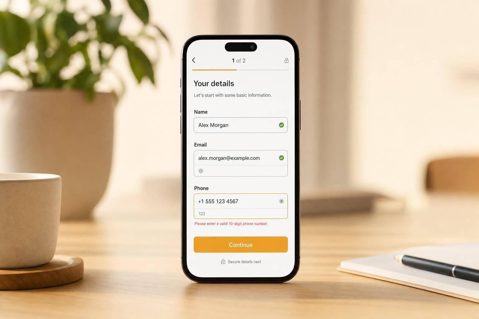
- Be specific: Replace "Invalid input" with actionable guidance like, "Phone number must be 10 digits."
- Place messages wisely: Position errors near the problematic field (right side for desktop, below for mobile).
- Use a neutral tone: Avoid blame with phrases like, "Oops! Your password doesn't meet the requirements."
- Time feedback effectively: Validate inputs after users leave a field or with a slight delay (300–500ms).
Research shows that inline validation reduces error rates by 22% and shortens completion time by 42%. Tools like Reform help by offering real-time validation, tailored messaging, and analytics to refine forms and cut abandonment by nearly a quarter. Clear error messaging isn’t just user-friendly - it directly impacts your bottom line.

Impact of Error Messaging and Inline Validation on Form Completion Rates
Core Principles of Effective Error Messages
Clear and Specific Messages
Vague error messages are a common and frustrating mistake. When users encounter messages like "Invalid input" or "Error occurred", they’re left guessing what went wrong. Research reveals that only 2% of websites use "Adaptive Error Messages" tailored to specific issues.
Specificity makes all the difference. For instance, a generic message such as "Invalid Phone Number" leaves users to figure out the issue, while a more precise message like "Phone number is too short - please enter 10 digits" provides clarity and actionable guidance. Edward Scott, a research lead at Baymard Institute, emphasizes this point: "The content of the error message itself is vital to user's ability to quickly recover from the error and get back on track".
The most effective error messages follow a straightforward formula: identify the issue, explain why it’s a problem, and provide a clear solution. For example, instead of saying, "Invalid email", use something like, "Email is missing an @. Add an @ and domain. Example: name@domain.com". This approach eliminates confusion and helps users resolve errors quickly.
But crafting clear content is only part of the equation - placement is just as important.
Inline and Contextual Placement
Placement of error messages plays a critical role in usability. The closer an error message is to the relevant field, the easier it is for users to address the issue. Inline validation - placing messages directly next to the problematic field - helps users recognize errors immediately, reducing mental effort.
For desktop interfaces, error messages work best when placed to the right of the field. On mobile, positioning them below the field is more effective. Avoid placing error messages at the top of the form, a common issue in multi-step form design, as this forces users to scroll back and forth, leading to higher error rates and lower satisfaction.
Timing also matters. Displaying errors as users type can be distracting and frustrating. Instead, wait until they exit the field (blur event) or introduce a slight delay of 300–500ms before showing the message.
Once placement and clarity are addressed, the tone of the message becomes the next key consideration.
Neutral and Helpful Tone
The tone of error messages should never make users feel blamed or judged. Words like "invalid", "illegal", or "failed" can come across as accusatory and create unnecessary tension. Rachel Krause from Nielsen Norman Group highlights this:
"When users make errors, it's not their fault. Errors highlight flaws in your design".
For example, instead of saying, "You entered an invalid password", reframe it as, "Oops! Your password doesn't meet the requirements." Using inclusive language like "we" instead of "you" can also soften the message, such as, "We couldn’t process this" or "We ran into a small problem." This shifts the focus away from blame and toward collaboration, making the experience feel more supportive.
That said, while a friendly tone can be helpful, it’s crucial to avoid humor in serious contexts like payment forms or identity verification. A lighthearted message that works on a 404 page might feel dismissive when users are handling sensitive tasks. Instead, aim for a tone that’s supportive, straightforward, and focused on guiding users toward the solution.
sbb-itb-5f36581
Inline Validation: Best Practices and Results
When to Show Validation Messages
Timing is everything when it comes to inline validation. Building on the importance of clear messages and proper placement, the key focus here is when to deliver feedback. Showing errors too early - like flagging an email as invalid before the "@" symbol is typed - can interrupt the user's flow and cause unnecessary frustration. This premature feedback often feels intrusive and unhelpful.
A better approach? Trigger validation when the user leaves a field (on blur) for general inputs like names or addresses. For fields with specific formats, such as email or phone numbers, adding a slight delay of 300–500ms before validating can make a big difference. Once an error message appears, keep validating with every keystroke so users see the error disappear as soon as their input is corrected. This immediate confirmation makes the process smoother and more intuitive.
By following these timing strategies, you can significantly enhance the overall form experience.
Performance Data from Studies
Inline validation doesn’t just improve the user experience - it delivers measurable results. Studies show that forms using inline validation achieve a 22% higher success rate compared to traditional models that rely on submitting and refreshing the page. Even better, real-time feedback can reduce form completion times by up to 42%.
But the benefits don’t stop there. Users report a 31% boost in satisfaction when forms provide real-time guidance, and error rates drop by 22% during form completion. Eye-tracking studies also reveal a 47% reduction in the number of eye fixations, showing that these forms are easier to navigate and understand visually. Despite these clear advantages, around 31% of e-commerce sites still don’t implement any inline validation.
These statistics highlight just how impactful inline validation can be in improving both user satisfaction and form performance. It’s a simple yet powerful way to make forms more effective and user-friendly.
Practical Ways to Improve Error Messaging
Visual Indicators and Accessibility
Don't rely only on color to communicate errors. With around 350 million people worldwide affected by color-vision deficiency, depending solely on red text or borders can leave some users in the dark. Pair color changes with icons - like an exclamation mark - or clear text labels to ensure everyone can identify the issue. To make errors stand out, use high-contrast red text, bold formatting, and colored borders around the problematic field. A thick red vertical line next to the error-prone section can also be highly effective [6, 16].
Error message placement matters too. While many systems position messages below the input field, placing them above prevents them from being hidden by virtual keyboards on mobile devices or browser autofill overlays [6, 16, 5]. For accessibility, use aria-invalid="true" to programmatically flag errors and aria-describedby to link error messages to the input field for screen readers. For longer multi-step forms, include a summary of all errors at the top of the page, with anchor links that direct users to the specific fields needing correction [1, 16, 5].
Clarity is key. Avoid vague error messages like "Invalid email." Instead, be precise: "Email is missing an '@' symbol". Research shows that 98% of websites use generic error messages, which can frustrate users and lead to delays - sometimes taking up to five minutes to fix simple issues like signing in.
Once you’ve established strong visual cues, the next step is to analyze error patterns to refine your design.
Testing and Iteration
Track every validation error. Use analytics to uncover common patterns and scenarios where users frequently stumble. As Rachel Krause from NNGroup notes:
"Errors highlight flaws in your design".
Focus your improvements on two critical metrics: how often an error occurs and how likely it is to cause users to abandon the process. Start by addressing the most frequent errors with adaptive, specific messaging. For example, create 4–7 tailored error messages for complex fields like email addresses or credit card numbers to cover different input mistakes. If a user encounters the same error multiple times - say, three or more - offer additional help, such as a link to support or more detailed instructions.
Clear messaging combined with data-driven testing can significantly reduce user frustration. But there’s more you can do to prevent errors before they even happen.
Using Autofill and Field Suggestions
Multi-step forms with autofill and field suggestions can increase form completion rates by 30–40%. Integrate tools like address validators that provide accurate suggestions as users type, helping avoid errors in shipping and billing information. Surprisingly, nearly half (47%) of websites still don’t offer this feature.
Input masking is another simple yet effective approach. For example, guide users to enter phone numbers in the correct format automatically. Similarly, for credit card fields, format spaces to match the layout on the physical card - something 80% of websites overlook, even though it reduces "invalid number" errors. Use placeholder text to show examples of valid input, like "e.g., john@example.com", but keep the field label visible to avoid confusion. These small adjustments can significantly cut down validation errors.
How Reform Supports Better Error Messaging
Real-Time Validation and Conditional Routing
Reform makes error messaging more effective by using real-time validation to provide immediate feedback during form completion. Instead of waiting until the user submits the form, Reform checks inputs as they’re entered. For example, it shows a green checkmark when an email address is formatted correctly or flags an issue - like a missing "@" symbol - right away.
This proactive approach helps reduce form abandonment and improve lead form conversion. Traditional forms often face challenges like low completion rates (around 35%) and data errors, with roughly 20% of captured leads containing formatting mistakes or incomplete information. Reform’s real-time validation has been shown to improve form completion rates by 20–30% and reduce data errors by as much as 80%.
Conditional validation takes this a step further by tailoring the form to the user. For instance, if someone selects "Individual" instead of "Business", fields like "Company Name" or "Tax ID" are hidden, making the form shorter and less prone to errors. This streamlined approach minimizes unnecessary friction and ensures users only see relevant fields. The goal is to create a seamless experience where users complete forms accurately without extra effort.
Once inputs are validated in real time, Reform enhances data accuracy further with precise email validation.
Email Validation and Spam Prevention
Reform’s email validation catches common errors as users type. If someone types "gmail.co" instead of "gmail.com", the platform identifies the typo and suggests a correction instantly. It also blocks disposable email addresses by using honeypot techniques to detect bots - no need for frustrating CAPTCHAs.
To combat spam, Reform’s system identifies suspicious activity, like rapid-fire submissions from bots, and prevents multiple entries from the same user in a short period. This ensures a smooth experience for real users while keeping unwanted submissions out of your database.
With these tools in place, Reform doesn’t just stop at fixing errors - it also helps you refine your forms through advanced analytics.
Analytics for Ongoing Improvement
Reform’s real-time analytics provide insights to continuously improve your forms. The platform tracks where users make mistakes or abandon the form, highlighting problem areas. This data helps you adjust error messages, tweak validation timing, or redesign specific fields to better meet your audience’s needs.
Reform offers reporting over 31-day periods, allowing you to spot trends and measure how changes impact performance. By analyzing this data, you can fine-tune your forms to deliver a better experience and higher-quality results over time.
How to Design Good Error Messages: The Root Problem of Bad Error Messages
Conclusion
Error messaging plays a critical role in whether users complete or abandon forms. Research shows that inline validation reduces completion time by 22% and increases success rates by 10%. Additionally, clear, actionable feedback can prevent users from quitting - 27% of people abandon processes they find too complex.
Here’s what works:
- Specific error messages: Clearly explain the issue and how to fix it. For example, "Email addresses need an @ symbol. Example: you@company.com".
- Inline validation: Allow users to correct mistakes immediately instead of confronting multiple errors after submission.
- Neutral, helpful tone: Guide users without assigning blame or causing frustration.
By implementing these strategies, you can cut form abandonment by 22% and increase completion rates by 30% to 40%.
Tools like Reform make this process easier. With features like real-time validation, email verification, and conditional routing, Reform ensures error messaging aligns with best practices. Its analytics identify where users struggle, allowing you to refine your forms for better performance. Combining these insights with proven design principles helps create forms that not only convert more visitors but also provide a seamless user experience.
FAQs
When is the best time to display an error message?
The best moment to show an error message is right after the user interacts with a field and makes a mistake. Displaying the message directly next to the specific field keeps things clear, minimizes confusion, and allows users to fix errors quickly and easily.
Where should error messages go on desktop vs. mobile?
Error messages on desktop should ideally be shown inline with the problematic fields. This approach reduces the mental effort needed to identify and fix errors. Another option is placing them at the top of the form, though this may require users to match errors back to specific fields.
For mobile, the best practice is to display error messages directly below the affected fields. This aligns with the natural vertical reading flow on smaller screens, making it easier for users to spot and address issues.
How can I track which form errors cause drop-offs?
Understanding where users abandon your form is key to improving its completion rates. By analyzing user behavior, you can pinpoint the exact moments where things go wrong. Tools like Reform are particularly helpful - they track user interactions and create visual representations of drop-off points, making it easier to spot trouble areas.
On top of that, form analytics software can reveal which fields are causing the most friction. These insights allow you to address specific issues, streamline the form, and ultimately encourage more users to complete it.
Related Blog Posts
Get new content delivered straight to your inbox

The Response
Updates on the Reform platform, insights on optimizing conversion rates, and tips to craft forms that convert.


Drive real results with form optimizations
Tested across hundreds of experiments, our strategies deliver a 215% lift in qualified leads for B2B and SaaS companies.
