

Landing Page Forms: Above vs. Below Fold


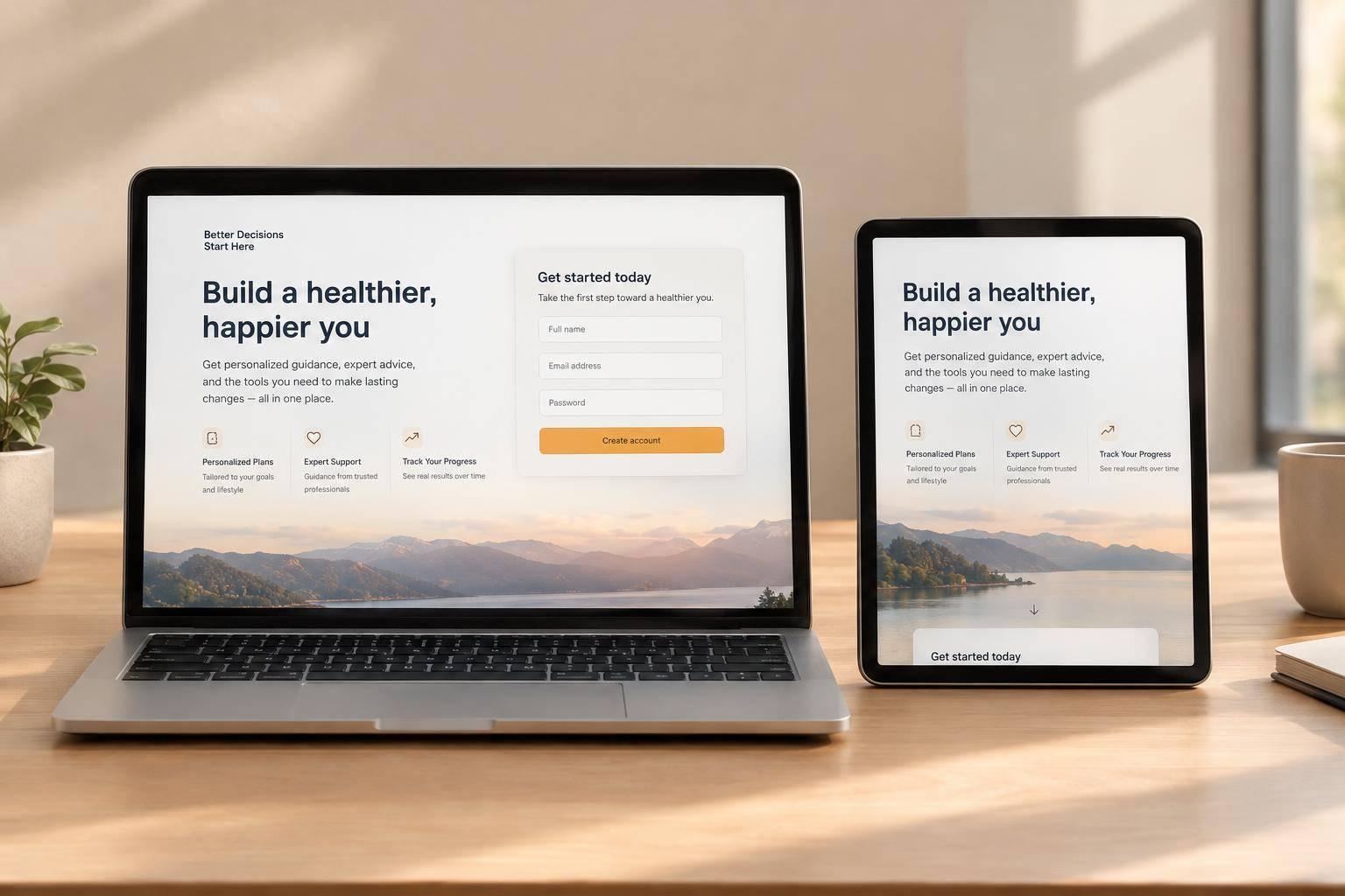
Place the form above the fold when visitors are ready to act. Put it below supporting content when they need more explanation or proof. A newsletter signup may need little context; a SaaS demo may need details about pricing, fit, and next steps. In these complex cases, multi-step forms often outperform static ones by reducing perceived friction.
The choice depends on the offer, visitor intent, traffic source, form length, and commitment - not placement alone.
Quick Comparison
| Factor | Above the fold | Below the fold |
|---|---|---|
| Access | Visible without scrolling | Requires scrolling; add an early jump-to-form CTA |
| Offer | Simple and familiar | Needs explanation or proof |
| Visitor intent | Ready to sign up or request | Still researching or comparing |
| Traffic | Branded search or informed email visitors | Cold social or display visitors |
| Form and commitment | Clear request with little perceived risk | Detailed or sensitive requests needing context |
Test for qualified leads, not just submissions. Keep the offer and form the same, change only placement, and check both mobile and desktop. Plan the sample size and test duration before launch; 80% power is a common testing convention, not a promised conversion gain.

Landing Page Forms: Above vs. Below the Fold
Above vs. Below the Fold: Pros and Cons
The fold depends on the device. A form that appears above the fold on desktop may sit below it on mobile, so check both layouts. Neither placement wins by default.
The tradeoff comes down to visibility, context, and the risk that visitors miss the form.
| Factor | Above-the-fold form | Below-the-fold form |
|---|---|---|
| Visibility | Visible immediately within the viewport | Visitors must scroll to reach it |
| Room to explain value | Less space before the ask; copy must stay concise | More room for benefits, proof, and objections |
| Feels like a bigger ask | Can feel too soon when trust is low | Added context can help justify the ask |
| Risk of missing the form | Lower when the entire form is visible | Higher if visitors leave before reaching it |
Above the Fold: Give Ready Visitors Immediate Access
Above-the-fold forms make it easier for visitors who are ready to convert to take action, especially when they arrive from high-intent traffic.
Newsletter subscriptions, free resources, and straightforward free trials suit this approach when the value is easy to explain.
Make the headline, required fields, and submission button easy to scan with impressive multi-step form design.
Visibility does not build trust. New visitors may hesitate when a form requests sensitive details without explaining why. Place relevant reviews or other trust signals near the request, and don't let the form crowd out the offer’s value.
If the offer needs more explanation, place the form lower on the page.
Below the Fold: Explain the Offer Before Asking
Complex SaaS demos and sales consultations can benefit from supporting content before the form.
Start with the benefit, follow with proof, then address objections. Each section should help visitors decide whether the offer is worth their time before asking them to fill out the form.
Give ready visitors an early CTA that jumps to the form. For everyone else, use descriptive subheads that make it easy to scan for the information they need.
Next, choose placement based on offer complexity, visitor intent, and traffic source.
sbb-itb-5f36581
Choose Placement by Offer, Intent, and Traffic Source
Treat these conditions as starting hypotheses, not rules. When signals conflict, focus on what visitors still need to understand.
| Factor | Favors above the fold | Favors below the fold |
|---|---|---|
| Offer complexity | Value is simple and easy to understand | Benefits, risks, or process need explanation |
| Visitor intent | Ready to request or sign up | Still researching or comparing options |
| Traffic source | Branded search, high-intent paid search, or retargeting | Cold social, display, or broad prospecting |
| Form length | Few fields with an obvious purpose | Detailed questions that need explanation |
| Required commitment | Little time, cost, or obligation | Payment, sensitive information, or a large time commitment |
Start with how much you’re asking visitors to commit.
Assess Offer Complexity and Visitor Commitment
Judge the commitment, not the field count.
A short form for an unfamiliar, expensive service can still feel risky.
Explain the scope, cost, and next step before asking for details. A longer form can work earlier for highly qualified visitors who already understand the value and why you need the information.
Review each required field alongside what the submission button promises. If visitors must share sensitive information or commit to a consultation, show relevant proof and set clear expectations before the request. If they already understand the offer, don’t make them scroll through explanations they don’t need.
Use Traffic Source to Estimate Visitor Intent
Channel suggests readiness, but doesn’t prove it. Check the search query, ad promise, referring page, and audience’s relationship with your business to judge how much context visitors need before the form.
Retargeting someone who abandoned a conversion is different from retargeting someone who only browsed.
| Traffic source | Likely readiness | Initial placement hypothesis |
|---|---|---|
| Branded search | High | Above the fold if the offer is already understood |
| High-intent paid search | High | Above the fold with brief context |
| Nurture email | Moderate to high | Above the fold when the email has already explained the offer |
| Referrals | Moderate | After a short introduction |
| Retargeting | High | Above the fold or early in the scroll for previous visitors |
| Cold social | Low | Below supporting content |
| Display | Low | Below educational content |
| Broad prospecting | Low to mixed | Below an explanation of value and fit |
When visitor intent differs sharply by channel, use source-specific pages. Test each starting layout against qualified conversions.
Test Form Placement for Qualified Conversions
Use what visitors know, how complex the offer is, and how much commitment it requires to form one measurable placement hypothesis. Randomly split eligible visitors between two variants.
| Variant | Placement | Hypothesis | Controlled elements | Success metrics |
|---|---|---|---|---|
| A | Above the fold | Immediate access helps ready visitors become qualified leads | Same offer, fields, messaging, design, validation, routing, and follow-up | Primary: qualified leads per eligible visitor. Secondary: submissions, completion, abandonment, and sales outcomes |
| B | After supporting content | Context before the form improves qualified conversions | Same as A; only placement changes | Same metrics and definitions as A |
Check desktop and mobile layouts before launch. Make sure headers, cookie notices, and lazy loading don’t hide the form. Test keyboard access, labels, validation, confirmation screens, analytics, and the CRM handoff.
Measure Submission Rates and Lead Quality
Once both variants are live, check whether placement changes qualified leads - not just submission counts.
Before collecting results, define an eligible visitor, a form start, and a qualified lead. Count the first field interaction as the start event. Track submissions per eligible visitor, completion among visitors who start the form, and abandonment among starters. Use the same attribution and qualification windows for both variants. When data is available, connect records to sales acceptance, opportunities, closed-won deals, and revenue.
Before launch, set the primary metric, minimum detectable effect, required sample per variant, test duration, and stopping rule. A common planning convention is a 5% two-sided significance level and 80% power, based on the page’s own baseline rate. Run the test across normal weekday and weekend behavior, and give leads time to qualify.
Don’t stop just because one variant takes an early lead or the planned end date arrives. Review source and device segments only when sample sizes support those comparisons. Test changes to offers or form length separately.
Build and Track Form Variants With Reform
With the test plan set, use Reform to build both variants with the same form copy, validation, routing, and filters. Control random assignment and placement on the page, then use analytics and CRM integrations to connect variant IDs to lead outcomes.
Conclusion: Choose a Placement and Test It
Place the form early when intent is high and visitors understand the offer. Put it below the fold when they need more explanation, proof, pricing, or reassurance. Keep a clear CTA near the top that jumps to the form, so ready visitors can act without reading the whole page.
Complexity and commitment matter more than field count, which is why a multi-step form can help manage longer requests. Tell visitors what they’ll receive, what information they’ll need to share, and what happens after they submit.
Treat your placement as a starting point, not a fixed rule. Compare results by device and channel only when sample sizes are large enough. Favor the version that brings in qualified leads and downstream sales - not just more submissions.
FAQs
Should I repeat my form on a long landing page?
Yes. Placing your form above and below the fold lets visitors act when they’re ready, without scrolling back to the top. Supporting content gives them a chance to build trust before filling it out.
With Reform, you can embed forms at multiple points on your page.
What if my offer is complex but visitors are ready to act?
For complex offers, placing the form below the fold often works best. It gives visitors context and shows the offer’s value before they commit. For visitors ready to act, multi-step forms keep things moving by breaking the process into smaller steps.
Reform’s conditional routing and progressive profiling help you ask only for details that matter to each visitor, keeping the process efficient.
How can I test placement with low traffic?
When traffic is low, use A/B testing to compare big placement changes, not small tweaks. Test placement alone - such as above versus below the fold - to see what works for your audience.
Use real-time analytics to see how users interact and guide your adjustments. With Reform, track abandoned submissions to find where visitors drop off in your form.
Related Blog Posts
Get new content delivered straight to your inbox

The Response
Updates on the Reform platform, insights on optimizing conversion rates, and tips to craft forms that convert.

Drive real results with form optimizations
Tested across hundreds of experiments, our strategies deliver a 215% lift in qualified leads for B2B and SaaS companies.
