
.webp)
Best Practices for Form Instructions


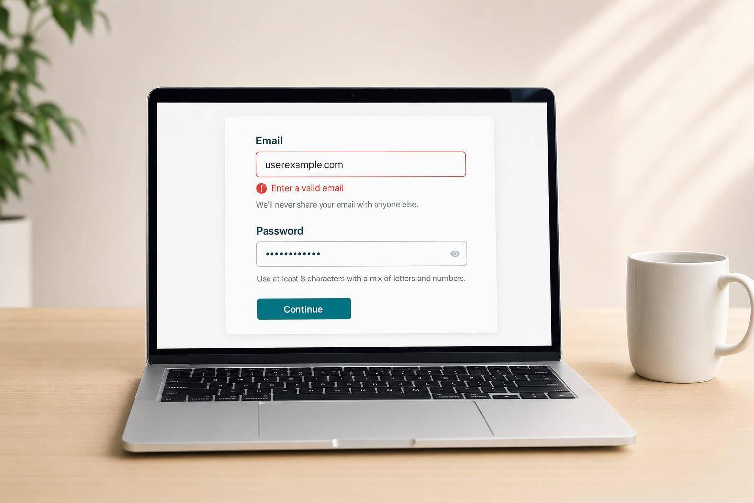
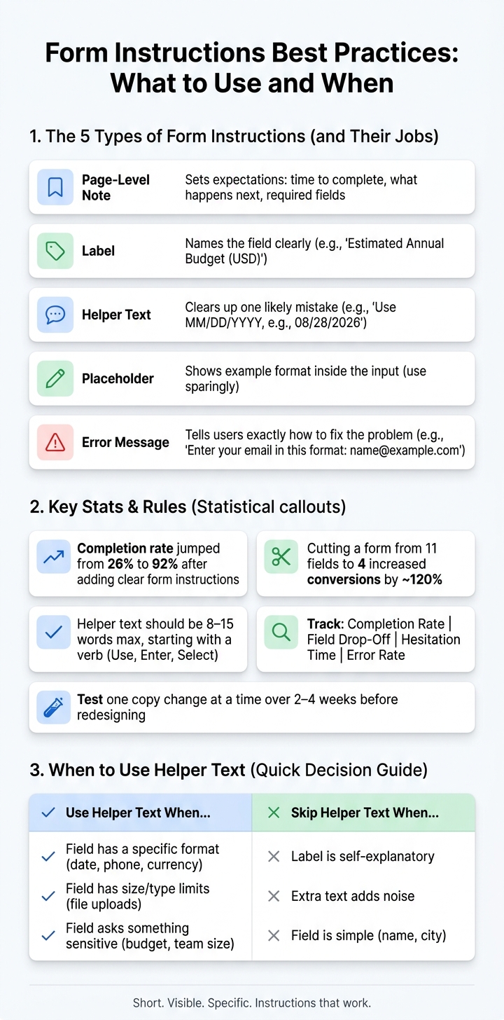
Clear form instructions can cut errors, lower drop-off, and improve lead quality. In one case, adding helpful hints moved completion from 26% to 92%. I’d keep it simple: use a short note at the top, place help next to the field, explain sensitive asks, write direct error messages, and track where people pause or quit.
If I had to sum up the whole article in a few points, it would be this:
- Give each instruction one job: page note, label, helper text, placeholder, or error message
- Keep directions where people need them: near the field, not far away
- Use helper text only when it stops likely mistakes
- Explain private questions like budget, revenue, team size, or phone number
- Show exact formats for dates, phone numbers, currency, and file uploads
- Write error messages that tell people how to fix the problem
- Don’t rewrite a bad field before asking if it should exist, or if multi-step forms beat static ones for your use case
- Measure completion rate, field drop-off, hesitation time, and error rate
- Test one copy change at a time before changing the full form
Here’s the core idea: short, visible, specific instructions work better than long explanations. A label should name the field. Helper text should clear up one point. Error text should say what went wrong. And if a field needs too much explanation, I’d question the field before I touch the copy.
A few examples make the point fast:
-
Phone number
Label: Phone number
Help: Enter a U.S. number, e.g., (555) 123-4567. -
Budget
Label: Estimated annual budget (USD)
Help: A ballpark is fine. We use this to suggest the right plan. -
Date
Help: Use MM/DD/YYYY, e.g., 08/28/2026. -
File upload
Help: Max 10 MB; accepted types: PDF, DOCX, PNG.
If I were reviewing a form today, I’d check four things first:
| Area | What I’d look for | Good sign |
|---|---|---|
| Labels | Does every field have a clear visible name? | Short, plain labels |
| Helper text | Is it only used where mistakes are likely? | One-line guidance |
| Error handling | Does each message say how to fix the issue? | Specific inline errors |
| Form length | Are there fields that don’t need to be there? | Fewer required fields |
Bottom line: if users know what to enter, why you need it, and what happens next, forms feel easier to finish and the data tends to come in cleaner.
Form Instructions Best Practices: What to Use and When
UX Design Best Practices for Forms: How to Prevent Error Messages
sbb-itb-5f36581
Place Instructions Where Users Expect to See Them
Once each instruction has a clear job, put it where people will notice it first. Placement matters just as much as wording. A short note at the top sets the stage. Then field-level help should sit right beside the input.
Add One Short Set of Rules at the Top of the Form
Start with a brief note that covers time, follow-up, and required fields. For example: This form takes about 2–3 minutes to complete. We'll use your answers to recommend the right plan and email you within 1 business day. All fields are required unless marked optional.
That kind of opening does a simple but important job. It tells people how long the form will take, what happens next, and which fields they need to fill in. Use plain, direct language. Skip marketing copy and legalese.
After that, keep the rest of the help close to the field it explains.
Keep Field-Specific Guidance Next to the Field
Format instructions should sit directly below the label, between the label and the input. That spot keeps the guidance in view while the person is typing. For example, use Phone number with helper text: Enter a U.S. number, e.g., (555) 123-4567.
This shows the format before someone starts typing, which can cut down on mistakes in the data you collect. It also helps people move through the form with less second-guessing. Programmatically linking helper text to the field with aria-describedby makes sure screen readers announce it with the label and input - a basic but critical accessibility step.
Repeat Critical Guidance in Multi-Step Forms
Multi-step forms need repeated guidance so people don't lose context as they move from one screen to the next. Add a short step heading, a progress indicator such as Step 2 of 3, and one or two sentences of step-specific help at the top of each step.
For example: Step 2: Project details - Share your timeline and budget so we can match you with the right team.
That small bit of repeated context helps users stay oriented without needing to backtrack.
Use Helper Text Only When It Prevents Mistakes
Once placement is handled, the next move is restraint. Helper text should appear only when it helps someone avoid a likely mistake. If a field is easy to understand on its own, extra copy just adds noise.
Add Helper Text for Formats, Limits, and Sensitive Questions
Use helper text when a field has a clear, repeatable risk of error. In practice, three types of fields benefit most: format-sensitive fields, limit-constrained fields, and sensitive qualification fields.
For format-sensitive fields, show the exact pattern people should follow. A date field should read Use MM/DD/YYYY, e.g., 08/28/2026. A phone number field should read Use a U.S. number, e.g., (555) 123-4567. A revenue field should read Enter last year's revenue in whole dollars. That kind of direction stops errors that can break CRM imports and leave sales teams cleaning up bad data.
File uploads need the same level of clarity. State the file size cap and accepted file types right in the helper text: Max 10 MB; accepted types: PDF, DOCX, PNG. If someone uploads a file over the limit, the upload fails.
Sensitive qualification fields like annual budget, team size, and timeline also need helper text - but for a different reason. Here, users want to know why you're asking. A line like We use this to match you with the right plan. Enter your estimated annual budget in $USD. can reduce hesitation without adding friction. When budget or revenue questions show up with no explanation, drop-off often goes up.
Do Not Use Helper Text as a Replacement for Labels
Every field needs a clear, visible label. Helper text is secondary. It gives context; it does not name the field.
When teams use helper text to explain what a field is instead of how to complete it, two problems show up. First, accessibility suffers. Screen readers rely on explicit labels, and without them, users with disabilities may hear vague descriptions - or nothing useful at all. Second, people moving through a form often skip helper text when they're focused on typing, so buried instructions get missed.
A label like Work Email with helper text Use your work email so we can connect you with the right team works well because each part has a job. The label identifies the field. The helper text gives a reason that isn't obvious. Reverse that setup - say, a vague label with helper text like Enter your email address - and users lose that anchor.
Write Helper Text in One Line Whenever Possible
Keep helper text to one line whenever you can. If it takes two sentences to explain the field, that's usually a sign the field should be split into multi-step forms or moved to another step.
Start with a verb: Use, Enter, Select. Aim for 8–15 words that clear up one specific point of confusion. Enter revenue in whole dollars works. Please make sure to enter your total annual revenue figure in U.S. dollars in whole dollars doesn't.
Write Form Microcopy That Reduces Drop-Off
Good microcopy does three jobs fast: it tells people what to enter, why you need it, and what happens next. When those answers are clear, people move through a form with less second-guessing, even when a field feels personal or takes more effort.
Answer What to Enter, Why It Is Needed, and What Happens Next
For simple fields like name and email, a plain label is often enough. The bigger challenge starts with fields that feel private or annoying to fill out.
Take a phone number field. A label like Phone number can do the basic job, but helper text does the heavy lifting: We'll only call if we have questions about your quote. That small line explains the use and makes the ask feel less pushy.
The same approach works for qualification fields. If you ask for team size, helper text like We use this to recommend the right plan for your company. gives people a reason to cooperate. If you're asking for demo details, don't leave the field wide open. Guide the user with a direct prompt and one example: What should we focus on in your demo? Example: We need approvals for a 10-person team by October 15.
Right above or near the submit button, spell out the next step. A short line like We'll email you within one business day with your demo link. removes doubt at the last moment, which is often where people pause.
Use Clear Error Messages and Real-Time Validation
Even with strong labels and helper text, people can still get stuck. When that happens, error handling often decides whether they finish the form or leave.
Vague messages like Invalid input don't help. They force users to guess, and guessing is where drop-off happens. Use calm, specific error text in a single line. For example:
- Enter your email in this format: name@example.com.
- Enter a whole number in USD, e.g., 2500.
- Include area code, e.g., 415-555-0123.
Place each error message right under the field. And if an error appears, never wipe out what the person already typed. That's one of the fastest ways to turn a small mistake into frustration.
Real-time validation can help by catching problems while someone is typing or right after they leave a field, instead of waiting until they hit submit and face a hard stop. If someone enters an email without an @, inline validation can flag it at once. At the same time, helper text like We'll send your confirmation here reminds them why the format matters. Reform's email validation and spam prevention can stop bad submissions before they hit your CRM.
Remove Unnecessary Fields Before Rewriting Instructions
If a field needs a long explanation, that may be the real warning sign. The issue usually isn't the wording. It's the field.
Better copy won't fix a form that's too long. In a widely cited case study, cutting a contact form from 11 fields to 4 increased conversions by around 120%. Fewer fields also tend to improve data quality. Less required input means fewer mistakes and cleaner leads in your CRM.
Before you spend time rewriting microcopy for a weak field, stop and ask whether the field belongs there at all. A simple way to sort this out is to group fields into three buckets:
- critical
- helpful but optional
- nice-to-have
Start by removing the nice-to-have fields. Then look at the helpful-but-optional ones. In many cases, making them optional and adding a short reason is enough. If a field takes more than one line to defend, it's probably better placed in a later step or a follow-up. This is often best achieved through multi-step form design.
Measure Where Instructions Fail and Improve the Form
Once the form is simpler, the next step is to see which instructions still trip people up.
Track Completion Rate, Field Drop-Off, and Hesitation Time
Watch three signals: overall completion rate, field-level drop-off, and hesitation time per field.
Completion rate tells you how many people started the form and made it all the way to submission. Field-level drop-off gives you a closer look by showing the last field users saw before leaving. If one field has an odd drop-off rate, it needs a closer look. Hesitation time matters too. When someone pauses for a long time without typing, that often points to confusion, uncertainty, or plain old distraction. That’s a good sign the field copy needs work, or that the question belongs somewhere else.
Read those signals together. That’s where the pattern starts to show.
- High hesitation + high error rate usually means the instructions aren’t clear.
- High drop-off + normal hesitation often means the question feels too personal or annoying. People understand it, but they don’t want to answer it.
If a field is underperforming, test the instruction first before you touch the full layout.
Test Instruction Changes Before Redesigning the Whole Form
Use those signals to test one field at a time instead of reworking the whole form.
Start with the smallest edit you can make. Rewrite one fuzzy label. Add one line of helper text to the field with the highest drop-off. Change one generic error message into something specific. Then track the same metrics for 2–4 weeks and see what changed.
For example, if a "Budget" field leads to long pauses, changing Budget to Estimated annual budget (USD) clears up two common points of confusion: the time period and the level of precision. Adding helper text like A ballpark is fine - this helps us recommend the right plan can make the question feel easier to answer. If a phone number field has a high error rate, spelling out 10-digit US number, including area code and adding real-time validation can lower invalid entries without changing the form structure at all.
If drop-off piles up around one section, break that section into steps. Reform makes this easier. Its multi-step form setup shows completion data by step, so you can spot exactly where people leave. Pair that with conditional routing, and you can keep sensitive or detailed questions out of the main flow, showing them only to leads who meet certain criteria.
When one edit lifts completion or cuts errors, keep it, then test the next field.
Conclusion: Keep Instructions Short, Visible, and Measurable
The main rule is simple: instructions work best when they sit right next to the field, say what they need to say in one plain line, and show up only when they stop a real mistake.
Top-of-form rules should be short and used sparingly. Helper text should answer a clear question, not echo the label. Error messages should tell people exactly what to fix. And every instruction change should tie back to something you can measure, like completion rate, field drop-off, and lead quality, so each update is based on what users do, not guesswork.
FAQs
How do I know if a field needs helper text?
Use helper text when a field might make people pause. It should answer the small questions that slow them down: What format do you want? Why do you need this? What are the rules? Keep it short, tied to the field, and easy to spot.
For example, helper text can:
- show the right phone number format
- explain how the data will be used or handled
- spell out password rules
Before adding helper text, make sure the field label itself is clear and specific. A good label does a lot of the work on its own.
What should I do if one field causes most drop-off?
Use the Three Ds: delete the field if it isn’t needed, delay it until after the first conversion, or explain why you need it.
If a field has to stay, look for confusing input rules like phone number formatting or password requirements. Add real-time validation with specific feedback, and use Reform’s analytics to spot hesitation, corrections, and other friction points.
How can I make form instructions accessible?
Follow WCAG 2.1 so instructions stay short, easy to scan, and readable with screen readers. Use native HTML form controls, and give each field a clear, descriptive label instead of relying on placeholders alone.
Put instructions next to the field they apply to, and link them with aria-describedby when needed. Reform can help with accessibility features like ARIA labels, focus management, and color contrast that meets WCAG needs.
Related Blog Posts
Get new content delivered straight to your inbox

The Response
Updates on the Reform platform, insights on optimizing conversion rates, and tips to craft forms that convert.



Drive real results with form optimizations
Tested across hundreds of experiments, our strategies deliver a 215% lift in qualified leads for B2B and SaaS companies.
