
.webp)
Mobile Form Design: Insights from Recent Studies


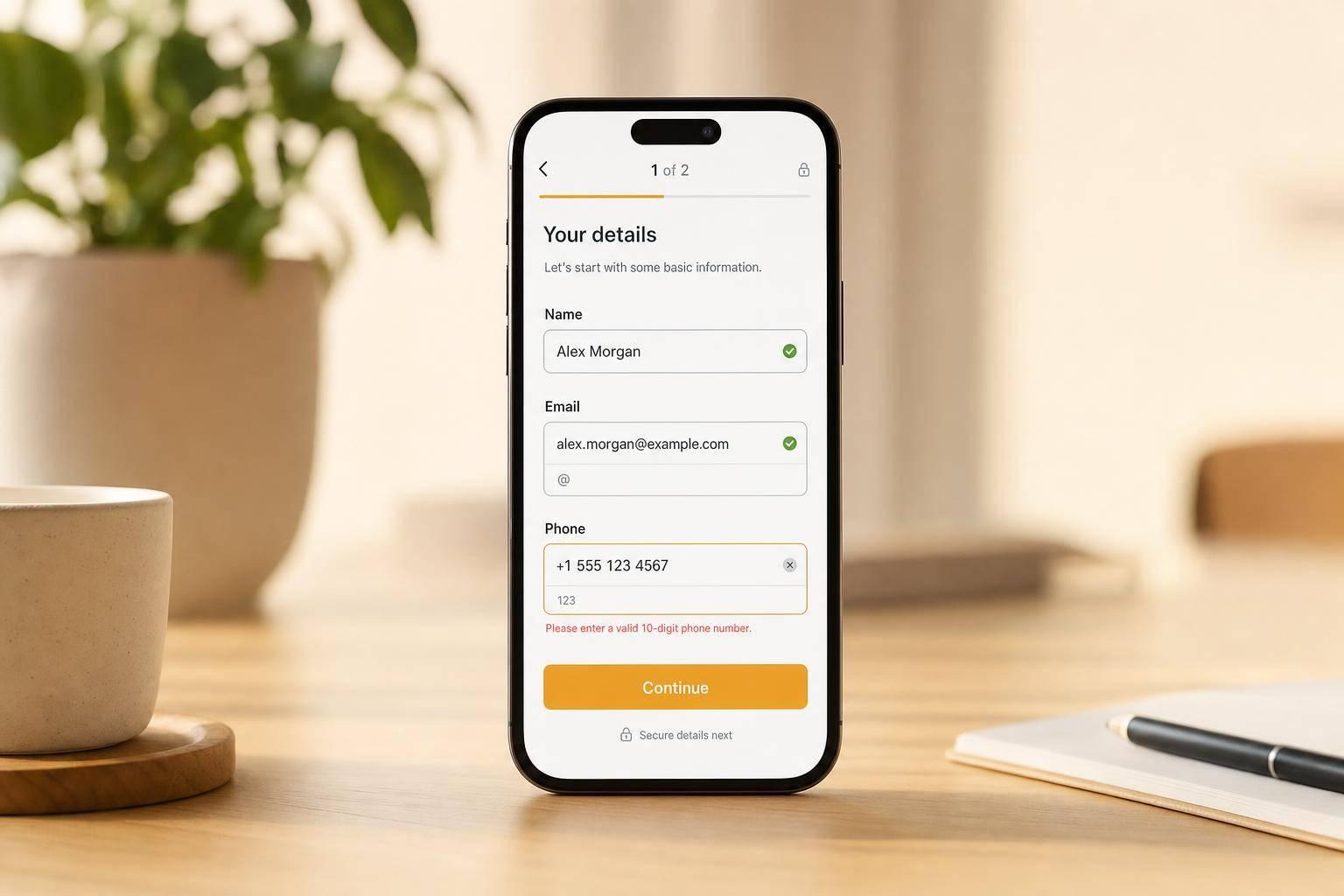
Mobile forms lose more leads mostly because they feel harder to use. The research points to a short list of fixes: keep forms short, use a single-column layout, show labels above fields, match each field to the right mobile keyboard, validate errors after each field, and delay high-friction questions until later.
Here’s the simple version:
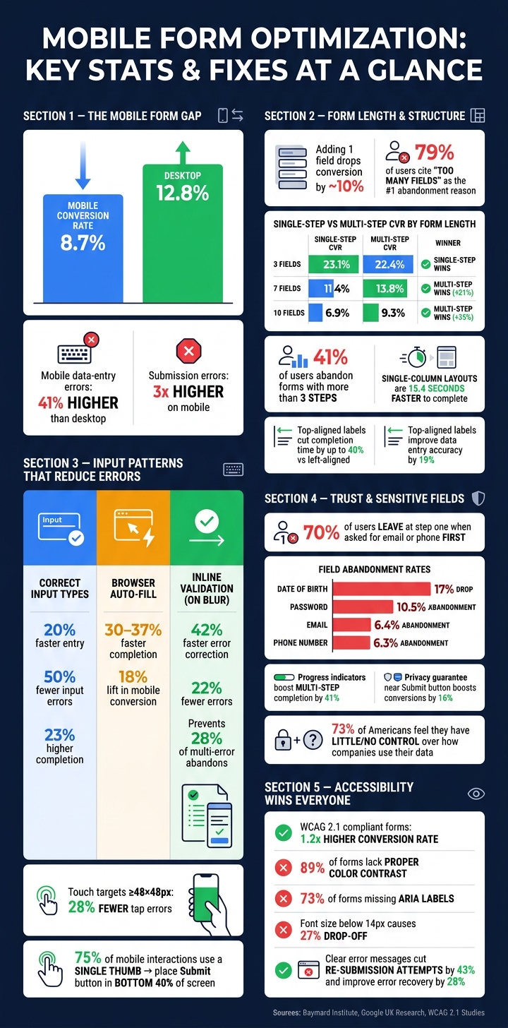
- Mobile traffic is high, but form completion is lower: a standard 5-field B2B form converts at 8.7% on mobile vs. 12.8% on desktop
- Errors are a big part of the gap: mobile data-entry errors are 41% higher, and submission errors are 3x higher
- Layout matters: single-column forms are 15.4 seconds faster to finish, and top-aligned labels improve accuracy
- Long forms need a different setup: multi-step forms tend to help after about 7+ fields, but forms over 3 steps lose many users
- Input details matter: correct input types, auto-fill, and on-blur validation can reduce mistakes and improve completion
- Trust affects completion: users often leave when forms ask for email, phone, budget, or other personal details too early
- Testing must be mobile-only: track completion rate, time to complete, field drop-off, resubmissions, and cost per lead by device
If I had to boil the article down to one point, it would be this: mobile form performance improves when I reduce effort, cut mistakes, and ask for trust only when the user is ready.
That’s the lens I’d use for every form decision in the rest of the piece.
Mobile Form Optimization: Key Stats & Fixes at a Glance
Optimizing Forms for Mobile Devices
sbb-itb-5f36581
What Research Says About Mobile Form Layout And Structure
When mobile friction can't be removed, form structure becomes the next thing to fix. On a phone, layout shapes how hard each field feels. Short forms, single-column layouts, and labels that stay visible all help cut abandonment.
Form Length, Perceived Effort, And Multi-Step Trade-Offs
The link between field count and conversion isn't a straight line. It drops fast. On mobile, that decline starts earlier, around 4–6 fields, because users hit scrolling sooner. Add one more field, and conversion drops by about 10%. That lines up with user feedback too: 79% of users say "too many fields" is the main reason they abandon a form.
Multi-step forms can help, but only when the form is long enough to need the split. For short forms, they usually backfire. Every extra page creates one more place for a user to leave.
| Form Length | Single-Step CVR | Multi-Step CVR | Outcome |
|---|---|---|---|
| 3 fields | 23.1% | 22.4% | –3% |
| 7 fields | 11.4% | 13.8% | +21% |
| 10 fields | 6.9% | 9.3% | +35% |
The pattern is pretty clear. At 3 fields, a single-step form converts better. At 7 and 10 fields, multi-step forms pull ahead. But there's a limit: research shows 41% of users abandon forms that go past 3 steps, no matter how many total fields are in the form.
So if a form has to stay long, the next move isn't stuffing in more steps. It's making the layout feel lighter.
Why Single-Column Layouts And Clear Field Grouping Work Better On Mobile
Single-column forms are 15.4 seconds faster to finish than multi-column layouts because they fit the way people scan on mobile: straight down the page.
Field grouping helps too. When related inputs sit together - contact details first, then company info, for example - users can make sense of the task faster. It feels less like a wall of fields and more like a series of small jobs. That sense of structure matters. Showing 1–2 fields per screen can improve focus by 57%.
Labels Above Fields Outperform Placeholder-Only Inputs
Label placement affects both speed and mistakes. Top-aligned labels stay visible while someone types. Placeholder-only labels vanish the moment input starts, which forces users to remember what the field was for. That's where slip-ups creep in.
Using persistent labels instead of placeholder-only labels improves data entry accuracy by 19%. Top-aligned labels can also cut completion time by up to 40% compared to left-aligned labels.
| Label Style | Completion Speed | Error Risk | Accessibility |
|---|---|---|---|
| Top-Aligned | Highest | Lowest | High |
| Floating | High | Low | Medium |
| Placeholder-Only | Lowest | Highest | Low |
| Inline/Beside | Low | Medium | Low |
Placeholder-only labels also create access issues, especially for screen reader users and people with cognitive impairments.
After layout, input behavior becomes the next source of friction.
Mobile Input Patterns That Cut Errors And Speed Up Completion
Once you've improved accessibility with multi-step forms, the next problem is usually input. A clean form lowers effort. Better input patterns cut mistakes.
Touch Targets, Thumb Reach, And Button Placement
Small or crowded tap targets cause a big share of mobile form errors. Apple recommends a minimum of 44×44 points, and Google Material Design suggests 48×48 dp. But size alone isn't enough. Spacing matters too. Touch-friendly buttons at or above 48×48px lead to 28% fewer errors.
Placement also changes how easy a form feels. About 75% of mobile interactions happen with a single thumb, so primary actions like "Next" or "Submit" should sit in the bottom 40% of the screen, where the thumb can reach them with less strain. Put those actions at the top, and users have to work harder than they should. Buttons placed within 16pt of the screen edge can also clash with system gestures like swipe-back. Full-width buttons help here. They remove awkward dead space around the main action and give users a bigger target to hit.
Input Types, Auto-Fill, And Inline Validation
Using the right HTML input type is one of those small fixes that pays off fast. Set type="email", and the keyboard shows the @ symbol. Set type="tel", and users get a numeric dial pad. That simple match between field and keyboard makes entry smoother.
Auto-fill adds another layer. When autocomplete tokens are tagged the right way, users can fill name, email, and phone fields with a single tap. That leads to an 18% lift in mobile conversion. But there's a catch: about 18% of auto-filled data contains errors. So auto-fill works best when it's paired with inline validation.
| Feature | Speed Gain | Error Reduction | Abandonment Impact |
|---|---|---|---|
| Correct input types | 20% faster entry | 50% fewer input errors | 23% higher completion |
| Browser auto-fill | 30–37% faster completion | 18% incorrect data rate | 18% lift in mobile conversion |
| Inline validation (on blur) | 42% faster error correction | 22% fewer errors vs. submit-time | Prevents 28% of multi-error abandons |
Inline validation works best on blur - right after a user leaves a field. That timing catches mistakes early without interrupting someone while they're still typing. It's a small detail, but it keeps the form from feeling jumpy or annoying.
How Accessible Form Design Improves Completion Rates
Accessibility changes completion rates in a very direct way. Forms that meet WCAG 2.1 standards show a 1.2x higher conversion rate. And the gap between good practice and what many forms do today is hard to ignore: 89% of forms lack proper color contrast, and 73% don't use ARIA labels for screen readers.
Font size is one of the easiest fixes. Mobile font sizes below 14px lead to a 27% drop-off in completion. That's not a subtle hit. It's the kind of thing people feel right away, even if they can't explain why the form feels harder to use.
Error messages matter just as much. They shouldn't just flash red and hope the user figures it out. A useful message tells people what went wrong, why it happened, and what to do next. Relying on color alone misses about 8% of men who have color vision deficiency. Clear, instructional error messages cut re-submission attempts by 43% and improve error recovery by 28%.
The nice thing about these fixes is that they don't just help people with access needs. They make the form easier for everyone using a phone, especially in rushed, one-handed, or distracted moments. Once that friction drops, trust signals start to matter more.
What Studies Show About Trust, Privacy, And Lead Quality
Once you reduce layout issues and cut input friction, trust becomes the next big mobile hurdle.
Required Fields, Sensitive Questions, And Drop-Off Risk
The order of your fields can make or break the flow. Research shows that 70% of users leave at step one when the first screen asks for an email or phone number. That’s a steep drop, and it tells you something simple: asking for contact details too early can feel like too much, too soon.
A better move is to ask for those details later, once users have already put some effort into earlier steps. At that point, the form feels less like a cold ask and more like the next logical step.
| Field | Mobile Friction | Abandonment Impact | Qualification Value |
|---|---|---|---|
| Password | Very High | 10.5% abandonment | Low (security only) |
| High | 6.4% abandonment | Critical (primary contact) | |
| Phone Number | High | 6.3% abandonment | High (sales follow-up) |
| Date of Birth | High | 17% decrease | Low to Medium (compliance) |
| Budget/Timeline | High | High drop-off if shown early | Critical (sales readiness) |
The pattern is pretty clear. Fields like password, date of birth, and budget/timeline ask for more effort or feel more personal. If they don’t sharply improve qualification, don’t put them up front.
Value Messaging, Progress Indicators, And Privacy Microcopy
Even when a field belongs in the form, users still need a reason to feel okay about filling it out.
People are more willing to share information when they understand the value and know how their data will be used. That matters a lot on mobile, especially since 73% of Americans feel they have little or no control over how companies use their data. A short line of privacy microcopy near a sensitive field can ease that tension. For example:
"Used only for order updates."
That kind of short note helps because it answers the silent question in the user’s head: Why do you need this, and what will happen next?
Progress indicators do something similar. They reduce uncertainty by showing users where they are in the process. And the lift can be big: showing progress in a multi-step flow increases completion rates by 41%. Privacy reassurance near the final action also matters. Placing a privacy guarantee near the "Submit" button boosts conversions by 16%.
So the takeaway is simple:
- Use progress indicators for multi-step forms
- Place privacy microcopy next to sensitive fields and near the submit button
Small trust signals can do a lot of work on mobile, especially when users are already deciding whether your form is worth finishing.
Putting The Research Into Practice On Mobile Lead Forms
A Mobile-First Checklist For Lead Generation Forms
Now it’s time to turn the research into action.
Start by cutting any field you can prefill or enrich automatically. On mobile, every extra tap adds friction. Then make sure each field uses the correct input type. That small setup change can increase mobile completion by up to 23%.
If your form has 5 or more fields, test a multi-step layout. B2B lead-gen forms see an average 21% lift with 2–3 steps, and visible progress indicators can improve completion by another 9% to 15%. On the other hand, if you’re offering a short gated content download, keep the flow tight and compact.
No matter which format you use, place higher-friction fields near the end. That way, people can build momentum before they hit the tougher asks.
How To Test Changes With Analytics And Controlled Experiments
Once the changes are live, test them on mobile traffic only - not blended traffic. If you mix mobile and desktop data together, you can miss what’s actually happening.
Watch these metrics closely:
- completion rate
- time to complete
- field-level drop-off
- resubmission rate
- cost per lead
Field-level drop-off matters a lot because it shows exactly where users quit, not just that they quit.
Break results out by device, too. A multi-step flow might help desktop users while hurting mobile completion. That kind of split happens more often than teams expect.
For cleaner test results, use a minimum runtime of 21 days. Also wait until each variant has at least 1,000 sessions and 100 conversions before calling the test.
Using Reform To Apply Research-Backed Mobile Patterns
These patterns line up well with a form builder made for short, adaptive mobile flows. Reform supports this setup with multi-step forms, conditional routing, lead enrichment, email validation, spam prevention, built-in analytics, and CRM integrations.
Conclusion: What The Evidence Consistently Supports
The evidence points to a clear next move: apply the patterns, measure results by device, and keep iterating.
FAQs
When should I use a multi-step mobile form?
Use a multi-step mobile form when a form is too long or too involved for people to finish on a single screen. A good rule of thumb: if it has more than about 7 fields, asks for mixed profile-style details, uses branching logic, or mobile drop-off is happening because people have to scroll too much, break it into steps.
Keep each step short. Aim for 3–5 fields, and 2–4 is even better. That helps keep the Next or Submit button within easy thumb reach and makes each step fit neatly on one screen.
Which fields should I move later in the form?
Prioritize the fields you need for the first interaction, like name and email, and push anything non-essential or optional further down the line.
A simple way to think about it is to sort fields into three buckets: required, optional, and ask later. If a field isn’t needed right away for lead qualification or to deliver value, it can wait. You can place it in a later step, a post-submission flow, or a follow-up.
Reform helps here with multi-step forms and conditional routing.
What mobile form metrics should I track first?
Start with form completion rate. It’s the clearest sign of user friction.
Mobile conversion rates often lag behind desktop by 30% to 50%, so pay close attention to where people bail out. That gap can tell you a lot, fast.
Use session recordings and heatmaps to find problem fields and abandoned sessions. Also watch your field-to-completion ratio, and segment the data by device type and traffic source.
Related Blog Posts
Get new content delivered straight to your inbox

The Response
Updates on the Reform platform, insights on optimizing conversion rates, and tips to craft forms that convert.


Drive real results with form optimizations
Tested across hundreds of experiments, our strategies deliver a 215% lift in qualified leads for B2B and SaaS companies.
