
.webp)
10 Tips for ADA-Compliant Forms


Creating ADA-compliant forms ensures accessibility for everyone, including the 61 million U.S. adults with disabilities. Inaccessible forms lead to frustration, with 73% of users encountering barriers and 36% abandoning them entirely. By following these 10 tips, you can improve usability, meet legal standards, and create a better experience for all users:
- Add Clear Labels: Use visible, properly linked labels for every field. Avoid relying on placeholder text alone.
- Write Specific Error Messages: Provide actionable guidance and avoid using color alone to indicate errors.
- Use High Color Contrast: Ensure text, borders, and placeholders meet WCAG contrast ratios.
- Replace CAPTCHA: Opt for accessible alternatives like invisible bot detection.
- Keep Questions Simple: Use plain language and organize fields logically using multi-step forms.
- Make Keyboard Navigation Easy: Ensure logical tab order, visible focus indicators, and no keyboard traps.
- Auto-Save Responses: Prevent data loss by saving user input incrementally.
- Show Clear Confirmations: Use programmatic announcements and visible messages after submission.
- Ensure Consistent Navigation: Keep buttons, progress indicators, and layouts predictable.
- Use Plain Language: Provide clear instructions and avoid jargon.
Key takeaway: Accessible forms improve usability for everyone while reducing legal risks. Start with semantic HTML, visible labels, and clear navigation, and always test with tools like screen readers and keyboards. Accessibility isn’t just compliance - it’s about ensuring everyone can complete your forms without barriers.

ADA Form Accessibility Statistics and Impact
How to make accessible forms - with lots of examples!
sbb-itb-5f36581
1. Add Clear Labels to Every Form Field
Every form field should have a visible text label that stays on the screen at all times. Without a clear label, screen reader users might only hear vague prompts like "edit text" or "text field", leaving them unsure about what information to enter. This can lead to frustration and might even stop users from completing the form altogether.
The best way to link labels to fields is by using the HTML <label> element with a for attribute that matches the input field’s id. Here's an example:
<label for="email">Email Address</label>
<input id="email" type="email">
This approach ensures assistive technologies can identify which label corresponds to each field. Plus, it increases the clickable area around the field, which is especially helpful for users with motor disabilities.
Avoid relying on placeholder text as your main label. Once users start typing, placeholders disappear, which can confuse individuals with cognitive disabilities. They also tend to have low color contrast and may not always be read by screen readers. If you use placeholders, stick to offering extra hints, like format examples.
Be precise with your labels. For example, instead of a generic "Name" field, split it into "First Name" and "Last Name" to avoid ambiguity. For related fields, such as radio button options, wrap them in a <fieldset> and use a <legend> to provide context. Screen readers will announce the legend before each option, making the experience clearer.
Adding the autocomplete attribute (e.g., autocomplete="given-name") is another way to improve usability. It allows browsers to autofill fields, reducing the effort required for users with motor or cognitive challenges. Using interactive flows can further simplify the user experience by routing visitors based on their specific needs.
Did you know that 45% of home pages have missing form labels? This makes it the third most frequent accessibility issue on the web. Fixing this is simple: ensure every input field has a visible, properly linked label. It's a small change that makes a big difference - not just for screen reader users, but for anyone who might lose track of a field’s purpose while filling out a form.
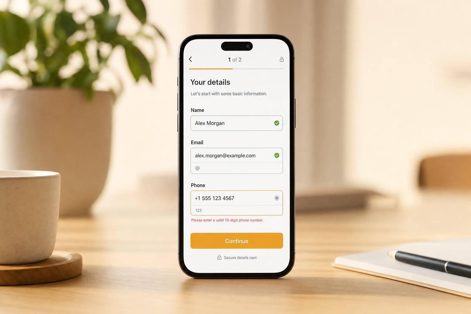
2. Write Specific Error Messages That Don't Rely on Color
Relying solely on a red border to indicate errors can create accessibility issues. Around 8% of men experience color vision deficiency, making it difficult for them to distinguish between a red error border and a standard gray one. Additionally, color changes are not announced by screen readers, leaving users who rely on assistive technologies unaware of potential errors.
"A red border looks identical to a gray border for some [users with color vision deficiency]." – Bohdan Khodakivskyi, Founder of Fomr
To create accessible error messages, avoid vague phrases like "Invalid input." Instead, provide clear, actionable instructions or use interactive multi-step forms to guide users through complex inputs. For instance, "Please enter a valid email address (e.g., name@example.com)" gives users specific guidance on correcting their input. Supplement text-based cues with visual elements like an exclamation mark or warning triangle to ensure the message is noticed, but don't rely on these alone.
For better compatibility with assistive technologies, use aria-invalid="true" on error fields so screen readers can identify them. Pair error messages with their respective inputs using aria-describedby, allowing screen readers to announce the issue when the user focuses on the field. If your form has multiple errors, include a summary at the top of the page that lists all issues as clickable links. This lets users quickly navigate to and address each error.
Using only color to convey errors violates WCAG Success Criterion 1.4.1 (Use of Color), which mandates alternative methods for delivering information. By combining clear text, recognizable icons, and programmatic indicators, you ensure your error messages are accessible to everyone, including the estimated 61 million U.S. adults living with disabilities.
3. Use High Color Contrast
Low color contrast is a top accessibility problem on the web. According to WebAIM's 2024 analysis, 81% of home pages tested had low-contrast text. When text blends into its background, it can make reading labels, input fields, and instructions difficult for users with visual impairments. This issue also violates ADA regulations.
To address this, contrast requirements ensure all form elements are legible. WCAG 2.1 Level AA specifies a minimum contrast ratio of 4.5:1 for normal text and 3:1 for large text (18pt/24px or larger, or 14pt/18.67px if bold). For input borders, checkbox outlines, and focus indicators, the minimum is 3:1. For example, pure red text (#FF0000) on a white background only achieves a 4:1 ratio, which falls short of the standard.
| Element Type | Minimum Contrast Ratio | Examples of Passing Colors on White |
|---|---|---|
| Normal Text (<18pt) | 4.5:1 | Gray (#767676), Purple (#CC21CC) |
| Large Text (>18pt or bold) | 3:1 | Gray (#949494), Purple (#C86FF1) |
| UI Components (Borders) | 3:1 | Dark Gray (#7A7A7A) |
Don’t overlook placeholder text. Light gray placeholder text, like #999 on white, typically has a contrast ratio of just 2.85:1, which fails accessibility standards. Similarly, thin light-colored borders (e.g., #ccc on white) can be nearly invisible to users with low vision.
To ensure your color choices meet these standards, use tools like the WebAIM Color Contrast Checker, the Colour Contrast Analyser (CCA), or the contrast checker built into Chrome DevTools. These tools calculate contrast based on luminance differences, helping you create high-converting landing page forms that are easier for everyone to use.
4. Replace CAPTCHA with Alternative Verification Methods
Traditional CAPTCHAs often create unnecessary obstacles for users with disabilities. Challenges like distorted text or image-based puzzles can be particularly difficult for individuals with visual or cognitive impairments. Even audio alternatives, while helpful in theory, must be clear and compatible with assistive technologies to be effective.
Thankfully, modern solutions can secure forms without these accessibility issues. Invisible bot detection is a great example. It works quietly in the background, analyzing user behavior patterns without requiring any extra effort from users. This approach is especially helpful for those with motor or cognitive disabilities, as it eliminates the need for direct interaction and reduces mental strain.
If interactive challenges are absolutely necessary, they must comply with WCAG 2.1 Level AA standards. This means they should be fully operable with a keyboard (per Success Criterion 2.1.1) and avoid relying solely on visual cues or color to convey information (Success Criterion 1.4.1). Additionally, every verification field should include a visible <label> that is programmatically linked to its input, and any errors must be communicated in text - not just through color.
"CAPTCHAs without accessible alternatives create absolute barriers. Image-based CAPTCHAs are impossible for blind users to complete." - OrbitForms
Using inaccessible CAPTCHAs can also expose your organization to legal risks, as they are a frequent point of failure in ADA-related lawsuits. By adopting invisible verification methods or offering multi-modal alternatives, you not only enhance the user experience but also protect your organization from potential legal challenges.
5. Keep Questions Simple and Direct
After establishing clear labels, precise error messages, and strong visual contrast, the next step is to focus on crafting simple and direct questions to improve form accessibility.
Overly complex questions can frustrate users with cognitive disabilities, ADHD, or limited digital literacy. When forms include technical jargon or complicated phrasing, they can overwhelm users, leading to form abandonment. In fact, a WebAIM study found that 73% of disabled respondents encountered inaccessible forms, and 36% ended up abandoning them entirely.
The fix is simple: use plain language and organize questions logically. For example, instead of asking, "Please provide your residential domicile address", go with a straightforward, "What is your home address?" Additionally, grouping related fields under clear headings gives users a better understanding of context. This approach not only makes forms easier to navigate but also aligns with ADA standards, offering clarity to millions of people with disabilities.
Breaking forms into smaller sections can also reduce cognitive strain. A long list of questions can feel overwhelming, creating anxiety or confusion about what’s expected. Dividing forms into manageable chunks and including a progress bar helps users - especially those with cognitive disabilities - track their progress and stay oriented throughout the process.
"Individuals with cognitive disabilities may need clear instructions and helpful feedback to complete forms confidently." - Recite Me
Lastly, make sure required fields are clearly labeled with the word "required" instead of relying on an asterisk or color alone. Visual cues like these can be missed by screen readers, so pairing them with clear, direct language ensures accessibility for all users.
These straightforward adjustments to language and layout work hand-in-hand with technical considerations, making forms easier for everyone to complete.
6. Make All Form Elements Keyboard Accessible
Not everyone uses a mouse. Some people rely entirely on keyboards due to motor disabilities, repetitive strain injuries, or assistive devices. In fact, form accessibility issues are cited in 70% of ADA-related website lawsuits. This makes keyboard accessibility not just a legal requirement but also a practical necessity. Alongside clear labels and proper contrast, ensuring smooth keyboard navigation is a cornerstone of accessible form design.
At the heart of keyboard accessibility is logical tab order. When users press Tab, the focus should move in a natural, visual order - from top to bottom, left to right. Avoid disrupting this flow with CSS positioning tricks or using tabindex values greater than zero, as these can interfere with intuitive navigation. The best practice? Keep your HTML structure aligned with the visual layout. Using a tool with built-in accessibility features can simplify this process.
Visible focus indicators are non-negotiable. A 2024 WebAIM report revealed that low-contrast text - affecting focus indicators - was present on 81% of tested home pages. Never remove the browser's default focus outline with outline: none unless you replace it with a high-contrast alternative that meets at least a 3:1 contrast ratio. Without a visible focus ring, keyboard users have no way of knowing where they are on the page. Along with proper sequencing, clear visual cues are essential for smooth navigation.
"When a form isn't accessible, it doesn't just create a bad experience. It creates a locked door." - Bohdan Khodakivskyi, Founder of Fomr
Custom components like date pickers and dropdowns require extra attention. Standard HTML elements - such as <button>, <input>, and <select> - come with built-in keyboard support. However, custom-styled components often don't. These need to respond to arrow keys for navigation, Enter to select, and Escape to close.
"The date picker is the single most consistently inaccessible form component in government websites" - Hayden Baillio, Hounder
Also, beware of keyboard traps. These occur when users can tab into a component but can't exit it without a mouse. To avoid this, ensure all modals and complex widgets can be closed using the Escape key.
| Keyboard Command | Expected Action in Forms |
|---|---|
| Tab | Move to the next interactive element |
| Shift + Tab | Move to the previous interactive element |
| Enter | Activate buttons or submit the form |
| Spacebar | Toggle checkboxes or activate buttons |
| Arrow Keys | Navigate within radio groups, select menus, or calendar grids |
| Escape | Close menus, modals, or date pickers |
7. Auto-Save User Responses
Auto-save is a game-changer for making forms more accessible and user-friendly, especially for ADA compliance. Losing progress on a form is frustrating for anyone, but for users with disabilities, it can create significant challenges. People with motor impairments, cognitive difficulties, or those using assistive devices often need more time to fill out forms. Auto-saving ensures their work isn’t lost if a session times out, the browser crashes, or they need to step away.
One effective method is using incremental saving with AJAX to temporarily store user input until the form is submitted. This approach reduces the risk of losing data due to connectivity issues or accidental browser closures. It also aligns with WCAG guidelines by eliminating the need for redundant data entry and accommodating users who may require additional time.
"If sessions do timeout, save user input so they don't lose work. This benefits everyone but is especially important for users who may take longer to complete forms." - TestParty
To create a seamless experience, clearly communicate the auto-save status. For example, use an aria-live="polite" region to inform screen reader users discreetly when a draft is saved. For sighted users, display a visual cue like "Last saved at 2:45 PM" to reassure them their progress is secure. Make sure the background saving process doesn’t disrupt navigation or take focus away from the user.
When users return to an incomplete form, repopulate their saved data automatically. If errors are flagged during submission, retain all valid input so users only need to fix the problematic fields. For sensitive information, always use HTTPS and implement robust access controls to protect user data.
Looking for a way to simplify this process? Reform provides built-in auto-save functionality, making it easier to create forms that meet accessibility standards while improving usability for everyone.
8. Show Clear Submission Confirmations
When users submit a form, a clear confirmation message is essential - especially for those with disabilities. Without proper feedback, screen reader users might not realize their submission was successful, potentially leading to duplicate entries or even abandoning the form altogether. Much like auto-save features, visible and accessible confirmation messages reassure users that their input has been securely received.
Programmatic announcements play a key role here. Use ARIA live regions (e.g., aria-live="polite" or role="alert") to make sure confirmation messages are announced by assistive technologies. For example, instead of just showing an icon or relying on colors, display a clear message like, "Thank you! Your submission has been received!" This approach is critical because around 26% of U.S. adults live with a disability that could impact their interaction with digital forms. Avoid relying solely on color indicators, as users with color vision deficiencies might not perceive them.
Focus management is another vital aspect. After a user submits a form, move the keyboard focus programmatically to the confirmation message or its heading (e.g., using JavaScript: document.getElementById('success-heading').focus();). This ensures that screen readers immediately announce the result, aligning with user expectations and reinforcing trust in the form’s design.
For forms handling sensitive data, consider splitting the form into multiple steps to include a review screen before final submission. WCAG 3.3.4 recommends displaying a summary of all entered information, allowing users to double-check and correct any errors before hitting the final "Submit" button. This extra step can reduce mistakes and provide peace of mind.
Lastly, keep confirmation messages visible on the screen. Messages that disappear automatically can be problematic for users with cognitive disabilities or slower reading speeds. Ensure the text remains on-screen, meets a contrast ratio of at least 4.5:1, and is still readable when zoomed to 200%. These adjustments ensure that every user receives clear, accessible, and reassuring feedback after completing a form.
9. Keep Navigation and Interface Elements Consistent
Once you've tackled error handling and auto-save features, the next step is to focus on consistent navigation. A well-structured and predictable interface not only makes forms easier to use but also strengthens ADA compliance. By aligning clear labels, error handling, and consistent navigation, you create an accessible and user-friendly experience.
When buttons, menus, and other interactive elements stay in the same place and function predictably, users can navigate forms with confidence. This consistency is especially important for the 61 million adults in the United States living with disabilities.
"This predictability is a cornerstone of web accessibility, facilitating easier navigation for all users, including those with cognitive and visual impairments."
– Allyant
Logical Tab Order and Keyboard Navigation
A logical tab order is essential for keyboard users. The tab sequence should follow the visual layout - top-to-bottom and left-to-right. Bohdan Khodakivskyi, Founder of Fomr, highlights this:
"The order should follow the visual layout: top to bottom, left to right... If your form's tab order jumps around... keyboard users will get lost".
Avoid using positive tabindex values, as they can disrupt the natural flow and confuse users relying on keyboard navigation. Maintaining a predictable tab order ensures that users, especially those with disabilities, can navigate forms efficiently.
Consistency in Multi-Step Forms
For multi-step forms, consistency is non-negotiable. Buttons like "Next" or "Continue" should use the same wording throughout the process. Progress indicators (e.g., "Step 2 of 3") should always appear in the same location, and "Back" and "Next" buttons should remain in identical positions across all steps. When a new page loads, ensure the focus moves to the page heading, helping users stay oriented.
High-Contrast Focus Indicators and Grouping
A clear, high-contrast focus indicator (like a 2px solid outline) is crucial for accessibility. Never remove the default focus outline without providing an accessible alternative. Additionally, related fields should always be grouped using <fieldset> and <legend> tags, such as grouping address fields together. This consistent approach helps screen reader users understand the relationship between questions, making the form easier to navigate.
10. Use Plain Language
Clear communication plays a vital role in making websites accessible and meeting ADA compliance standards. Using plain language ensures that instructions and feedback are easy to understand for all users, including those with disabilities.
Plain language eliminates ambiguity by replacing unclear terms with specific and actionable instructions. For example, instead of a vague error message like "Invalid input", opt for something more precise, such as: "Please enter a 10-digit phone number (e.g., 555-555-5555)." Similarly, for required fields, don't rely solely on a red asterisk. Since screen readers may not interpret symbols consistently, include the word "(required)" in the text to make it clear.
| Inaccessible Language | Plain Language Alternative | Why it Works |
|---|---|---|
| "Invalid input" | "Please enter a 10-digit phone number (e.g., 555-555-5555)" | Identifies the issue and provides a solution |
| "*" | "(required)" | Ensures clarity without relying on visual cues |
| "Submit" | "Register for Account" | Clearly describes the button's purpose |
| "Error" | "Date of birth: Please enter a date in MM/DD/YYYY format" | Offers actionable guidance for correction |
Incorporating examples like "MM/DD/YYYY" or "name@example.com" directly into labels or help text (using tools like aria-describedby) is particularly helpful for users with cognitive disabilities. These hints make it easier to enter data correctly on the first try, reducing frustration and the likelihood of abandoning the form.
When designing forms, static plain-text labels positioned above input fields are the most effective. Avoid using animated or floating labels, as they can confuse users and disrupt screen reader functionality. Visible, static labels are essential for users relying on voice controls, as they help ensure smooth interaction with the corresponding fields.
Testing and Validation
Once you've implemented ADA-friendly design tips, the next step is thorough testing to ensure your form works seamlessly for all users. Automated tools like axe DevTools, WAVE, and Lighthouse can help identify technical issues such as missing labels, incorrect ARIA attributes, or poor color contrast. However, it's worth noting that these tools typically catch only about 30–40% of accessibility issues. This is where manual testing becomes critical, as it can uncover problems automated scans might miss.
Start by putting your mouse aside and relying solely on your keyboard to navigate the form. Use Tab, Shift+Tab, Enter, and Space to move through fields, select options, and submit the form. Pay attention to the focus indicator - it should be clear and easy to follow. Additionally, the navigation order must align with the visual layout, ensuring a logical and intuitive flow. These steps lay the groundwork for more in-depth manual testing.
Next, test the form with screen readers like NVDA (free for Windows) or VoiceOver (built into macOS and iOS). This ensures that every label, instruction, and error message is announced correctly. For an even deeper understanding of accessibility, try completing the form blindfolded to simulate the experience of a visually impaired user.
| Tool Category | Tools | Purpose |
|---|---|---|
| Automated Scanners | axe DevTools, Lighthouse, WAVE | Identifying technical issues like missing labels and ARIA attribute errors. |
| Screen Readers | NVDA, JAWS, VoiceOver, Narrator | Ensuring form elements and instructions are properly announced. |
| Contrast Checkers | WebAIM Contrast Checker, Chrome DevTools | Verifying text and UI elements are readable for users with low vision. |
| Manual Testing | Keyboard (Tab/Enter), 200% Zoom | Checking navigation flow, focus visibility, and layout stability under zoom. |
Testing at extreme zoom levels is another vital step. Set your browser to 200% zoom and ensure that text doesn’t overlap or disappear, and that all functionality remains intact. Also, verify color contrast: normal text should meet a 4.5:1 ratio, while large text should meet a 3:1 ratio.
"The rest require manual testing."
- Bohdan Khodakivskyi, Founder of Fomr
Finally, real-user testing is invaluable. Invite individuals who rely on assistive technologies to test your form. Their insights can highlight overlooked issues, ensuring your form is accessible to the 61 million U.S. adults with disabilities.
Conclusion
Ensuring your forms are ADA-compliant isn’t just about avoiding legal trouble - it’s about making your services accessible to everyone. With lawsuits jumping 37% in 2025, and 73% of disabled users encountering inaccessible forms (36% of whom abandon them entirely), ignoring accessibility means losing out on a crucial audience.
But accessibility goes beyond legal obligations. It enhances usability for everyone. Features like high-contrast text improve readability on mobile screens in bright sunlight, logical tab orders speed up keyboard navigation, and clear error messages help all users complete forms with ease. Designing accessible forms isn’t just inclusive - it’s practical for millions of users worldwide.
Here’s a key takeaway to keep in mind:
"The real goal isn't checking boxes on a compliance checklist. It's making sure that when someone needs to fill out your form, they actually can." - Bohdan Khodakivskyi, Founder of Fomr
To get started, focus on the essentials: use semantic HTML, provide visible labels, enable smooth keyboard navigation, and write descriptive error messages. Testing is equally important - automated tools only catch 30–40% of issues, so manual testing with keyboards and screen readers is a must. Accessibility isn’t a one-and-done task; it’s a continuous effort to ensure everyone can use your forms.
FAQs
What counts as an ADA-compliant form?
An ADA-compliant form ensures accessibility for all users, including individuals with disabilities. It adheres to WCAG 2.1 guidelines by incorporating features such as clear and descriptive labels, logical navigation paths, high-contrast design, and compatibility with assistive technologies. These elements not only make forms easier to use for everyone but also help organizations meet essential accessibility standards.
How do I make custom widgets (like date pickers) keyboard accessible?
Creating custom widgets, like date pickers, that are fully accessible involves a few essential steps. First, ensure complete keyboard navigation. Users should be able to interact with all widget features using only their keyboard.
Next, focus on managing focus effectively. This means the user's focus should move logically and stay within the widget until the interaction is complete. Pair this with ARIA roles and labels to clearly communicate the widget's state and purpose to assistive technologies.
For example, ARIA labels can indicate whether a date is selected or unavailable. Provide clear instructions so users know how to operate the widget using their keyboard alone.
Finally, test thoroughly. Use screen readers and keyboard navigation to ensure the widget behaves as expected. Following the ARIA Authoring Practices can help you build widgets that are both accessible and user-friendly. These guidelines are invaluable for ensuring an inclusive experience for all users.
What’s the best way to test a form for accessibility?
To ensure a form is accessible, start by confirming that every form input has a clearly associated label. Then, test the form's navigation using only a keyboard to make sure all elements can be accessed and interacted with. Additionally, check that error messages are properly announced to screen readers, so users with disabilities are informed of any issues. Using assistive tools like screen readers is essential to verify that individuals with disabilities can complete the form without barriers. These practices align with WCAG standards and promote usability for everyone.
Related Blog Posts
Get new content delivered straight to your inbox

The Response
Updates on the Reform platform, insights on optimizing conversion rates, and tips to craft forms that convert.


Drive real results with form optimizations
Tested across hundreds of experiments, our strategies deliver a 215% lift in qualified leads for B2B and SaaS companies.
